Critique my Wes Wilson style variable font!

Matthijs Herzberg
Posts: 159
Hi all! This is a typeface I stopped working on a while ago, but would like to pick up again, and would like to run by some trained eyes before I do.
I'm sure most of you are familiar with the late psychedelic poster artist Wes Wilson, who's iconic lettering style is in turn based on that of Vienna succesionist Alfred Roller. The concept is simple: each letter is a box with a few curves ending in ball terminals cut into it.
I'm sure most of you are familiar with the late psychedelic poster artist Wes Wilson, who's iconic lettering style is in turn based on that of Vienna succesionist Alfred Roller. The concept is simple: each letter is a box with a few curves ending in ball terminals cut into it.
There's a few fonts based on Wilson's work, some pretty good, some pretty bad, but all single weight. Hence, recreating one of Wilson's posters while using one of these fonts would be pretty tricky.
My concept is a variable font with width and optical axis. The width goes from pretty regular to 4 times as wide. See below, as well as numbers and punctuation, and a little mockup in illustrator of what these axes are capable of when combined with size (said mockup took me ~10 minutes). The optical sizing is best adjusted by comparing size of the ball terminals, and keeping them roughly the same throughout a design.
This typeface obviously throws tradition out the window, but I did try to stick to certain parameters. All characters should remain between the baseline and cap line, counters should be open if at all possible (a rule I break a few times for legibility's sake), each glyph should fill as much black space as possible while remaining legible (like a psychedelic version of DJR's Fit), round letters get a little extra curve in their corners. The font is nearly monospace, but the /I and /1 are half width, and the /M and /W are 1.5 width.
Challenges include:
- Diacritics. As I want to stay true to the single height for all characters, I've used the display approach of shortening letters and squeezing their diacritics above/below them. This is kinda fun, but also perhaps a little ugly, not to mention that things get quite illegible at wider widths (Ş is a wreck).
- Punctuation. I've opted for not-quite-hairline on brackets and dashes (essentially the reverse of the counterforms in the letters), but am pretty sure at this point that wasn't a great move. Will probably redo those.
- Even texture, especially in the smallest optical size. Keeping ball terminals the same size seemed more important than keeping thicks and thins matching, but this leads to some strange situations in many letters.


5
Comments
-
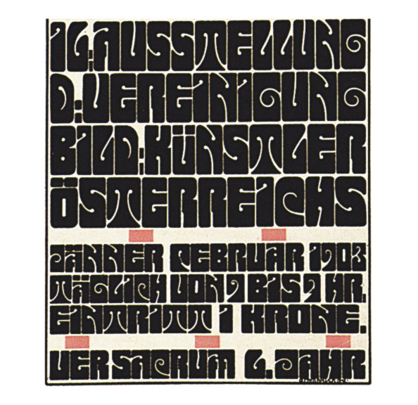
Great project, Matthijs. I think it's the ideal variable challenge, especially optical size. If you want more, high quality examples of Roller’s lettering we recently added the complete Ver Sacrum calendar to Letterform’s Online Archive. While some of the letters are pretty wacky, and not so legible for contemporary use (A, F), I prefer some of Roller’s solutions to Wilson’s. See the J, for example, which does a better job filling the square.

3 -
@Matthijs Herzberg Always nice to see designs where the negative space matters.
{Edit, inspired by Stephen's post below.}
Do you have a name for it?
http://www.mythencyclopedia.com/Pa-Pr/Polynesian-Mythology.html
0 -
I think some of your other forms could have more density too: M, T, W. As an alternative to the spade-like shape, Wilson’s simpler M from this poster:

2 -
I think this is the best argument I’ve seen for variable fonts so far. You’ve done a great thing with this technology.0
-
@Stephen Coles Hey Stephen, thank you very much for these links! The only images of Roller's work I've been able to find have been low-res Jpegs on Google Images. This is gorgeous, and I agree with you on that /J (although I'm a little annoyed that Alfred seemed to forget to put the ball terminal in it). And man, those illustrations!My initial /M was like the one in that Wilson poster, then I changed it...now I may reverse back to the original. Perhaps a little stylistic set wouldn't hurt. This album is what's mostly served as inspiration so far.@Hrant H. Papazian Is there a single typeface where negative space doesn't matter? Working name has been "Psychblock", obviously I'll have to think of something better but I don't know if something Polynesian is appropriate, even though the letterforms do have that vibe sometimes.
@James Puckett Wow, thanks!0 -
Certainly true of course, otherwise it wouldn't be legible. :-) But it's relative, and the closer letterforms are to painted skeletons the less they can respect the white.Matthijs Herzberg said:Is there a single typeface where negative space doesn't matter?2 -
Is the monospacing (or actually severely unitized spacing) necessary? Seems to me like a constraint that isn't adding value, and for this psychedelic style it feels kind of, well, square.
Of the letters, only F feels like it's not quite there yet. Did you play at all with a lowercase-like form (i.e. with a curvy top and crossbar that comes out both sides)? In the figures, I worry a bit that one is sevenish and seven is ninish. Four needs rethinking.
For the diacritics maybe some solution that was more like overlapping could be promising?2 -
@Craig Eliason Interesting thought on the Monospace. I went with it initially as it just kinda made sense, but maybe you’re right. I also don’t want it too chaotic in widths, but perhaps some letters could benefit from a little deviation. Also thanks for your notes on individual letters.
Do you have any examples of overlapping diacritics? I’m not 100% sure what you mean by that.0 -
The exclamation and question might be better formed conventionally in two pieces. In the more extreme proportions, the connected question mark reads like it could be an unusual 2 or 7. And when they're inverted for Spanish you want the distinction between punctuation and letters to especially obvious in settings like this.
1 -
I like it. I did my own take on this style (Ver Sacrum NF), and this suite puts my humble efforts to shame.
0 -
@K Pease You break my heart, because you're probably right. I was really proud of that question mark (the exclamation mark is whatever but the two should match).@Nick Curtis I saw that one come up while doing my research, and will admit I looked at it a few times, especially to see how you handled less common characters. Definitely one of the better digitizations out there!

0 -
Try a solid bar for the tilde. You'll avoid that ugly negative space and the wave isn't needed for comprehension.1
-
No examples on hand, but I just mean the diacritics would just appear, outlined in white, superimposed on the top of the unshortened letter. Don't actually know how well it would work but I thought I'd toss it out there.Matthijs Herzberg said:Do you have any examples of overlapping diacritics? I’m not 100% sure what you mean by that.0 -
@Ray Larabie I learned about this from DJR's diacritic lecture video. Just double checked to see if any languages use both the macron and the tilde on top of their vowels, and it seems there aren't. Neat, thanks for the suggestion.
@Craig Eliason It's worth a try!
0 -
An update: I've completed this typeface and released it under the name Libido. You can find it here. I've also written a blog post on the history of the style and design process.Thanks to all who offered their help and feedback!6
-
Congrats! The Ragged style is a nice surprise.1
-
@Stephen Coles Cheers Steven! A humble attempt to put my own spin on the concept.0


Categories
- All Categories
- 47 Introductions
- 4K Typeface Design
- 493 Type Design Critiques
- 575 Type Design Software
- 1.1K Type Design Technique & Theory
- 669 Type Business
- 884 Font Technology
- 29 Punchcutting
- 537 Typography
- 124 Type Education
- 332 Type History
- 81 Type Resources
- 113 Lettering and Calligraphy
- 33 Lettering Critiques
- 80 Lettering Technique & Theory
- 569 Announcements
- 100 Events
- 116 Job Postings
- 170 Type Releases
- 182 Miscellaneous News
- 270 About TypeDrawers
- 54 TypeDrawers Announcements
- 114 Suggestions and Bug Reports