Constructed Copperplate script

Nick Cooke
Posts: 209
I started a new font a couple of weeks ago. Is there any demand for a constructed Copperplate script font? I don't know, but it has generated a fair bit of interest on Twitter: @gtypefoundry recently so I presume there might be. I bought a flexible nib fountain pen and had been practising writing with it when I got the idea of a constructed Copperplate to give a modern twist to an archaic style.
I did a really quick sketch to see if the idea had legs. I tried to stick to rigid geometry as much as possible for the bold down strokes but followed fairly closely to traditional Copperplate for the thin strokes.

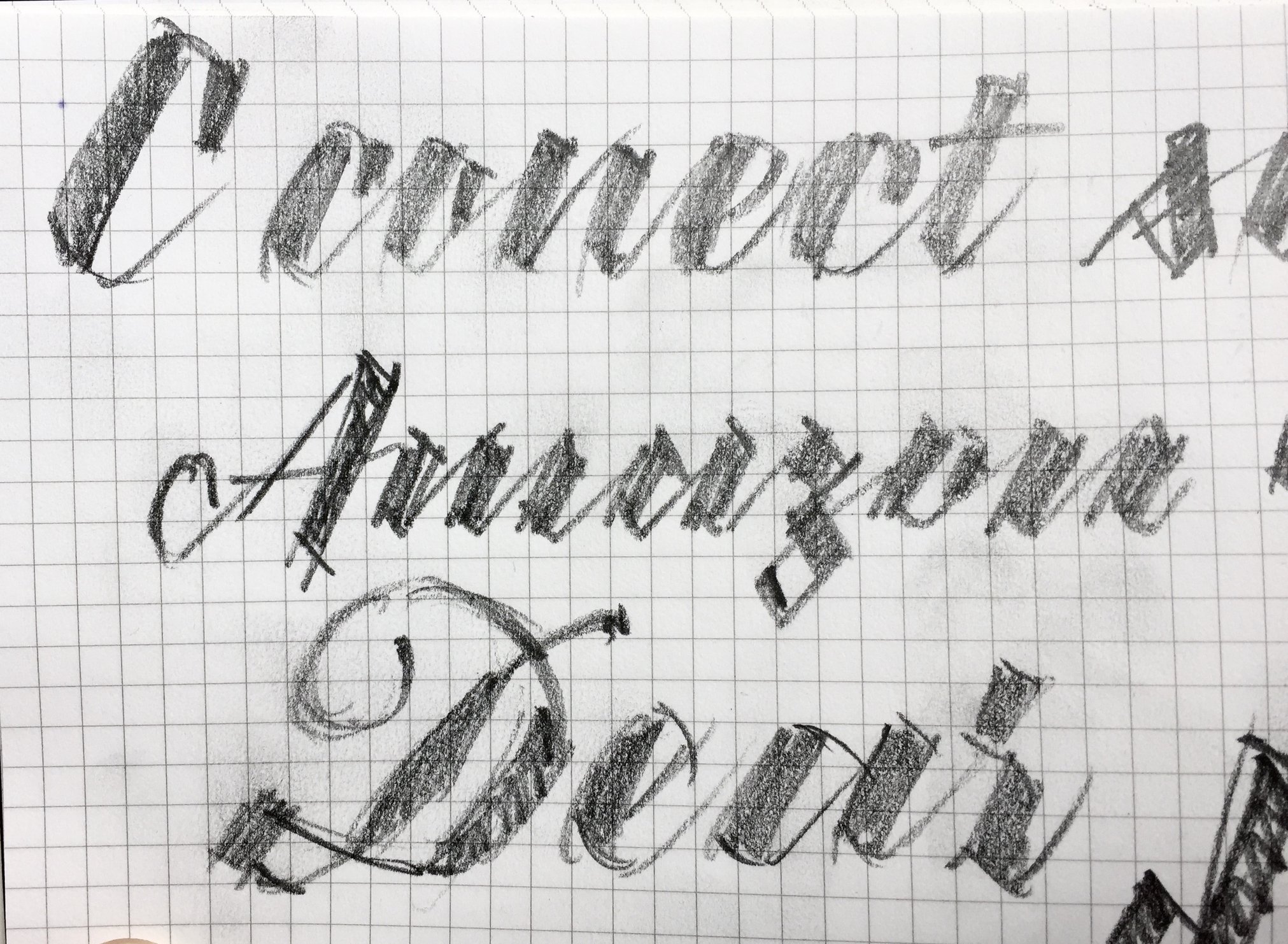

From very crude sketch to first drawing, then taller and a bit more refined, to final(ish) more polished with even taller glyphs and much bigger Cap.


Then tried different styles. Modern Cap P on the right maybe fits better. Also alt r, b and a on top line look better.

I then finished all lowercase and added caps in traditional Copperplate style, but may add a more 'modern' alternate set.
Not happy with the X.
Testing weights. 1 and 4 are extremes. 2 and 3 are interpolated. 5 is an extrapolation which just needs some adjustment to be used as the Bold extreme. 4 is the original which has been adjusted to work with 1.

It's always good to do an extrapolated heavier weight so that one can see what needs to be adjusted.
I did a really quick sketch to see if the idea had legs. I tried to stick to rigid geometry as much as possible for the bold down strokes but followed fairly closely to traditional Copperplate for the thin strokes.
From very crude sketch to first drawing, then taller and a bit more refined, to final(ish) more polished with even taller glyphs and much bigger Cap.
Then tried different styles. Modern Cap P on the right maybe fits better. Also alt r, b and a on top line look better.
I then finished all lowercase and added caps in traditional Copperplate style, but may add a more 'modern' alternate set.
Not happy with the X.
Testing weights. 1 and 4 are extremes. 2 and 3 are interpolated. 5 is an extrapolation which just needs some adjustment to be used as the Bold extreme. 4 is the original which has been adjusted to work with 1.
It's always good to do an extrapolated heavier weight so that one can see what needs to be adjusted.
0
Comments
-
Good stuff overall!Quite a few caps are too light IMHO. The /G/ in particular needs work. I'm wondering whether they could also be more constructed; right now the contrast of freeform cap vs constructed lowercase is quite dramatic.The /z/ is perhaps too jagged compared to all other letters. The /s/ seems to crowd the previous letter (and the combination /x/s/ is particularly cramped).The Light cut might need smoother transitions from straight thick stems to thin curves. Probably the loop of /f/ is a bit too large compared to the dark weights?I still think this might be a promising way to construct /a/:

0 -
So far, I like it! Don't worry so much about the demand, just feed your inspiration.
1 -
Chris, I usually do just feed my inspiration, but I'd also like to sell a font occasionally.
") 1
1 -
I know the caps aren't there yet Christian, but I like the contract between caps and l/c.
I have altered the 's' so that it fits better. I had thought the 'z' was a bit out of place, but based on my original sketch. I quite like the new 'z' being more curvy. 3
3 -
I posted too soon last time. The 'z' was a bit too 'Arabic'. This is better.
 1
1 -
Both of those newer z’s read to me as a touch too upright, and the most recent one a little too light too.3
-
The more I look at the traditional caps, the less appropriate they seem. Looking forward to seeing a full set of the modern options.2
-
Thanks. Fixed now.Craig Eliason said:Both of those newer z’s read to me as a touch too upright, and the most recent one a little too light too.0 -
I like the contrast with the lowercase but they need a fair bit of work. I might have them as the alt style set, and the modern ones (yet to be designed) as the default.John Hudson said:The more I look at the traditional caps, the less appropriate they seem. Looking forward to seeing a full set of the modern options.1 -

Variations of thin strokes of the Bold weight. Top one matches the thin of the Light, bottom one is as it is now, getting progressively heavier from top to bottom. I'm favouring the very thin. Bottom one now looks a bit brutal.
0 -
Brutal fits.
0 -
MUCH better caps match!
1 -
I've long thought that hairline thickness, in itself, can legitimately constitute the whole of optical size variation in such a script. Your heaviest hairline thickness looks brutal at the size your're showing it, while the thinnest would be far too light at any smaller size.
Since this is a display face, and isn't expect to perform at small sizes, you don't need to worry about other aspects of optical size design adjustment such as x-height size, counter shape, spacing, etc., so you can keep everything else the same and just vary the hairline weight.
This is how the engravers of roundhand copybooks handled size: weight variation was handled in the thick strokes, while the width of the thin strokes was cut according to size.0 -
Charming design, evolving nicely!0
-

I thought the thinner thins were also more suitable. Here is the new Bold weight with thinner thins.0 -
Just shear the terminals at that angle.0
-
The cap U interior is pretty wide isn’t it?1
-
I don't mind the /U/, but the /M/ still looks too dancy for my taste.The near miss at the entrance of the /z/ bothers me a bit...And I'd very much encourage an optical size axis that thickens the thins!0
-
I would do the same swoosh on the M as on the K.Christian Thalmann said:I don't mind the /U/, but the /M/ still looks too dancy for my taste.0 -
I think adding some weight to the instroke of /M might help stabilize it.
0 -
It’s an up stroke. Up strokes are thin. Besides, adding weight where? I don’t see a problem.Adam Jagosz said:I think adding some weight to the instroke of /M might help stabilize it.1 -

- It’s finished.
3 -
Congratulations, Nick. Very charming!
6 -
Thanks Andreas.0
-
This is really strong, spirited work—congrats! It’s a bit hard to read in the text size, but as display I think it’s a winner. It reminds me a bit of early-20th century Czech design: Dyrynk, Menhart, Preissig, Tyfa—though entirely fresh, especially as a connected script.
0


Categories
- All Categories
- 47 Introductions
- 4K Typeface Design
- 495 Type Design Critiques
- 577 Type Design Software
- 1.1K Type Design Technique & Theory
- 671 Type Business
- 885 Font Technology
- 29 Punchcutting
- 539 Typography
- 125 Type Education
- 333 Type History
- 81 Type Resources
- 113 Lettering and Calligraphy
- 33 Lettering Critiques
- 80 Lettering Technique & Theory
- 569 Announcements
- 100 Events
- 116 Job Postings
- 170 Type Releases
- 182 Miscellaneous News
- 270 About TypeDrawers
- 54 TypeDrawers Announcements
- 114 Suggestions and Bug Reports