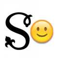
Simple rounded wordmark
JoannesMathieu
Posts: 9
Hi all
I have a wordmark in need of critique. It is supposed to look cute and playful, but modern and stylish. It uses the same circle forms that are also in the artwork for the product that it represents, blending in with said artwork.
Two versions, though I do not even know if the slight tweaks make a real difference.
v1: /p inner counter is somewhat above center, belly seems to be sagging somewhat?
v2: /p inner counter centered, but lower belly (4-5 o'clock) slightly thickened. /b slightly thicker (it is a reversed /p now)
The background circle is not part of the logo.
Thanks in advance!

The background circle is not part of the logo.
Thanks in advance!

Tagged:
0
Comments
-
The difference is so minor I probably wouldn't have noticed if you hadn't specified, but number 2 looks better to me. I do have a hang-up with that /y: it looks vertically squashed. I think it would look more balanced with the descender going down as far as the descender on /p, and the top part looking more like /u.
0 -
Every single letter in this mark is wrong, the y because it is too clogged and the others + the y because the so-called "bone effect" is not taken into consideration.
 Read on it and you will be able to improve it instantly.
Rework the y to a classical form of two intersecting curves, IMO. It would be instantly more legible.
Also, the bottom oval of an U is traditionally squished vertically under the weight of the stems. Not doing so brings us back to the '00 club scene.
Centered how? Vertically on the ovals is best IMO.0 -
Thank you both!0
Categories
- All Categories
- 46 Introductions
- 3.9K Typeface Design
- 489 Type Design Critiques
- 572 Type Design Software
- 1.1K Type Design Technique & Theory
- 663 Type Business
- 875 Font Technology
- 29 Punchcutting
- 530 Typography
- 121 Type Education
- 328 Type History
- 81 Type Resources
- 111 Lettering and Calligraphy
- 32 Lettering Critiques
- 79 Lettering Technique & Theory
- 561 Announcements
- 96 Events
- 116 Job Postings
- 169 Type Releases
- 179 Miscellaneous News
- 269 About TypeDrawers
- 53 TypeDrawers Announcements
- 114 Suggestions and Bug Reports

