‘Grand Cru Classés’ sprouting from Antwerp soil
Comments
-
Thanks Pablo!0
-
On Saturday, 5 October 2019, the Annual Academic Meeting of the Plantin Institute of Typography will be concluded with the opening of the EcTd 2019 exhibition at the Museum Plantin-Moretus. The title of the exhibition is, as in previous years, In Plantin’s Footsteps, and will present the common and individual projects results (based, for example, on a Balthazar van Wolsschaten type specimen, see image below) of the 2018–2019 group. Furthermore, the further development during the past post-course year of the 2017–2018 projects will be exhibited too.

This year’s group project was an in-depth investigation of the idiom-differences between Claude Garamont and Robert Granjon. To which extent did these punchcutters use the same underlying standardized models and what exactly did they add to these models to make their ‘hands’ unique? To pinpoint the boundaries of both punchcutter’s idioms, the students made a variable font, which interpolates their revivals based on related body sizes cut by both French masters. This font can be used to find out where exactly the idioms of Garamont and Granjon become dominant. After all, most of us will recognize the details of Garamont’s and Granjon‘s hands, but if the underlying model is basically the same, when exactly can a letter form be attributed to one of them?
However, both interpolated revivals are as such the result of a comparable idiom-pinpointing by the members of the group, because they are based on their personal interpretations. Hence, the students first had to agree on what exactly can be seen in, and distilled from, the original models from each punchcutter. So, one could state that initially there was a vertical interpolation of interpretations of each punchcutter, and subsequently there was a horizontal interpolation of the resulting two poles, cumulating in the variable font.
Last Thursday this year’s group had a meeting under the roof of the Museum Plantin-Moretus, at which the project‘s results and panels for the exhibition were discussed. Although there is undoubtedly some work to do still, it is going to be a great expo.
2 -
 The panels have been mounted on the walls of the Museum Plantin-Moretus. Only the lighting has to be adjusted and the boxes with Renaissance matrices and punches, which were used by the students for their projects, have to be put in the glass cases still. Almost everything is ready for the opening of this year’s In Plantin’s Footsteps exhibition coming Saturday, 5 October, where, aside from the refined typography of the Expert class Book design students, the type projects made at the Expert class Type design course will be presented.
 In the article ‘The Garamond Types of Christopher Plantin’, which was published in the Journal of the Printing Historical Society in 1965, Dr. Vervliet lists the impressive collection of the Museum Plantin-Moretus: 4,500 punches, 20,000 matrices, and 60 moulds. There are also tons and tons of foundry type, mostly dating from the 18th century and, of course, there are printed books. The students of the Expert class Type design can directly make use of this incredible wealth of historical type-foundry material for their projects. Therefore, at the exhibition one will find revivals based on work of renowned punchcutters, such as Sanleque, Haultin, Smit, and Rosart –to name a few.
 In case of Renaissance foundry type, one has to distill information about the systematization and patterning from artifacts, like archeologists do. After all, there does not consist documentation on the original archetypal production processes. Therefore, research, whether scientfically based and/or empirically oriented, will generate additional knowledge on the fundamentals of typography and will undoubtedly learn us more than through merely optically reproducing the historical letter forms.
I mentioned this also in the foreword of Reviving Type. Especially the unrestricted access to the rich collection of the Museum Plantin-Moretus makes the Expert class Type design course a unique place for the study of (the fundamental aspects of) type. This year’s group project was an in-depth investigation of the idiom-differences between Claude Garamont and Robert Granjon. The research question the students tried to find an answer to, was whether –and if so– to which extent, these two excellent punchcutters used the same underlying systematized and standardized models. Furthermore, what exactly did Garamont and Granjon specifically add to these models to make them unique representatives of their ‘hands’?
To more exactly pinpoint the boundaries of both punchcutter’s ‘hands’, the students made a variable font, which interpolates their revivals based on related body sizes cut by both French masters. This font can be used to find out where exactly the idiom of either Garamont or Granjon becomes dominant. After all, most of us will recognize the characteristic details of Garamont’s and Granjon’s hands, but if the underlying model is basically the same, when exactly can a letter form be attributed to one of them?
To create the poles for the variable font, first a consensus had to be reached on what exactly the characteristics of on the one hand Garamont and on the other Granjon are. For this, multiple interpretations of the two punchcutter’s models in question were made and these were in turn compared and combined to come up with a single model for each punchcutter. Whether these interpretations are merely representative for Garamont and Granjon is, however, open for discussion still. After all, inevitably these revivals also show characteristics of their interpreters, who are undoubtedly influenced by matters such as Zeitgeist and their own technical abilities. Last year’s group project comprised an investigation into types cut by the 16th-century Flemish punchcutter Hendrik van den Keere for small (text) and large (display) sizes. Comparing Van den Keere’s well-known Parangon Romain from 1575 and Ascendonica Romain from 1577 with his Philosophie Romaine from 1578, and investigating the patterning, proportions, and details. Evaluations of the approaches of working in metal and standardization in type design at different optical sizes were considered, and were contrasted to methods and tools of digital typeface design today. The outcome of this research was surprising, as one can see and read on the panels, and it also led to the design of a revival using the Small Pica Roman as a departure.
Having both group projects together on the walls of the Museum Plantin-Moretus is great, because they are quite complementary.
3 -
@LeMo aka PatternMan aka Frank E Blokland Hi Frank, I remain fascinated by my visit at this exhibition last year in St Paul Church. Could you tell me how many times this one will stay in the Museum ?
0 -
Hi Ivan, the exhibition runs till 17 November 2019. For those on Facebook: a huge spoiler can be found here.
0 -
Thanks a lot Frank ! I will see it on facebook too
0 -
At the Annual Academic Session of the Plantin Institute of Typography at the Museum Plantin-Moretus, which will take place tomorrow morning prior to the opening of the In Plantin’s Footsteps exhibition, EcTd-laureate Ramiro Espinoza will be the keynote speaker. Ramiro will also talk –in more detail then– about his punchcutting experiments at a special afternoon session in the beautiful Sint Andries church, which is located close to the museum.
 1
1 -
The In Plantin’s Footsteps 2019 exhibition is now open to the public.


1 -
Congratulations, Frank Blokland and Jan Van der Linden (Secretary of the Plantin Institute of Typography)! It is an outstanding exhibition full with interesting projects to look at. Also, I think it was a great idea to exhibit as well the punches and matrices that inspired the works. I'll try to visit it again with more time.
1 -
This is great work—congratulations!
0 -
It is already a week ago that the Annual Academic Meeting of the Plantin Institute of Typography and the related opening of the In Plantin’s Footsteps 2019 exhibition took place under the roof of the Museum Plantin-Moretus. One of the absolute highlights was Ramiro Espinoza’s keynote on the necessity of the preservation of punchcutting techniques and, related, research by the reproduction of punchcutting processes.
 A very special moment was Ramiro’s presentation of the new matrix he made for a capital /T, missing from an original set of matrices from Ameet Tavernier in the collection of Museum Plantin-Moretus. The museum’s director Iris Kockelbergh was very happy to receive the matrix, which will be added to the collection. The punch Ramiro used for the strike is shown above in a previous post.
 3
3 -
As mentioned, the In Plantin’s Footsteps exhibition at Museum Plantin-Moretus runs until Sunday, 17 November 2019. Already there were many visitors and the guestbook contains quite some compliments. It is nice to see that aside from colleagues also laymen appreciate the exhibition.
 A small selection from the guestbook:
– ‘Lovely to see — such passion for craftsmanship.’
– ‘Make good typography. Even if nobody cares. Well thank you from those who do care.’
– ‘Great work again. Congratulations to Frank and the whole class.’ (originally in Dutch)
– ‘So interesting to see this within the museum. I did not realise the common typefaces were so old, nor how much work goes into creating them. Bravo.’ And more common, but not less complimentful:
– ‘Beautiful work!’
– ‘Very interesting.’
– ‘Very good work.’ The new Expert class Type design course starts in one month. It is possible to enrol still.1
 -
 For the tenth consecutive year I have the privilege to guide the Expert class Type design students in the illustrious Museum Plantin-Moretus. In 2009 I wrote the EcTd curriculum, which I have adjusted a bit over the years. I am very lucky to have highly motivated and very inspired international students in my class.
 In my dissertation I discuss that the production of the (French) Renaissance type was systematized and standardized. I show Robert Granjon’s Ascendonica Romain (1569) and Ascendonica Cursive (1570) as examples. This year, the students are investigating whether other Granjon italic/cursive models, which mutually share the same body size, exhibit comparable standardization/unitization of character widths. Moreover, the emphasis is on the following research question: is there a shared standardization of widths, or maybe even a cross-unitization, between roman and italic models of Granjon?
 The students work in the context of a group project on related digital revivals of Granjon’s roman and italic models, in which the results of their meticulous studies are processed. The first impressive letter forms were digitally sculpted with the help of LeMo and Glyphs, but a number of drawings were also made by hand. Last Wednesday, 29 January 2020, the students presented the process and progress of the group project in the museum’s auditorium, where the EcTd sessions take place.
 0
0 -
Yesterday the informative and beautifully illustrated website for the prestigious Rosart Project, which originated in the Expert class Type design 2014–2015 course at the Plantin Institute of Typography under the roof of the illustrious Museum Plantin-Moretus in Antwerp, was launched.
 As can be can read in the introduction: ‘Hundreds of hours of in-depth research, meticulous drawing, discussion, testing, and refining, ultimately resulting in in a comprehensive series of cutting-edge digital revivals: the Rosart Project. This website describes the processes involved and shows the outcomes of an intensive typographical adventure of the experts Walda Verbaenen, Michel Paré and Lukas Schneider.’
 1
1 -
From April 17 to June 6, 2021, the annual exhibition In Plantin’s footsteps will take place in the illustrious Museum Plantin-Moretus in Antwerp. Laureates of the Expert classes Type and Book design (acronyms: EcTd and EcBd respectively) will present the results of their intensive studies. Both courses are organized by the renowned Plantin Institute of Typography.
The emphasis in the EcTd course is on research into the intrinsic patterning aspects in historical type, which are as much the source as the result of typographic conventions. Information about Renaissance standardization and unitization is distilled from artifacts, such as punches, matrices, foundry type, and prints. The outcomes are extrapolated and translated into a systematized approach to digital font production. This includes matters like the parameterization of spacing and kerning, and the automation of font-generation processes.
In this video: https://youtu.be/G8sZBzk32Oc
Anna Damoli and Eugene Yukechev take the audience by the hand and walk them through this unfamiliar territory for many working with fonts and typography. While it may not be necessary for reproduction, research into Renaissance standardization and systematization can provide a deeper insight into the intrinsic structure of (unconsciously) reproduced historical frameworks. Information hidden at first glance can support a more authentic interpretation of the source models in question, and the distilled patterns can be used to further master the harmonic and rhythmic aspects of type in today’s digital font-production environment.
The Renaissance Type Systematization and Digital Frameworks video was initially created by Anna and Eugene for the ATypI ‘All Over’ online conference, which took place at the end of October 2020.
0 -
 Last Saturday, in the illustrious Museum Plantin-Moretus in Antwerp, the exhibition of the work of my Expert class Type design 2019–2020 students opened. Not surprisingly, this exhibition has been postponed due to the unprecedented circumstances: otherwise it would have taken place last autumn.
 It is combined with a presentation of work from the Expert class Book design of the same academic year. The exhibition will run until Saturday July 31, 2021.
 I am very happy to have been leading the EcTd course for over ten years now. It is an absolute pleasure and privilege to work with highly motivated and talented students from all over the world. As the name of the course implies, the Expert class Type design is intended to provide a solid foundation for a professional career in the type business. To this end, historical typefaces from the rich collection of Museum Plantin-Moretus are examined in a way that is unique in the world, that is, with an emphasis on the intrinsic pattern-forming aspects.
 As mentioned in my previous post, Information about Renaissance standardization and unitization is distilled from artifacts, such as punches, matrices, foundry type, and prints. The results are then extrapolated to the practice of today’s digital type designer and translated into a systematic approach to type design and font production. This includes matters like the parameterization of spacing and kerning, and the automation of font-generation processes
 An exhibition such as In Plantin’s footsteps can only be realized with the help of many involved, such as, of course, the students in question, the dedicated people of the Plantin Institute of Typography, the motivated staff and management of the Museum Plantin-Moretus, and finally but certainly, the cooperation and kind sponsorship by Agfa. Each year the Forex A0-format panels designed by the students of the Expert class Type design are produced on high-res inkjet printers.
 0
0 -
In the latest issue of Visible Language, Krassen Krestev, laureate of the Expert class Type design, describes an investigation into possible standardizations across body sizes of roman-type models cut by Hendrik van den Keere (ca.1540–1580). This research started as a group project of the EcTd 2017–2018 students and was based on a research question I proposed.
 The students compared the Reale Romaine (1575) and Ascendonica Romaine (1576) with the Philosophie Romaine (1578), investigating the supposed differences between patterning, proportions, and details. Evaluations of the approaches to working in metal and standardization (in ‘type design’) at different body sizes and related optical adjustments were considered, and then compared using methods and tools of today’s digital type-design practice.
 This intriguing research was expanded by Krassen by investigating and comparing more roman-type models cut by Van den Keere. For example, for the images shown here, photos of the relevant punches in the collection of Museum Plantin-Moretus have been used. Krassen worked for a long time on the article that now has been published in Visible Language, which is a peer-reviewed journal with a focus on research into visual communication.1
 -
 In about three weeks, the exhibition In Plantin’s footsteps will end in the illustrious Museum Plantin-Moretus in Antwerp. The work of the laureates of the Expert classes Type and Book Design (EcTd and EcBd) 2019–2020 has so far been seen by many and the exhibition is a success. In the case of the EcTd, the research into the intrinsic patterning aspects in historical typefaces and the extrapolation of the findings to the practice of the contemporary digital type designer is apparently seen as an interesting angle.
 The image above shows two of the panels on display explaining the group’s research and revival project on the possible cross-standardization/unitization between Robert Granjon’s Ascendonica Romaine (1569) and Ascendonica Cursive (1570). The photos in the exhibition space were taken by Victoriano Moreno for Museum Plantin-Moretus. The exhibition ends on Saturday 31 July.
 The interest in the upcoming EcTd 2021-2022 is quite overwhelming and the course, which starts on October 20, 2021 is already almost fully booked: the registration process will probably close very soon.
 Photos: © Victoriano Moreno, Museum Plantin-Moretus, 2021
 1
1 -
The Expert Class Type Design 2021-2022 will start next Wednesday. The course will be largely online, but will be combined with a four-day program in Antwerp, as described on this page. The EcTd 21-22 was fully booked within a week or so: 16 students from all over the world are taking part.
 In the EcTd, the emphasis is on research and the value of research for the type designer’s profession, as well as on the practical aspects of type design. To this end, the intrinsic pattern-forming features in type-foundry artefacts from the rich collection of Museum Plantin-Moretus are investigated. For students who cannot travel to Antwerp, we already have a huge in-house collection of microscope photos of punches, matrices, and prints, and additional photos can be made on request. The research results are extrapolated to today’s digital practice and translated into a systematized approach to type design and font production. This is shown and explained, for example, in this video by Anna Damoli and Eugene Yukechev.
 The EcTd 20-21 students and I are now working on a book that focuses on the idiosyncratic aspects of type design. As part of an assignment, the students first distilled the details that they themselves, i.e., individually, find typical of the idioms of Claude Garamont, William Caslon, John Baskerville, and Giambattista Bodoni. Then, after much deliberation, together they recreated the letters on fixed archetypal frameworks, akin to those Francesco Griffo and Garamont, created with LeMo. These fixed patterns made it possible to first exclude the differences in proportions and then pinpoint and examine the reasons for such deviations more closely. Moreover, with regard to archetypal punchcutters: to what extent can we speak of type designers or perhaps more of type refiners?
 The EcTd 20-21 students explored methods to investigate and compare the unique features in idioms and underlying frameworks between some renowned Renaissance and Baroque punchcutters, such as Hendrik van den Keere and Christoffel van Dijck. However, punches and/or matrices are not always available, as is the case with Van Dijck’s œuvre, and prints must be used. Then you have to somehow get rid of anomalies, such as the influence of the ink squash. For example, do you use superimposing or is distilling heart (skeleton) lines a better way?
 The course methods and outcomes provide valuable resource models and guidelines for further research in this area. I believe the ‘idiom’ book will be a nice addition to Reviving Type by Céline Hurka and Nóra Békés. If everything goes according to plan, the book will be available in the spring of 2022. I will undoubtedly keep you informed –including about any crowdfunding.2
 -
The Expert class Type design 2021–2022 course is coming to an end and preparations have started for the traditional exhibition in Museum Plantin-Moretus, which will take place from Tuesday 16 August to Sunday 25 September 2022. For those who are not yet familiar with the focus and program of the course, I give a summary below.Although it is not always considered necessary for digitally reviving historical type, research into Renaissance standardization and systematization can provide a deeper insight into the intrinsic structure of (unconsciously) reproduced archetypal frameworks. Information hidden at first glance can support a more authentic interpretation of the source models in question, and the distilled patterns can be used to further master the harmonic and rhythmic aspects of type in today’s digital font-production environment
 The emphasis in the EcTd course is thus on research into the intrinsic patterning aspects in historical type, which are as much the source as the result of typographical conventions. Information about Renaissance standardization and unitization is distilled from artifacts such as punches, matrices, foundry type, and prints. The results are extrapolated and translated into a systematic approach to digital font production. This includes matters like the parameterization of spacing and kerning, and the automation of font-generation processes. After all, the better the font production is organized, the easier the type-design process becomes.
 So far, the results of research into the standardization and systematization of Renaisance and Baroque type have made it plausible that the archetypal punchcutters used established frameworks, defined in the early days of the profession, as a solid foundation for their ‘designs’. Basically, what they did was modifying these frameworks, which also originated in the intrinsic standardization of the underlying written model, by putting their idiom at the top. As such, the archetypal punchcutters could be considered more ‘type refiners’ than type designers. Above all, they produced a method of conveying information that was ergonomically appropriate for both the font producers and the end users, i.e., the punchcutters, matrix-justifiers, casters, typographers on the one hand, and the readers on the other.
 It can be concluded that the standardized production methods formed a solid basis for the æsthetic refinement of the roman and Italic type models. After all, the basic conventional requirements for the type, which one could ultimately summarize as ‘legibility’, were retained by adopting established frameworks, i.e., the foundation that defined the rules for harmony and rhythm. In addition, the production method had proven its quality over time. So, if extrapolated: instead of seeing digital font production as the last step of the design process, as it seems often considered today, would it make sense to look at type design as the first step of the font production process?0
 -
 On June 18, 2022, the European Design Awards were presented in Tallinn, Estonia. The very talented and prolific Juanjez López (Madrid, 1973) has won gold in the category ‘Original Typeface –Text’ with Graveur. This is an extensive and sophisticated type revival based on the work of the illustrious sixteenth-century French punchcutter Robert Granjon, which has its origins in the Expert class Type design 2018–2019 course in Antwerp.
 As Juanjez wrote on his introductory panel for the EcTd exhibition at Museum Plantin-Moretus in the fall of 2019, studying Granjon’s artifacts in the collection of the Museum Plantin-Moretus with a microscope enabled him to discover the mastery and grace of the French punchcutter’s work. He then decided to make a revival of Granjon’s type, building on original material: ‘I have tried to recover his style avoiding preconceived ideas about how a Renaissance letter should be.’
 Juanjez added in the accompanying text for the European Design Awards that Graveur meets the most demanding typography needs with a huge character set and intensive use of OpenType Layout features.
 0
0 -
 In addition, some of the 16th-century Granjon source models that Juanjez used as a reference for Graveur: 1. Ascendonica Romaine, 2. Parangonne Romaine, 3. Ascendonica Cursive, and 4. Texte Cursive. The two digital versions of the italics show different possible interpretations.1
 -
 The students of the Expert class Type design 2020–2021 and 2021–2022 courses have worked very intensively in recent months on the preparation of the upcoming exhibition of their studies in Museum Plantin-Moretus. The results will certainly surprise visitors: never before have we been able to present 19 new revivals simultaneously. Think of digital interpretations of Pierre Haultin’s Coronelle Romaine, Christoffel van Dijck’s Ascendonica Romeyn, Miklós Kis’ Groote Paragon, and Jan Baptist van Wolsschaten’s Groote Augustyn Romyn.
 Due to the apparently increased interest in Baroque type, the final results are also more diverse than in previous years. The same applies to the thorough research carried out. For example, one of the research questions was to what extent did aforementioned Baroque punchcutters use Renaissance frameworks as a basis for their types?
 The PDF files have been sent to Agfa, for the production of the Forex A0-format panels. As always, Agfa kindly sponsors these panels, which are produced on high-res inkjet printers. In total, visitors can view 52 different panels, spread over four rooms of the museum. The exhibition runs from August 16 to September 25, from 10 a.m. to 5 p.m. (closed on Mondays).
 0
0 -
 Next Tuesday the Expert class Type design exhibition In Plantin’s Footsteps 2022 will open in Museum Plantin-Moretus. Preparations are in full swing and yesterday the printed panels, kindly sponsored by Agfa, were mounted on the walls in the former print gallery.
 Artifacts of illustrious punchcutters examined by the students for their revival projects were also selected for the display cases. In addition, historical printed matter, such as Christopher Plantin’s Index sive specimen characterum from 1567, was selected for display.
 The panels still have to be illuminated and the spots will be positioned for this tomorrow. The boxes with relevant punches and matrices will then also be placed. The attached photos give an impression of the build-up.
 The exhibition will run until September 25, 2022.
 1
1 -
While the aforementioned In Plantin’s Footsteps exhibition is still successfully running in Museum Plantin-Moretus, preparations for the Expert class Type design 2022–2023 are in full swing. The EcTd course has a mixed formula this school year: at the end of next October, the online classes will be supplemented by an intensive four-day introductory program in Antwerp under the roof of the museum. The focus in the morning sessions is on tangible matters that are more difficult to demonstrate and discuss online. In addition, the collaboration aspect, which is an important part of the course and in particular the revival project of the group, will receive extra attention. The afternoons are used for demonstrations, study visits, and guest lectures. Students are also introduced to the museum’s extensive collections of type-foundry artifacts and historical prints.
 Even though there is an indisputable connection, there is a quintessential difference between writing and type: the calligrapher divides the space with strokes and the type designer divides the space between the strokes. The calligrapher’s pattern is chopped by the type designer, restored by the typesetter, and shaped by the typographer. The rectangular-based movable-type paradigm is completely foreign to the calligrapher, who does not have to figure out where a character’s space starts or ends. However, due to the repetitive and recombinant nature of writing, there is an intrinsic standardization of character widths that can be used to define the horizontal dimensions of the rectangles (as recorded in LeMo). Therefore, the relationship between the Renaissance movable-type frameworks and the organic tactile frameworks is further investigated.
 The underlying calligraphic aspects in movable type –regardless of whether the latter is analog or digital– are also examined. The contrast sorts that define the boundaries of the Latin-type models in use today, which are all based on (an interpolation of) the broad nib and the pointed pen, are being investigated empirically. Noordzij’s brilliant cube, in which he arranged the contrast-sort/contrast-flow/contrast universe via the ‘translation’ and ‘expansion’ poles, is discussed. Furthermore, drawing by hand is compared to sculpting contours in (cubic) Bézier format on the screen. In addition, marking and subsequent manual digitization of analog contours in the IKARUS format using a lens cursor and tablet is practiced, as also to work together on the production of a typeface.
 0
0 -
At the end of today, the exhibition In Plantin’s Footsteps with the results of the Expert class Type design laureates of the past two courses ends in Museum Plantin-Moretus. When it comes to the title of the exhibition, this sounds logical at first sight: after all, the exhibition takes place under the roof of the historic premises of the Plantin printing family. However, neither Christopher Plantin nor his sons-in-law were type designers and the laureates involved are not printers either. Also, as far as we know, Plantin has never exhibited his works on Forex A0 panels.
 That said, one could argue that the focus on typographical details is specifically shared by the work of the famous 16th-century Antwerp printing press and that of the EcTd laureates. The question then is: what exactly are we comparing and what forms the basis of our judgment? After all, one cannot see more than one knows, to refer to Sir Ernst Hans Josef Gombrich’s comment from Art and Illusion (London, 1960) about what exactly determines our image of the visual world.
 A thorough examination of Renaissance frameworks in the context of the archetypal font-production constraints, combined with an understanding of the intrinsic morphological patterning in the underlying handwritten models, provides a deeper understanding of what the rhythmic and harmonic rules for type and typography defines. Mapping such knowledge and insight is then useful for current type-design practice and for organizing an efficient workflow. It cannot be excluded that it may even be helpful for defining examples for training type-design related neural networks.
 This mapping is intensively done at the EcTd and the results of the research can be seen in the annual In Plantin’s Footsteps exhibition. By revealing, explaining, and applying the underlying patterns and related frameworks, the students stepwise come closer to Plantin and the famous punchcutters whose type he applied so successfully many centuries ago. In short, the EcTd course ensures that one ultimately knows and thus sees more by basically making the invisible visible.
 In order to elevate results to the sublime, also for contemporary type design, a thorough understanding of what happened under the Renaissance hood is a clear advantage. And if you want to explore the basics of typographical conventions in depth, Museum Plantin-Moretus is the place to be. As I wrote in my previous post, preparations for the EcTd 2022-2023 (mainly online) course are in full swing. Registration is still possible until October 1. However, there are only a few places left.1
 -
Between 1740 and 1759, the punchcutter Jacques-François Rosart lived in the city of Haarlem. There he mainly worked for the type foundry of Johannes and Izaak Enschedé. Unfortunately, while he created many sophisticated and attractive types, he was not highly regarded in his own time. In the exhibition Rosart: Revival of a Punchcutter, contemporary type designers and researchers look again at Rosart’s œuvre and come to a revaluation.
 The basis for the exhibition was a group study of Rosart’s work by six students as part of my Expert class Type design (EcTd) course 2014–2015 at the Plantin Institute of Typography in Antwerp. Rosart became a further source of inspiration for three alumni: Lukas Schneider, Michel Paré, and Walda Verbaenen. They continued the research and examined the extensive collections of punches, matrices, foundry type, and related prints by Rosart in Museum Plantin-Moretus in Antwerp and the Noord-Hollands Archief in Haarlem.This closer examination resulted in a new insight into this gifted autodidact and digital revivals of various types, originally more than 250 years old. The outcomes can be seen in the Janskerk, the public center of the Noord-Hollands Archief, at Jansstraat 40 in Haarlem. The exhibition will be officially opened on Friday 3 February at 4:00 pm (doors open at 3:30 pm) together with Walda and Michel, the main curators of the exhibition, and the undersigned, who mostly acted as advisor. Interested parties can register for the opening via communicatie@noord-hollandsarchief.nl, stating ‘Rosart’ in the subject of the e-mail.The exhibition (of which the texts are in Dutch) runs until June 30, 2023 and is open from Monday to Friday from 09:00 to 17:00 and every third Saturday of the month from 09:00 to 16:00. Entrance is free. More information about the Rosart Project can be found at this website.3
 -
Last Friday, the aforementioned exhibition Rosart: Revival of a Punchcutter opened in the Janskerk, the public center of the Noord-Hollands Archief in Haarlem. The photos below give an impression of the arrangement of the exhibited material in the historic church. The expo runs until June 30, 2023.


 1
1 -
 Due to renovation work in Museum Plantin-Moretus, the exhibition of the results of the laureates of the Expert class Type design 2022–2023 course has been postponed to next year. However, the expo panels with the group and personal projects are all done and the results are impressive. I post here three –more or less random– details of the panels.
 This delay of the exhibition does not mean that the EcTd laureates have nothing to show in the meantime. At the annual meeting of the Plantin Institute of Typography on Saturday September 16, they present Melting Metal; Developing Typecraft, a self-authored booklet.
 This publication is the result of a thorough investigation of the relationship between established Renaissance and Baroque font-production frameworks and punchcutters’ idioms. It contains an overview of digital revivals made during the course, which are based on the work of four selected illustrious punchcutters from equally different style periods. This is combined with a detailed account of the processes that led to these revivals. The booklet also contains descriptions of the interaction between the students and additionally reflections on the way of working (together).Melting Metal; Developing Typecraft can be regarded as a model outline for those who want to dig deeper into the foundations of type design and related typographic conventions. Moreover, this publication can also be very useful for those who do not work professionally with type, but want to gain a better understanding of what exactly one sees when looking at typography, whether made with historical movable or current digital type. The measurements and associated graphs make the invisible visible and help laymen to see what they apparently do not see immediately. Connoisseurs, on the other hand, can get a better understanding of what idiom comprises, that is, what exactly distinguishes one punchcutter from another.I will let you know as soon as possible about how to obtain the booklet.
 3
3 -
 On Saturday, September 16, 2023, the annual graduation event of the Plantin Institute of Typography took place at Museum Plantin-Moretus, which radiates the typographic tradition that spans almost 600 years in every detail and in every corner of the building. The graduates included the 14 Expert class Type design students from around the world, seven of whom managed to travel to Antwerp for the event. It was a very pleasant meeting in the wonderful atmosphere of the museum, and the beautiful weather contributed to the festive character of the reception in the courtyard.
 Keynote speaker was the successful Spanish type designer and former EcTd graduate Juanjo López. He spoke about Graveur, a text tyeface in Renaissance style, based on the work of the French punchcutter Robert Granjon (ca.1513-1590). Juanjo began his award-winning extended revival during the EcTd course a couple of years ago, examining the relevant punches, matrices, and printed materials in the museum’s collection. Graveur attempts to capture Granjon’s overall style rather than simply being a slavish copy of a particular source.
 In the afternoon, Juanjo elaborated more about Graveur and its production process in the museum’s auditorium. In addition, three graduates, Zofia Oslislo from Poland, Kelsey Elder from the US, and Jeremy Vinson from England, gave a presentation on the booklet Melting Metal; Developing Typecraft, co-written and produced by the group of students. It is the result of an in-depth investigation into the relationship between established Renaissance and Baroque type-production frameworks and the idioms of punchcutters. It contains an overview of the digital revivals created during the course, based on the work of four illustrious punchcutters selected from equally different style periods. The booklet is the result of careful consideration of the relationship between the archetypal framework and the intrinsic morphological systematization of the underlying written models. This is typical of the type-education approach in Antwerp and extends from revivals to contemporary type design. That is why I would like to call this approach ‘Antwerp School of Type Design’.
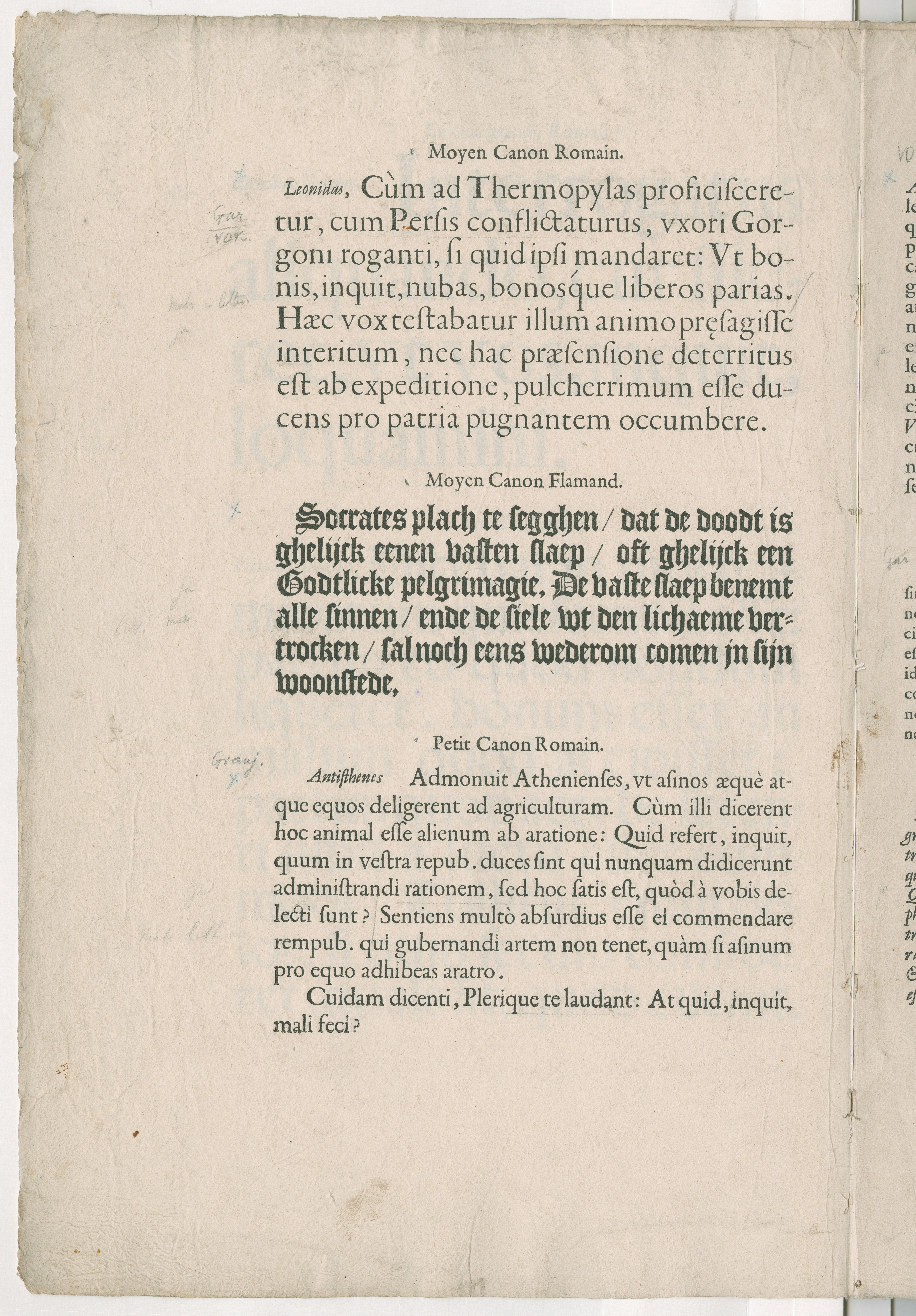
 To give you an idea of what happens under the roof of Museum Plantin-Moretus, I will show you a small exercise. The following image is taken from a type specimen published by Christoffel Plantin around 1585. Shown here is the Moyen Canon Romain (cut in 1570), an adapted version of Claude Garamont’s famous Gros Canon Romain (cut before 1549) by Hendrik van den Keere, in which he shortened the ascenders and descenders at Plantin’s request. If you look closely, you will see two letters of the Gros Canon Romain in the text. When one realizes that this integration requires some technical juggling, this is almost certainly not a mistake –especially because of the central position of both characters.
 It can be interesting to distill the width of the characters from the specimen. For this I have devised a method of which you can see traces on top of the Plantin copy. The method is as simple as it is effective (image below). Regardless of whether the spacing is done optically or according to a predefined pattern, in roman type normally at least two letters have identical positioning of the left and right side bearings within the x-height: the /l and the /o, because within the x-height, these letters are (almost) symmetrical. When a text contains a string of two /l’s or twice the /o, the side bearing between the repeated letters will be centered by definition. A higher resolution version of the print in question (27 MB) can be downloaded from here.
 Once the position of these side bearings has been recorded in a historical print, the text can be checked for other instances of the same letter and the side bearings of the adjacent letters can be determined simultaneously. There will also be many shapes related to the /l and /o, which will normally share the same side-bearing positioning. For example, the left side of the lower case /k will usually be identical to the left side of the /l and will therefore have the same positioning in relation to the side bearing. The bowls of /b, /d, /p, and /q will most likely share the positioning of the /o’s side bearings. You can check the intrinsic standardization of the underlying written model (basically the Carolingian minuscule) with LeMo.
 Photos of graduation event by Frederik-Hulstaert ©20235


Categories
- All Categories
- 47 Introductions
- 4K Typeface Design
- 495 Type Design Critiques
- 577 Type Design Software
- 1.1K Type Design Technique & Theory
- 670 Type Business
- 885 Font Technology
- 29 Punchcutting
- 539 Typography
- 125 Type Education
- 333 Type History
- 81 Type Resources
- 113 Lettering and Calligraphy
- 33 Lettering Critiques
- 80 Lettering Technique & Theory
- 569 Announcements
- 100 Events
- 116 Job Postings
- 170 Type Releases
- 182 Miscellaneous News
- 270 About TypeDrawers
- 54 TypeDrawers Announcements
- 114 Suggestions and Bug Reports