‘Grand Cru Classés’ sprouting from Antwerp soil
Comments
-
 In my September 2023 post I introduced the Melting Metal; Developing Typecraft booklet, a self-authored publication by the graduates of the Expert class Type design 2022–2023. It is the result of a thorough investigation into the (reuse of) patterns recorded in frameworks during the Renaissance, Baroque, and Neoclassicism style periods. Superimposed on these patterns are the idioms of punchcutters. One of the questions being asked is whether the relevant punchcutters can be regarded as type designers in the modern sense of the word or merely as ‘type refiners’, consciously or perhaps even unconsciously changing details of established frameworks setup by their predecessors?
The graduates not only did intensive research, but also managed to organize their collaboration in such a way that this resulted in the booklet, which is quite impressive. They also started a publishing company: Addition Projects. Melting metal; Developing Typecraft is available via the company’s new website.2 -
Looks like an interesting book, but Canada is missing from the dropdown list of countries to which the company will ship the book.

0 -
Hi John, thanks for your interest and for pointing out the omission. Sorry about that last one. Canada has now been added to the list.
0 -
Thanks! Ordered.2
-
In 2012, the first edition of the Expert class Type design course took place under the roof of Museum Plantin-Moretus. As I wrote in my introductory text of Melting Metal; Developing Typecraft, rather than focusing primarily on handwriting and learning to look through the eyes of the teacher in an attempt to understand the basics of type, one could also have a closer look at the technical constraints of the early movable-type production process. That is actually typical for the Antwerp approach, call it the ‘Antwerp School of Type Design’.
 Research into Renaissance standardization and systematization can provide a deeper insight into the intrinsic structure of (unconsciously) reproduced archetypal frameworks: to measure is to know (see also this article). And then it is a good thing that the collection of type-foundry material in Museum Plantin-Moretus is so impressive. Naturally, the influence of the handwritten models, which is mainly a matter of formal principles (morphology), is not ignored during the course, nor the role of the eye in relation to design, conditioning, and typographical conventions.
Information hidden at first glance can support a more authentic interpretation of the historical source models in question, and distilled patterns can be used to further master the harmonic and rhythmic aspects of type in today’s digital font-production environment. The emphasis at the Expert class Type design course is therefore on research into the intrinsic patterning aspects in historical type, which are both the source and the result of typographical conventions. Information about Renaissance standardization and unitization is distilled from artifacts such as punches (smoke proofs), matrices, foundry type, and prints (see also this video). The results are extrapolated and translated into a systematic approach to digital font production.
This summer, the EcTd 2022–2023 graduates who created the Melting Metal booklet will exhibit their work together with the current group of students in Museum Plantin-Moretus. The 2024–2025 course starts in the autumn: more information can be found here.0 -
Daniel Calders, a talented current EcTd student, defined a workflow to digitally reproduce a type specimen of a historical foundry-type model. To this end, he has automated a large part of the process with a few tools. He called the project ‘Autospecimen’. Unlike the method of distilling widths that I described in my second post from September 2023, Daniel simulates the spacing with LS Cadencer. Because my ‘cadence’ algorithm comes from my measurements and analysis of type-foundry artifacts, including prints, the results will generally be close to the distilled widths. Of course, parameters can be adjusted for a smaller or wider spacing. I asked Daniel if he wanted to share his workflow on, for example, social media. For your information, below are his explanatory images and texts.
The question that started this little project was: to what extent can I automate a type revival? The type in question is the Descendiaen Romeyn by Christoffel van Dijck (ca.1606–1669) from the 1681 copy of the widow Elsevier (collection of Museum Plantin-Moretus). First, letters from the type specimen were distilled using GlyphCollector.
 2. The resulting averages were cleaned up (contrast/sharpness) with Acorn’s batch-editing sister app Retrobatch.
 3. The cleaned images were auto-traced in DTL FoundryMaster. The outlines were exported as a UFO file.
 4. The UFO file was opened in Glyphs and characters were auto-spaced using the LS Cadencer plugin.
 Finally, a proof was typeset in Affinity Publisher.4
 -
 Fernando Mello is a graduate of the EcTd 2012–2013 course, during which he started designing the award-winning typeface FS Brabo. He was an employee of Fontsmith at the time and after this company was acquired by Monotype, Fernando was employed by the latter for 11 months. He is currently setting up his own type foundry Font FM.
 Fernando recently published a type specimen in a limited edition of 700 copies. It provides an overview of what he has designed so far with explanatory texts. Fernando is a very talented and prolific type designer and the specimen is undoubtedly an impressive achievement. While it showcases his work to date, his foundry’s website, which is currently in development, will focus on his new typefaces also currently in development.
 The type specimen is not available online, but interested parties can contact Fernando directly for ordering details at <info[at]font.fm>.1
 -
Fernando collaborated with us on a couple of projects, and was a pleasure to work with.
Tiro Tamil:
1 -
The offline course Expert class Type design 2023–24 under the roof of Museum Plantin-Moretus is coming to an end. The students are currently preparing their panels for the upcoming exhibition at the museum, which will run from July 2 to August 25. The panels of last year’s students (who created the booklet Melting Metal) will also be on display there (an exhibition in MPM was not possible in 2023 due to renovation work). I will post more about the expo soon.
 Although the course does not start until the end of October, registration for the ‘mixed formula’ EcTd 2024–25 is almost closing. There are a maximum of 16 seats and 13 are already occupied by participants from all over the world. More information can be found here.0
 -
All seats for the EcTd 2024–2025 course are now occupied. However, it is still possible to be placed on the waiting list in case someone drops out.
 Agfa has printed a large number of panels for the upcoming exhibition in Museum Plantin-Moretus (July 2 to August 25, 2024). A short video made by Agfa gives an impression of this production on the most modern printing machines.0
 -
 Yesterday, four exhibition rooms were set up in Museum Plantin-Moretus by laureates and staff of the Plantin Institute of Typography with the help of museum employees. For this purpose, more than 50 printed panels, kindly sponsored by Agfa, were mounted on the colored walls.
 In addition, display cases have been installed and cleaned. These will be used to present historical books and type-foundry objects from the museum’s collection, which served as source material for the type revivals. Results of the Expert class Book design will also be exhibited in the display cases.
 I will post some photos of the end result here soon. The exhibition will open next Tuesday.1
 -
 The EcTd course emphasizes research into the intrinsic pattern-forming aspects of historical type, which are both the source and the result of typographical conventions. Information about Renaissance standardization and unitization is distilled from artifacts such as punches, matrices, foundry type, and prints. The results are extrapolated and translated into a systematic approach to contemporary font production. After all, it can be concluded that the standardized production methods provided a solid basis for the æsthetic refinement of type. That knowledge and insight can be converted into digital typography, which is undoubtedly strongly anchored in almost six centuries old conventions.
 Reproducibility was an elementary part of archetypal font production. It simplified the processes considerably, but had the side effect of allowing others to easily copy foundry type via smoke proofs onto blank punches, including the intrinsic pattern (see also Measurements and Gauges). So far, the results of the Antwerp research into the creation of Renaissance and Baroque type have made it plausible that punchcutters used established frameworks, defined in the early days of the profession, as a solid foundation for their creations. These frameworks ensured that the personal touch, that is, the idiom, was supported by a proven foundation that ensured versatility in terms of (re)production and application. Whether this personal touch is always the result of skill and insight and not a lack thereof varies per punchcutter.
 The recent EcTd research results and their applications to digital type (revivals) can be seen in Museum Plantin-Moretus until August 25, 2024.0
 -
After all, it can be concluded that the standardized production methods provided a solid basis for the æsthetic refinement of type.It can be argued, certainly, with plenty of evidence towards this conclusion in a European context. The application of the same standardised production methods to non-European writing systems often produced the opposite result: aesthetic degradation of the scripts by forcing them into procrustean standards of alignment and unitisation inherited from European typesetting models. One of the great benefits of digital text composition for these scripts is the relative freedom from the material constraints that produced those models, inspiring type designers to look beyond limited histories of typographic expression to longer manuscript and inscriptional traditions.
1 -
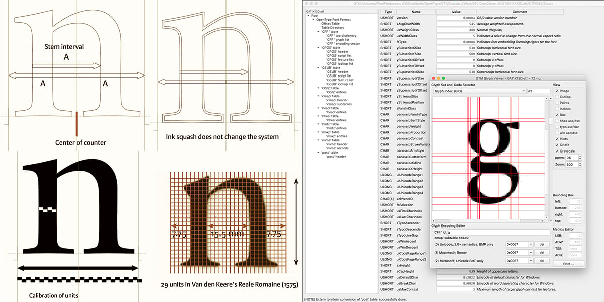
Hi John, thanks for your reply and additional information.I reckon that my Antwerp students and also some of my students from The Hague have indeed happily provided a lot of evidence for standardization in the Renaissance font-production process. This insight helps them to gain more control over the origins of systematization. As far as I can see, none of the students consider this as a restriction: after all, one has to know where the boundaries are in order to be able to trespass. The latter has also been tried in the past on horizontal proportions, for example by Hendrik van den Keere when he apparently based the patterning of his Gros Canon Romain on that of his rotunda model Canon d’Espaigne (see also DTL’s [Gros] Canon Project ). A few years later the somewhat exorbitant wood-carved model La Plus Grande Romaine was basically based on the same pattern.
 In this context it might be advisable to distinguish, on the one hand, between the archetypal natural standardization for Latin type, which was based on the intrinsic systematization in the underlying written models (as recorded in the LeMo application) and, on the other hand, the artificial standardization applied to other models, arising from technical requirements and constraints of typesetting systems (which, directly or indirectly, may ultimately have their origins in the aforementioned Renaissance [Latin] standardization).All the best, Frank0
 -
Yes, that distinction is indeed important and what I was getting at. The problem observed in the violence done to many writing systems in reduction to typography is not standardisation per se, but in the application of extrinsically derived standards, thereby missing the point that what makes the Latin case work so well is that the standards developed during the renaissance are intrinsically derived from contemporary forms of the script and worked out and refined over time.0
-
 Perhaps also triggered by the current EcTd exhibition in Museum Plantin-Moretus (see my previous posts), there is a lot of interest in the upcoming course. That is why we have decided to increase the number of students to a total of 24. The group will then be split and the online sessions will take place twice, on Mondays and Wednesdays in the same weeks.
There are only a few seats still available for those interested. More information can be found here.0 -
 Recently, Blackletra Type Foundry released Drummond, a typeface by the talented multidisciplinary Brazilian type designer Emerson Eller. It is the result of an intensive revival process that originated in the Expert class Type design 2018–2019 course. As can be read here, Emerson was particularly interested in sets of matrices and punches in the collection of Museum Plantin-Moretus that are incomplete and fragmented –especially when there are uncertainties about their authorship in the 1960 inventory. In this context, he selected a 16th-century Mediane Romaine model from the museum’s collection. The inventory indicates that this model deserves a detailed study.
 Emerson holds a Master’s degree in Design, Culture, and Society from Minas Gerais State University in Brazil, where he studied from 2012 to 2014. In 2016, he attended the Type Design Intensive (TDi) course at the University of Reading in England. In 2020, he completed a PhD in Communication Design at the Faculty of Fine Arts at the University of Lisbon in Portugal. His doctoral research focused on the introduction of the printing press in Brazil. He is currently a professor at the aforementioned University of Minas Gerais in Brazil.
 Emerson noted about the selected type model that despite the uncertain origin of the relevant Mediane Romaine matrices (see photos), his research considered the aspects that point to Claude Garamont (ca.1480-1561) as the original punchcutter, as the beginning for his revival project. This research process is thus based not only on the relevant set of matrices, but, for example, also on the Mediane Romaine letterforms (although not entirely identical according to the aforementioned inventory) found in the books that the Parisian bookseller and printer Jean Barbé (†1547) published in collaboration with Garamont.
 Drummond is primarily designed for body text and performs excellently in both print and digital media. It features an extensive Latin character set, covering over 200 languages, several OpenType features, and even a set of manicules: the full list of characters and features is available on the Blackletra website. Incidentally, the name of the typeface, which sounds a bit like ‘Garamond’, is essentially a tribute to Carlos Drummond de Andrade (1902-1987), a Brazilian modernist poet.
 More detailed information on Drummond can be found here0
 -
After 30 years of being affiliated with the Plantin Society / Plantin Institute of Typography, I will retire this summer. I was invited to become a lecturer in Antwerp when the renowned Plantin Society was re-established in 1995. Initially I taught at the regular Saturday course and when 15 years later the Expert class Type design was started, I was asked to set it up. It has been a pleasure and a privilege to teach under the roof of Museum Plantin-Moretus and I have enjoyed every minute of it. This topic is clear evidence of that, I reckon.
The British type designer Jeremy Tankard will now take over the EcTd course. The structure will remain broadly the same, but the content will inevitably change. However, the original opinionated focus on pattern formation, as discussed extensively here, will remain in a new online course. It offers a practical and theoretical study of type design and font technology, taught by Dr. Jürgen Willrodt and myself. Together we have over 80 years of experience in the type industry. Moreover, we both feel much too young to stop sharing knowledge and experience. It is great to have been part of the Plantin Society for three decades. The annual exhibition in Museum Plantin-Moretus was always something special. The photo shows the assembly of panels there, with former chairman Erik Michiels on the ladder and secretary Jan Van der Linden and myself holding a panel in place. Now, however, it is time for a new chapter, details about this can be found in this topic here on TypeDrawers.5
 -
Preparations are well underway for the upcoming In Plantin’s Footsteps exhibition at Museum Plantin-Moretus. This summer, more than twenty graduates of the Expert class Type design (EcTd) course will showcase both group and individual projects. These works are the result of in-depth research into the harmonic and rhythmic foundations of movable type, explored in relation to the technical constraints of archetypal font production. To support their investigations, the EcTd graduates made extensive use of the museum’s unique collection of type-foundry artifacts.
 The exhibition presents comparative studies of the structural frameworks underlying French Renaissance and Baroque type. Key research questions include: to what extent were type models simply the result of copying foundry type that had already proven its functionality onto blank punches, guided by an intrinsic grid system? Furthermore, what exactly is the added value of idiom, i.e., the distinctive hand of the punchcutter? Was this idiom always a product of skill and insight, or did it also emerge from other factors?
 In Plantin’s Footsteps marks the grand finale of the School of Patterning. It stands as the apotheosis of a unique approach to type-design education that has been practiced and refined in Antwerp over the past fifteen years.1
 -
Next Wednesday, the panels created by the EcTd laureates will be mounted on the walls of Museum Plantin-Moretus. Designed with a keen eye for detail, these panels showcase the dedication and typographic expertise of the participants from all around the world. As in previous years, the panels have been generously printed and sponsored by Agfa.
 The EcTd panels are typically printed on Forex boards, approximately A0 in size. The book-design panels, along with those containing general information, are printed on larger honeycomb panels (you can see an example of the printing in this video).
The six small images shown here represent a random selection from the 42 EcTd panels that will be on display at the museum. They offer a clear reflection of the core themes of the course, particularly the emergence of pattern formation and the archetypal standardization observable across body sizes, type models, and even punchcutters, beginning in the Renaissance and continuing through the following centuries.1 -
 In a very warm Antwerp, with the kind help of an enthusiastic handful of volunteers, the EcTd panels were mounted yesterday for the In Plantin’s Footsteps 2025 exhibition at Museum Plantin-Moretus. Today, the spotlights will be fine-tuned so that the panels receive the attention they deserve.
 The showcases have also been installed. They will display the punches, matrices, and prints that served as source material for the revivals featured in the exhibition. Think, for example, of the Parangonne Romaine and Garamonde Romaine sur Colineus by Robert Granjon, Médiane Italique Grasse by Pierre Haultin, Ascendonica Cursive by François Guyot, and Jolie Romaine by Hendrik van den Keere.
 The impressive research into Renaissance patterning, and the practical translation of its outcomes by the EcTd laureates, are clearly reflected in the panels now on display.5
 -
With the current In Plantin’s Footsteps exhibition at Museum Plantin-Moretus, I am bidding farewell to the Expert class Type design course, which I have set up and shaped over the past 15 years. The exhibition will run until September 7, 2025: I highly recommend a visit if you have the chance.
 As mentioned earlier, I am looking ahead to bring my School of Patterning into a new, research-based program: the OTF Course. This new environment will foster thoughtful, rigorous inquiry, combining practical skills with critical insight. I will continue to post updates about the new course in this thread. After all, this new initiative is a substantive continuation of the program I have been describing here since May 2014.
 The accompanying photos were taken by Jan Van der Linden, the secretary of the Plantin Institute of Typography.2
 -
The OTF Course (OTFC) has now been running for a little over two months, and the students have already produced an impressive amount of work. Much of this has focused on investigating pattern formation in type. Combined with a growing understanding of both ancient and contemporary technologies, this research has expanded their view of type and typography and sharpened their sense of what it means to operate as a type designer today.
To recognize what we, as type designers, contribute through our own idiom, we first need to understand the systems that support and shape our work. And if we want to push boundaries, we must first be clear about how those boundaries are defined, and where they are situated within the typographic landscape.
Almost twelve years ago I started posting on TypeDrawers about my Antwerp Expert class Type design (EcTd) course. In March of this year, I announced the launch of the OTF Course. As its content relates to EcTd (while expanding its scope) I will continue posting about it here, in the same discussion thread. From time to time, I will share selected student research and results.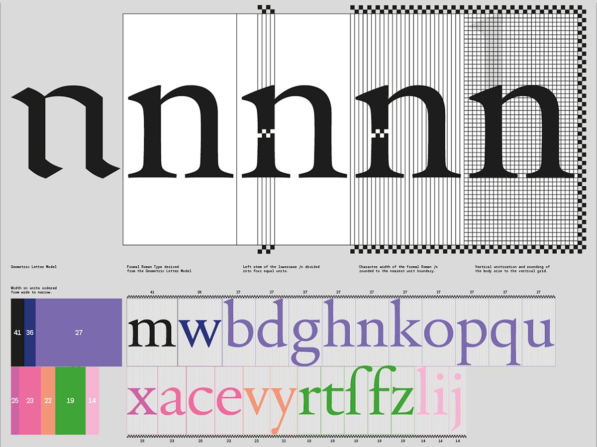 I will start today with work by Alexander Roth, of the German type-design practice neue. Alexander produced a thoughtful and informative series of posters that present the outcomes of several assignments focused on pattern formation and archetypal frameworks:
– OTFC_Assignment-1_AR
– OTFC_Assignment-1.1_AR
– OTFC_Assignment-1.3_AR
– OTFC_Assignment-2_AR
– OTFC_Assignment-2.1_AR
– OTFC_Assignment-2.3_AR2 -
 On Type Tuesdays, May 19 and June 16, 2026, from 3:00 to 5:00 PM (Amsterdam time), I will host online Zoom sessions to introduce the 2026–2027 OTFC type-design course, which my friend and colleague, Dr. Jürgen Willrodt, and I teach together. These sessions provide an opportunity to explore the course structure, learn about its content, and ask any questions you may have.
To register, please email: <otf [at] lettermodel [dot] org>.
The Origin of Type Frameworks Course (OTFC) covers the essential elements of type design –drawing, spacing, kerning, and font technology– while offering a holistic approach informed by 40 years of practical experience in type design and teaching, plus an additional 40 years developing font-editing tools, all enriched with academic research.
Today, with modern digital tools and expert guidance, almost anyone can create something that resembles a typeface. This will most likely become even more true with AI-assisted workflows. However, mastering a craft so deeply rooted in history and acquiring the subtle skills and insights that define it, requires a more thorough, considered approach.
Whether you are aiming to refine your craft, deepen your understanding of type design, or reposition yourself in a changing landscape, the OTFC offers a solid foundation for continued study and professional development.0


Categories
- All Categories
- 47 Introductions
- 4K Typeface Design
- 493 Type Design Critiques
- 575 Type Design Software
- 1.1K Type Design Technique & Theory
- 669 Type Business
- 884 Font Technology
- 29 Punchcutting
- 537 Typography
- 124 Type Education
- 332 Type History
- 81 Type Resources
- 113 Lettering and Calligraphy
- 33 Lettering Critiques
- 80 Lettering Technique & Theory
- 569 Announcements
- 100 Events
- 116 Job Postings
- 170 Type Releases
- 182 Miscellaneous News
- 270 About TypeDrawers
- 54 TypeDrawers Announcements
- 114 Suggestions and Bug Reports