German Script Assistance, Antique Melone / Bowler Hat

Hutmann
Posts: 43
I am a collector of German and Austrian vintage hats. I have an old Melone/Bowler hat and the following writing was found on the back of the liner.
https://c1.staticflickr.com/5/4321/36119419996_7b109167e7_b.jpg
I am thinking this hat is from the early 1900s but was hoping the script might help with the dating.
This letter is on the sweatband. I am thinking it might be a Fraktur "I" or "J".
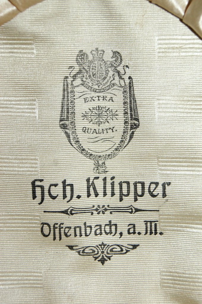
https://c1.staticflickr.com/5/4301/36142794076_1c38722b3e_c.jpg
There is also the use of inches witch I was thinking might be German Zoll measurement.
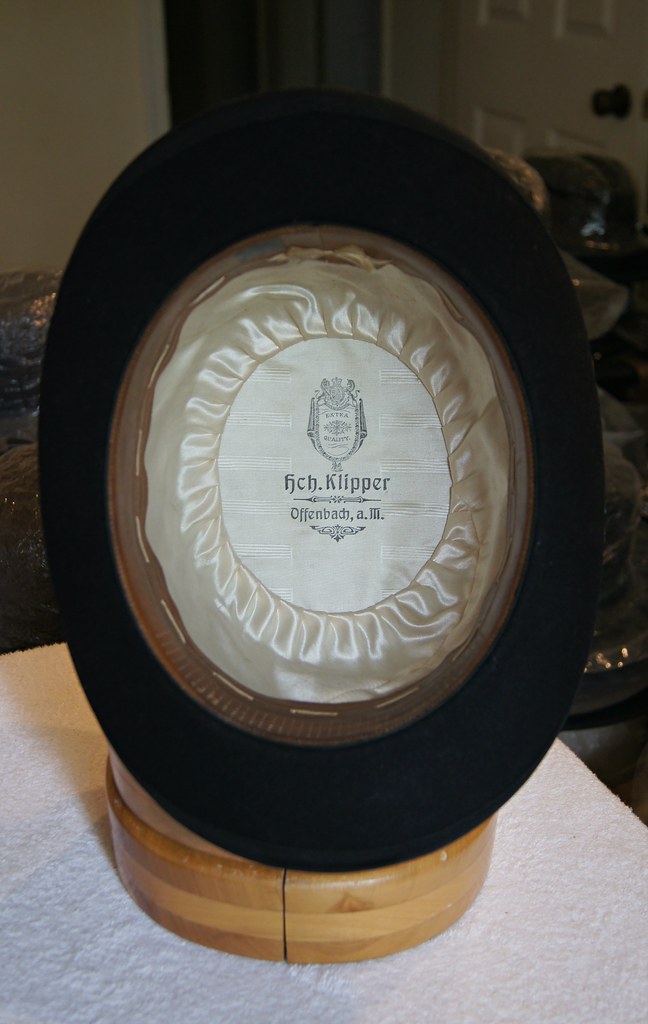
https://c1.staticflickr.com/5/4325/36119417826_b738d7503c_b.jpg
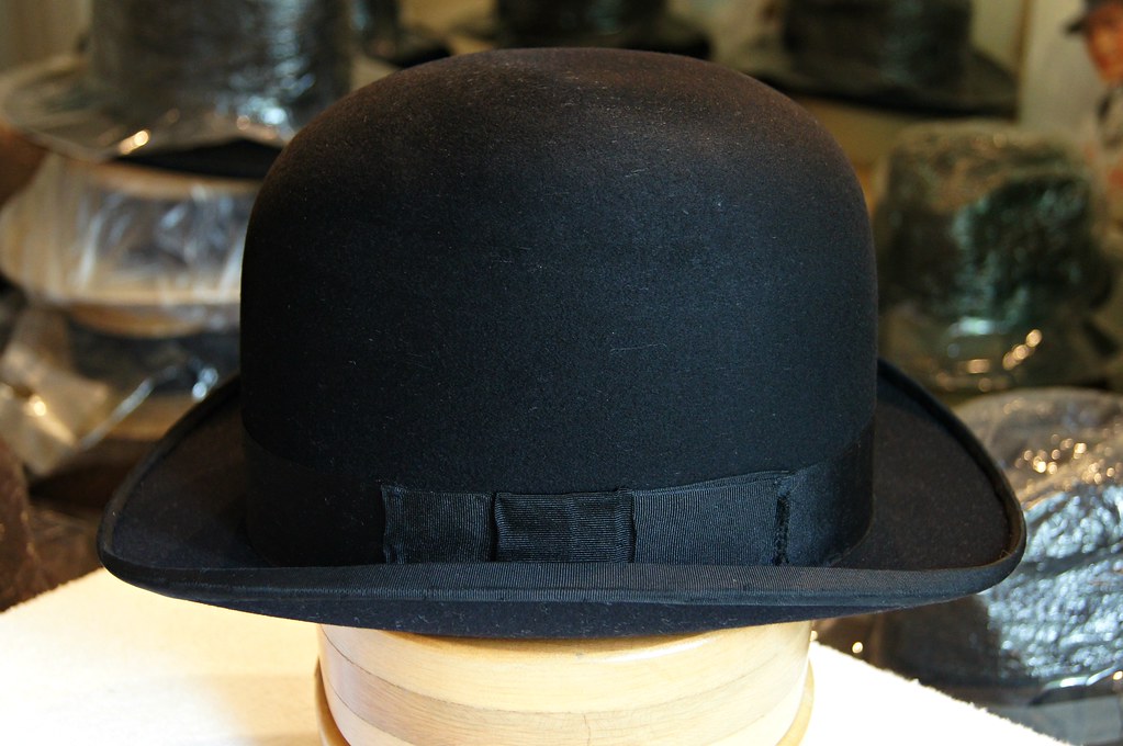
This is the outside and inside of the Melone/Bowler.
https://c1.staticflickr.com/5/4198/34828942066_aa573e2f00_b.jpg
https://c1.staticflickr.com/5/4157/34737103311_e13b713d24_b.jpg
https://c1.staticflickr.com/5/4274/34024926574_d7f0dbea2d_b.jpg
Thanks for the help!
-Steve
https://c1.staticflickr.com/5/4321/36119419996_7b109167e7_b.jpg
I am thinking this hat is from the early 1900s but was hoping the script might help with the dating.
This letter is on the sweatband. I am thinking it might be a Fraktur "I" or "J".
https://c1.staticflickr.com/5/4301/36142794076_1c38722b3e_c.jpg
There is also the use of inches witch I was thinking might be German Zoll measurement.
https://c1.staticflickr.com/5/4325/36119417826_b738d7503c_b.jpg
This is the outside and inside of the Melone/Bowler.
https://c1.staticflickr.com/5/4198/34828942066_aa573e2f00_b.jpg
https://c1.staticflickr.com/5/4157/34737103311_e13b713d24_b.jpg
https://c1.staticflickr.com/5/4274/34024926574_d7f0dbea2d_b.jpg
Thanks for the help!
-Steve
0
Comments
-
Hi Steve, I don’t see how the script could help with the dating. The first image includes a line saying “R. 1857”, but that doesn’t tell us much.
The sign on the inside is more revealing: “H[einri]ch Klipper Offenbach, a.M.” is in Behrens-Schrift, a typeface that was first cast by the Rudhard’sche Gießerei in 1901. The sign can’t be any older than that. Behrens-Schrift was immensely popular in the first and second decade of the 20th century, but it’s impossible to rule out a later date. The Klipper company existed from 1858 to 1965, but you probably knew that already.
2 -
Hello Florian,
Thank you for the quick reply and great information. Do you think the 22 1/2 might be Zoll? The hat does measure ~ 22 1/2 inches which is just over 57 cm. Also what about the single letter on the inside of the sweatband? Thanks!
Best,
Steve0 -
Hello Florian,
I have some details on Klipper (see link below). The owner told me it was from around 1905. This hat belonged to her great grandfather. The style and components of the hat seem to point to that time period.
http://germanaustrianhats.invisionzone.com/index.php?/topic/291-hch-klipper-comp-offenbach-a-m/
Best,
Steve0 -
The shopfront pictures are a delight.Do you think the 22 1/2 might be Zoll?That sounds plausible to me. I don’t know about hats in particular, but at least in some areas, Zoll remained a common unit until deep into the 20th century.Also what about the single letter on the inside of the sweatband?
No Fraktur, but rather a bold Antiqua with ball terminals, as it was common in the time and period, cf. this piece of fascia lettering from Heidelberg. It could be either a ‘J’ with a spur, or bifurcated base (as in a Tuscan), or simply a minuscule ‘r’. A wild guess: Would the manufacturer have felt the need to denote the right-hand (rechts) side?
1 -
Hello Florian,
Sorry for my late reply.
Thank you for the additional great information!
If it's an "r" then it's stamped 360 degrees from the "22 1/2". I guess an "r" could denote right-hand side but not sure why that would be needed unless maybe during the sweatband construction. The sweatband construction is completed prior to installation in the hat.
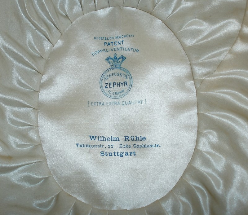
Do you have any idea why "Extra Quality" was used on the liner? In most cases you see "Extra Qualität" (see below). Could this be time specific?
Rehfus & Cie. "Extra Extra Qualität"
http://farm8.staticflickr.com/7267/7809332052_724542e5ab_b.jpg
I am think this hat is probably from the 1920s. Can you see anything in the printing that might point to a specific time period?
http://germanaustrianhats.invisionzone.com/index.php?/topic/20-rehfus-federleicht/#entry605
Thanks again!
-Steve
0 -
Do you have any idea why "Extra Quality" was used on the liner? In most cases you see "Extra Qualität" (see below). Could this be time specific?
I assume the English spelling was chosen because it appears underneath the royal coat of arms of the United Kingdom.
Can you see anything in the printing that might point to a specific time period?Sorry, I don’t. The letterforms for “Wilhelm Rühle Stuttgart” are in style that also appears in several typefaces, typically named (Breite halbfette) Renaissance. They came into fashion around 1880, but didn’t fall out of use before the 1920s or even the 1930s.
1 -
Hello Florian,
Thank you again for the great information.
That makes sense that they would use English because to the Royal Coat of Arms of the UK.
Thanks again.
-Steve
0 -
Hello Florian,
I posted an update on my website. Thank you for the help!
(Make sure to Scroll down)
http://germanaustrianhats.invisionzone.com/index.php?/topic/291-hch-klipper-comp-offenbach-a-m/#entry1790
Best,
Steve1 -
Hello Florian,
I hope all is well with you.
I was wondering if you could tell me anything about this script (type, dating).
https://c1.staticflickr.com/5/4344/36878068555_d98926355e_c.jpg
This is the hat.
http://germanaustrianhats.invisionzone.com/index.php?/topic/130-ems-hutfabrik/#entry753
Thanks!
Best,
Steve0 -
Hi Steve,
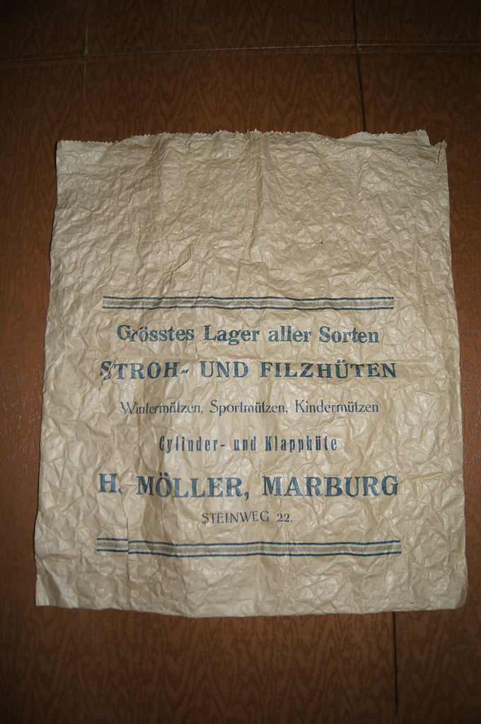
The “Gloria” logo looks custom to me, I can’t reliably date it. The original hat shop bag (H. Moeller Marburg) is a tad more helpful in this regard: Some of the lines are set in a face known as Druckhaus-Antiqua, among other names. The schmal halbfett weight used for “Cylinder- und Klapphüte” was not added before 1910, see the typeface bio on Fonts In Use. I’d estimate that this typeface was in use at least until the 1930s.
Best, Florian
1 -
Hello Florian,
Sorry for the late reply. Thank you for the great information!
Best,
Steve0 -
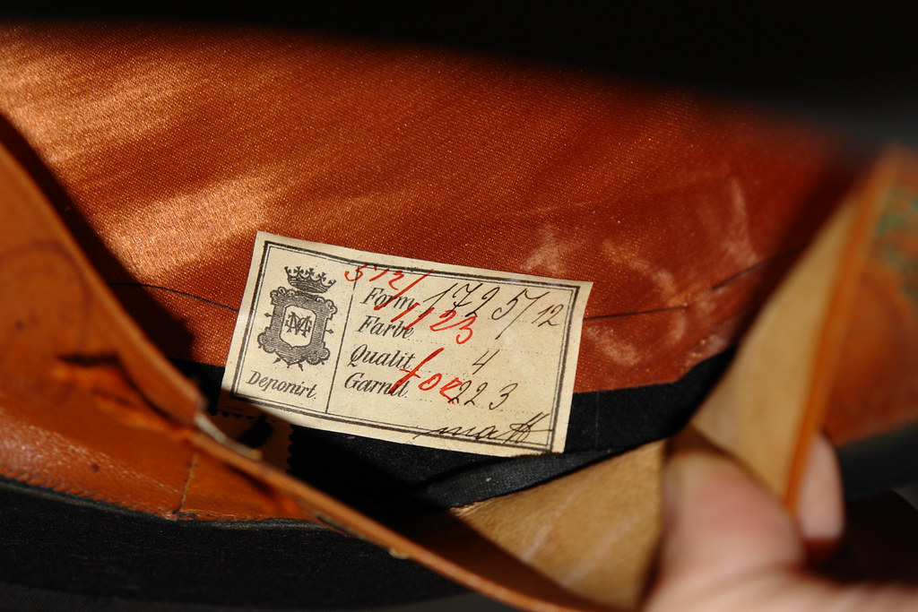
Hello Florian,
I hope all is well. I was wondering if dating is possible from the No. in the following paper label.
Hat
I believe this hat is later.
Hat
Thanks!
-Steve0 -
Hi Steve, good to hear from you!
The numbers themselves don’t tell my anything. But the letterforms used for “Dieses Etikett bei Nachbestellung …” are pretty characteristic. They are from a typeface that originated at Wagner & Schmidt, a company in Leipzig that produced matrices and sold them to type foundries. It was cast under two names. Gronau in Berlin had it as Weitblick-Antiqua, and Weber in Stuttgart and Schriftguss in Dresden named it Orient-Antiqua. The label can’t be any older than 1912. The typeface was in Weber’s collection at least into the 1930s (they registered the name in December 1932). It very likely wasn’t sold anymore after WWII.
Hope this helps!
Florian
1 -
Hello Florian,
Thanks!
I think both hats are from the 1950s so might be possible Mayser used old typeface.
I was asking about No. (in red) in the first paper label. It's different than the more typical No. on the second label.
0 -
Sorry, I can’t speak to the swash italic numero sign.
1 -
Thanks!0
-
Florian,
I was wondering if you could tell me anything about these two (see below). They are from the same hat that came from an East German seller. I am thinking early 1900s.

Hat
http://germanaustrianhats.invisionzone.com/index.php?/topic/60-c-w-n-hutfabriken/#entry325
Thank you your assistance!
0 -
What exactly is the question you are actually placing?Hutmann said:Florian,
I was wondering if you could tell me anything about these two (see below). …
0 -
I am looking for dating based on the typeface / artwork. I was thinking the liner artwork is possibly Jugendstil?0
-
I can see no typefaces in your two images. The labels may have been designed around 1890, yet the object may still be from 1925 or later. The green label looks like Jugendstil, the leather embossing may be a little older. Difficult to say.
2 -
What Andreas said. I agree that the frame in the first image looks typically Jugendstil. Likewise, the (custom, non-typographic) letterforms with the reversed contrast and the club-like endings are similar to typefaces like Carola-Grotesk (Berthold, 1896) or Propaganda (Stempel, 1901) which emerged at the end of the 19th century and stayed in fashion for a decade or two.
1 -
Thank you!Andreas Stötzner said:I can see no typefaces in your two images. The labels may have been designed around 1890, yet the object may still be from 1925 or later. The green label looks like Jugendstil, the leather embossing may be a little older. Difficult to say.0 -
Florian, Thanks! Sorry regarding the misuse of the term.Florian Hardwig said:What Andreas said. I agree that the frame in the first image looks typically Jugendstil. Likewise, the (custom, non-typographic) letterforms with the reversed contrast and the club-like endings are similar to typefaces like Carola-Grotesk (Berthold, 1896) or Propaganda (Stempel, 1901) which emerged at the end of the 19th century and stayed in fashion for a decade or two.") My guess (based on form, parts / construction) is WWI era. 0
My guess (based on form, parts / construction) is WWI era. 0 -
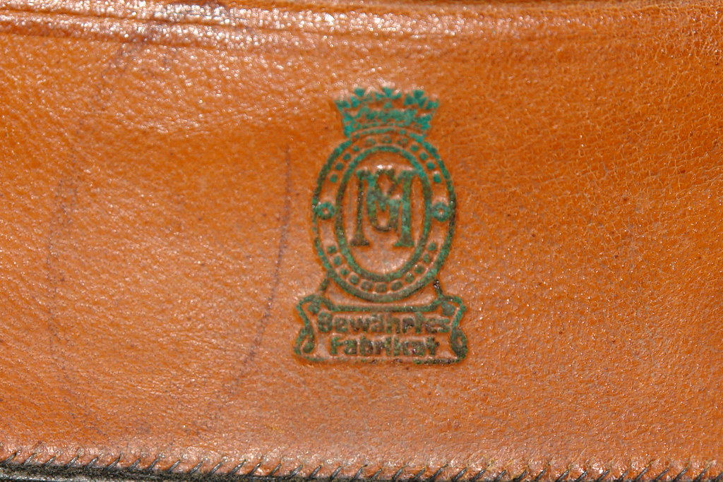
Here is another interesting one when you have a moment. I believe G.M. could Georg Miech Hutfabrik Haydnstrs. 37 Dresden. My guess is early 1900s. Thanks!

Probably King Albert of Saxony - reign 1873 - 1902 (see below)
Hat / Melone
http://germanaustrianhats.invisionzone.com/index.php?/topic/46-g-m-could-be-georg-miech-dresden-hutfabrik/#entry230
(scroll down)
I can't say the carton is original to the Melone.
0 -
Nothing in the letterforms that is a hot lead, I’m afraid.
“Bewährtes Fabrikat” looks like a style that was common in the first decade of the 1900s, plus/minus several years.
“Deponirt” uses the old spelling. This was standardized as “Deponiert” in 1901, but the change didn’t happen over night, of course. See also this resource for dating porcelain marks.
The double digit in the phone number (not pictured here, but on the linked forum page) doesn’t necessarily indicate a very early date. This really depends on the size of the place – here’s a single (!) digit number from 1925, for example.
Having you tried looking into the type of crown?
1 -
Florian, Thank you for this great information! Do you mean the crown of the Melone/Bowler?0
-
I meant the crown that goes with the GM monogram. A heraldist might know whether this is indeed a depiction that matches the crown as used by the Kingdom of Saxony.
1 -
Florian, Thank you for the clarification. I will check on that. Thanks for the help!0
-
By the way from a form and construction standpoint I think this Melone / Bowler could be early 1900s maybe even a little bit earlier.0
-
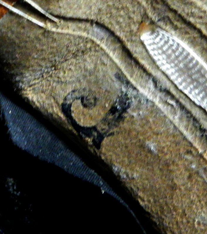
I was wondering if there are any clues regarding the liner tip patch or sweatband. Sorry but this is the only photo I have. It's from the Czech Republic and most likely a Czechoslovakian source. Not sure if it's WWII era or older. Thanks!

This link should display a larger photo.
https://live.staticflickr.com/65535/47911351021_c19ee20382_b.jpg
0


Categories
- All Categories
- 47 Introductions
- 4K Typeface Design
- 494 Type Design Critiques
- 576 Type Design Software
- 1.1K Type Design Technique & Theory
- 670 Type Business
- 884 Font Technology
- 29 Punchcutting
- 537 Typography
- 124 Type Education
- 332 Type History
- 81 Type Resources
- 113 Lettering and Calligraphy
- 33 Lettering Critiques
- 80 Lettering Technique & Theory
- 569 Announcements
- 100 Events
- 116 Job Postings
- 170 Type Releases
- 182 Miscellaneous News
- 270 About TypeDrawers
- 54 TypeDrawers Announcements
- 114 Suggestions and Bug Reports