German ch and ck ligs

Chris Lozos
Posts: 1,478
in Type History
A music friend sent me a scan of a cover for sheet music from 1911 which contained these ligs. I found this old Typophile reference but wondered if anyone knew more about it?
1
Comments
-
Hi Chris,
Nice find! Lots of things have already been said in the Typophile thread you linked to, so if you any specific questions, please let us know.
The typeface used here is Wittelsbach (Schelter & Giesecke, 1903). It has been grouped with other faces from the Jugendstil period as Neudeutsche Schriften. These seeked to overcome the Antiqua–Fraktur dispute by hybridization.
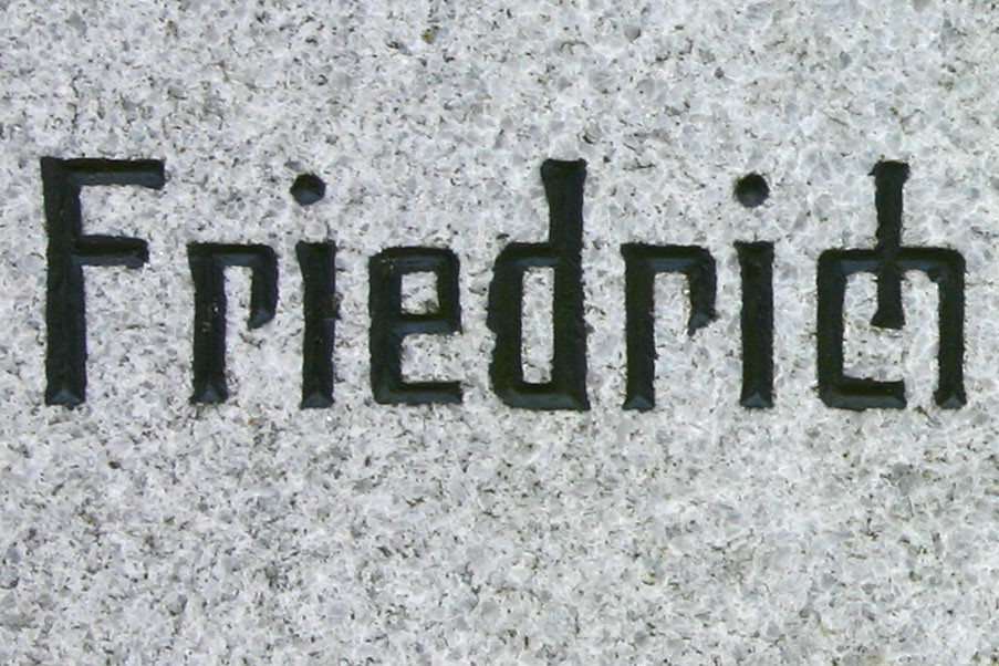
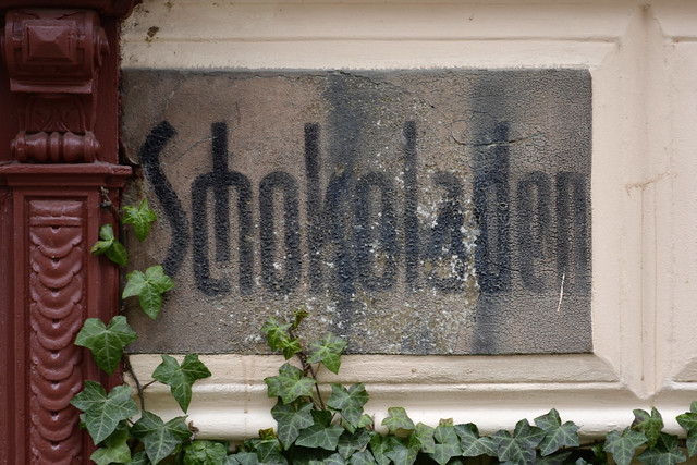
The ligatures in the squarish Wittelsbach are special in that the lower part of ‘c’ ends short. In ‘ch’, this results in a shape that almost looks like an upside-down psi (ψ). Other typeface designs offered different solutions like a truncated middle stem, see e.g. Georg Schiller’s Neudeutsch (1899). Similar shapes can be found in gravestone lettering and sign painting, too:

8 -
Much appreciated, Florian!0
-
Those ch ligatures are delightful.5
-
I think the ch ligature is unrecognisable to anyone nowadays. It looks more like a Cyrillic or Greek glyph, and is completely out of place in Latin text. The ck ligature in the first post is just about legible.
In my opinion the ch ligature would work better if the ligature joined at the top of the ascender as it does for ck in this font. Then there is no doubt that what it is.
0 -
Love those Schokoladen! Wouldn't want that ligature in a text font, though.
0 -
For readers not familiar with German this makes sense. But for us the recognition of Schlicht or Friedrich or Schokolade in the depictions above is without difficulty because we are familiar with the Wortbild (the word’s visual). In any language, if one is familiar with its written representation, one picks the sense easily despite occasional specific details such as a peculiar ligature.Bhikkhu Pesala said:I think the ch ligature is unrecognisable to anyone nowadays. It looks more like a Cyrillic or Greek glyph, and is completely out of place in Latin text. …
In a running text I would probably also not want to have such a very special ligature glyph in general, but in title settings and short phrases it is no problem at all.
A joining loop at the top would not work better in texts. The ch digraph is very frequent in German: Ich mache mir vielleicht einen schönen Nachmittag. The extra fancy bit would make the ch visually stand out and this would most likely, in a typical case, disturb seemless reading.
Originally the two ligatures (in their simple version) were common in blackletter lead type because it speeds up composing. Also the option to tighten the large inner white space was welcomed and proved to be beneficial. Later these two ligatures were also done in typefaces other than Fraktur, their usage was standard good practice throughout. Check the sample below (Weiß-Antiqua, a book from 1950).

7 -
To add to that, more precisely what readers recognize is the combination of letter shapes and how prevalent they are in the language know to the reader. Readers notice less the entirety of the shape of "Schokolade" word, but rather the letter combination of "Sch" is one that checks against a known pattern.Andreas Stötzner said:
For readers not familiar with German this makes sense. But for us the recognition of Schlicht or Friedrich or Schokolade in the depictions above is without difficulty because we are familiar with the Wortbild (the word’s visual). In any language, if one is familiar with its written representation, one picks the sense easily despite occasional specific details such as a peculiar ligature.
An experiment where participants were asked to identify letters from a) standalone letters b) pseudo words with language-specific letter combinations and c) real words showed that "word superiority" extends to pseudo words, i.e. it is not the shape of the word but the shape of letter combinations that significantly improves perception of letters in words, versus standing alone (for example, McClelland & Johnston 1977 "The role of familiar units in perception of words and nonwords").
Andreas is of course right on the disruptive nature of those more visually pronounced ligatures, especially in text. And mind you, the initial post's image most certainly will seem very antiquated to present day readers of German. The Fraktur origins of those ch/ck ligatures, however, are just gorgeous to my eye
1 -
I think also the samples that @Andreas Stötzner posted look antiquated. These ligatures fit in with the 1950s/1960s German typefaces, and add to a ‘period feel’ there. In modern text typefaces, they look out of place to me.1
-
Don't believe the Modernists, people can handle this stuff, and end up enjoying life more.0
-
I’ve put c_h and c_k discretionary ligatures in a couple of typefaces—nothing fancy, just the letters very close to one another, as per the Weiss.
It seemed appropriate for faces with something of the quality of a mid-20th century “antiqua”, as Jens notes, and goes with optional lowered umlauts on Ä, Ö and Ü—another feature of the typography of that time and place.
But I was tempted to make them the default, via the <deu> language tag.
As per Hrant’s thinking, nobody but typographers will notice (who will hopefully appreciate the nuance)—and I support this with personal observation, because I have read books printed in English, in Germany, before I became a type designer, which had this feature, and never saw it at the time, only later.1
Categories
- All Categories
- 46 Introductions
- 3.9K Typeface Design
- 489 Type Design Critiques
- 572 Type Design Software
- 1.1K Type Design Technique & Theory
- 664 Type Business
- 877 Font Technology
- 29 Punchcutting
- 530 Typography
- 121 Type Education
- 328 Type History
- 81 Type Resources
- 111 Lettering and Calligraphy
- 32 Lettering Critiques
- 79 Lettering Technique & Theory
- 562 Announcements
- 97 Events
- 116 Job Postings
- 169 Type Releases
- 179 Miscellaneous News
- 269 About TypeDrawers
- 53 TypeDrawers Announcements
- 114 Suggestions and Bug Reports


