Could this be a new approach to Arabic type design?

In Persian / Arabic fonts we have 4 forms (initial, medial, final and isolated) and also we have letters that are exactly identical with tiny differences like dots. But despite the fact that designers copy one to other glyphs or make a component and use that, we have to have too many glyphs.
You can see here that we have ب ـب ـبـ بـ and also their brothers پ ـپ ـپـ پـ and ت ـت ـتـ ـتـ and ث ـث ثـ ـثـ and نـ ـنـ and یـ ـیـ and ئـ ـئـ! Also ر ـر and her sisters ز ـز and ژ ـژ.
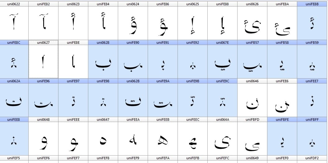
All the same with just dots on top or bottom. Why all those glyphs? I mean technically.
So one mistake have been made ears ago when they created the first digital Arabic font system which was the 4 formation thing that has no basis according to the alphabet. In Persian / Arabic alphabet we only have 2 forms: Initial and final. (A different final which could be final or isolated!) When you learn Persian in schools there is no medial and final forms. So because they were lazy and desperate to attach letters together with the most easiest way they created a bunch of letters (glyphs) that made the Persian / Arabic type design more time-consuming. A lot of new "letters/glyphs" was added to fonts. If you think about it in Latin you don't have this. You don't have glyphs that are not in the original alphabet. You have uppercase and lowercase which everybody uses in a real life. We Persians do not write down medial and final forms per se, we write an initial and when it goes to the final form the pen automatically creates a link between them. That's why we call it cursive.
So the second mistake is (I think) creating glyphs for letters that are identical. Could we at least think about the fact that we could have had one dotless Beh (which exists btw) and then add dots to that? Couldn't it be easier creating fonts with much less glyphs and probably file size?
So here me thinking out loud:
I saw a font that did something like this but it needs a software and only works on some applications and a lot of other things. But my approach/proposal is this:
5- And we make the font in a way that automatically does this: When a user types ب with keyboard the font shows a dotless ٮ with a below dot. So there is no need to put all those glyphs in the font.
Boom!
Maybe you can skip the 2 because some of the fonts have somehow "unique" medial forms which couldn't be produced by a default joint and an initial form.
If we use all of these, a Persian / Arabic font could be much more smaller in size and the glyph numbers. And on top of that it would be more clean and logical.

I somehow did this for Persian except the joint which I don't how to manage it with dotless glyphs and dots. Also I want to go a little far with "Smart ligatures"! I created the term just now!
By smart I mean this:
A ligature can be modified with marks (in our case dots) based on different inputs by user. I mean like the dotless example we only use one ligature and then change it and add dots to it based on different glyphs that has been entered. It will save a lot of time and glyphs I guess.
Actually I don't know about this and maybe there is something like this already. If there is I would be glad if you could help me find it.
I hope it wasn't boring after all. What do you think? Is it all unnecessary or there is no need to remove all those glyphs and life is good?
This is my Twitter: @si47ash
Comments
-
I've only designed one Arabic font yet and don't actually read any of its languages, so I'm probably not the right person to ask.
But isn't your base glyph + diacritics idea already the status quo in modern type design apps such as Glyphs? (For Latin as well.) Sure, some formats unlink the components in a compound glyph during export, but that's probably for backward compatibility with "dumb" user applications.
As for your deconstruction of linked glyph variants, I think that would only work for extremely geometric typefaces that forego the rich texture of traditional Arabic script. The small irregularities in the practical realization of a character's underlying design in initial, medial, final, isolated, and even ligated environments add to the legibility of a typeface; they are not dead weight.1 -
Yes. It's correct that for Latin fonts they do that and I have seen cases of that.
And yet I didn't see any Arabic / Persian font designer to do this specially for dots.
The third one is I want to discuss about the probability of removing the medial and final forms. I think for the most fonts out there it will do the trick. And if I remember correctly it was done by a designer years ago. But when the Unicode assigned the tables for Arabic and Persian all type designers had to follow that.
The last one is I really want to find a way to do this for ligatures in different situations.0 -
With regard to the separation of dots from base letter shapes, this is something we did in the Aldhabi project for Microsoft, and is common in nastaliq and other cascading style fonts where the dots need to move relative to adjacent shapes. However, most software still requires that each Unicode character have a single glyph in the cmap as an initial input, so the separation of base shape and dots has to happen during the OpenType Layout GSUB operations. [Some time ago, I proposed to Microsoft a new cmap format that would map from Unicode codepoint to arbitrary sequences of glyph IDs, but they thought it would be too difficult to get a new cmap format accepted and supported in software.]
The 'four forms' analysis of Arabic script is mistaken, and really represents a particular mechanical solution to typesetting a simplified model of Arabic. In fact, what there are is two kinds of letters: those that can connect on both sides, and those that only connect on the right. The actual ways in which the letters connect, and hence how many forms they require, depend on the style of the script and what they're connecting to. There is no historical style in which there were only four forms of any given dual-joining letter. So the scheme you describe with connecting element and only two base forms may be appropriate to the style of typeface you are designing — a kind of refinement to the Simplified Arabic model of Yakout —, but not necessarily as a general model of Arabic font technology, which needs to accommodate more styles.
With regard to ligatures, I would advise to avoid them most of the time, and instead to use contextual variant forms that join in different ways, which are more efficient and more flexible.5 -
So the second mistake is (I think) creating glyphs for letters that are identical. Could we at least think about the fact that we could have had one dotless Beh (which exists btw) and then add dots to that? Couldn't it be easier creating fonts with much less glyphs and probably file size?
I do that all the time, I’ve currently 4 Arabic fonts built this way and they work with any good enough OpenType implementation (Aref Ruqaa, Mada, Reem Kufi, and Amiri Typewriter, if you want examples to check). I hear that Glyphs makes it even easier (though it will compose the output glyphs, my fonts do this on the fly with GPOS marks).
As for the other suggestion, like Christian said, that would work only for very simplified fonts. However this is not unheared of either, Ahmed Lakhdar Ghazal designed such a system (in the 60s I think) that is still in use in Morocco:
4 -
John Hudson said:With regard to the separation of dots from base letter shapes, this is something we did in the Aldhabi project for Microsoft, and is common in nastaliq and other cascading style fonts where the dots need to move relative to adjacent shapes. However, most software still requires that each Unicode character have a single glyph in the cmap as an initial input, so the separation of base shape and dots has to happen during the OpenType Layout GSUB operations.
Thanks for the reply. I didn't know about that project and I can assure you in Persian font designers I haven't seen anyone does this. I searched and I think the Aldhabi is available in Windows 8 (Maybe also 10?). So I will check that to learn more about the method if it's ok.
Interestingly you mentioned Nastaligh. I forgot to write that in thefirst part of the post I was writing about the Naskh-based types which the letters don't move on or off the baseline normally. In those handwritten or Tahriri or Nastaligh fonts of course we can't do the trick.
Because of the fact that most Arabic / Persian fonts are not in fact stylish or calligraphic and are simple and Naskh-based maybe the joint could be useful for most of the time. Don't you agree?[Some time ago, I proposed to Microsoft a new cmap format that would map from Unicode codepoint to arbitrary sequences of glyph IDs, but they thought it would be too difficult to get a new cmap format accepted and supported in software.]So I think the main problem is here that we have to see a lot of glyphs in a font. I have a question: Does the separation actually affect the font size and increase that or It is just a process and does not do a harm.With regard to ligatures, I would advise to avoid them most of the time, and instead to use contextual variant forms that join in different ways, which are more efficient and more flexible.The last paragraph was actually about handwritten or as you mentioned Nastaligh fonts. Which there are a very few of them available right now that would create a good and natural form. These fonts have a lot of glyphs and hundreds lines of scripts. For example a few years ago we had a designer in Iran who created the IranNastaligh font funded by the government and it was something like 1,3 MB. And yet you could encounter a lot of dots and letters overlapping. I have to say he did a nice job, but it bothers me somehow that after all these years the only way to write with a Nastaligh or Tahriri or Persian handwritten style which based on Nastaligh and Tahriri is using some apps or software to correct the position of dots and letters.
If you are familiar with a font that does not have that problem I really appreciated if you introduce it to me. And could we use contextual variant to solve the many many ligatures that are needed for a handwritten font?
Thanks for you insightful comment.
0 -
Thanks. I'm going to see your fonts. Just looked at them and they're amazing. Curious to find out more about the technique you used.Khaled Hosny said:So the second mistake is (I think) creating glyphs for letters that are identical. Could we at least think about the fact that we could have had one dotless Beh (which exists btw) and then add dots to that? Couldn't it be easier creating fonts with much less glyphs and probably file size?I do that all the time, I’ve currently 4 Arabic fonts built this way and they work with any good enough OpenType implementation (Aref Ruqaa, Mada, Reem Kufi, and Amiri Typewriter, if you want examples to check). I hear that Glyphs makes it even easier (though it will compose the output glyphs, my fonts do this on the fly with GPOS marks).
As for the other suggestion, like Christian said, that would work only for very simplified fonts. However this is not unheared of either, Ahmed Lakhdar Ghazal designed such a system (in the 60s I think) that is still in use in Morocco:
I'll post here after that")
About the picture I think I have seen that before somewhere, but like you said there is only one example and nobody uses it today.0 -
Regarding nastaliq OpenType Fonts (as distinct from formats that are limited to particular software), I think the Noto Nastaliq Urdu is one of the best, in terms of going to considerable lengths to handle dot interaction within the clumsy mechanism of OpenType contextual GPOS (but also cheating a bit, by using smaller dots than are conventional in Urdu style of nastaliq). But there are still many issues in the interaction of spacing and mark positioning, and the deep problem is that OpenType Layout was not designed to be able to handle cascading styles of Arabic (I have this acknowledgement directly from the man who invented OpenType Layout).
For more information on the Aldhabi project, including illustration of the relatively small glyph set and some of the GPOS issues referred to above, see the slides from my 2012 ISType presentation: Adventures on the way to curls. At the time of the project, we didn't realise just how unsuited to what we were trying to do was the OpenType GPOS mechanism. The result is that the font is really only useful for headlines and other short pieces of display typography, and preferably in environments where the user can manually adjust spacing between lettergroups.
For a more general discussion of the issues around spacing and mark interaction, see my TypeCon 2014 presentation text and illustrations: Problems of adjacency.1 -
I, for one, prefer having dedicated glyph slots for differently connected forms of a letter. For instance, these are the /fehDotless-ar.medi and /fehDotless-ar.init from my Quinoa Black:


I've had to apply some trickery to the former to make it look like a circle sitting on top of a continuous baseline, when in fact the counter dips below the baseline's top and the circle is optically adjusted to avoid blotting. For the latter, of course, much of that adjustment was unnecessary or would have been counterproductive on its right side.
You can't do this sort of thing if you use the same glyph for connecting and non-connecting instances. Note that Quinoa is a geometric typeface whose Arabic has even been called «more progressive» (as in non-traditional) than its Roman. The vast majority of Arabic typefaces are going to be less geometric, more organic and thus even much less amenable to this kind of treatment than Quinoa.
3 -
As Christian pointed out, the idea of using compounds in a script like Arabic where you have many characters that share the same base glyph is not a novel one, and I assume it's the approach that most designers take with apps like Glyphs. You design a base, you design the diacritic dots, you match the compounds to create your final glyph.
The idea of only using a 'joint' to differentiate between an initial and medial form is just lazy though. What you end up with will look static and clunky, and I don't think that's worth sacrificing for a slightly smaller font file. You need to have different forms for different connections to convey the fluidity of the pen movement in Arabic. Chris is showing a geometric style above, here's the difference of forms in a more calligraphic style:

You have two examples here; the top one being Adobe Arabic, and the bottom one is Yakout, where the same form is used for both initial and medial forms (this was entirely due to the technological restrains, and meant as a solution for limiting the character set to what type setting machines would allow). I think we can all agree that Adobe Arabic looks much more refined and organic. Needless to say that for characters like an Ain and Feh this just falls apart because the forms that connects on both sides are entirely different from the initial ones. An example from Athelas Arabic (designed by yours truly):
-->P.S. as a side note I would like to point out that there are quite a few Iranian type designers doing some amazing work, just because they aren't active here on typedrawers or at type conferences doesn't mean they don't exist. I know Damoon has been working on a Nastaliq (quite beautifully drawn forms I must add) and has used the approach of separating dots from base glyphs. It's been a long time coming abut I won't comment on this further as it's his project and not for me to talk about, but he's been doing some amazing things. I'm sure that both Bahman and Borna are highly aware of the possibilities that new type design apps and technologies offer, and make good use of them in their designs, as well as other designers in Iran.3 -
I wrote a little about Google Noto project and also the Noto Nastaliq Urdo. When I tested the font it was good in a technical way. Although it had huge problems in Adobe products, and not in Microsoft office. Me personally like the Persian Nastaliq variation more.John Hudson said:Regarding nastaliq OpenType Fonts (as distinct from formats that are limited to particular software), I think the Noto Nastaliq Urdu is one of the best, in terms of going to considerable lengths to handle dot interaction within the clumsy mechanism of OpenType contextual GPOS (but also cheating a bit, by using smaller dots than are conventional in Urdu style of nastaliq). But there are still many issues in the interaction of spacing and mark positioning, and the deep problem is that OpenType Layout was not designed to be able to handle cascading styles of Arabic (I have this acknowledgement directly from the man who invented OpenType Layout).
For more information on the Aldhabi project, including illustration of the relatively small glyph set and some of the GPOS issues referred to above, see the slides from my 2012 ISType presentation: Adventures on the way to curls. At the time of the project, we didn't realise just how unsuited to what we were trying to do was the OpenType GPOS mechanism. The result is that the font is really only useful for headlines and other short pieces of display typography, and preferably in environments where the user can manually adjust spacing between lettergroups.
For a more general discussion of the issues around spacing and mark interaction, see my TypeCon 2014 presentation text and illustrations: Problems of adjacency.
I don't know you ever tried IranNastaliq. I'm gonna put a download link here. Would be happy to know your comments on that. It is a beautiful type considering the aesthetics, but not very good in a technical area. I must say again Hossein Zahedi the designer of the font did a wonderful job doing this font around ten years ago with the base letters of the Master Amir Falsafi.

This is me testing Noto in PS. IranNastaliq is not great either but Noto is a mess.
Probably a new proposal for Arabic / Persian fonts would be good to consider for the OpenType layout.
I read your PDFs. So happy to put the post here. Thanks for sharing them with me. Now I understand what you said about not using ligatures and instead get help from contextual variants. I found your Aldhabi font too. A question that maybe naive, but I knew that we use Cursive Attachments when it's necessary, otherwise the default connection between glyphs applies. But I can see about 200,000 cursive attachments. The first question if I may why it had to be done and the second do you do them manually?
Thanks for the PDF files and I'm going to find videos of the TypeCon too")
0 -
I saw the fonts. You used the dotless and mark to base and everythingKhaled Hosny said:So the second mistake is (I think) creating glyphs for letters that are identical. Could we at least think about the fact that we could have had one dotless Beh (which exists btw) and then add dots to that? Couldn't it be easier creating fonts with much less glyphs and probably file size?I do that all the time, I’ve currently 4 Arabic fonts built this way and they work with any good enough OpenType implementation (Aref Ruqaa, Mada, Reem Kufi, and Amiri Typewriter, if you want examples to check). I hear that Glyphs makes it even easier (though it will compose the output glyphs, my fonts do this on the fly with GPOS marks).
As for the other suggestion, like Christian said, that would work only for very simplified fonts. However this is not unheared of either, Ahmed Lakhdar Ghazal designed such a system (in the 60s I think) that is still in use in Morocco:
Do you think there is any solution to reduce the number of glyphs while preserving the cursive writing as well? Or it doesn't matter when it comes to calligraphic complicated writing system?
My point is always simplifying the type design specially for Persian / Arabic and in a result we could have have a lot of more calligraphic fonts. The more the better.
I have the same question about cursive attachments. There are thousands of them I think, were there necessary and how do you them if I may?
0 -
What an interesting example. Thanks for the visual. Of course for some medial glyphs like feh maybe an alternate would do the job and also that's why I wrote this in the postChristian Thalmann said:I, for one, prefer having dedicated glyph slots for differently connected forms of a letter. For instance, these are the /fehDotless-ar.medi and /fehDotless-ar.init from my Quinoa Black:
I've had to apply some trickery to the former to make it look like a circle sitting on top of a continuous baseline, when in fact the counter dips below the baseline's top and the circle is optically adjusted to avoid blotting. For the latter, of course, much of that adjustment was unnecessary or would have been counterproductive on its right side.
You can't do this sort of thing if you use the same glyph for connecting and non-connecting instances. Note that Quinoa is a geometric typeface whose Arabic has even been called «more progressive» (as in non-traditional) than its Roman. The vast majority of Arabic typefaces are going to be less geometric, more organic and thus even much less amenable to this kind of treatment than Quinoa.Maybe you can skip the 2 because some of the fonts have somehow "unique" medial forms which couldn't be produced by a default joint and an initial form.
I do like the progressive ones, if "they" allow us to do them
0 -
I didn't say it is a novel one. And yet I don't see it in Persian fonts.Sahar Afshar said:As Christian pointed out, the idea of using compounds in a script like Arabic where you have many characters that share the same base glyph is not a novel one, and I assume it's the approach that most designers take with apps like Glyphs. You design a base, you design the diacritic dots, you match the compounds to create your final glyph.
The idea of only using a 'joint' to differentiate between an initial and medial form is just lazy though. What you end up with will look static and clunky, and I don't think that's worth sacrificing for a slightly smaller font file. You need to have different forms for different connections to convey the fluidity of the pen movement in Arabic. Chris is showing a geometric style above, here's the difference of forms in a more calligraphic style:
You are the only person who calls the joint idea lazy. You do realize that in Naskh-based fonts we don't have a "pen fluidity" like we have in a Tahriri or Handwritten one right?
I wrote specifically about the possibility of ignoring the the joint and the fact that this should be considered in a non-calligraphic and non-handwritten font. So I'm not gonna say that twice.
Every designer should always think outside the box. And shall indeed find new ways to reduce the time and energy for a project. It's not an honorary thing to do more time-consuming projects so we prove that we are so good at them. Design should be efficient and every designer knows this.
I didn't say that they don't exist. I said that we don't have a decent Nastaliq font yet. And because we are Persians and Nastaliq was originally Persian we should have one. Not to mention again that IranNastaliq was a great job and probably some Persian type designers (if they can collaborate together once) should consider completing and improving that.-->P.S. as a side note I would like to point out that there are quite a few Iranian type designers doing some amazing work, just because they aren't active here on typedrawers or at type conferences doesn't mean they don't exist. I know Damoon has been working on a Nastaliq (quite beautifully drawn forms I must add) and has used the approach of separating dots from base glyphs. It's been a long time coming abut I won't comment on this further as it's his project and not for me to talk about, but he's been doing some amazing things. I'm sure that both Bahman and Borna are highly aware of the possibilities that new type design apps and technologies offer, and make good use of them in their designs, as well as other designers in Iran.
I think Lalezar is one of the greatest typefaces ever and some other fonts are good too. But yet none of them that I see use these techniques. And why there aren't active here again? Everybody's eager to hear their "novel" ideas.
But I think this is much more deeper that this. Persian type designers with all due respect are the most conservative ones. Every time there is a new approach they immediately think the Persian alphabet is in danger and after that every Persian person forget how to write!
A lot of proposals offered by Arab designers for a non-cursive Arabic font. I didn't see any major backlashes. Once I did KayKhosrow you could hear the whispers: "This is not a font!, This is not a font!" Of all the comments in that TyepDrawer post only one person said it is not a font. Guess what? He was Persian. I wrote an entire page explaining why I did that and how it is a non-cursive font and yet the answer was: "For one thing Arabic script is cursive." The title says: Persian (Arabic) typeface that works as a new alphabet!
But it doesn't matter because Persian alphabet is sacred.
They don't like the idea of seeing one and one only non-cursive Persian font. The font that tries to make exactly similar letters for both Persian/Arabic and Latin. And when they don't make a distinction between a script and a font what can you say? I have never seen anything like this in a Latin type community.
You would imagine that the first chromatic Persian font ever could bring some excitement, but no, that was not a font either. The way they say "This is not a font!" it's like it is a philosophical thing. So of course in this atmosphere the Persian type designers abroad that have connections with firms and institutes that could make a big difference in Persian/Arabic type layout by designing or at lease making a proposal to get the standards forward are more likely to be compatible with what is already there and at the same time don't even want to make a dialogue on how everybody can help to make things more efficient and creative.
0 -
Not to get philosophical, but just because you don't see it doesn't mean it's not there and isn't being used. Glyphs is an easy app to get your head around and this stuff is pretty basic.
I didn't say it is a novel one. And yet I don't see it in Persian fonts.
I don't understand this comment, Naskh is a calligraphic style, traditionally written with a calligraphic pen, and it is in fact, incredibly elegant and fluid. If you're talking about Naskh based typefaces (which makes up 90% of Arabic fonts out there), that's up to the designer how much they want to reflect the movement of the pen or neglect it. I posted two examples of that above(?) The idea to write Arabic letters disconnected isn't only opposed by a majority of Persian designers, but many others as well (same as the joint thing. It is lazy, and again, I'm not the only one who thinks so). There's an old saying: "if it ain't broke, don't fix it." This has nothing to do with the script being held on a sacred level. It's just unnecessary. For a smaller font file size you say? How much of a difference will that make? One or two seconds when loading a website? I don't see anyone in India eager to detach Devanagari or Gurmukhi. Again, this is novelty for the sake of novelty--if even that.You are the only person who calls the joint idea lazy. You do realize that in Naskh-based fonts we don't have a "pen fluidity" like we have in a Tahriri or Handwritten one right?
Does any person who designs typefaces professionally have 'extra time' to design for the sake of boasting talent or ability? You don't think this is a bit insulting?It's not an honorary thing to do more time-consuming projects so we prove that we are so good at them.
Fonts are developed for a purpose. To be read. Even if it's a display style, there still needs to be some element of legibility. Yours is an unreadable typeface. That's where the problem is. I'm not going to spend one whole minute on every letter in a word. The distinction you talk of can exist in lettering, not between fonts and scripts. I feel silly even feeling like I need to say this. Also, the native's opinion IS the one you need to seek out. Of course nobody else would make a case against this idea but the Persian individual. He/She is the one that truly feels the impact of your design. Fonts are designed for users. If the one opposing vote is from a native, that's the one you take. Every time. As for why those guys aren't active here, maybe the reason is they don't really have time to explain these very basic things and exhausted topics. But you'd have to ask them.They don't like the idea of seeing one and one only non-cursive Persian font. The font that tries to make exactly similar letters for both Persian/Arabic and Latin. And when they don't make a distinction between a script and a font what can you say? I have never seen anything like this in a Latin type community.
---
Finally this just seemed like a very emotional/aggressive/condescending reply. You obviously only want to dismiss opinions opposing your own, or would rather not hear them from a woman. Either way I refuse to waste my time on this any further. And I don't need a lecture on 'what every designer knows' from someone who actively pirates fonts and provides download links on his website. Thanks though.
3 -
I found your Aldhabi font too. A question that maybe naive, but I knew that we use Cursive Attachments when it's necessary, otherwise the default connection between glyphs applies. But I can see about 200,000 cursive attachments. The first question if I may why it had to be done and the second do you do them manually?
In Aldhabi, and most other cascading styles, cursive attachment connections are going to be necessary for basically all joining glyphs, because all involve arbitrary movements in the y-direction (vertical offsets from the baseline) determined by context of the whole letter group. So only the final glyph in a letter group is sitting at its' default height, and all the others use cursive attachment positioning to chain together.
200,000? Each right-joining glyph requires a cursive attachment point to be defined on the right side, to which left-joining glyphs attach. The left-joining glyphs are all designed so that the cursive attachment on that size is the 0,0 origin point of the glyph. This means that one only needs to define the right-side attachment points. These are manually defined, but it doesn't take very long. I use a script that places a key component (generic-left joining glyph) at the advance width (right side) of each right-joining glyph, and then I just need to move it up so that the connecting strokes align nicely. Then I have a script that writes a VOLT GPOS cursive attachment lookup based on those positions. [We developed this workflow long before tools like Glyphs made it fairly easy to create Arabic fonts without recourse to VOLT, but I still like my old tools that have served me so well for so many years.]1 -
Thanks for the reply. I saw the number here. But maybe it is automatically generated since you used the scripts?John Hudson said:I found your Aldhabi font too. A question that maybe naive, but I knew that we use Cursive Attachments when it's necessary, otherwise the default connection between glyphs applies. But I can see about 200,000 cursive attachments. The first question if I may why it had to be done and the second do you do them manually?
In Aldhabi, and most other cascading styles, cursive attachment connections are going to be necessary for basically all joining glyphs, because all involve arbitrary movements in the y-direction (vertical offsets from the baseline) determined by context of the whole letter group. So only the final glyph in a letter group is sitting at its' default height, and all the others use cursive attachment positioning to chain together.
200,000? Each right-joining glyph requires a cursive attachment point to be defined on the right side, to which left-joining glyphs attach. The left-joining glyphs are all designed so that the cursive attachment on that size is the 0,0 origin point of the glyph. This means that one only needs to define the right-side attachment points. These are manually defined, but it doesn't take very long. I use a script that places a key component (generic-left joining glyph) at the advance width (right side) of each right-joining glyph, and then I just need to move it up so that the connecting strokes align nicely. Then I have a script that writes a VOLT GPOS cursive attachment lookup based on those positions. [We developed this workflow long before tools like Glyphs made it fairly easy to create Arabic fonts without recourse to VOLT, but I still like my old tools that have served me so well for so many years.]
I have never designed a cascading typeface so thanks again for the comments. And I am eager to test Glyphs which I hear is great and its creator put some useful comments here about how easy it is to do the job. But I'm on Windows and he told me that there is no enough market for Windows which I must say it's correct, so maybe someday I run a virtual machine or something to use that
0 -
From what tool is that screenshot? It's possibly coming up with that number by multiplying all the first glyph attachments by all the second glyph attachments. But in fact the set of anchors I need to define is just the number of second glyphs. So 204,684 may be a generated count of all the possible combinations of glyphs with entry and exit cursive attachments, not the actual number of those attachments.
Note also that very many of the combinations that can be displayed in that tool panel are never actually going to occur. So, for example, the glyphs shown there include a top-connecting lam which is only used when preceded by an isolated alif (this is a feature of diwani style), and never when preceded by the long kashida stroke shown in the image.2 -
This is FontCreator. Yes, you're right. Now that I look at it again it has a lot that does not make any sense.
I always wondered (since I didn't design a cascading type before) how one should be absolutely sure that he figured out all the combinations? Of course a lot of them are known by the definition of the script itself, but in a script the calligrapher can do it with his hands on the spot, in a type it should be correct for all the words. My point is is there a reference to go or the designer would do it glyph by glyph by trial and error?
0 -
Basically, you plan the project carefully, consider all the kinds of variants that you are going to need and the contextual rules for when to use them. The cursive connection lookups are actually pretty easy, because each initial glyph has to have an exit point, each medial glyph has to have an entrance and an exit point, and each final glyph has to have an entrance point. That covers all the possible combinations.
1 -
Great! Thanks a lot for all your comments and helpJohn Hudson said:Basically, you plan the project carefully, consider all the kinds of variants that you are going to need and the contextual rules for when to use them. The cursive connection lookups are actually pretty easy, because each initial glyph has to have an exit point, each medial glyph has to have an entrance and an exit point, and each final glyph has to have an entrance point. That covers all the possible combinations. 0


Categories
- All Categories
- 47 Introductions
- 4K Typeface Design
- 493 Type Design Critiques
- 576 Type Design Software
- 1.1K Type Design Technique & Theory
- 669 Type Business
- 884 Font Technology
- 29 Punchcutting
- 537 Typography
- 124 Type Education
- 332 Type History
- 81 Type Resources
- 113 Lettering and Calligraphy
- 33 Lettering Critiques
- 80 Lettering Technique & Theory
- 569 Announcements
- 100 Events
- 116 Job Postings
- 170 Type Releases
- 182 Miscellaneous News
- 270 About TypeDrawers
- 54 TypeDrawers Announcements
- 114 Suggestions and Bug Reports