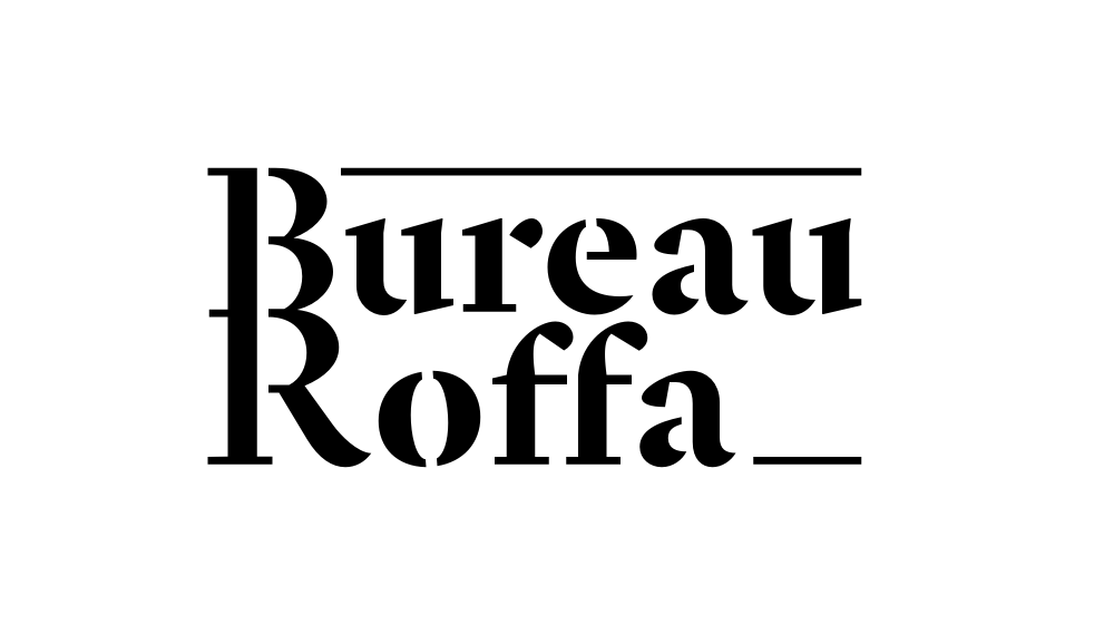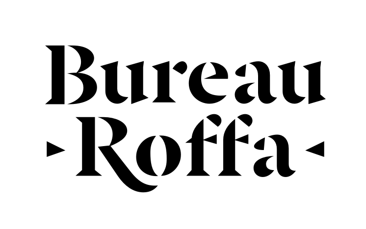
New Bureau Roffa logo

Jasper de Waard
Posts: 654
I've had some helpful feedback on facebook already. What do you think?

0
Comments
-
The stencil cuts in B and R feel obvious compared to the way you’ve altered the lowercase letters to work as stencils.1
-
Ok. I will bite.Connecting the BR in this way creates such a strong connection between those two letters that they become almost a distraction and lose connection to the words to which they really belong.Also the Ro pair needs a little love.5
-
The top rule and the unresolved area above the 'o' contribute to a feeling of trapped internal space. You might get away with the bottom rule as a nod to a cursor, but I would consider losing the rules altogether.
I agree with Tiffany that the BR combo is problematic. If nothing else, its tight leading is at odds with the loose (for a logo) letterspacing everywhere else.
You're already playing up the elegant/utilitarian contrast of serif v. stencil -- you could try giving the R a swash leg that cuddles the o and pulls it closer.2 -
Thanks all for your feedback!
@James Puckett I think I get what you mean, but I'm not sure if there's anything I could/should do about it.
@Tiffany Wardle I actually more or less started from the BR 'ligature' in an attempt to tie the words together, but I'll give a non-ligated version a try.
@Marc Oxborrow the lines/rules were intended to do something about Roffa being much shorter than Bureau. The Ro pair is deliberately this wide to be able to have the ff 'fit' around the e, and make the difference in width smaller, but I guess I'll have to find a different solution altogether.
0 -
Yeah R-o seems like it's got way too much space up there. To address the spacing issue with Roffa being shorter, you could center align it to Bureau and design a printer's mark on either side of Roffa. Nothing extravagant, something simple to go on either side. On a different note, stencil cuts work best on a dark background. If you plan to do both for light and dark(I recommend you do) then of course you'd wanna redraw it so it doesn't end up looking thicker on a dark bg. Having one as a monogram or just bare initials would be handy for smaller areas, such as icons, or anywhere you can avoid/cannot use the full name.0
-
Are you opposed to having it composed as one line? You could solve a couple of the issues discussed by changing the format. An abbreviated BR logomark could be utilized in applications where a horizontal wordmark wouldn't work.1
-
Do something special where the bowl strokes of B connect. And do something compatible to R. Use it to set up a cool leg that sweeps under o.Jasper de Waard said:@James Puckett I think I get what you mean, but I'm not sure if there's anything I could/should do about it.
The upper rule is problematic because it looks like a rule in a Vignelli sense. But it’s not implemented the way Vignelli would have. He’d have put a floated a heavy rules across the entire top of Bureau. That might work for someone else, but I don’t think the international style is your style.
I think that you can get rid of the horizontal rules if you tighten up the spacing and pull it together with a nice descending leg on R. That said, conceptually I think the lower rule works, because it suggests a space to be filled—by you.
1 -
Thanks again for all the feedback people. I feel much less comfortable designing a logo than designing a typeface, which obviously shows in the result.
@AbiRasheed I used simple triangles taken from the f as printer's marks (if you can call it that). And yes, a version with just initials sounds like a good idea.
@James Puckett Yes, the rules were very much an afterthought. Got rid of them.
I've basically made two versions. One is more robust, but the sharp one is more exciting I think and still works in small sizes. I personally think overall this is a great improvement, but more feedback is of course still greatly appreciated!
 2
2 -
Ok. Rebellious thought. What if you raise the /o/? That space is quite the gap. Even when I shrink the logo down. But yes, these are more cohesive now that the BR are no longer attached.1
-
BTW The triangles are a nice detail.
Also, raising the /o/ could allow for the tail of the /R/ to do different things.0 -
I tried raising the o but didn't like it. I did manage to tighten op that space further, though. Better?
 0
0 -
Nice! Try inverting the second triangle.0
-
What is "Bureau Roffa" ? I am trying to get a handle on how this word mark reflects on the referent?0
-
Roffa is slang for Rotterdam, Jasper's city.1
-
Love the new stencilled /f and /a.1
-
@Chris Lozos What Igor said. Retail and custom typedesign. Hopefully some lettering projects in the future, typographic posters/t-shirts, and such. Ideally, though this may take a while, Bureau Roffa will become a sort of hub for starting designers, through workshops, and possibly releases on Bureau Roffa.
@Simon Cozens Thanks
@James Puckett Like so?
0 -
-
-
How about just using the Bu/Ro square as in your profile picture?
0 -
The BuRo square was useful as a pictogram, but I'd like my logo to contain the full name of the company. I redesigned the pictogram to just the R, without the swash:
 1
1 -
I still like the connected B/R. Makes it very distinct.0
-
The new idea, with the two weights, I think is too subtle to work. If 'Bureau' were smaller, in a sans, or maybe just smaller and all caps…something to make it seem "done on purpose".1
-
Jasper, you could consider a mark with the linked BR (say, reduced and inside a geometry) besides or above the full text. The linked BR is nice and this way you could use it avoiding the issues pointed here. Just an idea:
 1
1 -
If Igor's idea appeals to you, try removing one of the bowls of the B, so that a single, unique character contains both letters, as in this quick 'n' dirty mashup:

0 -
@Georg Seifert So do I, but it simply wasn't working in the wordmark.
@Tiffany Wardle I value your input, but I disagree. I don't think it has to be super obvious, subtle can work. I tried both versions (thick-thick & thin-thick) on my website and ended up choosing the version with two weights.
@Igor Freiberger Interesting idea, but it seems a bit forced to me, a bit too much. As in writing, I think a designer sometimes has to kill his/her darlings.
@Marc Oxborrow It could work as an icon, but I don't think I need an icon next to the wordmark, and the icon on itself is rarely necessary.
I didn't think this thread was going to come alive again, so I never posted the last version of the logo. It now looks like this:
2 -
I feel like the little triangles cheapen the wordmark. I also preferred the version with a single weight.
1 -
Context is king. I see it and it does work.0
Categories
- All Categories
- 46 Introductions
- 3.9K Typeface Design
- 489 Type Design Critiques
- 572 Type Design Software
- 1.1K Type Design Technique & Theory
- 663 Type Business
- 876 Font Technology
- 29 Punchcutting
- 530 Typography
- 121 Type Education
- 328 Type History
- 81 Type Resources
- 111 Lettering and Calligraphy
- 32 Lettering Critiques
- 79 Lettering Technique & Theory
- 561 Announcements
- 96 Events
- 116 Job Postings
- 169 Type Releases
- 179 Miscellaneous News
- 269 About TypeDrawers
- 53 TypeDrawers Announcements
- 114 Suggestions and Bug Reports


