Modification Briefs - Best practices
Comments
-
0
-
-
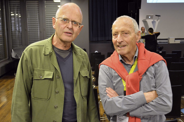
Great photo.
 I am still learning. Shall we get back to modification? What's going to happen with missing diacritics on web fonts? We've got a lovely series on Islamic law that chokes up on substitution. I'd hate to see a font's forms defaulted to Georgia on a single character – not because of FOUT, FOIT, FOFT – but because there isn't a compound char for a dotted character. Or equally watch some horrendous kerning from an ArialUnicode combining dot as it fails to anchor itself to the font-in-use.0
 -
Not the solution to your questions but you can absolutely make a more creative font stack than just Georgia or Arial. Windows as well as other OS come with a variety of typefaces that may fit the typeface in question better (and then stack those). However, in the end not all users will see the same thing.-1
-
This is what we do in print publications. But, some fonts cannot be substituted with even a grimace of adequacy. My concern is not with the solutions for unstyled content, but with the solutions for "ạ fe ̇w chạrạcte ̇rs in the te ̇xt", nominally diacritics, that are not catered for by the @font-face.Indra Kupferschmid said:…you can absolutely make a more creative font stack than just Georgia or Arial. Windows as well as other OS come with a variety of typefaces that may fit the typeface in question better (and then stack those).0 -
@Florian Hardwig
I met Willi when I was a graduate student at Ohio State University in 1972. At the time, he was a young fellow who taught undergraduates Typography. He had studied at Basel with several of my classmates; Dan Friedman, Bill Shoerner, Arthur Celladonia, Ruth Geshecter, Frank Vigliotti. I never got to take any of his classes but we talked type and other things like Russian Constructivist art. He was a terrific guy.-1 -
The user and all related content has been deleted.1
-
Microtypography was also a term that Hermann Zapf used in the hz-program; he used it to refer to a collection of type manipulation techniques (optical margin compensation, expanding or condensing letterforms, automated kerning) to improve justification and paragraph fit. Even more micro than above!2
-
If there is no solution to high costs for these types of modification, I'll encourage our editorial teams to request text design amends that incorporate libre fonts, or proprietary fonts that do permit modification. It may be that is the direction for our academic publishing, it would simplify a lot of processes.
I'm an advocate for a mixture of proprietary and libre. But, where this does not meet the needs of the business, alternative approaches should be found.
2 -
If there is no solution to high costs for these types of modification, I'll encourage our editorial teams to request text design amends that incorporate libre fonts, or proprietary fonts that do permit modification.
Perhaps there’s a benefactor who would like to help your employer commission extensions and improvements of libre fonts. It’s certainly the right press to do so if the funding can happen.
0 -
A smart benefactor might figure out that it's usually better to spend the money internally modifying high-quality commercial fonts that allow it.
0
Categories
- All Categories
- 46 Introductions
- 3.9K Typeface Design
- 489 Type Design Critiques
- 572 Type Design Software
- 1.1K Type Design Technique & Theory
- 665 Type Business
- 877 Font Technology
- 29 Punchcutting
- 530 Typography
- 121 Type Education
- 328 Type History
- 81 Type Resources
- 111 Lettering and Calligraphy
- 32 Lettering Critiques
- 79 Lettering Technique & Theory
- 562 Announcements
- 97 Events
- 116 Job Postings
- 169 Type Releases
- 179 Miscellaneous News
- 269 About TypeDrawers
- 53 TypeDrawers Announcements
- 114 Suggestions and Bug Reports


