Lagu Sans

Alessio Laiso
Posts: 4
Hi everyone, this is my first post here. I’m a software designer by trade, and I enjoy drawing letters on the side. I’ve been lurking in this forum for a while, and now the moment to start posting has come for me too.
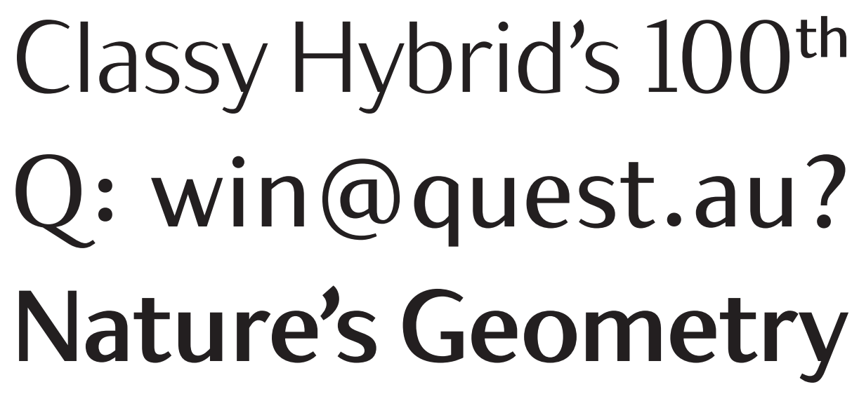
I’m attaching a pdf showing the sans I’m currently working on: Lagu. This is not my very first work with type, but it’s my first large family starting completely from scratch, so any feedback would be greatly appreciated. Thank you!

I’m attaching a pdf showing the sans I’m currently working on: Lagu. This is not my very first work with type, but it’s my first large family starting completely from scratch, so any feedback would be greatly appreciated. Thank you!
Tagged:
0
Comments
-
The thin terminals of C/G/S/a/c/f/g/j/s etc. don't seem related to the other thins in the typeface.
Pay more attention to counter size.
Get one weight's alphabet working well before further expanding the weights and character set.1 -
Consistency is very important with type, for instance your lc /u, where the curve comes in to join the right vertical stem, is smooth and well formed whereas the same is not true of the lc /a and /g. They come in from the left to midpoint then continue on, less curved. It really stands out, to me, although you may intend it to be that way. I didn't look at the PDF, just what you previewed so there likely are others.
1 -
This typeface reminds me a lot of Cosmos, an '80s typeface from Berthold. Consider taking a look, for tips on how to handle a typeface with a similar design approach, and/or to make sure you're sufficiently differentiating your work.
http://www.myfonts.com/fonts/berthold/cosmos-pro/
2 -
Hi Alessio, George Thomas pointed out a few things correctly. Take a look at my attached image, before and after, my adjustments to better demonstrate what George is saying. It's critical that the inside counters and curves follow the shape and curves on the outside. If they do not, the eye will pick it up as a bad overall outline. I hope this helps.
 1
1 -
Thank you all for the valuable feedback, I really appreciate that! I will post some new images here as soon as I get to implement your advice, starting with the regular weight.
@Craig Eliason
Those thin terminals are one of the details that made me sweat the most. Do you mean they should be thicker and less quirky, closer to what Alex has posted?
@George Thomas
I see what you're saying, I'll work on it.
@Marc Oxborrow
I had never seen Cosmos, thanks for the heads up.
@Alex Kaczun
Thank you for the picture, it really helps a lot! The counters do look a lot better there. The peculiar curve on the terminal of the /a (and other letters) was a choice, but I can see how it makes it hard to stay consistent in every glyph, so I may need to rework that.0 -
I just don't get why the taper of the top of /a/, for example, is so much thinner than the part of the /g/ bowl that thins as it heads to the join. Near each other, the /a/ will look too weak, or the /g/ will look too clunky.
One thing beginners tend to neglect, though it's crucially important, is the size for which this is intended. That decision might steer whether the /a/ should be more like the /g/ or vice versa.1 -
Hi Alessio, You're welcome. Glad to help—a picture is worth a thousand words. Actually,
I think the taper is a bit too thin, as others have pointed out. How about this? I think better. —Alex 1
1 -
IMHO, Lagu Sans does look too similar to Berthold Cosmos. It's okay to be inspired by other fonts but always remember and try to bring a unique perspective to your work. You have a good start here. Just keep making visual adjustment as you go to reflect your personality. Bring something new and original as you go. Do not be afraid to experiment. You may be pleasantly surprised. Good luck. —Alex1
-
I took the liberty to work on this still further, to illustrate the subtle changes you can incorporate to distinguish your design from Cosmos. Just by introducing subtle changes can dramatically improve the overall design, making it more interesting and organic. Take a look at this example. The stems are no longer straight. Subtle flairs can transform the entire thing. It doesn't take much. —Alex

2 -
Craig and Alex, thank you again!
@Alex Kaczun
The idea behind Lagu was to create a hybrid between contemporary geometric typefaces (e.g., Gotham, Proxima Nova) and faces with a stronger contrast (Optima). Seeing Cosmos for the first time now is a bit of a bummer, although certainly helpful. I really appreciate your advice on how to differentiate Lagu more. Although the flairs in your latest picture may go too far from the edgy sans look I had in mind (especially on the /L/), that's definitely a great direction for me to start exploring again.0 -
Personally, I find that last redesign a step backward. The original appears to aim for the clean elegance of a Didone sans, whereas the clipped tails pointing here and there introduce some Benguiat-style stuffiness and visual unrest.
2 -
Hi guys, I'm back after the very helpful feedback received the last time. I'm still working on differentiating Lagu more from existing typefaces, but for now I've worked to harmonize the thins and to generally improve the quality of the curves. Any advice on this would be very welcome.0
-
The numeral figures work better (even much better) than the letters, in my opinion.0
-
The first thing I would do is raise the ascenders and/or shorten the descenders.
BTW this reminds me of my submission to the Canberra type design competition: http://luc.devroye.org/HrantPapazian-Griffin-CanberraCompetitionTypeface-2013b.png
0


Categories
- All Categories
- 47 Introductions
- 3.9K Typeface Design
- 493 Type Design Critiques
- 574 Type Design Software
- 1.1K Type Design Technique & Theory
- 668 Type Business
- 882 Font Technology
- 29 Punchcutting
- 535 Typography
- 123 Type Education
- 331 Type History
- 81 Type Resources
- 112 Lettering and Calligraphy
- 32 Lettering Critiques
- 80 Lettering Technique & Theory
- 565 Announcements
- 98 Events
- 116 Job Postings
- 170 Type Releases
- 180 Miscellaneous News
- 270 About TypeDrawers
- 54 TypeDrawers Announcements
- 114 Suggestions and Bug Reports