Howdy, Stranger!
Categories
- All Categories
- 39 Introductions
- 3.6K Typeface Design
- 764 Font Technology
- 1K Technique and Theory
- 587 Type Business
- 435 Type Design Critiques
- 526 Type Design Software
- 30 Punchcutting
- 132 Lettering and Calligraphy
- 79 Technique and Theory
- 53 Lettering Critiques
- 461 Typography
- 289 History of Typography
- 111 Education
- 61 Resources
- 479 Announcements
- 74 Events
- 104 Job Postings
- 147 Type Releases
- 153 Miscellaneous News
- 259 About TypeDrawers
- 52 TypeDrawers Announcements
- 109 Suggestions and Bug Reports
Inovato—My first typeface
 Aceler Chua
Posts: 13
Hi guys!
I wanted to get some professional opinion/critics on my first typeface. Here are some background about it.
I started working on Inovato when I attended Crafting Type in Hong Kong March last year (kudos to @Dave Crossland, @Thomas Phinney, @Blondina Elms Pastel, & @Alexei Vanyashin). We were asked to design and create a typeface and I chose to make a text sans serif. I thought it’ll be more challenging and I’ll learn more during the process.
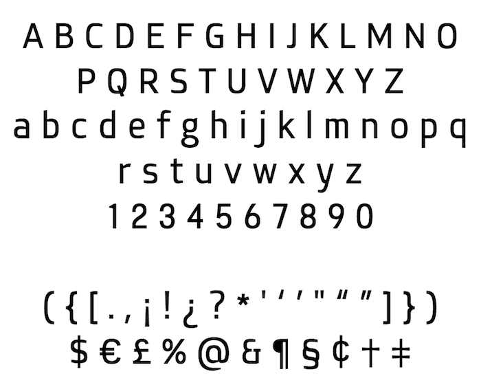
Here’s the objectives of Inovato: I wanted it to look neutral with a bit of friendliness and character in it. It has to be able to perform well in smaller sizes. From what I understand, the usual way of making type work in smaller sizes is to have a taller x-height and wider width to give it more space. I want to try some other options, so instead I maintained a rather normal x-height, a regular width(in fact it’s a bit condensed), and tried to use more open apertures and clean shapes to achieve the breathability. Look at the lowercase “a” and “e”, you’ll see there’s a slanted cut to help stealing some white from the black. The slant is also consistent throughout the typeface so it serves the purpose of giving the design a certain character.

I’ve attached the proof for the regular and the bold weight. The regular one hasn’t been perfectly kerned yet and there’s no kerning set for the bold one at all.
Any thoughts and opinions are greatly appreciated. Looking forward to learn more from all of you!
With thanks,
Aceler
Comments
If it's easier, you could describe the contexts that you would like to see the design work particularly well at, and approach the design given what would make it suited for those contexts (sci-fi poster? kombucha bottle? major wireless carrier branding?)—the more specific the better when you're working on your first few designs.
As is usual at this point, you have a number of competing ideas, and I'm not sure a discernible core use-case that would help you decide which aspects to keep and which to save for another project.
I like the connection idea. Like the connection on the n. It seems like you missed some opportunities to use this idea in the numerals. The lowercase g could use one of these connections. I see what you did with the lower bowl but, it seem like it would perform its intended function where the link meets the upper bowl. Rotate it 90 degrees and compare to your lowercase m. That hump connection doesn't look like anything in the rest of the typeface.
Thanks for the advice!
@Ray Larabie: It wasn’t really my intention to make the corners of O thicker, now you’ve mentioned it I think I’ll need to fix the O. Regarding the g, I too am not very satisfy with it. I’ll try your suggestions and see if it works well.
Thanks for the advice!