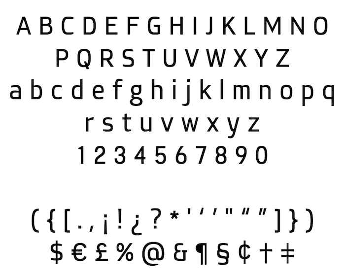
Inovato—My first typeface

Hi guys!
I wanted to get some professional opinion/critics on my first typeface. Here are some background about it.
I started working on Inovato when I attended Crafting Type in Hong Kong March last year (kudos to @Dave Crossland, @Thomas Phinney, @Blondina Elms Pastel, & @Alexei Vanyashin). We were asked to design and create a typeface and I chose to make a text sans serif. I thought it’ll be more challenging and I’ll learn more during the process.
Here’s the objectives of Inovato: I wanted it to look neutral with a bit of friendliness and character in it. It has to be able to perform well in smaller sizes. From what I understand, the usual way of making type work in smaller sizes is to have a taller x-height and wider width to give it more space. I want to try some other options, so instead I maintained a rather normal x-height, a regular width(in fact it’s a bit condensed), and tried to use more open apertures and clean shapes to achieve the breathability. Look at the lowercase “a” and “e”, you’ll see there’s a slanted cut to help stealing some white from the black. The slant is also consistent throughout the typeface so it serves the purpose of giving the design a certain character.

I’ve attached the proof for the regular and the bold weight. The regular one hasn’t been perfectly kerned yet and there’s no kerning set for the bold one at all.
Any thoughts and opinions are greatly appreciated. Looking forward to learn more from all of you!
With thanks,
Aceler
Comments
-
Was this created by editing another font? Because many of the glyphs look like they were lifted from another font and adjusted rather than being drawn to fit the design.0
-
Nope. The whole design was created from scratch.James Puckett said:Was this created by editing another font? Because many of the glyphs look like they were lifted from another font and adjusted rather than being drawn to fit the design. 1
1 -
I'd consider trying to describe the intent with an adjective other than "neutral". Like "masculine" and "feminine", "neutral" brings with it a lot of baggage while at the same time not being particularly descriptive.
If it's easier, you could describe the contexts that you would like to see the design work particularly well at, and approach the design given what would make it suited for those contexts (sci-fi poster? kombucha bottle? major wireless carrier branding?)—the more specific the better when you're working on your first few designs.
As is usual at this point, you have a number of competing ideas, and I'm not sure a discernible core use-case that would help you decide which aspects to keep and which to save for another project.
2 -
I'll focus on the problem of consistent use of elements. See the silhouette of the O and how the curves get thicker in the corners? The way the ends of the C taper? You seem to be committed that that rule. It's been perpetuated to a lot glyphs. But not all of them. The curves of the B don't look like they belong with curves of the O. You don't have to measure them or make the technically identical. They should feel like they belong together. As it is now, if you showed me only the O and B, I would assume that they belonged to two different typefaces. The lower bowl of the g doesn't resemble the shape of the O, it doesn't thicken in the corners. The numerals don't like like they belong with the O or C at all.
I like the connection idea. Like the connection on the n. It seems like you missed some opportunities to use this idea in the numerals. The lowercase g could use one of these connections. I see what you did with the lower bowl but, it seem like it would perform its intended function where the link meets the upper bowl. Rotate it 90 degrees and compare to your lowercase m. That hump connection doesn't look like anything in the rest of the typeface.
3 -
@Jack Jennings: The design was intended to be used in books or articles, but without a specific genre. I agree it’d possibly be easier if I have a super specific application.
Thanks for the advice!
@Ray Larabie: It wasn’t really my intention to make the corners of O thicker, now you’ve mentioned it I think I’ll need to fix the O. Regarding the g, I too am not very satisfy with it. I’ll try your suggestions and see if it works well.
Thanks for the advice!0 -
I'm curious which glyphs look to you like they were lifted, and what the adjustments were?James Puckett said:Was this created by editing another font? Because many of the glyphs look like they were lifted from another font and adjusted rather than being drawn to fit the design.3
Categories
- All Categories
- 46 Introductions
- 3.9K Typeface Design
- 489 Type Design Critiques
- 572 Type Design Software
- 1.1K Type Design Technique & Theory
- 663 Type Business
- 875 Font Technology
- 29 Punchcutting
- 530 Typography
- 121 Type Education
- 328 Type History
- 81 Type Resources
- 111 Lettering and Calligraphy
- 32 Lettering Critiques
- 79 Lettering Technique & Theory
- 561 Announcements
- 96 Events
- 116 Job Postings
- 169 Type Releases
- 179 Miscellaneous News
- 269 About TypeDrawers
- 53 TypeDrawers Announcements
- 114 Suggestions and Bug Reports

