Imperial vs Gazette

Wei Huang
Posts: 102
Here's another post from me looking for obscure knowledge.
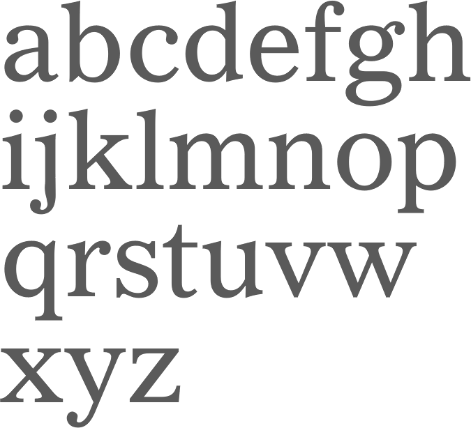
Does anyone know the story behind Edwin W. Shaar's Imperial and Gazette? All I could find is this on Luc Devroye's page about him:
Gif:

Images:


Does anyone know the story behind Edwin W. Shaar's Imperial and Gazette? All I could find is this on Luc Devroye's page about him:
1954: Imperial (+Bold, +Italic), done at Intertype, and called Gazetteby Linotype in 1977. The New York Times uses Imperial for its text since 1967, but it is based on in-house scans of the old metal Imperial (an Intertype design from 1954), not on the digital versions from Intertype or Linotype. The typophiles discuss Imperial: Kent Lew states The New York Times text is Imperial. Has been for at least the last several years. Koppa points out that the NY Times Imperial designed by Intertype looks like an ATF Century Old Style rip-off. [...] I will stick with my opinion that the original, the metal Century Old Style, credited to M Benton, is better than the copy-cat Intertype Imperial and most definitely better than the copy-cat digital Imperial I saw on myfonts.com last night. Bitstream made a digital version ofImperial. Mac McGrew: Imperial was designed by Edwin W. Shaar in 1954 as a newspaper text face. Like most other news faces it has a large x-height with short descenders. but unlike most news faces of the time, it blends certain oldstyle and contemporary characteristics, and is a little narrower and more closely fitted. This gives a feeling of friendliness and warmth, but retains a high degree of legibility.Looks like Gazette spacing is tighter and some glyphs are the result of spacing restrictions?
Gif:
Images:
Tagged:
1
Comments
-
Metal Intertype or Linotype did not have to follow a unit system (apart from Teletype). If this is taken over from an older incarnation, it has to stem from photo-type times. [Ah, you changed your question. Yes, the difference in form comes from the fact that line casting systems had no possibility for kerns, hence the hooky f in the Bold and Italic, and the duplexing of course.]3
-
One explanation for the difference in spacing compared with Gazette might be that two different design sizes are being compared.
Intertype unit-cut (not unitized) the face to duplex with several other wider faces including Futura Bold. Imperial is a newspaper face and was wider than Century Old Style. I don't feel it is a rip of Century Old Style, which is a beautiful face -- Imperial, not so much.
Jaspert dates it as 1957, McGrew says 1954. I think McGrew's is the correct date.
2 -
@Indra Kupferschmid
Thanks for your answer!
Edit: My mistake, Imperial is the tighter one and Gazette has the backwards leaning space-saving f — and of course, I didn't even notice the duplexing! I confused having unit system with the lack of kerns.
I'm curious to know if the NYT was using Imperial then what sort of machine were they using to do the typesetting?0 -
I knew someone who worked there in the late seventies when they were starting to phase out metal type. He said they used Linotype machines, but they may well have been Intertype. The matrices were interchangeable.1
-
Farewell ETAOIN SHRDLU shows the NYT's Linotypes in action on their last day.3
-
The matrices were interchangeable.
Many parts of the machines were, too. Intertype just knocked off Linotype's machines after the patents expired.
0 -
You make that sound like a bad thing. :-P1
-
Over the years, I have periodically sought more information about Edwin Schaar, asking folks like Tobias Frere-Jones and Frank Romano. But so far, I haven’t really turned up much about the man and his career.
A month or so ago, during a workshop at the TDC, I discovered a copy of an Imperial specimen in their collection. I took several crappy phone snapshots, but haven’t processed them yet. The editorial content was marketing copy and so, of course, mostly touted Imperial’s benefits and not so much the details of its development.
Funny that Devroye would reference Koppa’s “rip-off” comments about Century Oldstyle, since I think I refuted that assertion at the time in that very same thread.
I personally think Imperial was as good as, if not superior to, Linotype’s Readability series. (Which I realize some of my colleagues might find sacrilegious. ;-) It continues to fascinate me.
1 -
BTW, that is not Schaar’s g in that Bitstream digitization shown above.
0 -
-
It didn’t have an ear like that. Those Bitstream g’s have much more ionic flavor.
Here’s a showing, and a bit of background, from Lawson’s Anatomy of a Typeface (presumably reproduced from an Intertype marketing piece):
4 -
BTW, I found a Wayback copy of the original Typophile thread that Devroye referenced:
http://web.archive.org/web/20110320055523/http://typophile.com/node/34046
Warning: It’s a typically wide-ranging and rambling thread, filled with tangents and potholes. So, one might have to navigate around some stuff to find the productive conversation.
The point where Imperial enters the discussion is around 29.May.2007 10.11am when Koppa enters the fray.
FWIW.
1


Categories
- All Categories
- 47 Introductions
- 4K Typeface Design
- 495 Type Design Critiques
- 577 Type Design Software
- 1.1K Type Design Technique & Theory
- 670 Type Business
- 885 Font Technology
- 29 Punchcutting
- 539 Typography
- 125 Type Education
- 333 Type History
- 81 Type Resources
- 113 Lettering and Calligraphy
- 33 Lettering Critiques
- 80 Lettering Technique & Theory
- 569 Announcements
- 100 Events
- 116 Job Postings
- 170 Type Releases
- 182 Miscellaneous News
- 270 About TypeDrawers
- 54 TypeDrawers Announcements
- 114 Suggestions and Bug Reports