multiscript Bodoni - Kasira

Aditya Bayu
Posts: 5
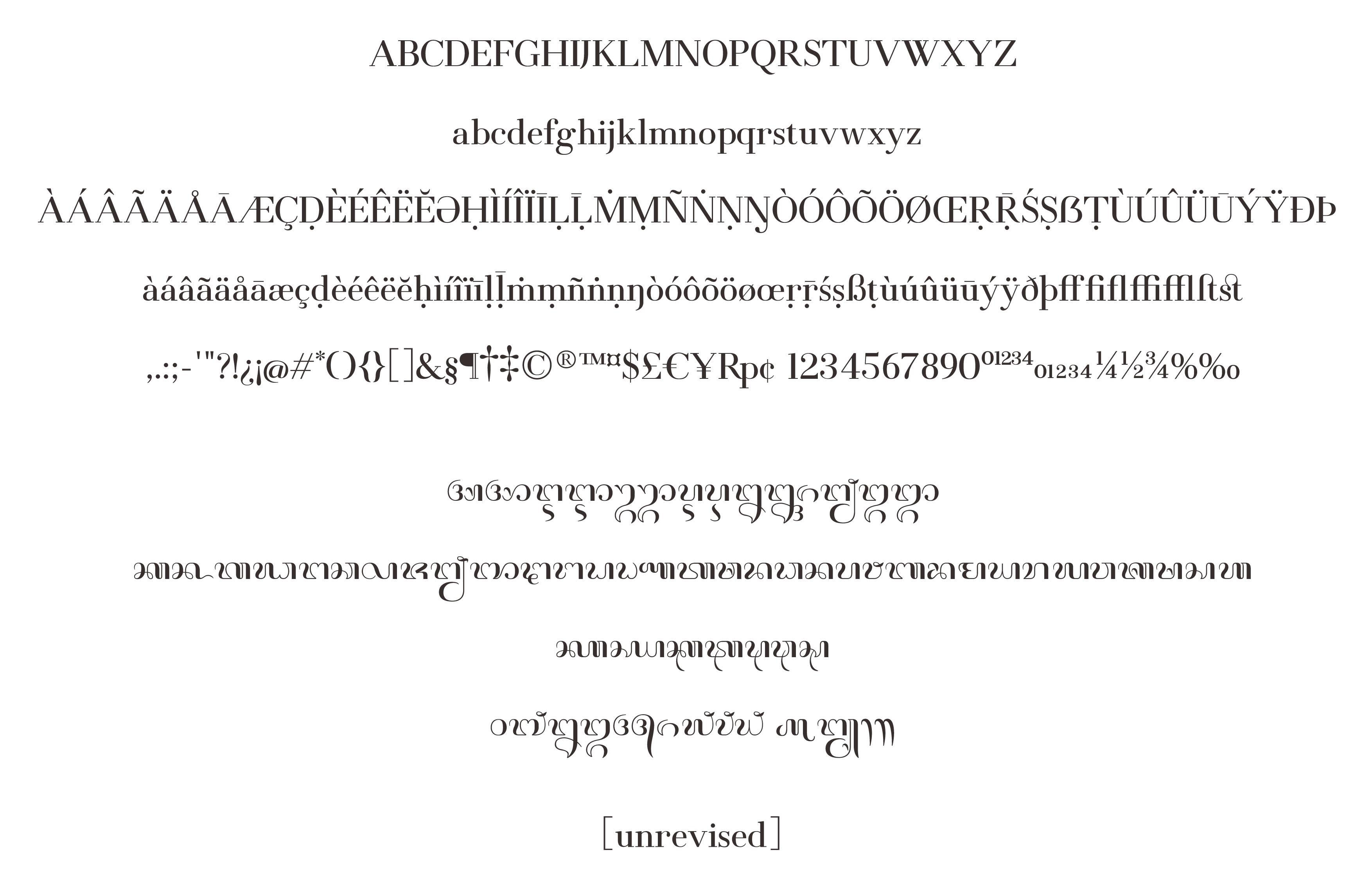
Hello all, I'm trying to make a bodoni font that includes many codepoints, which includes cyrillic, greek, and balinese. I'm particularly worried on the design of greek/cyrillic because I'm not a native user of them.
This is my first try on bodoni, so any critics or comments are welcomed! (the pdf sample is not kerned btw)
This is my first try on bodoni, so any critics or comments are welcomed! (the pdf sample is not kerned btw)
Tagged:
2
Comments
-
I wasn't aware that Balinese script is so beautiful!
As for your typeface, you will need to work on your curve quality. Do you see how there appear to be abrupt kinks in the outlines where the red angles are, and how the thin stroke marked with interrupted lines fluctuates in stroke width? This sort of thing happens everywhere, as far as I can tell. Before you add more and more features and glyph coverage, make sure the basics are solid.
As for the design:- Serifs on thin strokes, such as in /A and /K, are way too timid. /A is lopsided and perhaps a bit too wide?
- Shoulders in /n, /h, /u etc. and bowl connections in /d, /b etc strike me as inelegant. I would suggest making the cleft between stem and arc deeper, and moving the apex of the arc away from the stem.
- Top serifs are stylistically inconsistent with bottom serifs (e.g. on /l).
- Stem weight looks inconsistent between some letters. For instance, the thick strokes in /w look lighter than the stem of /d, /s looks lighter than /t, the diagonal in /K is lighter than the vertical, etc.
- The /r is too wide and droopy.
- The foot of /R looks like it's testing the waters with a toe. /J needs a solid footing.
- The /ß collides with itself.
- Spacing needs more work. For instance, /g has way too much space to the right.
- Greek: The ascenders and descenders are inconsistent. For instance, /delta and /gamma need to fill out the ascender and descender height, respectively.
1 -
You may have bitten off more than you can chew. I’m seeing a lot of systemic problems with the weight and proportions, and because of that also the spacing. Just the word ‘beings’ alone, on the second page, shows how this affects the entire word image.
With this fundamental issue, it’s hard to judge the other formal aspects – intentional quirks or visual tone. Though I’m not the right person to comment on non-Latin designs, I do see similar problems there. I hope some of our on-forum polyscribes can weigh in on your cross-script design.2 -
Thanks for the input!
@Rob I do think it's kind of my (bad) habit to keep adding new glyphs even though basic ones are still coarse. And now knowing that Kasira's basic glyphs has many fundamental flaws, I fell embarrassed for being overzealous^^"
At it's core, I want Kasira to be a harmonious bodoni style for Latin & Balinese. So I'll just focus on working these:
core kasira.jpg
basic latin, latin supplement, extended latin (for sanskrit transcription), and balinese (diacritics and conjuncts not shown)
@Christian Thanks for the inputs! I'll work on these issues asap.
Regarding balinese. Interestingly, a publication on southeast asian scripts do acknowledged that Balinese (including Javanese) is actually the most ornate and beautiful of southeasian scripts (compated to thai, khmer, and whatnot). However, Balinese typographically very underdeveloped, which is why I made Kasira") 0
0 -
@Aditya Bayu That sounds like a much stronger start. It is also a lot easier for people on this forum – and elsewhere, if you seek advice from other professionals – to provide critique when you focus on a core issue.
In your case, a good step would be to produce a proof that tests the proportions of the caps, round and straight, and analyse what is good and what isn’t. When that works, a more natural overall picture should be easier to figure out. So please return with smaller questions — it’ll help us help you.0


Categories
- All Categories
- 47 Introductions
- 4K Typeface Design
- 493 Type Design Critiques
- 575 Type Design Software
- 1.1K Type Design Technique & Theory
- 669 Type Business
- 884 Font Technology
- 29 Punchcutting
- 537 Typography
- 124 Type Education
- 332 Type History
- 81 Type Resources
- 113 Lettering and Calligraphy
- 33 Lettering Critiques
- 80 Lettering Technique & Theory
- 569 Announcements
- 100 Events
- 116 Job Postings
- 170 Type Releases
- 182 Miscellaneous News
- 270 About TypeDrawers
- 54 TypeDrawers Announcements
- 114 Suggestions and Bug Reports