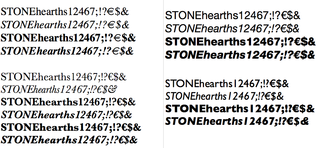
Why are italics lighter than their upright counterparts?
Wei Huang
Posts: 99
I think there was a thread on Typophile about drawing Italics but… obviously I can't find it. I have a a question I hope someone can shed some light on:
Why are Italics usually lighter than their roman counterparts? How is this calculated, or decided how much it should be lighter by?
Checking the outlines themselves, the stems are actually drawn lighter than the upright too. In text its clear that that italics are lighter too. Is it so that the italics don't stick out in running upright text and that these typefaces were not designed with running italics text next to upright in mind?
(While I'm here does anyone have the link to the thread on Typophile [to access on Archive.org] where David Berlow or someone else from Font Bureau explains how they create a slanted sans?)


3
Comments
-
Two reasons. Italic stems, being angled, have to be drawn slightly lighter or they look too dark. But they're often drawn to produce a lighter color than a roman so that they stand out when used as a hierarchical device in text.4
-
Italic x-heights can also be made slightly lower to compensate for the angled stems being longer.1
-
Also: italics are often narrower (at least the lower case), than their corresponding romans, which means the stems must be proportionally narrower, too.
2 -
Italics were used to save space (and paper) by Francesco da Bologna . I assume, to compensate for being narrower and more tightly tracked, the developer felt they needed lightening, less they darken the page too much.
Obliques are often share their upright brethren's weight and tracking, and are usually very close in weight; that just might be because they are computer tilted knock-offs, though.0 -
Indeed, if it was only to compensate the width or the angle, we shouldn't notice they're lighter in body text. It's also strange to say, today, the italic has to be lighter to stand out as we should consider a lighter style as we so with uprights. Maybe the reason is mostly historical? Something about too-much-ink when printing?1
-
After from using alternate italic forms, when I make sans-serif obliques, slanting alone creates an italic that usually fails to sufficiently emphasize. Although, I could keep increasing the angle, at a certain point, it starts to look ridiculous. The slant is just one aspect of an oblique. Lighter stems, condensing, looser sidebearings...all that stuff helps.3
-
@Choz, I've frequently heard that Manutius found Griffo's italic to be laterally compressed and have never seen any evidence that it actually is... or that it was ever Griffo's intention in cutting it. As its progenitor, its equally possible that he followed the much admired Roman chancery hand and that efficiency was a byproduct of the model.
A bit of a tangent I suppose, Manutius's italic-set books usually contain no roman at all and it wasn't really until Granjon that the italics acquired a greater slant, a lighter weight, and more compression. By that time setting roman and italic together was fairly common.3 -
Italics were used to save space (and paper) by Francesco da Bologna .
That’s unfounded speculation. See Cramsie, The Story of Graphic Design, p. 89.
It has been thought that Aldus adopted this cursive humanist script as a space-saving device, but not only is there no quote or comment that supports this supposition, when the text is set in the same size as his roman type it does not increase in length. What is more certain is that his books benefitted from the popularity of the humanist script, which was held as a model for handwriting among educated and literate Italians.
The adoption of an imitation of a cursive hand by Aldus for his new fonts is not wholly explicable by the wish for a compact type. His italic types were only a development of an idea already put into effect in his Greek fonts. The older Greek manuscripts employed formal, simple characters, separate from each other and with comparatively few ligatures or contractions, which adapted them very well to translation into type; but Aldus preferred to imitate the cursive Greek handwriting of his time, which was filled with an immense number of ligatures, contractions, and unnecessary complications. Despite their faults, these cursive Greek fonts hit the popular taste. So when a small, compact type was wanted for editions of Latin classics, etc., I suppose it may have seemed to Aldus natural and clever, to do for Latin letter-forms what he had done for old Greek letter-forms. It may be, too, that Aldus adopted a cursive letter for his new font because it suggested the popular and informal character of his projected series. Whatever his reasons, the result was the Aldine italic.
5 -
Slanting an upright stem without adjusting its stem thickness at all still creates the optical appearance that the slanted stem is lighter.
It's design-dependent, but sometimes a reduction in width is not necessary, the italics/obliques will naturally look lighter.
It's the same reason that in already angled stems (such as A), slanting makes this optical discrepancy even more pronounced. After slanting the upstroke will appear lighter, while the downstroke darker.
With some basic sans designs, I've found that the italics/obliques without any stem width reduction, still look lighter next to the romans because of this.4 -
What I gather from this discussion so far:
Merely slanting an upright makes the font look too dark. Therefore it is made lighter to compensate. This I understand.
But most of the serif designs I see take it further and actually reduce the weight so that optically they appear even lighter than the uprights. This is done is so that the italic has enough emphasis (like a word within a line or a sentence within a paragraph?) compared to the upright text —why not have italics that are darker instead?0 -
—why not have italics that are darker instead?
Because that is not what the reader expects. From that point of view, a darker italic would not be as functional as a lighter italic. If you want to use an italic which is darker, you can also use an italic with a medium or even bold weight. Or take a bold roman. The darker the weight, the more the evenness of the grey value of the page is distorted. Until you end up with raisin-bread typography.
Another reason why italics are lighter is probably that humanist roman scripts are being written with a pen held at approx. 30°, whereas humanist cursive scripts are typically written wit a pen angle of 45°. When you write these scripts with the same pen at the same x-height, the cursive script is always lighter than its roman counterpart.
Yes, the idea of doing an italic with an x-height that is lower than that of the roman is temptative, but it may look awfully unrest when hinting for smaller sizes is not done properly. I wonder how many professionally text typeface designs really feature such an italic (except for the – in my eyes – obvious bloopers from the pre-war Monotype office, such as Fournier).
When you want to test the grey value of your italics, you would probably like to test some words in italic within a text set in the roman, because that is the most common and critical situation for the use of a roman and its italic counterpart.7 -
The following is completely anecdotal coffeetable psychology that I'm making up as I go along:
Upright roman letterforms are static, akin to bodybuilders and weightlifters. Italic letterforms are more dynamic, they echo a quicker writing style, so they’re akin to runners and jumpers.
We’re psychologically hardwired to perceive objects that imply movement as lighter as those that imply sturdiness and reliance — and we expect them to be that way.
But even if we limit ourselves to writing alone: writing upright letterforms is slower, and when we write slower, we tend to push the writing tool harder into the surface (so it’s easier to maintain a consistent stroke while going at a slow pace). Writing italic forms is faster, and when we write faster, we tend to push the tool less, we let it glide.
So as a natural outcome, the italic letterforms tend to be lighter than the upright ones, even coming from the same hand. That “natural” consequence results in our expectations for what’s “normal” to be formed accordingly.
Seeing bolder italic forms being used alongside lighter upright forms is just as confusing as seeing a heavyweight boxer moving swiftly and gracefully next to a ballet dancer who stomps around clunkily.
By similar mechanism, we perceive “printed” letterforms to convey more objective information while “handwritten” letterforms to convey subjective opinion. So by convention, in newspapers news are printed in upright while quotations or opinions are printed in italic. If we reverse the convention, many readers would be confused.13 -
Thinking about Italic stem width, I also think about the diagonals in the letters A, N, V in roman style, which are also should be narrower than the vertical stems. I think the same rule is applies to italic, as the first step of adjusting. The reason is that we read horizontally and perceive the total mass falling into the reading direction.

1 -
Albert_Jan_Pool said:Another reason why italics are lighter is probably that humanist roman scripts are being written with a pen held at approx. 30°, whereas humanist cursive scripts are typically written wit a pen angle of 45°. When you write these scripts with the same pen at the same x-height, the cursive script is always lighter than its roman counterpart.
Adam’s version is a great post-hoc rationalization, yet… this makes a lot of sense to me, as regards the most likely historical origin of the difference in italic stroke weight.
To expand on what AJP is saying here: the larger the difference between nib angle and stroke direction, the thicker the stroke.
Writing a vertical stroke with a 30° nib angle, there is a 60° difference between nib angle and stroke direction. Writing a 10–20° italic with a 45° nib angle, there is a 25–35° difference between the nib angle and the stroke direction, for the nominally-vertical strokes.
Yes, both forms have some strokes that are at an equal maximum thickness. But the most common stroke thickness is the vertical (or “nominally vertical” in the case of the italic), and the impact on the most common stroke makes for a significant difference.0 -
as long as the type designer is making it what he wants it to be instead of letting it be whatever happens without control, it is fine with me.1
-
Is it begging the question to say it is due to nib angle? There are reasons why scribes hold and manipulate pens in different ways for different script styles. In the case of italic hand, it seems to be two-fold: a) the steeper angle of the nib lends itself more to cursive construction, facilitating reversal into NE direction strokes, and b) the horizontal compression that comes from the speed of italic writing makes the spatial frequency of strokes denser than roman, so the lighter weight of the strokes compensates.1
-
Whatever the type designer wants to do, Italic should stand out if mixed with Regular, or it can't be used. IMHO in this example of a "Swiss" monoline it's hard to recognise for fast readers:

In comparison Garamond takes the contrast between Regular and Italic to an extreme:
1 -
Whatever the type designer wants to do, Italic should stand out if mixed with Regular, or it can't be used.Indeed, and you are right that some of the obliqued-roman italics are insufficiently distinguished, i.e. slant in itself is not adequate. Of the three conventional properties of italics—slant, distinctive (cursive) construction, and horizonal compression—I think a useful italic always needs at least two.
A question for the type designer or typography to consider is how will the italics be used. There are several conventional uses for italics in text—for semantic emphasis, for citations, for transcription—and while a good italic should be able to function in any of these roles, some might be better suited to one or other. The vary narrow italics of the Garamond tradition work very well for emphasis and adequately for citations, but not so well for transcription, where one wants the roman and italic to be easily distinguished but have a similar presence on the page. That’s why Brill italic, which is used a lot for tanscription, is so wide:
5 -
Because it came out after this thread's first life, but before it was revived, I'll drop a reference here to Victor Gaultney's work on the italic topic.2
-
Thanks for sharing that, Craig.Craig Eliason said:Because it came out after this thread's first life, but before it was revived, I'll drop a reference here to Victor Gaultney's work on the italic topic.1
Categories
- All Categories
- 46 Introductions
- 3.9K Typeface Design
- 489 Type Design Critiques
- 572 Type Design Software
- 1.1K Type Design Technique & Theory
- 663 Type Business
- 875 Font Technology
- 29 Punchcutting
- 529 Typography
- 121 Type Education
- 328 Type History
- 80 Type Resources
- 111 Lettering and Calligraphy
- 32 Lettering Critiques
- 79 Lettering Technique & Theory
- 561 Announcements
- 96 Events
- 116 Job Postings
- 169 Type Releases
- 179 Miscellaneous News
- 269 About TypeDrawers
- 53 TypeDrawers Announcements
- 114 Suggestions and Bug Reports


