"Ethos" — First try at font making

Tiago Santos
Posts: 2
First of all I would like to say that I'm very happy to have found this forum! I'm a graphic designer and as a big fan of typography I thought it would be nice to try and make a "generic" sans serif roughly based on some sketches that I made just to get some experience dealing with shapes, visual compensations and font making apps. As a total begginer in typography making I would really like to hear your opinions about it! I'm still strugling with the kerning so I would like to ask you guys what techniques or software do you usually use to do it.( the name Ethos is totally random so if you have cool ideas for that I'm all ears )
0
Comments
-
This is very good for a first font. Much better than mine. Now file it away, design five more, and then come back to this and start revising them all.3
-
I agree with James. I'd like to see more variety in letter widths, and it definitely needs much more in the way of optical compensation and lightening of joins, but this is an excellent beginning. Well done, and welcome!
1 -
The Uppercase are narrow/small for the Lowercase.
3 -
Some small details that are never too early to learn:
The crossbar on ð is too light. The ring accent on å is too light and too round – you’ll want to make it have roughly the same shape as the /o. Your tilde is very shallow, and the vertical alignment on the diacritics in general is very uneven. The /r feels very much like you cut apart an /n. That’s a good start, but it’s not enough – lower the joint and try to even out the curvature of the arm.
1 -
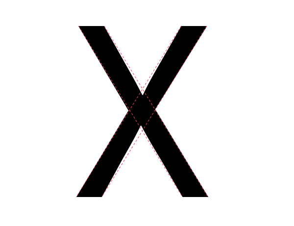
The lower bowl of B could lean slightly more towards to right. The G with the top that does not over the letter looks weird. Bottom of J is way too subsided (take a look at e.g. FF DIN for a correctly-proportioned one). Bottom leg of K is weaker than the top one, this cannot be – as is the case in architecture, the top needs to sit on the bottom. The M looks somewhat too closed-off – maybe it could use from being wider. The bowl of P could be slightly wider. I think the bowl of R could take slightly more vertical space. Top-right of S looks "diminishing" while top-left looks somewhat too heavy – the same happens on the bottom although less dramatically. Check your vertical stems on it, it should (*visually*) get thickest on the center (not really on this typeface since it's pretty much contrast-less, but it shouldn't feel less wide on the center). Also the S should form a "trapeze" i.e. top is less wide than bottom on both sides. Bottom of U looks a little weird, dunno why exactly... Less side of V could be slightly more heavier. W, like M, needs to open up more and could be wider – don't be shy in making these wider than their neighbors. X, like S, should be a bit less wide on both sides at the top vs. bottom. Y could open-up some more I think (in terms of width).
Looking at the lowercase, it seems you could give a slight redux to your vertical stems (so c which doesn't have a vstem wouldn't look thinner than a, b, d – for instance).
The ear of the g is clearly way to small here (it could eventually work in a design where other letters have small parts to echo this but in a rather DIN-like design this is a no-go). The foot of the j is clearly too long, also you gave it too much sidebearings it seems (I think it could work with same sidebearing as i in this case given some redux of the foot). The k suffers from the same problem as its capital counterpart. Do you use all the same vertical stem for h, m, n? It should be the case. r is not correct as Rob mentioned already. w seems too wide, too thin on the middle, too contrasted on the sides. x has the same problems as its capital counterpart and the optical correction is done in the wrong direction – it should be made like this:
http://designwithfontforge.com/en-US/images/myriad-x.png
Numbers could use some work as well.
1 -
Wow! I cannot thank you enough for your in-depth critique guys! I'm going to print this page and get to work.0


Categories
- All Categories
- 47 Introductions
- 4K Typeface Design
- 495 Type Design Critiques
- 577 Type Design Software
- 1.1K Type Design Technique & Theory
- 671 Type Business
- 885 Font Technology
- 29 Punchcutting
- 539 Typography
- 125 Type Education
- 333 Type History
- 81 Type Resources
- 113 Lettering and Calligraphy
- 33 Lettering Critiques
- 80 Lettering Technique & Theory
- 569 Announcements
- 100 Events
- 116 Job Postings
- 170 Type Releases
- 182 Miscellaneous News
- 270 About TypeDrawers
- 54 TypeDrawers Announcements
- 114 Suggestions and Bug Reports