‘Grand Cru Classés’ sprouting from Antwerp soil

LeMo aka PatternMan aka Frank E Blokland
Posts: 787
In the exquisite setting of the Museum Plantin-Moretus the Inside/Outside exhibition, organized by the Plantin Institute of Typography, was opened on Saturday 17 May 2014. The exhibition comprises work of students who successfully finished the Expert class Type design (EcTd) 2012–2013 course, and a preview of the ongoing projects of the current 2013–2014 course. This is the third consecutive EcTd exhibition at the Museum Plantin-Moretus and the first one that is combined with the Expert class Book design (EcBd) course.

On behalf of the board of the Plantin Institute of Typography, vice-president and lecturer Marc Mombaerts underlined the uniqueness of the educational program offered by the institute. Also he emphasized the importance of the cooperation with the Museum Plantin-Moretus and, of course, the support by the sponsors (for instance the printing of the exhibition panels by Agfa) . EcBd lecturer and awarded Belgium typographer Antoon De Vylder spoke about the book design projects and praised the enthusiasm of the students who he and his colleague Paul Verrept guide.

As lecturer and author of the EcTd program I underlined the importance of an in-depth course that combines theoretical insights and historical backgrounds with technical knowledge and practical skills in a time in which the production and distribution of fonts is far from exclusive anymore. I mentioned that when I started to design type for a living in the first half of the 1980s, people reacted surprised when I told them what my profession was. ‘Wow, a type designer; what is that?’ Today people react with ‘well, who isn’t a type designer’. Almost everyone seems to design type nowadays, helped by the fact that computers and font tools don’t cost much anymore and, regrettably, ‘type design’ has been made easier than ever before because it is simple to open and tweak existing font data (although this is often not allowed by the EULA’s). Fonts are offered even for free, because for instance of diverging earning models.

One could raise the question why one should bother to design and tediously develop type from scratch when fonts seem to have lost value. I made a comparison with wine in my talk: more wine is produced than ever before and a lot of (inferior) wine is for sale for a very small price. But there is also a higher demand for great wines, i.e., the Grand Cru Classés. So, IMHO there will remain a market for well-made fonts that add high value to the trade.

The Expert class Type design student’s sprouting ‘Grand Cru Classés’ shown at the exhibition proof the importance of education targeted at enhancing skills and knowledge. The course comprises ten lessons (under the roof of the Museum Plantin-Moretus) in a period of roughly three quarters of a year, and it requires a lot of hard work from the students in between the lessons. The EcTd course forms a good alternative for people who don’t have the time nor the opportunity to follow the Type & Media master course at the KABK or the type course in Reading. In some cases students who successfully finished master courses in type design also join the EcTd one; in the past three years three type masters from Reading did this actually.

The photo’s presented here give an impression of the relatively small, but very informative Inside/Outsideexhibition.

More related info can be found here.
On behalf of the board of the Plantin Institute of Typography, vice-president and lecturer Marc Mombaerts underlined the uniqueness of the educational program offered by the institute. Also he emphasized the importance of the cooperation with the Museum Plantin-Moretus and, of course, the support by the sponsors (for instance the printing of the exhibition panels by Agfa) . EcBd lecturer and awarded Belgium typographer Antoon De Vylder spoke about the book design projects and praised the enthusiasm of the students who he and his colleague Paul Verrept guide.
As lecturer and author of the EcTd program I underlined the importance of an in-depth course that combines theoretical insights and historical backgrounds with technical knowledge and practical skills in a time in which the production and distribution of fonts is far from exclusive anymore. I mentioned that when I started to design type for a living in the first half of the 1980s, people reacted surprised when I told them what my profession was. ‘Wow, a type designer; what is that?’ Today people react with ‘well, who isn’t a type designer’. Almost everyone seems to design type nowadays, helped by the fact that computers and font tools don’t cost much anymore and, regrettably, ‘type design’ has been made easier than ever before because it is simple to open and tweak existing font data (although this is often not allowed by the EULA’s). Fonts are offered even for free, because for instance of diverging earning models.
One could raise the question why one should bother to design and tediously develop type from scratch when fonts seem to have lost value. I made a comparison with wine in my talk: more wine is produced than ever before and a lot of (inferior) wine is for sale for a very small price. But there is also a higher demand for great wines, i.e., the Grand Cru Classés. So, IMHO there will remain a market for well-made fonts that add high value to the trade.
The Expert class Type design student’s sprouting ‘Grand Cru Classés’ shown at the exhibition proof the importance of education targeted at enhancing skills and knowledge. The course comprises ten lessons (under the roof of the Museum Plantin-Moretus) in a period of roughly three quarters of a year, and it requires a lot of hard work from the students in between the lessons. The EcTd course forms a good alternative for people who don’t have the time nor the opportunity to follow the Type & Media master course at the KABK or the type course in Reading. In some cases students who successfully finished master courses in type design also join the EcTd one; in the past three years three type masters from Reading did this actually.
The photo’s presented here give an impression of the relatively small, but very informative Inside/Outsideexhibition.
More related info can be found here.
3
Comments
-
Yesterday was the last lesson of the Expert class Type design 2013–2014 course in Antwerp. Although unfortunately not all students could attend, it was –as always– a nice session and we had lunch (with Belgian beers, of course!) at the Groote Witte Arend (Great White Eagle), around the corner of the Museum Plantin-Moretus.

Especially for the attendees of the 22nd SHARP (Society for the History of Authorship, Reading & Publishing) annual conference in Antwerp (17–21 September 2014), a selection of panels from the aforementioned Inside/Outside exhibition has been mounted on the wall of the large corridor near the main staircase of the Museum Plantin-Moretus.
The EcTd course’s reputation is clearly increasing, as was underlined by a tweet from the renowned French type designer Jean François Porchez last Tuesday: ‘You want to learn how to design type? > http://www.plantingenootschap.be/en/type-design/ by @ExquisiteFonts’0 -
Midst November the Expert class Type design 2014–2015 course will start at the Museum Plantin-Moretus in Antwerp. It’s possible to subscribe still.

The course results in type designs by the students, either completely new from scratch or a revival that for instance is based on the unique historic material from the collection of the Museum Plantin-Moretus. The typeface has to be presented in a booklet with an accompanying text on the process. Above and below is a small selection of this year’s harvest.

 0
0 -
I suppose the fonts also could use hinting. The /i (body text) and /T (bold titles) are a pixel too short.
What's the name of the typeface shown in the booklet with /d on the left page and 'future' on the right page? I like it a lot.0 -
I saw this exhibit in Antwerp last summer. It was surprisingly advanced compared what I'd imagined when I'd heard I was going to be looking at a student type design exhibit. The exhibit was fascinating. The rest of the museum is of interest to "normals" so you can feel free to drag your non-type friends along; they won't be bored. If you're never visited this museum, get your ass over to the Plantin-Moretus museum post-haste.1
-
Last Wednesday 17 June 2015 the last official Expert class Type design lesson of the 2014–2015 course took place at the Museum Plantin-Moretus. A large portion of the session was dedicated to measurements and casting from the matrices of Van den Keere’s Gras Canon Romain (1573), which is presented as Canon Romain in the folio specimen from ca. 1580) and VdK’s Canon d’Espaigne (1574), which is also shown in forenamed specimen.

The measurements were done in the context of my PhD research at Leiden University. The outcomes were in line with my hypothesized cross-size/cross-type standardization of the renaissance font production, and will be revealed in my dissertation. The actual casting was done by Guy Hutsebaut, who is a former Plantin Society graduate and who has invaluable knowledge of historic type-foundry material.
The current EcTd group is quite internationally oriented; the students come from Ireland, Poland, Germany, the Netherlands, and Belgium. Currently they are very busy preparing the upcoming Inside/Outside exhibition at Museum Plantin-Moretus (1 August till 26 September 2015), and the exhibition at Museum Meermanno in The Hague, which is planned for 6 November 2015 till 31 January 2016.
End of July the students will together publish a booklet on their common Rosart-revival project, which includes info on their research and application of historic material in the collection of the Museum Plantin-Moretus, and which can be used as a guide for those who want to make a revival.
2 -
Truly great work you and Guy are doing, Frank. Bravo!! I look forward to getting back to the MPM sometime soon.0
-
Frank, I think you meant to say Gros Canon, not Gras (Bold) Canon.0
-
Hi Adrien,
I think that I wrote what I meant. The Gras Canon Romain is a bold lowercase of large x-height that was combined by VdK with his Grasses Capitales de 3 Regles Mediane from 1570.
F.
1 -
I see, my bad. Thanks!0
-

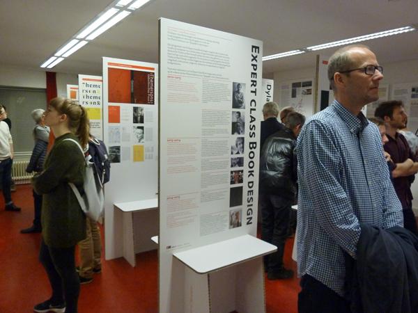
At this very moment the A0-sized panels for the upcoming Inside/Outside exhibition at Museum Plantin-Moretus (1 August till 26 September 2015) are printed by Agfa. Like at the former expo, projects of the Expert class Book design (EcBd) and Expert class Type design (EcTd) students of the Plantin Institute of Typography will be presented. The images below show some randomly picked panels produced by the EcTd students.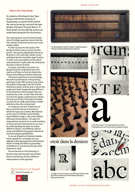
The EcTd course comprises ten sessions at the museum, roughly divided over three quarters of a year. During the first half of the course the students work together on a revival based on the marvelous historical material in the collection of the museum. This revival forms the basis for an intensive exchange of insights, perception, and technical know-how (of present-day digital matters and 18th-century foundry type related stuff) between the students.
The second half of the course is used by the students for the development of their own typeface projects. It is far from a prerequisite to make use of the collection of the Museum Plantin-Moretus for this. Nevertheless, it is very understandable that many students make use of the unique opportunity.

0 -
Thanks for sharing. I was willing visit the Plantin Moretus again and this is a good excuse to do it.1
-

One of the EcTd panels is dedicated to Lukas Schneider’s LS Cadencer and LS Cadenculator tools. Lukas graduated at KABK’s Type & Media before he attended the EcTd 2014–2015 course. The tools were developed during the latter and Lukas’s fellow students eagerly tested and applied them.
Lukas notes on the panel: ‘These two tools are (batch) fitting/autospacing tools written in Python, which can be used as extensions in the RoboFont editor. The underlying principle and algorithm find their origin in Frank E. Blokland’s PhD research on the (effects of) systematization, standardization, and unitization in Renaissance font production. With these tools the principles of spacing, applied in the production of printing types in the sixteenth century, are in a way transferred to our current digital technology of font design.
LS cadencer is basically meant for applying auto-spacing to fonts using an underlying grid for calculating side-bearings. This grid is flexible and dependent on the so called stem-interval. The width of the grid can be adjusted by the user to make the spacing wider or tighter. The LS Cadenculator, the second tool, reverse engineers in a way what LS Cadencer does.’
The tools will not only become available as extensions for RoboFont, but also for Glyphs. Shortly Lukas will start a dedicated topic on this forum. So, stay tuned!
3 -
Great news about LS Candenculator and LS Cadencer. Congratulations to Lukas!2
-


Every year Agfa kindly sponsors the production of the panels for the Inside/Outside exhibition. During the past weeks the panels were printed…
…and last Thursday they were delivered at the Museum Plantin-Moretus!
2 -
Pictures of the Inside/Outside 2015 exhibition:


3 -
Tomorrow the Inside/Outside 2014–2015 exhibition at the Museum Plantin-Moretus in Antwerp will enter its last week. On Saturday 26 September there will be the official finisage as part of the academic ceremony of the Plantin Institute of Typography at the museum. Already within two months the new 2015–2016 Expert classes for type and book design will start.
 0
0 -

The new edition of the Dutch magazine on graphic design Publish is available now! It contains a nice article by Henk W. Gianotten on the Expert class Type design (EcTd) and Book design (EcBd) courses of the Plantin Institute of Typography in Antwerp.
An exhibition of EcTd and EcBd students’ work will open at Museum Meermanno in The Hague coming month. In November also the new 2015–2016 expert courses will start. Registration is possible still.
3 -
Friday 6 November 2015 a small exhibition of results from the Expert classes Type design and Book design over the period 2011–2015 will open at the prestigious Museum Meermanno in The Hague.

Especially to celebrate this exhibition, the recent EcTd laureates have produced a booklet that will be presented at the opening. The publication mainly focuses on the students’ revival project for which type from the seventeenth-century punchcutter Jacques-François Rosart formed the basis.
Every year I am surprised by the willingness of the students to work together and the cohesion that develops between them. This cooperation is especially remarkable if one considers the different backgrounds of the students and their different nationalities. The EcTd laureates who made the booklet together come from Poland, Ireland, Germany, Italy, France, The Netherlands, and Belgium. The booklet is not just a presentation of the outcomes of the Rosart project; it is a concise but thorough manual and guide for everyone who wants to investigate historic type-foundry material, and anyone who wants to produce a revival.
1 -
Hello Frank,
Looks like nice and interesting work. A pity the samples are so small. Will the booklet be available for sale online? I would be interested in a copy.
0 -
Hi ybaggar,
The booklet will be available from DTL’s small online bookshop from next week on (€10 + €5 shipping).
F.
2 -
Great, looking forward to it!
Thank you Frank.
0 -

Everything is ready for the opening of the Expert classes Type design and Book design expo at Museum Meermanno in The Hague, the oldest museum of the book in the world.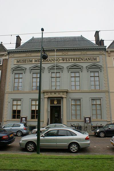
The building dates from 1712, which is two years before Rosart was born. What a perfect place to present a booklet on this punch cutter!

1 -
Last Friday the aforementioned EcTd/EcBd exhibition was opened at Museum Meermanno. An impression (photo’s by Marian Akkermans):


1 -
For those who are not familiar with the Expert class Type design (EcTd) course of the Plantin Institute of Typography: it comprises ten sessions (under the exquisite roof of the Museum Plantin-Moretus in Antwerp) during a period of roughly three quarters of a year. It is a tough study that requires a lot of hard work from the students in between the sessions.
Although as such it is not a master’s course, (laureates receive an official post-graduate certificate), the EcTd course provides a solid alternative for for instance those who don’t have the time nor the opportunity to follow the Type & Media (t]m) master’s course at the KABK, or the type course in Reading. In some cases students who successfully finished aforementioned master’s courses also join the EcTd; in the past years three type masters from Reading and one from t]m did this. Also the upcoming course will be joined by a t]m laureate.
On 18 November the Expert class Type design 2015–2016 course will start. Registering is possible until the end of this week still.
0 -
FYI: one of the typefaces shown at the expo has just been released by Fontsmith. You will find some info on the typeface and its origin at the bottom of the page. Additional information can be found here.
2 -
I can definitely recommend the course. An extraordinary place, nice people, good type and an outstanding teacher. Overall a great experience.3
-
@LeMo aka Frank E Blokland
FYI: one of the typefaces shown at the expo has just been released by Fontsmith. You will find some info on the typeface and its origin at the bottom of the page. Additional information can be found here.Wow is this the one that started from LeMo?
0 -
Yes, this typeface started with LeMo:

But if you refer to my talk in Dublin last Saturday, then I meant the typeface Joost Dekker made at the EcTd course:
0 -

Fernando Mello has been awarded the ‘Certificate of Excellence’ in the ‘Text’ category of the Tipos Latinos Biennial 2016 for his typeface FS Brabo. All of the projects that the jury selected will be exhibited in most of the Latin American countries later this year and next the expo will travel around the world.
5


Categories
- All Categories
- 47 Introductions
- 4K Typeface Design
- 493 Type Design Critiques
- 575 Type Design Software
- 1.1K Type Design Technique & Theory
- 669 Type Business
- 884 Font Technology
- 29 Punchcutting
- 537 Typography
- 124 Type Education
- 332 Type History
- 81 Type Resources
- 113 Lettering and Calligraphy
- 33 Lettering Critiques
- 80 Lettering Technique & Theory
- 569 Announcements
- 100 Events
- 116 Job Postings
- 170 Type Releases
- 182 Miscellaneous News
- 270 About TypeDrawers
- 54 TypeDrawers Announcements
- 114 Suggestions and Bug Reports