The LeMo Method


In line with my predecessor and tutor at the KABK, Gerrit Noordzij, I consider writing a good starting point for exploring matters like construction, contrast-sort, contrast-flow, and contrast. Translating handwriting into type is not very straightforward though. Despite the fact that they are trained to work directly from their own writings, students often start to define grids before drawing letters. And usually they look at existing typefaces for the ‘correct’ proportions. Obviously patterning is a requirement for designing type and it is difficult to distill these patterns from handwriting. Could it be possible that type also find its origin in patterning besides in writing, and that this even influenced writing after the invention of movable type?

There seems to be no Humanistic handwriting predating movable type that shows such a clear standardization as roman type. My measurements of incunabula seem to prove that character widths were standardized during the Renaissance. The written Textura Quadrata made it relatively easy for Gutenberg and consorts to standardize and systematize their movable Gothic type. When this was accomplished, it was obvious to apply the same system to the new roman type (and decades later to italic type). The clear morphological relationship between Textura and Humanistic Minuscule made this possible.

The underlying structure of Textura Quadrata and Humanistic Minuscule made an organic standardization of the handwritten models possible. It was there all the time, but it wasn’t necessary to capture it so literally before movable type was produced. Also side bearings were a natural extension of the handwritten model. This standardization is captured in the DTL LetterModel (LeMo) application.

Nowadays it is common practice to design characters first and subsequently apply side bearings. It’s quite plausible that during the early days of typography the proportions and widths of the characters were defined first and subsequently the details were adapted to the widths.
As mentioned, the step from handwriting to type design is difficult. Even for me as an experienced calligrapher. I set up a calligraphy course for the Dutch television and wrote a book for it end of the 1980s. Noordzij was very positive about it in Letterletter 12 (June 1991): ‘Frank Blokland has succeeded in bringing the literature on calligraphy on a higher level; his book makes better reading and is a more reliable guide than any other book on the subject.’
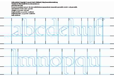
The question is, how to combine the outcomes of my measurements with calligraphy in type education. Well, one can make a template with LeMo, like this one for a Pilot Parallel Pen 6 mm. In case of a translation over 30º, the stem thickness is pen-width x sin 60º = 0.87. The x-height here is five times the stem thickness; approximating what I measured in Jenson’s type.

Next one can use the template for tracing with a broad nib, trying to apply subtle details. The outcome can be auto-traced and converted into a font. As mentioned, spacing is part of the system, so the letters should form words automatically.

This basis can be used for further formalization and refinement. For digital type it is not necessary to standardize widths, of course. This clearly is different from what IMHO was required in the practice of the Renaissance punch cutter.

Comments
-
Has anyone finished and released a typeface that begin in LeMo?0
-
Hi James, Dinah (Latin) began in LeM0.
To find out more check out: https://github.com/elms-/Dinah.
In my view, LeMo is a great tool for defining proportions.
What one does with the output can be varied. In this case, I printed the output
and then used it as a base to build design details (sketching over the output).
For reference, Fernando Mello a former Plantin-Society student (like myself) used LeMo as a basis for his EcTd project and he noted that LeMo was the foundation of his design. This design is to be published by Fontsmith Ltd in London.
1 -
To give you an idea of Fernando Mello’s project, I post here a couple of images and some text-excerpts from his panels for the recent EcTd expo in the Museum Plantin-Moretus.
‘The DTL LetterModeller was the real beginning of my practical design during the course, as I have defined main proportions (also the basic spacing) by going to LeMo, taking the ‘Renaissance’ preset with visible serifs as a starting point, and adjusting proportions and dimensions from there. After that a basic schematic font was exported from LeMo, and then imported into Fontlab. Modifications in spacing and general dimensions of the font were made as long as the design progressed, but the core essence of the dimensions and the broad-nibbed pen scheme generated through LeMo stayed through the whole design process like a skeleton.’
Starting the practical design (image above):
1. The original weight/proportion/spacing scheme originated through the customization of the ‘Renaissance’ preset in DTL LetterModeller.
2. The LeMo font data imported into Fontlab and being redrawn, maintaining general proportions and spacing.
3. First version of the lowercase set. 0
0 -

The past few days I found some spare time to transform the digitized handwritten letters into formal variants, using the original LeMo-based standardization. I tried to maintain the stem-interval and manipulated especially the lengths of the serifs to get an equilibrium of white space. This way for instance the n is measurably centered on its width; this preserves the equal distances between all stems. I believe that Jenson for this reason applied asymmetrical serifs to for instance the n. The o looks round, but is an ellipse and as wide as its handwritten origin.
For typesetting foundry type –specifically for the justification of lines– it is nice if the width of characters and spaces are defined in units. I applied here the most simple system, using the stem-thickness as value. The original spacing was just rounded to the grid.
The original character proportions are preserved here; the fitting becomes a bit tighter, but the word spaces in this case a bit wider (three units). So far in the whole process the character proportions and their widths were generated ‘artificially’.
Next one can double the grid for refinement.
And this process can be repeated.
A more refined grid also makes it possible to redefine the proportions of certain letters onto it. Here one enters the world of Kernagic, so that is another story.0 -
On 2 April 2014 I gave a related talk at the Libre Graphics Meeting 2014 in Leipzig. Not everything went smoothly: I had 55 slides squeezed in 20 minutes, and I encountered a fierce struggle with microphones. However, one get some idea of how Renaissance patterns can be applied for modern type design.0
-
I really like this. Both Mello's project and the vertical lines. To me it has a feeling of "rightness" in the rhythm.0
-
Yes, Mello's project is very pretty.
I also like aspects of Frank's proposition — especially that gorgeous /a! —, but I'm finding it difficult to focus on the rhythm due to a number of eye-catching features that strike me as unusual, such as the spur of the wide /e (especially where it collides with a following serif), the shallow /j, and the stratospheric tittles.0 -
What you consider unusual was quite normal during the Italian Renaissance. The dot on the i was generally small and Jenson shifted it together with all accents to the right to prevent collision with the terminals of f and long s. The j wasn’t used at that time and it’s simply a longer variant of the i. So, this is okay and an even longer variant is also okay.0
-
Frank, I am intrigued as well by your theory. But I was wondering if it works for all weights ? How would the rythm work in a bold or heavy weight, for example ?0
-
Hi Jacques,
Jenson and Griffo didn’t make any light, bold, condensed, or sans-serif variants of their archetypal romans. Nor did Garamont. These variants, which we are all used to nowadays, mainly date from the 19th-century, as you know. Making bold and condensed variants would have implied a lot of extra work for the early punch cutters, but was most probably never considered. Humanistic letters are supposed to be a reaction on the bold and condensed ones of the late Middle Ages.* But besides roman type, Gothic type was used during the Renaissance for liturgical works still. Jenson also cut Gothic type. Later Gothic type was basically used for display functions, i.e., as bold.
Bold variants can be made with LeMo, but what is generally considered ‘Black’ is usually outside the convention, because the space between the letters will become larger than within the counters and subsequently the stem-interval will be obstructed. And then LeMo will refuse to work. ;-)
With Kernagic basically the same table values can be used for the bold as for the regular weights. The distances between the stems become smaller and hence the units too. If I’ll find time tomorrow, I’ll gladly illustrate this.
* Leonard E. Boyle, ‘The Emergence of Gothic Handwriting’, Visible Language, Volume IV, Number 4, (1970) pp.307–316 (p.309)0 -
I am well aware that differations in weights like, Light, Bold etc. is a "modern" trend. I was wondering if, even if the balance of counter vs. stroke is different, it could be fitted in a rythm system as the one you are developping/studying ?1
-
You explained that the grid is (roughly) based on the stroke width. Did you find any clues in your studies on how they decided what stroke width (and weight !) to use ?1
-
Jacques: ‘Did you find any clues in your studies on how they decided what stroke width (and weight !) to use ?’
Calligraphers have the tendency to define the height of their letters by a number of pen-widths. Both Johnston and Noordzij describe the area covered by the hands from the Middle Ages and Renaissance between three and five times the pen-width. The weight increases if there is more black in relation to the white space. This is purely relative, because in absolute terms the strokes and the contrast remain the same, as you know.
Jenson’s type seems to fit almost in the five times pen-width = x-height model, but not completely; his letters are slightly bolder. As mentioned above, the 30-degrees angle results in a vertical stroke of 87% of the pen-width. It looks like Jenson defined the x-height of his roman as five times the vertical stroke-width instead of using the pen-width. This way his units are squares and otherwise would have been rectangles. This is also what I used for the LeMo template shown in the ‘LeMo Method’.
I think it’s plausible that these units were multifunctional. That they served a standardization of the design, a unitization for typesetting, and they could be well have been used for transfering larger-sized pen-based drawings, like shown above, to the punches.
‘I was wondering if, even if the balance of counter vs. stroke is different, it could be fitted in a rythm system as the one you are developping/studying ?’
The unit system shown in the first image is rather course and it only works well for letters that share the archetypal proportions, as captured in the default setting of LeMo. As soon as one changes these proportions, things become more complex. Van den Keere’s Canon Romain, which seems to share the proportions of VdK’s rotunda Canon d’Espaigne, is clearly outside the archetypal model for roman type.

The effect can be reproduced with LeMo by ‘stretching’ some letters and by leaving other ones unattached. The rhythmical pattern is obstructed and the original mechanism does not provide a correct spacing. So, one needs something different and I distilled a system from especially French Renaissance type in which the stem-interval is divided into what I named ‘cadence’ units. As a consequence the units are not by definition related anymore to the vertical stroke-width, and subsequently the system is more versatile. This forms the basis for Kernagic.
Do I have any documented proof for such a system? Well, Moxon’s units seems to fit the idea. Moxon showed in Mechanick Exercises a proprietary unit-arrangement system in which the em-square was divided into 42 units. His forenamed engraving of the ‘true Shape’ of Christopher van Dijck’s letters shows this division on an em that measures an inch. In his notes to the 1896 facsimile of Mechanick Exercises, Theodore De Vinne comes with a rather complex explanation of the origin of these units.* I have simply placed the grid from Moxon’s engravings on the ‘lower case’ letters. This seems to imply that the size of the ‘seven equal parts’, which he used for the division of the body, is defined by the proportions of the n (and m). Here Moxon divides the distance from stem to stem into 12 units.
As mentioned, this unitization forms the basis of Kernagic. To answer your question whether the system also can be used for type of which the relation between stem-interval and counter deviates from the archetypal pattern: yes! In case of (very) heavy weights the distance between the stems of the separate letters will presumably be larger than the stem-interval as defined above. In Kernagic the width of the distilled cadence-units can be made wider accordingly. This way (basically) the same table-units can be applied as for the regular weights. The system is comparable with an accordion. I will post examples a.s.a.p.
*Joseph Moxon (Theodore De Vinne, ed.), Mechanick Exercises (New York, 1896) pp.413,414
1 -
Thank you for the explanation.0
-
My apologies for the last image posted.
Here is a better view of Dinah (Latin) which began in LeM0.
To find out more check out: https://github.com/elms-/Dinah.
0 -
In Scribes and Sources (Boston, 1980) A.S. Osley presents an English translation of parts from Palatino’s writing-manual Libre nuovo d'imparare a scrivener from 1540. On page 95 Osley translates Palatino’s method for developing ‘a fine, firm, and steady hand’. This is sideways a bit related to the LeMo Method:
‘First, you must have a tablet of hard wood or copper, in which are cut, or rather hollowed out, all letters of the alphabet, made in their correct proportions with their basic elements, a little on the large side. Then take a stylus of tin, about the size of a small goose-quill, not hollow but completely solid as to give it weight and to leave your hand light and rapid when you stop using it. Cut this stylus to the ‘ploughshare’ shape as for a quill, though it is not necessary to slit the nib. Make your beginner move the end of the stylus repeatedly in the letters which have been hollowed out, starting each letter at the appropriate point, and continuing just as one does when writing with a pen. He should practice this way until he is certain that he can make the movements confidently without assistance. Then he begins to write on paper […]’
0 -
In the presented template for the LeMo Method a couple of letters are missing, for instance the k, s, and the v–z range. These letters have a different morphology, as they find their origin in the capitals. So, how to handle these, especially their widths?
The matrices of Robert Granjon’s Double Pica Roman or Gros-parangon in the collection of the Museum Plantin-Moretus (archived under ‘MA7’) provide a clue. These were used by former EcTd-student Nicolas Portnoï as basis for his great revival named Ascendonica (he made the photographs shown below). The matrices were clearly justified for casting with fixed registers. This was empirically tested at the Museum Plantin-Moretus early 2014.
 1
1 -
Frank, I'm always glad to see your postings on this subject, but I have to wonder: Why were these letters cast with such enormous sidebearings?0
-
The widths of the matrices were not fully used (I’m currently investigating whether copper bars with standardized widths were used for the production of matrices); with the registers the offset was determined. I made a simple diagram to explain this:

So for Granjon’s Double Pica Roman the register could for instance be set to result in the following (bit tight) side bearings:
And this is a matrix of the Double Pica Roman between the registers of a mould from Van den Keere: 1
1 -
Just noticed an error in the version of my diagram I posted: the nick was an indication of which way up the matrix was. The photo clearly shows that the spring is not kept in its place by the nick. Sorry about that.0
-
It stands to reason that copper bar stock of a uniform width was used for strikes of a certain size or range of sizes. That's the way one would buy it today and there's no reason to think it was ever otherwise. While I don't subscribe to Fred Smeijers's notion that strikes were made any which way, an allowance had to made for straightening to the baseline--especially with lowercase italics (and caps with no serifs at the base), whose angles were determined more by the justifier than they were by the punchcutter.1
-
Below you'll find the download addresses of the new DTL LetterModeller (code name ‘LeMousine’ ;-) edition. This contains a glyph editor now, but this works in one direction; it can only be used for a newly-generated LeMo glyph database (it can’t be re-opened). Also LeMo can export (currently unhinted) .otf and .ttf now, which makes it a nice tool for for instance pattern-testing. For hinting respectively the autohinter of the AFDKO or ttfautohint can be used (see the Read Me file), of course.

The glyph editor is identical to the one which is included in GlyphMaster, the new, enhanced successor of DTL FontMaster for Mac OS X, Windows, and Linux, which is currently under development at URW++ in Hamburg. This sophisticated editor basically requires quite a big screen for displaying all options.
BTW, the export of the UFO format is not perfect yet. The output will look good in older versions of FontForge, not so perfect in more recent versions of FF, distorted in Glyphs, and will make RoboFont probably crash. Alternatively one could use the .otf format for further editing in other font tools, of course.
http://www.fonttools.org/downloads/LEMO/LeMo_31_MAC.zip
http://www.fonttools.org/downloads/LEMO/LeMo_31_WIN.zip
http://www.fonttools.org/downloads/LEMO/LeMo_31_LIN.tgz
0 -
> The output will look good in older versions of FontForge
And how will it look with the current version?1 -
Adrien:
> The output will look good in older versions of FontForge, not so perfect in more recent versions of FF0 -
Irrespective of what I wrote earlier, the UFO-output actually looks good in the current
version of FontForge.

0 -
That's great to hear Frank, cheers.
(Thierry: I think he edited his post after I posted mine.)0 -
Those who get (one of) the following messages:
[NOTE] Export UFO failure : urw2ufo() failed with error code 101.
[ERROR] Export OTF failure : ConvertFromUrwFont() failed with error code 1.
are advised to select a .cha file in the LetterModeller Export Dialog first. You will find ‘DTL.cha’ in the install directory (together with the application).
0 -
I tried to maintain the stem-interval and manipulated especially the lengths of the serifs to get an equilibrium of white space. This way for instance the n is measurably centered on its width; this preserves the equal distances between all stems. I believe that Jenson for this reason applied asymmetrical serifs to for instance the n
Could you please elaborate what you mean here? I'm confused as to why the serif should become asymmetrical, how did it affect the width? I see the right serif is longer than the left and touches the right grid line, but could it also not be the same as the left?
I
 0
0 -
'm confused as to why the serif should become asymmetrical, how did it affect the width?
Present-day type designers will in most cases adjust the fitting/spacing to the design of the letters. And then they will focus on the equilibrium of white space:

If the n has symmetrical serifs, as shown in the image above, then as a consequence of the equilibrium of white space the right side bearing is closer to the stem then in case of the left side bearing. As a consequence the stem interval is a bit interrupted: the distance between to lowercase l’s will be less then between two lowercase i’s.

If one wants to preserve the stem interval, one has to place the n and the i in the center of their widths. So, not the space of the n is adjusted to the design, but the design of the n is adjusted to the space (which in cases of Jenson matches that of the b, d, h, o, p, q, u [and probably other letters too]). If one looks at Jenson’s famous roman type, then one will notice that the lengths of the serifs at the left are reduced and at at the right have been made longer in combination with an increased thickness. In the image above Adobe Jenson is shown. If one compares the length of the right serif with original prints from the 15th century, then the original serifs are even longer at the right. I think that it’s possible that Robert Slimbach reduced the length a bit because he didn’t take the stem interval into account. He spaced the type as we are used to today.
1 -
I recognize that this is an old thread, nevertheless: with respect to the blue outline templates above, I have the impression that they are produced directly in LeMo... but I cannot for the life of me figure out where the command to do that particular thing is....Am I mistaken about this? Having come up with some metrics, I am interested in producing 6mm pen templates so that I can experiment with designs....Any help would be appreciated!0


Categories
- All Categories
- 47 Introductions
- 4K Typeface Design
- 493 Type Design Critiques
- 575 Type Design Software
- 1.1K Type Design Technique & Theory
- 669 Type Business
- 884 Font Technology
- 29 Punchcutting
- 537 Typography
- 124 Type Education
- 332 Type History
- 81 Type Resources
- 113 Lettering and Calligraphy
- 33 Lettering Critiques
- 80 Lettering Technique & Theory
- 569 Announcements
- 100 Events
- 116 Job Postings
- 170 Type Releases
- 182 Miscellaneous News
- 270 About TypeDrawers
- 54 TypeDrawers Announcements
- 114 Suggestions and Bug Reports