Silvertype

Martin Silvertant
Posts: 166
I'm not sure this is the right category considering this is a logo and not strictly a typeface, but it's a logotype I'm designing with my Baran typeface (which is very far from finished) as starting point. Let me know if I ought to post this in a different category.
So I'm finally going to start selling some of my typefaces soon so I figured it might be a good idea to brand myself, particularly if I'm going to sell through MyFonts. Considering my last name is Silvertant I like the idea of calling my "foundry" Silvertype. Clear and simple. I usually like to involve some extra set of eyes as they always find kinks I missed. So feel free to give any criticism.
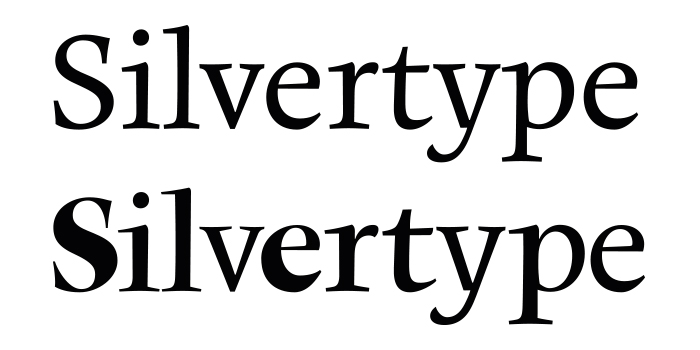
Here's an image of Baran and the beginning of the Silvertype logo:
Here's the initial logo as I posted it on Typophile for feedback:
The members of Typophile made me realize I was designing a typeface rather than a logo; for a logo I ought to make the spacing much more consistent, and they're absolutely right. Here I did some adjustments:
As you can see in the last image there are some wacky things going on. For example, I was compensating for the white space underneath /r's shoulder by extending the terminal downwards. Not great. I made a t_y ligature to make the spacing more consistent, though I'm not happy with it so I'm open to suggestions. I tried simply shortening the bar in /t but it looked awkward. I was also still finding ways to fix that very obtrusive y_p combination.
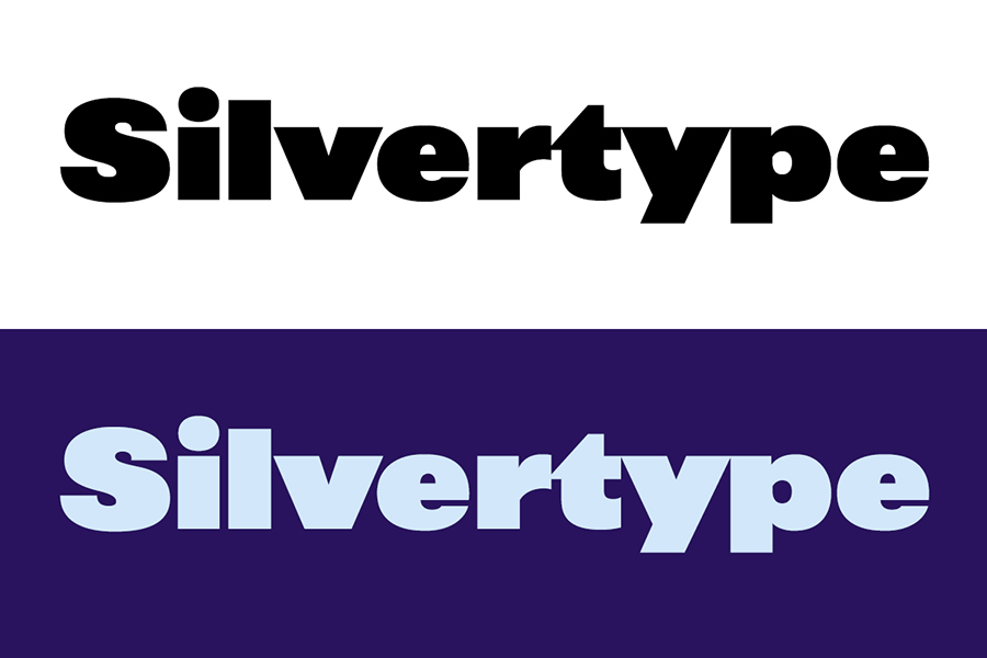
This is where I'm at now:
The ball terminal of /r is better, but I think I will make it more rounded again, somewhere between what I had in image 2 and the current one. I was subtly emulating the diamond shape of the tittle in image 3 but it doesn't look right. I'm also not happy about i_l connecting. Craig Eliason commented there's a disconnect between the sharpness of the corners in /S and the rounded right side of the head serifs. I wanted to play with this contrast between sharp and rounded forms.
Let me know what you think.
So I'm finally going to start selling some of my typefaces soon so I figured it might be a good idea to brand myself, particularly if I'm going to sell through MyFonts. Considering my last name is Silvertant I like the idea of calling my "foundry" Silvertype. Clear and simple. I usually like to involve some extra set of eyes as they always find kinks I missed. So feel free to give any criticism.
Here's an image of Baran and the beginning of the Silvertype logo:
Here's the initial logo as I posted it on Typophile for feedback:
The members of Typophile made me realize I was designing a typeface rather than a logo; for a logo I ought to make the spacing much more consistent, and they're absolutely right. Here I did some adjustments:
As you can see in the last image there are some wacky things going on. For example, I was compensating for the white space underneath /r's shoulder by extending the terminal downwards. Not great. I made a t_y ligature to make the spacing more consistent, though I'm not happy with it so I'm open to suggestions. I tried simply shortening the bar in /t but it looked awkward. I was also still finding ways to fix that very obtrusive y_p combination.
This is where I'm at now:
The ball terminal of /r is better, but I think I will make it more rounded again, somewhere between what I had in image 2 and the current one. I was subtly emulating the diamond shape of the tittle in image 3 but it doesn't look right. I'm also not happy about i_l connecting. Craig Eliason commented there's a disconnect between the sharpness of the corners in /S and the rounded right side of the head serifs. I wanted to play with this contrast between sharp and rounded forms.
Let me know what you think.
Tagged:
0
Comments
-
I moved this to the Lettering Critique category for you, Martin.0
-
First off, I wish you best of luck with selling your own fonts! Myfonts is becoming a stranger place every day. Secondly, I really like the brand, but maybe for a logo it could be more expressive. When you design mainly text fonts, that can be a hard shift to make, but to the untrained eye I fear this looks fairly boring. I'm not sure what you could do about that though, if anything at all. Terminal of y and bar in t could be larger, I think. Cheers!0
-
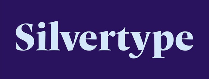
Martin, Baran looks fantastic and I notice that as the weight increases, for the logo, some complicated things begin to effect the kerning, /ver in particular. It also seems that, during the type's logoization, the serifs changed shape. The original serifs may actually be more conducive to the joins created by the letter collisions since they do not have the hard angles.
As far as the r goes, the blue version is the most pleasing to my eye. Adding weight and distortion is, I suppose, a method to strengthen the terminal which is quite a bit lighter than the stroke. Two ancillary approaches suggest themselves. You could lighten the stroke allowing the finial to determine its (the stroke's) maximum weight and you can also alter the angle of connection between the two elements thereby lessening the visual impact of a hairline join.
Generally speaking, in logos, the areas with ligatured joins should still have spacing consistent with unjoined letter pairs. Really though, this looks terrific.1 -
First off, I wish you best of luck with selling your own fonts! Myfonts is becoming a stranger place every day.
How is that?Secondly, I really like the brand, but maybe for a logo it could be more expressive. When you design mainly text fonts, that can be a hard shift to make, but to the untrained eye I fear this looks fairly boring.
Well, the idea was obviously to make a sober logo. Something along the lines of the logotypes by Commercial Type, and your logotype, but not quite as boring as those of Storm Type Foundry, Klim Type Foundry, Darden Studio, Suitcase Type Foundry etc. No disrespect to them; their logos work very well for them. Klim Type Foundry actually doesn't really have a logo and it works well for them as they bring all the focus to their typefaces. I don't plan on making my own website anytime soon though, so I couldn't get away with such approach now if I wanted to.
Anyway, I took the middle ground, but obviously I don't want to make a boring logotype. What would you suggest to make it more appealing? Making it a stencil seems to work for display typefaces but you and Commercial Type have already done that so I rather not do the same. I like logotypes involving scripts like Kostic and Suomi Type Foundry but that's also more or less a reflection of their portfolio of typefaces. I don't have any experience with designing script typefaces. I did some sketches with pencil and calligraphy pens but I got no new inspiration from it. When it comes to calligraphy I'm stuck in the same few letter models.Martin, Baran looks fantastic and I notice that as the weight increases, for the logo, some complicated things begin to effect the kerning
Would you suggest to keep the weight low or increase the spacing?It also seems that, during the type's logoization, the serifs changed shape. The original serifs may actually be more conducive to the joins created by the letter collisions since they do not have the hard angles.
I feel the sharper serifs and harder angles go with the display type. Would you rather see more rounded forms?Really though, this looks terrific.
Good or bad?0 -
Perhaps my Aghari typeface will make a better model for a logo as it has a more interesting texture, though I feel with a name like Silvertype it needs to look more refined, sharp and stylish; not organic like Aghari. Just as a tryout I used my Giltika typeface for a more commercial approach to the logo, but it's too playful for me.

 0
0 -
I wouldn't change that much. Terrific was positive I am sure. It looks great, honestly. I'd say keep it fat, keep it serif. Maybe you can do something catchy with the S? Replace the serif by a ball, or something like that just a little different. And the ball terminal in y could be fatter (or do something catchy with it)0
-
I'd also keep the first font choice. I'm not too fond of the color scheme, though; I'd prefer the black-on-white.0
-
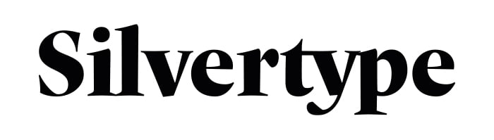
Actually I changed things a lot. I went through an extended period of continuous changes and now it's something very different, but I like it a lot. Here's the result:

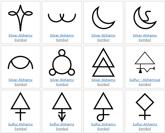
The symbol is derived from the alchemy symbol of silver. I would love to have utilized the periodic table but the symbol for silver is Ag from argentum. I'm quite certain I will use the period table concept at one point, but not for the logo as it would water down the brand.
Anyway, what do you think? Criticism is still welcome.0 -
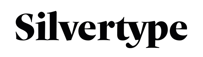
Nice! Take all this with plenty of salt:
-Top of S could be narrower
-the eye of e could be larger, especially for use at small sizes, or on screen
-terminal of r and y seem too small, but that could also be a feature. It's not overly disturbing
-bar of t could be thicker
And as far as the symbol goes, I would keep it simple. Most people won't get the reference to argentum, so the dots don't add that much IMO.1 -
The S I feel should be this wide at the top to get that kind of blocky appearance.
As for the eye of /e, I even think it could be a little bit smaller if I were to use it at this size. I designed it to work at a smaller size, but if I'm going to use it at an even smaller size than what I designed the current logo for, I will be sure to make an optical variant with bigger counters.
The terminal of /r is indeed too small, but I feel not obtrusively so. I consciously made it too small so I could bring the /t closer without sacrificing the shape of the terminal. As you see earlier in the process I tried to add more weight vertically because I didn't want to make such a wide /r but it just didn't look right. In the end I chose to value the rhythm and style of the logo higher than the aesthetics of individual letters. The terminal in /y is equally too small, firstly to match the terminal in /r and secondly because I don't want to bring the tail too close to /t. I had a wider and bigger tail before but it looked too cramped together. When bringing the tail closer to /t, the t_y part looks beautiful but it shifts the weight to that area and emphasizes the gap in /y_p. I might make the terminal of /y a bit bigger actually, as I don't necessarily need to bring the tail much closer to /t to give the terminal more weight.
This is off topic but I wanted to say it anyway. Yesterday I learned that in an early type by Bodoni he made the teardrop terminal in /f a lot bigger than the other terminals to emphasize the ascending parts that differentiate /f from /t. Now, there are very different considerations between a typeface and a logo, but I find it very interesting that while I learned the importance of consistency and distribution of weight, when you've achieved a certain level of experience and knowledge it may be fruitful to consciously stray away from that principle somewhat and bring emphasis or contrast where you feel fit. I'm not comfortable doing that quite yet, but I can already see in some of my book typefaces that there is a higher consideration of style and function over consistency.
The crossbar of /t was thicker before but I decreased it to match the sharpness of the serifs. I failed to see however that it doesn't match the thin strokes in /S. I think the thickness of the crossbar should probably be a bit thicker so it works in combination with both these aspects.
As for the symbol, I liked the idea of using the dots for an interactive element, such as a different hover state when you put your cursor on the logo. It's certainly not a strong reference to silver, but I feel none of the symbols for silver are. I forgot to show you the other options: files.abovetopsecret.com/images/member/2512f83e7980.png. With the symbol I didn't think it was necessarily relevant to make a strong reference to silver as long as the concept around it is consistent. Considering my name I think I should definitely do something with the elements and possibly use the periodic table to present OT features or typefaces. The symbol is simple and it makes me think of physics, which I like as well considering physics, astronomy and cosmology are big interests of mine.
On Typophile it has been suggested to me that the first symbol would make a nice typographic element but it just brings up the wrong associations. It makes me think of ovaries and spirituality.0


Categories
- All Categories
- 47 Introductions
- 4K Typeface Design
- 493 Type Design Critiques
- 576 Type Design Software
- 1.1K Type Design Technique & Theory
- 669 Type Business
- 884 Font Technology
- 29 Punchcutting
- 537 Typography
- 124 Type Education
- 332 Type History
- 81 Type Resources
- 113 Lettering and Calligraphy
- 33 Lettering Critiques
- 80 Lettering Technique & Theory
- 569 Announcements
- 100 Events
- 116 Job Postings
- 170 Type Releases
- 182 Miscellaneous News
- 270 About TypeDrawers
- 54 TypeDrawers Announcements
- 114 Suggestions and Bug Reports