How is the Walt Disney Logo drawn or constructed?

Alexis Samson
Posts: 11
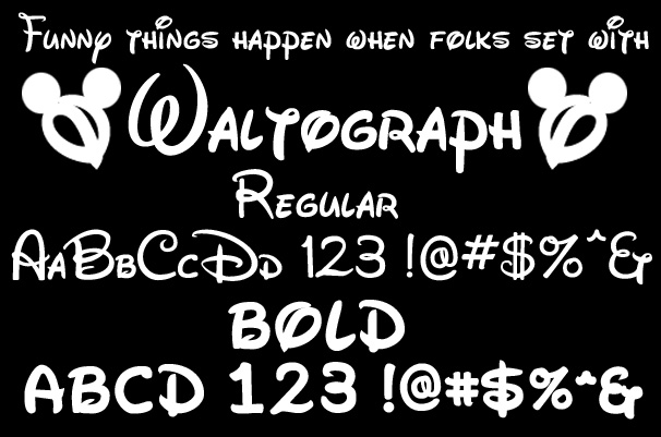
I'd like to design my own Walt Disney logo font, I have seen what currently exists but I don't really like these, for example:

I'm hoping to stay accurate to the logo with the drawing instruments; would anyone kindly be able to offer some insight into the method of drawing this logo may have used, i.e. kind of pen or brush?


I'm hoping to stay accurate to the logo with the drawing instruments; would anyone kindly be able to offer some insight into the method of drawing this logo may have used, i.e. kind of pen or brush?

Tagged:
0
Comments
-
I experimented with this idea few years ago. Seems like a watercolor brush. Be careful when choosing a name for it.0
-
Thanks Ray, did you ever publish your results anywhere? Also would it be a brush with a wide flat, slanted or pointy tip? It doesn't look consistent to me – though I've had little experience with water-colour brushes.0
-
My guess would be that the original signature was written with a fountain pen, normal for that era, then it was copied with a Lucie [projector] and enlarged and traced by hand. Originally copied, probably using animation ink, which writes on clear film. This was the way animation worked years ago. You drew pencil sketches, then traced each cell by hand on clear film in black. It was later filled in color, registered and single-frame shot on motion picture film. Over the years, one of these was scanned into the digital era and probably redrawn in a vector art program like AI.
Disney was an animation guy, he could draw. I don't know what you are looking for but why don't you just draw it as you see it in whatever tools you are comfortable with? After that, you can redraw it in a font software of your choice. I assume drawing letters is what you want to do? There is no big secret other than learning to draw.
Are you just doing this for yourself? I don't see a big market for it so I just wondered what your intent was?0 -
It was something experimented with at Sheridan (animation college). I was working on a parody but I didn't keep any of it. I had to cut them all out, Uhu stick 'em and hand trace them on the lazy lucy. The re-ink, then throw them in the trash because I had a better idea for a project.
But getting the Disney lettering isn't that hard. To be clear, the logo isn't based on Walt's actual signature. His real signature is unreadable. It's based on Walt's publicity signature which evolved over the years.
His 20's signature doesn't look like his signature from the 60's. It changed over time. Some people think he didn't actually write the signature that was used for the logo, but if you look at his actual brush signatures, it's very similar.
He printed his name quite a bit and that evolved over time too. He used the printed signature for signing publicity cels. It's similar to the Disney logo but the letterforms are less cursive.
That's three different signature types each evolving over decades.
As for the rumors that he had an animator design the logo, I doubt it. If you look at his actual brush signatures, there's no reason the Disney logo wouldn't have been based on one of Walt's actual brush publicity signatures. But maybe someone else did it. I'm sure it was traced off countless times and touched up but I think that's probably his brush. But you never know. Disney animators wound up with a similar drawing style from years of sitting at a desk at the same angle, drawing from the same model sheets, trying to make their style conform to everyone else's. But it looks just like something Walt could have written.
The Disney logo was based on Walt's brush signature. I've seen Walt's fountain pen signatures and the thick & thin is very different. The bottom of the L and E give it away; that thickness is caused by the brush going sideways.
In pencil, plan the letterforms. Not the thick/thin, just plan the shapes of the letters so it looks Disneyesque. I just drew them really small on foolscap. Use a watercolor brush and ink to write Disney over and over. You'll find out quickly that there's an ideal position for your arm and and ideal brush angle. You'll know when you hit it because it'll look ... like Disney.
2 -
Very good observations, Ray. Disney was often photographed with Sheaffer fountain pens, but for this logo, whether drawn by Disney or someone in the studio imitating his hand, the tool of choice would have been the Speedball dip pens, manufactured by the C. Howard Hunt Pen Company. These were ubiquitous in America during this period, and still very much available. Pens of this kind were made by manufacturers around the world.0
-
I'm sure he would have used a nib sometimes, but I'm pretty sure the logo signature was based on one of his brush signatures. His pen signatures didn't have the fat bottom on the L and E. The stroke ends are consistent with a brush held on an angle, not a nib. If you look at his signatures the difference between nib and brush is very clear.0
-
I agree with Ray, it looks like a brush to me too.
Although someone skilled as Michael Clark can manipulate a Speedball pen to look like a brush
http://www.myfonts.com/fonts/ihof/p22-pooper-black-pro/
http://www.myfonts.com/fonts/ihof/p22-sneaky-pro/
http://www.myfonts.com/fonts/ihof/p22-shibumi/0 -
I doubt very much this was done with a D or a B Speedball. Most likely Ray is right on the money… but I did send an e-mail to Louis Lemoine at Disney. If anyone knows, he will. Thanks Pablo for your kind words.0
-
Happy to be corrected on this--and eager to hear what the man at Disney has to say.0
-
The consensus, been batted around for many years, is that it is drawn… the brush being the go to tool. It does have the feel of a brush… sometimes "en pointe" and at others on its side.0
-
This one, http://disneyexaminer.com/wp-content/uploads/2013/04/walt-disney-animation-studios-logo.jpg , may be a bit more telling?1
-
The logo itself may be a post-production creation using a wash (remember at that point in time the use of overlays to expose a "textured background" was common) to give it an "original feel" but the tool there appears to be a brush. Of course this is all speculation and we will probably never know.0
-
It is Threads like this one why I love TypeDrawers. Where else can you find this level of geeking out over such niche interests? Thanks everyone!1
-
I am thoroughly enjoying threads like these
 Thanks for the insight guys. I am learning a lot. 0
Categories
- All Categories
- 46 Introductions
- 3.9K Typeface Design
- 489 Type Design Critiques
- 572 Type Design Software
- 1.1K Type Design Technique & Theory
- 663 Type Business
- 875 Font Technology
- 29 Punchcutting
- 529 Typography
- 121 Type Education
- 328 Type History
- 80 Type Resources
- 111 Lettering and Calligraphy
- 32 Lettering Critiques
- 79 Lettering Technique & Theory
- 561 Announcements
- 96 Events
- 116 Job Postings
- 169 Type Releases
- 179 Miscellaneous News
- 269 About TypeDrawers
- 53 TypeDrawers Announcements
- 114 Suggestions and Bug Reports


