Autokerner: free spacing and kerning for FontLab 8, all masters in one run

Hi all,
I'd like to share Autokerner, a free, open-source (MIT) script for FontLab 8. It sets the sidebearings, the word space and the kerning (classes plus exception pairs) of a whole font, on every master at once, with one set of kerning classes shared by all masters, as a variable font needs. Nothing is written until you have seen the result and pressed Apply. After writing, the script reads the font back and checks it against the calculation, and Revert undoes the write.
The same calculation also runs in the browser for static TTF, OTF, WOFF and WOFF2 files; more on that below.
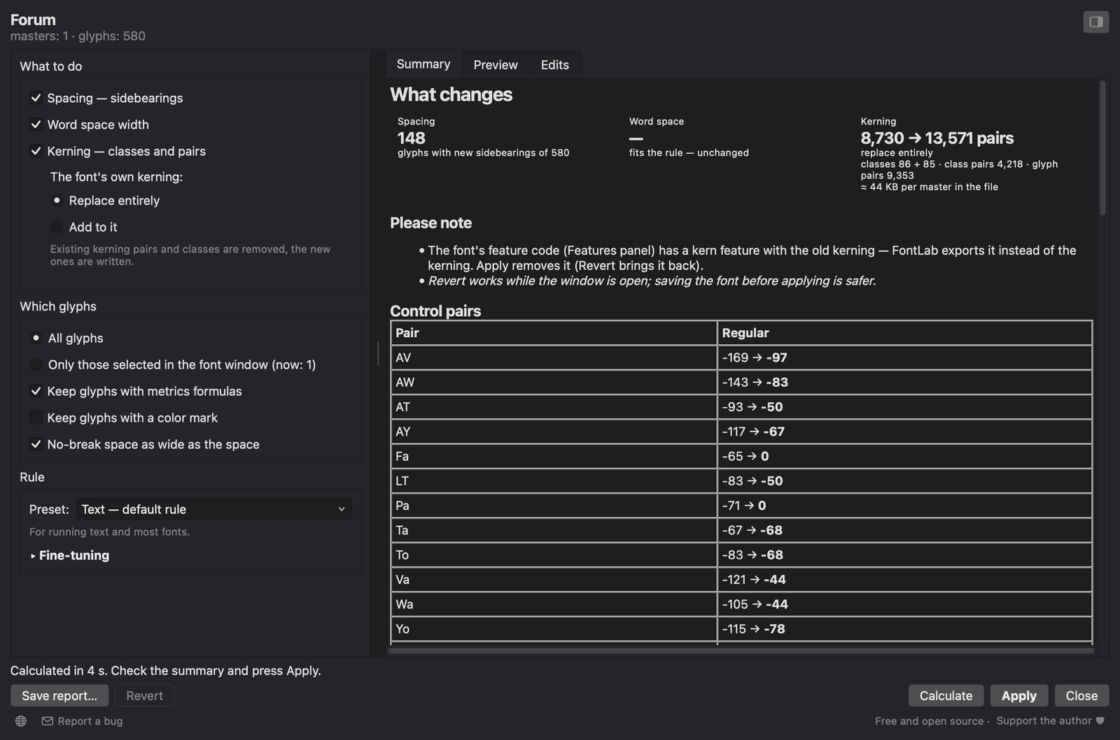
The window next to the font: settings on the left, results on the right. Forum Regular, 580 glyphs, calculated in 4 seconds.
What it does
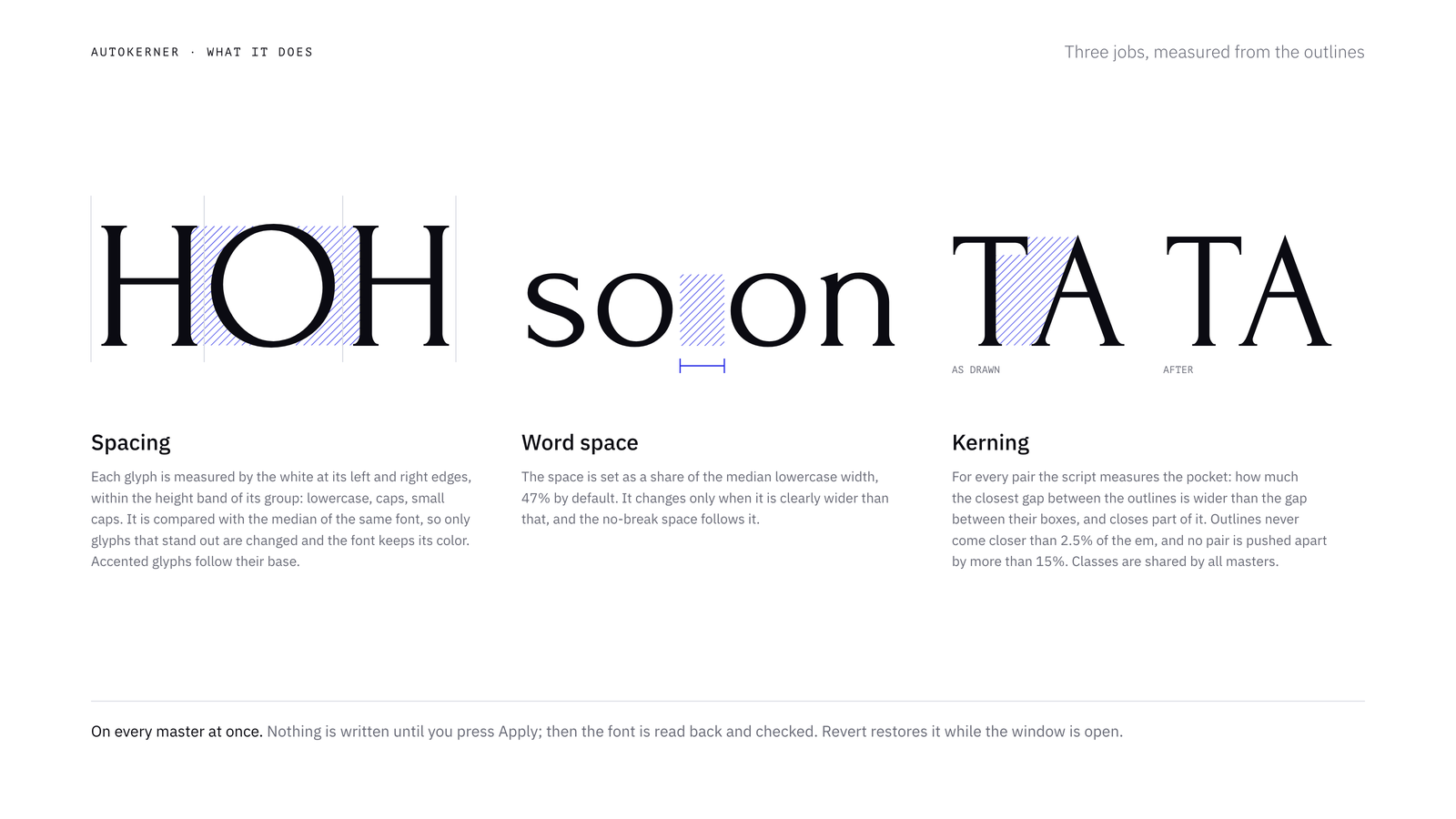
Spacing. Each glyph is measured by the area of white at its left and right edges, within the height band of its group (lowercase, caps, small caps), with the depth of the counted white limited to 7% of the em. This is the area method known from HT Letterspacer. The result is compared with the median of the same font, so only glyphs that stand out from their own family are changed (by default, when a sidebearing is off by more than 12/1000 em), and the font keeps its overall color. Accented letters follow their base letter, composites move with their base, and punctuation is spaced against the stem of a straight letter.
Word space. The target is 47% of the median lowercase width. A space that is much wider than that is narrowed to the edge of the tolerance (or, if you choose, all the way to the target), and the no-break space follows it.
Kerning. For every pair the script measures the pocket: how much wider the closest gap between the two outlines (including the shadow of overhangs) is than the gap between their bounding boxes. A share of the pocket is closed: 45% for letters, 40% for low punctuation (period, comma), 48% for high marks (quotes) and 32% for middle ones (hyphen, dashes). The Strength setting scales all of them. Pockets no deeper than the font's usual one (the median of model pairs such as HO and no) are left alone. Outlines never come closer than 2.5% of the em, and no pair is pushed apart by more than 15% of the em.
A few cases are handled separately. Figures never run into each other across , . : (7,4 · 3.5 · 12:30). A quote and a comma are not moved under each other. Combining marks, spacing accents and the underscore are not kerned, since they never stand next to letters in text.
All n × n pairs are measured on every master. The pairs are then grouped into classes by their values (one set of classes for all masters, values per master, class precision 10/1000 em), and pairs that don't fit their class are written by name, up to 12,000 by default.
The rules are ported to Python from another program of mine. With the window's corrections switched off, the results match it to the unit on the test fonts, including a variable font with nine masters.
How to use it
- Put
Autokerner.pyinto the FontLab 8 scripts folder (macOS:~/Library/Application Support/FontLab/FontLab 8/Scripts, Windows:%APPDATA%\FontLab\FontLab 8\Scripts) and choose Scripts → Refresh Scripts. - Open a font and choose Scripts → Autokerner. The window floats next to the font like FontLab's own panels, so you can select glyphs in the font window and calculate again.
- Tick what to do and which glyphs, pick a preset and press Calculate.
- Check the Summary, Preview and Edits tabs, and untick anything you don't want.
- Press Apply. Revert undoes the write while the window is open.
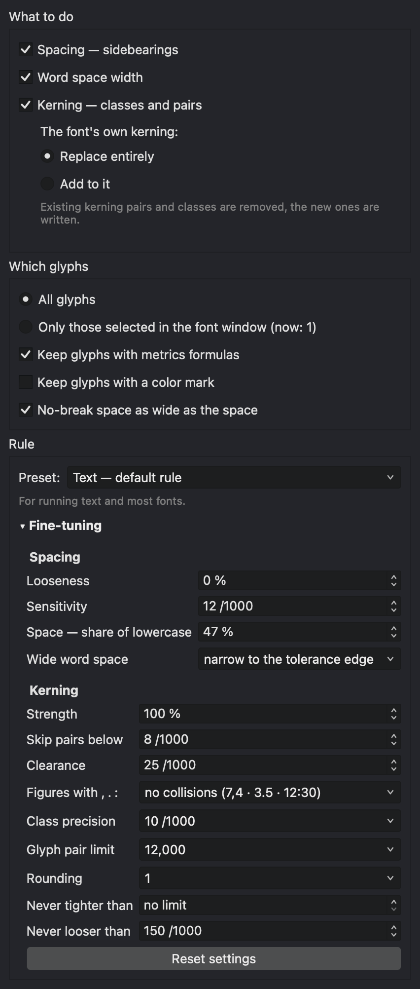
The left column with Fine-tuning unfolded.
- What to do: spacing, word space, kerning. Kerning can replace the font's own kerning or add to it: your pairs and classes stay, and only the pairs you don't have are added, as glyph pairs.
- Which glyphs: all, or only those selected in the font window. Glyphs with metrics formulas (
=H) or a color mark can be kept as they are. The no-break space can follow the word space. - Masters (multi-master fonts): which masters to calculate and write.
- Rule: three presets. Text is the default. Display sets spacing −8%, kerning strength 120%, clearance 15, threshold 5, finer classes and no pair limit. Light kerning sets strength 80%, threshold 15, class precision 20, values in steps of 5 and up to 3,000 glyph pairs, for small web fonts. Under Fine-tuning you can set looseness, sensitivity, the word space share and how far a too wide space is narrowed; for kerning, strength, threshold, clearance, figures with
, . :, class precision, the glyph pair limit, rounding, and the strongest and loosest allowed pair.
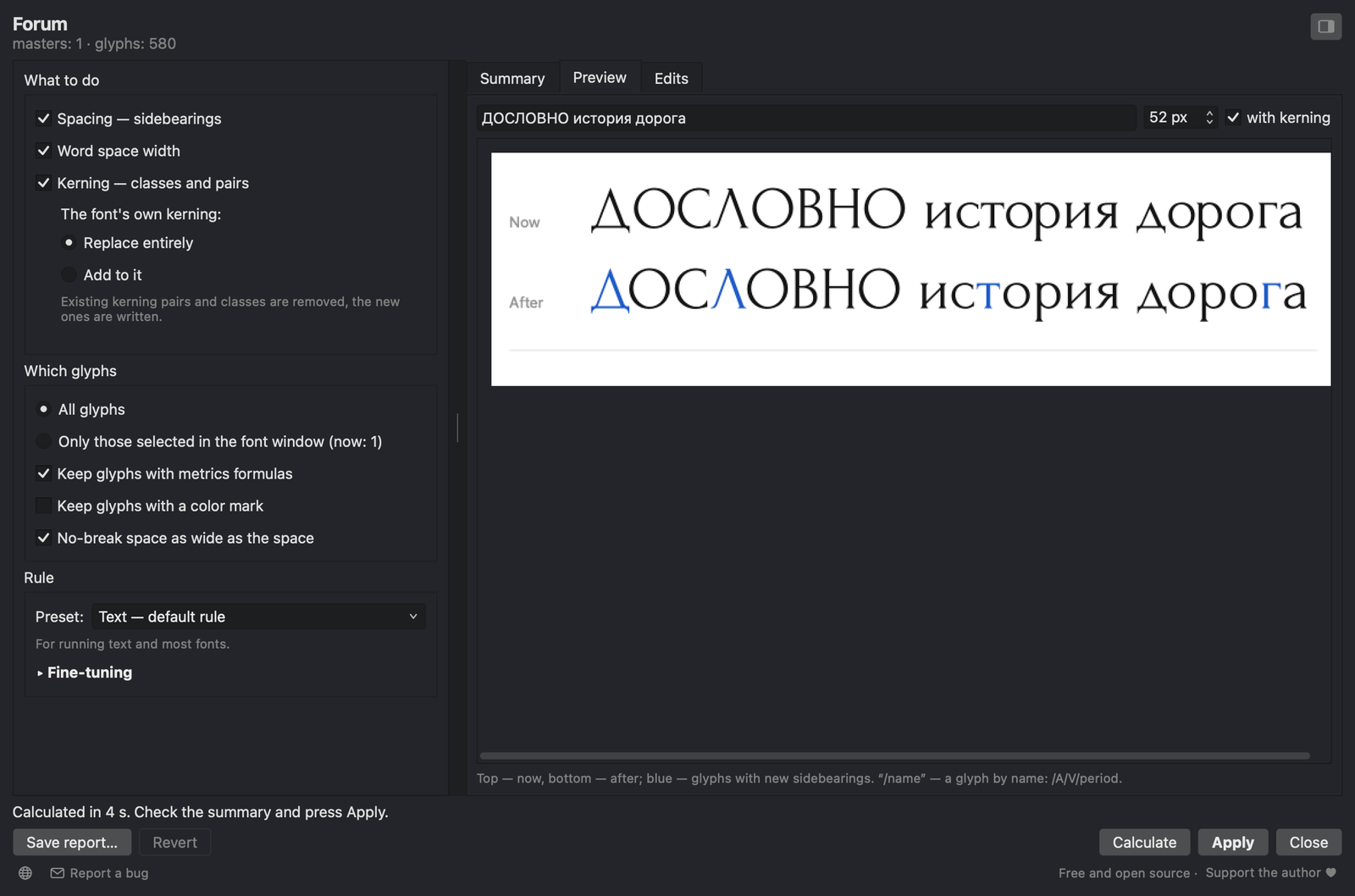
Preview: your own text set with the font as it is (top) and after Apply (bottom). Glyphs with new sidebearings are blue. /name inserts a glyph by name.
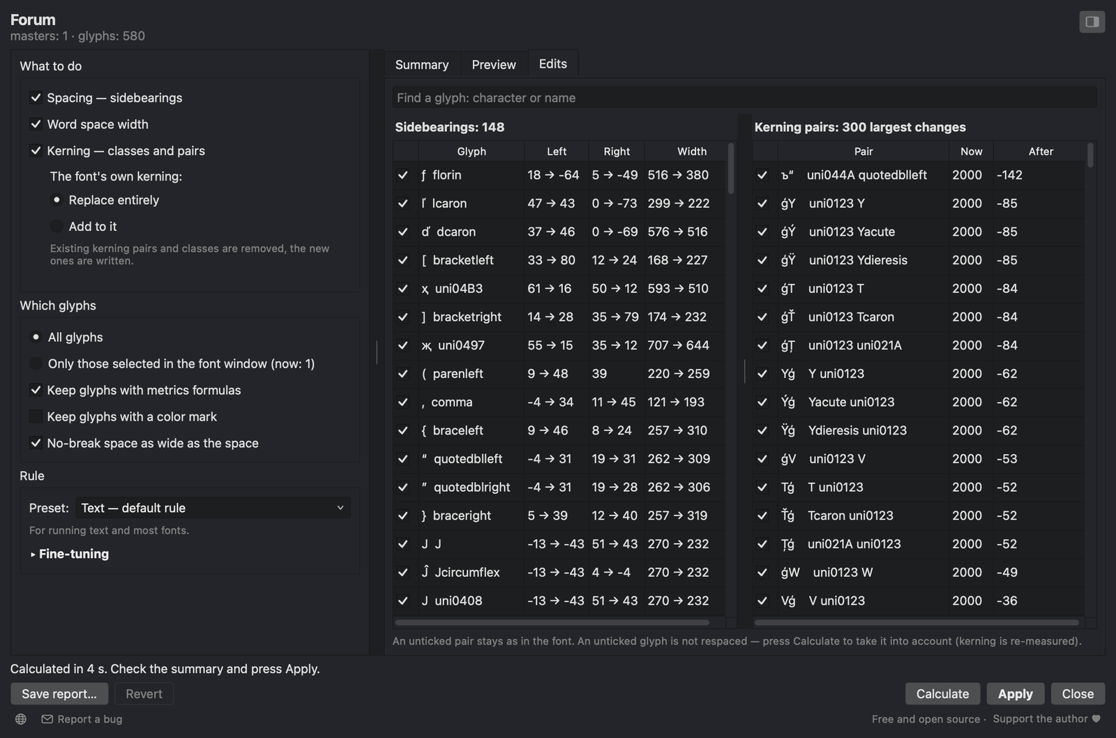
Edits: every respaced glyph and the 300 largest kerning changes. Searching by character or glyph name lists all pairs of a glyph. An unticked glyph is not respaced; an unticked pair stays as it is in the font. The top of the list here is a flaw in Forum itself: 54 broken pairs of 32,767 units in its GPOS, which FontLab reads as 2,000. The run replaces them.
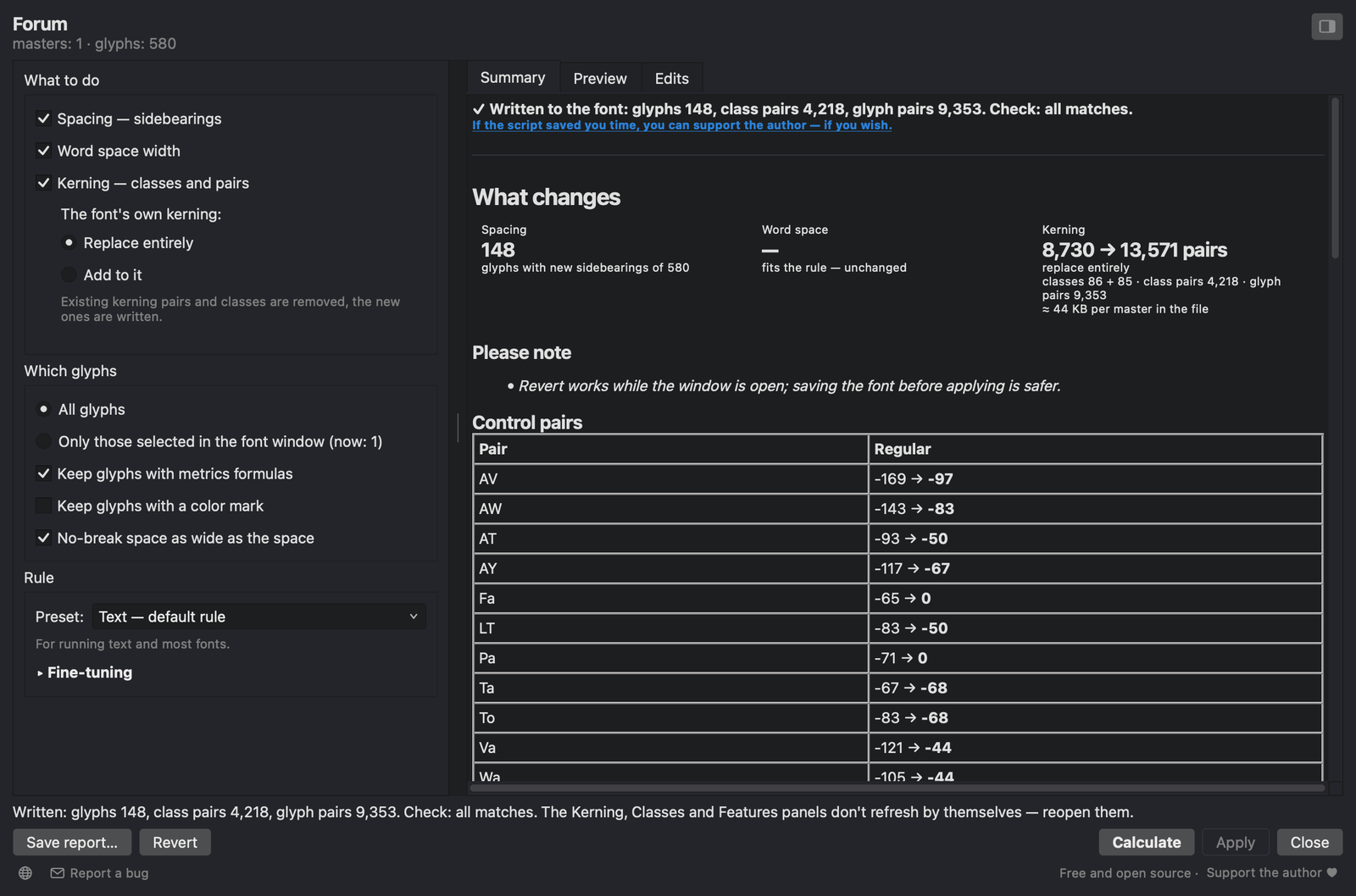
After Apply the font is read back and compared with the calculation. The status line says what was written and whether everything matches.
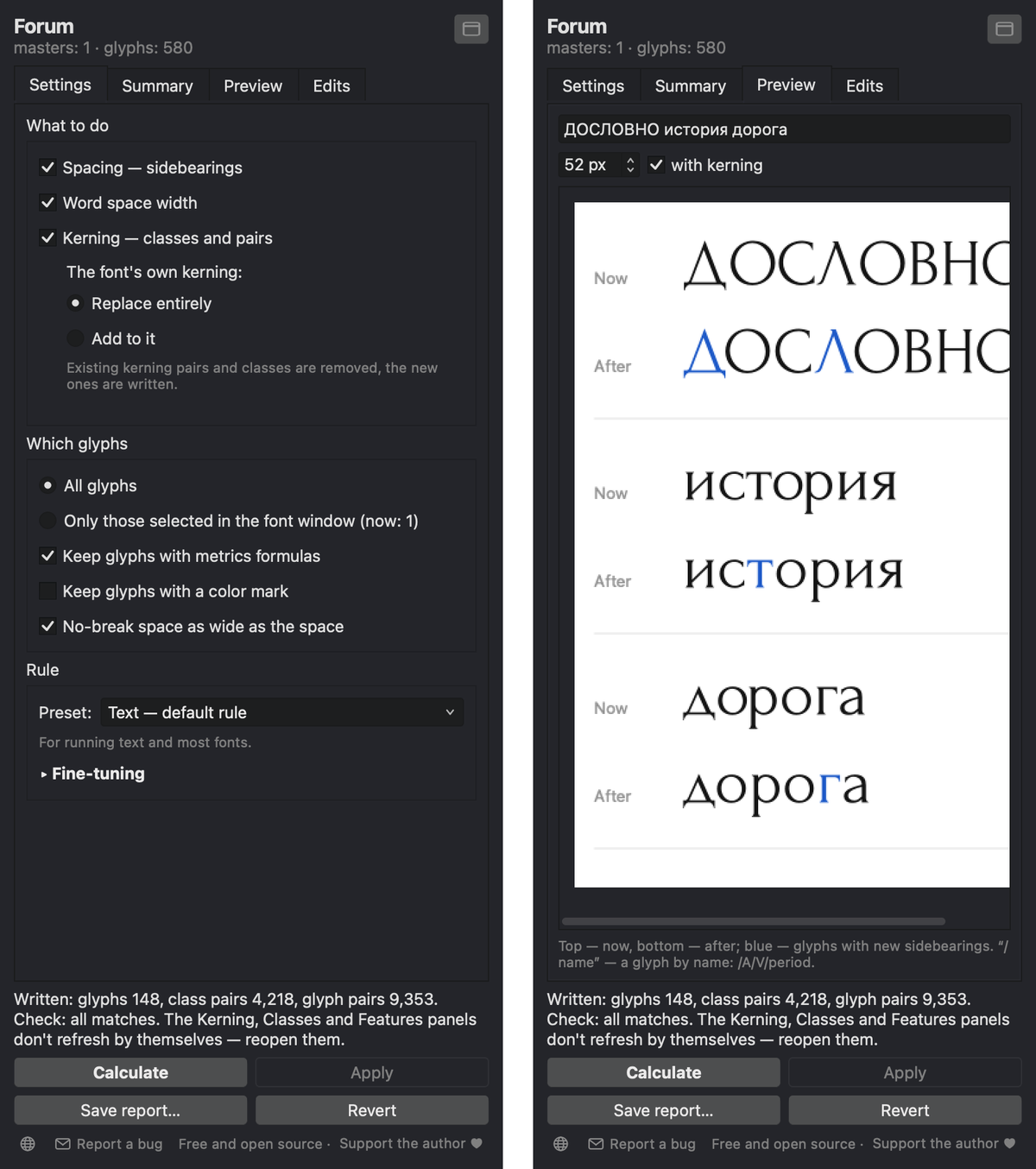
The same window as a narrow full-height panel. Switch with the button in the corner, or drag the window to the edge of the font window or a panel column, where it snaps.
Save report… writes an HTML summary, the sidebearing changes as CSV and the kerning of every master as .fea.
Results on real fonts
To show what a run does, I measured the white between letters before and after, and compared each pair with how widely used typefaces set the same pair: the median of ten typefaces for Latin, and of the four of them that have Cyrillic for Cyrillic. This check is independent of the script. Autokerner itself only compares a font with its own median.
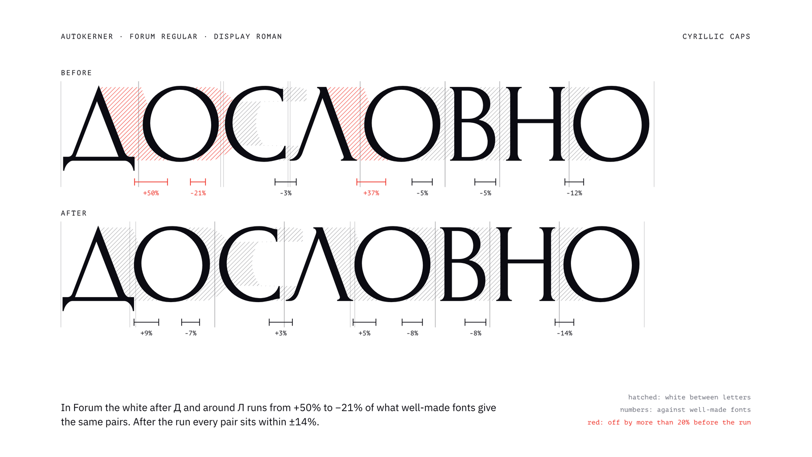
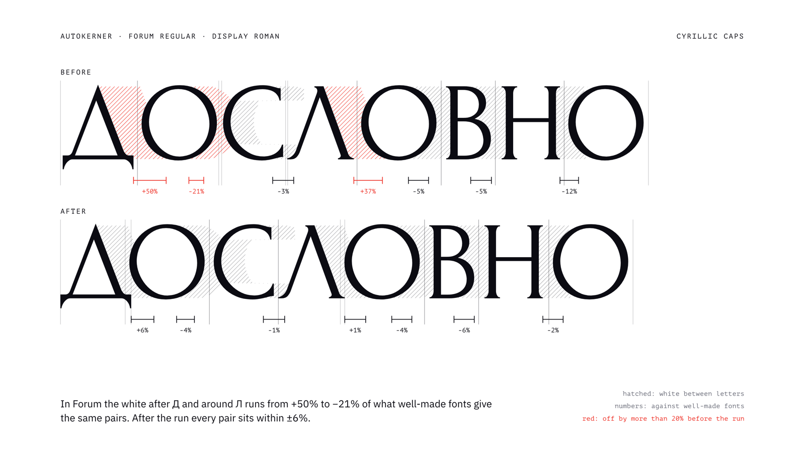
Forum, Cyrillic caps. Before, the white after Д and around Л ranges from +50% to −21%; after, every pair is within ±14%.
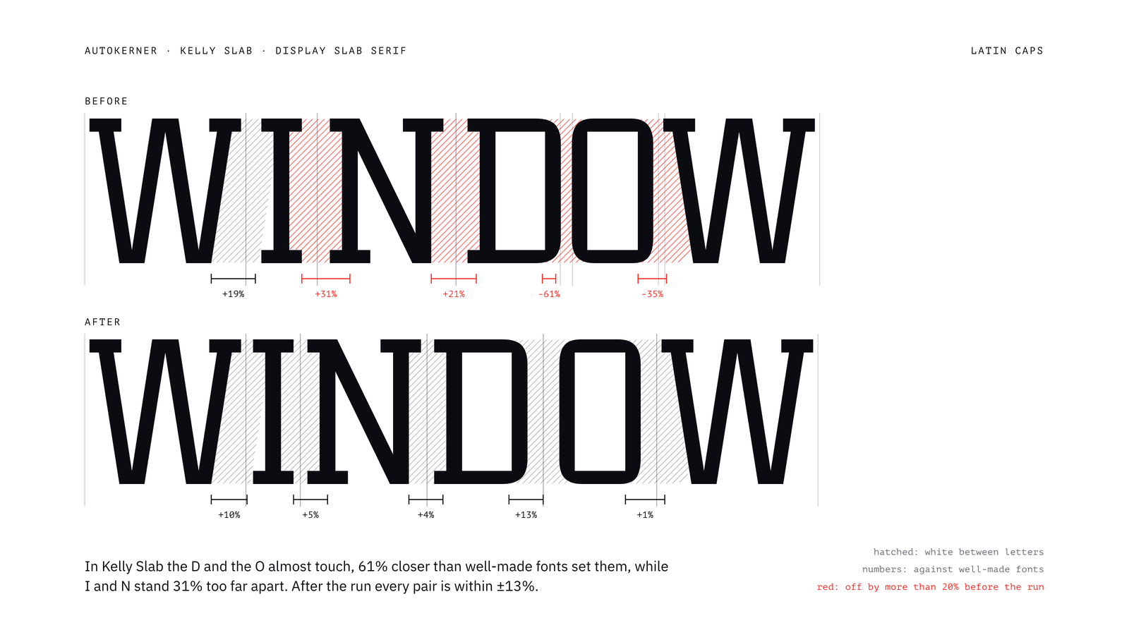
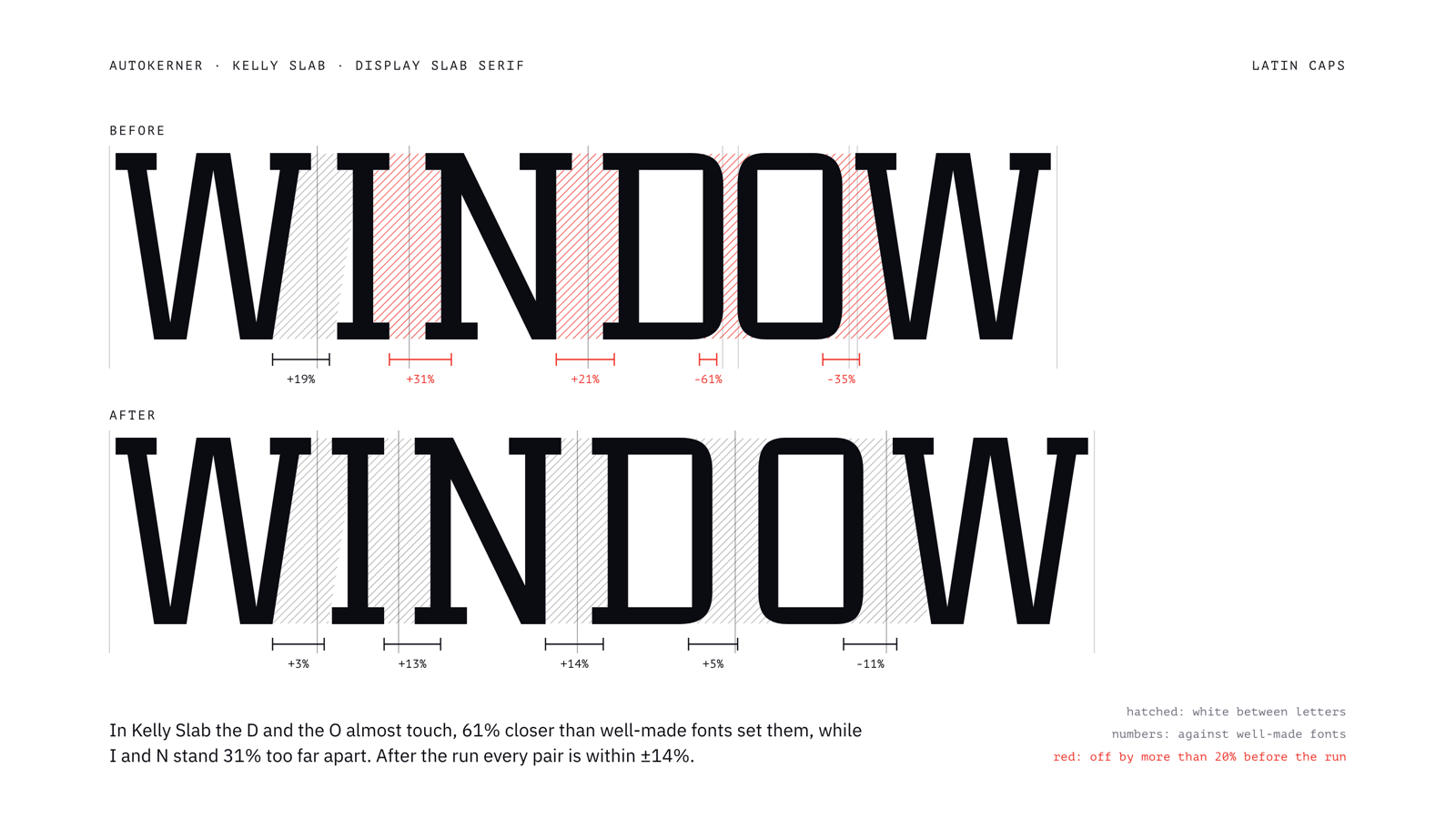
Kelly Slab, Latin caps. D and O almost touch (−61%), while I and N stand 31% too far apart; after, every pair is within ±13%.
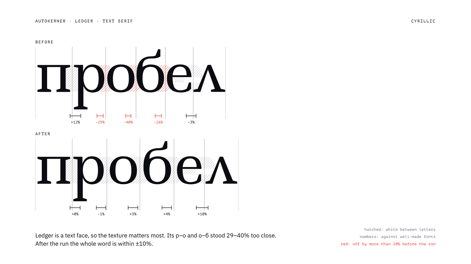
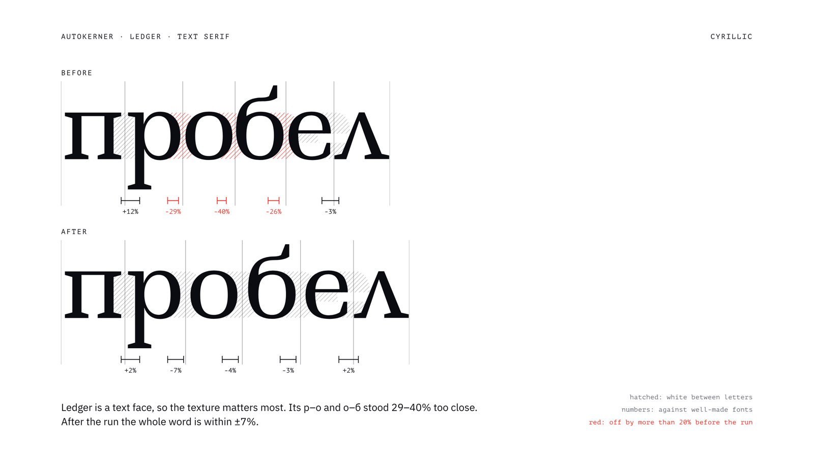
Ledger, a text face, Cyrillic lowercase. р–о and о–б were 29–40% too close; after, the whole word is within ±10%.
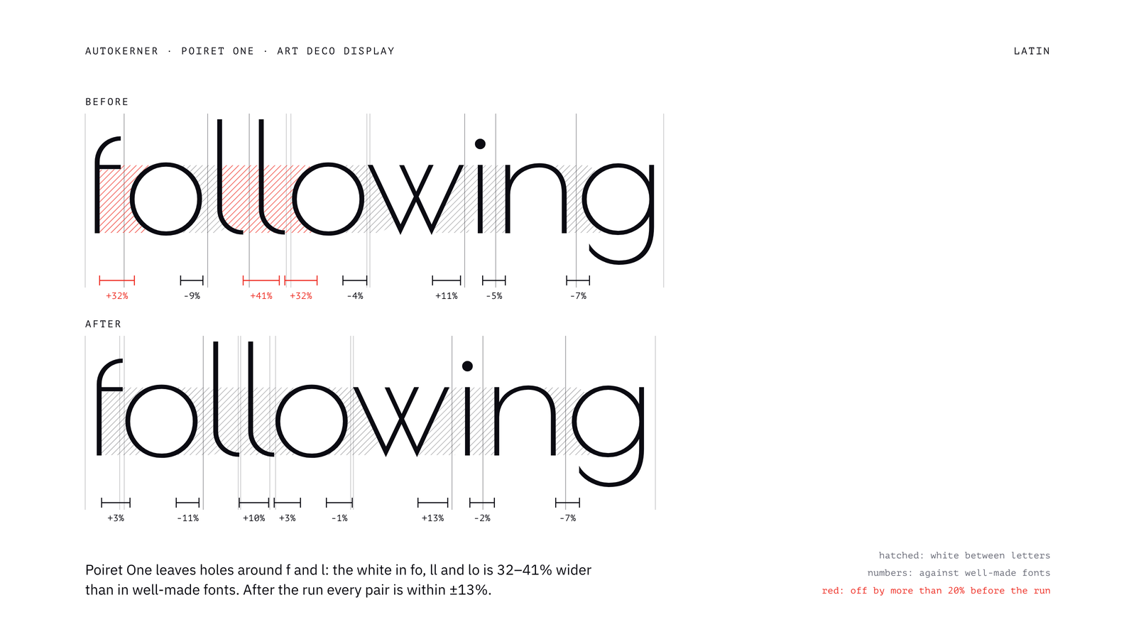
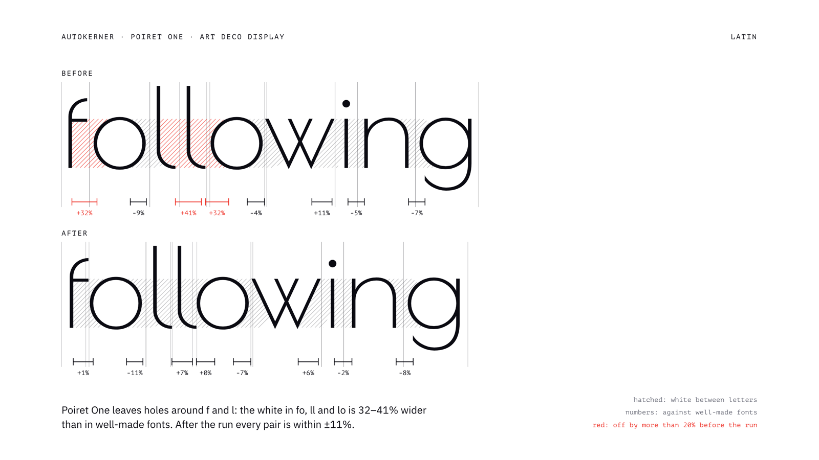
Poiret One, Latin lowercase. Holes around f and l: fo, ll and lo had 32–41% too much white; after, every pair is within ±13%.
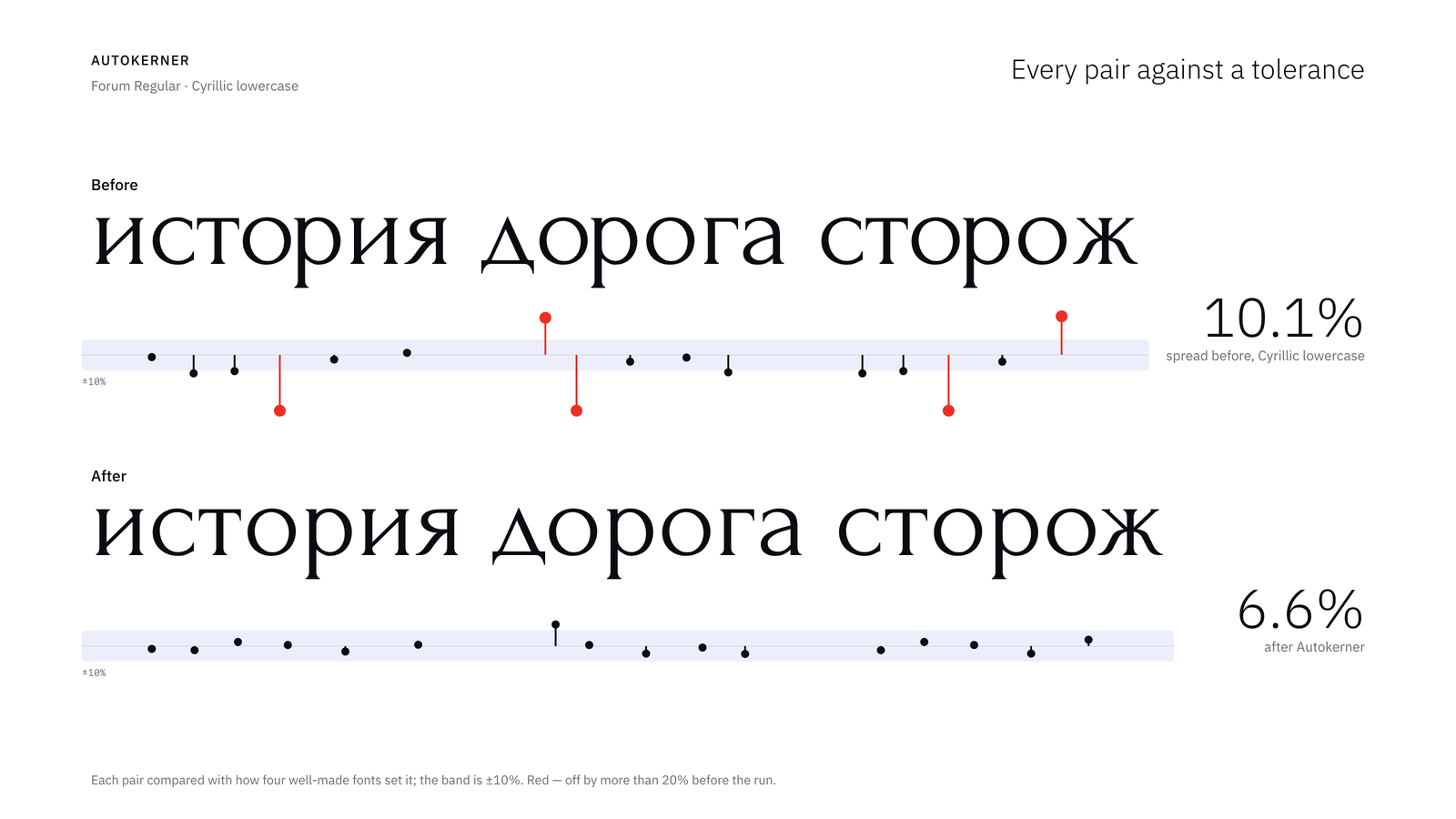
Every pair of a line against a ±10% band. Over the 160 most frequent Cyrillic lowercase pairs of Forum, the weighted spread drops from 10.1% to 6.6%.
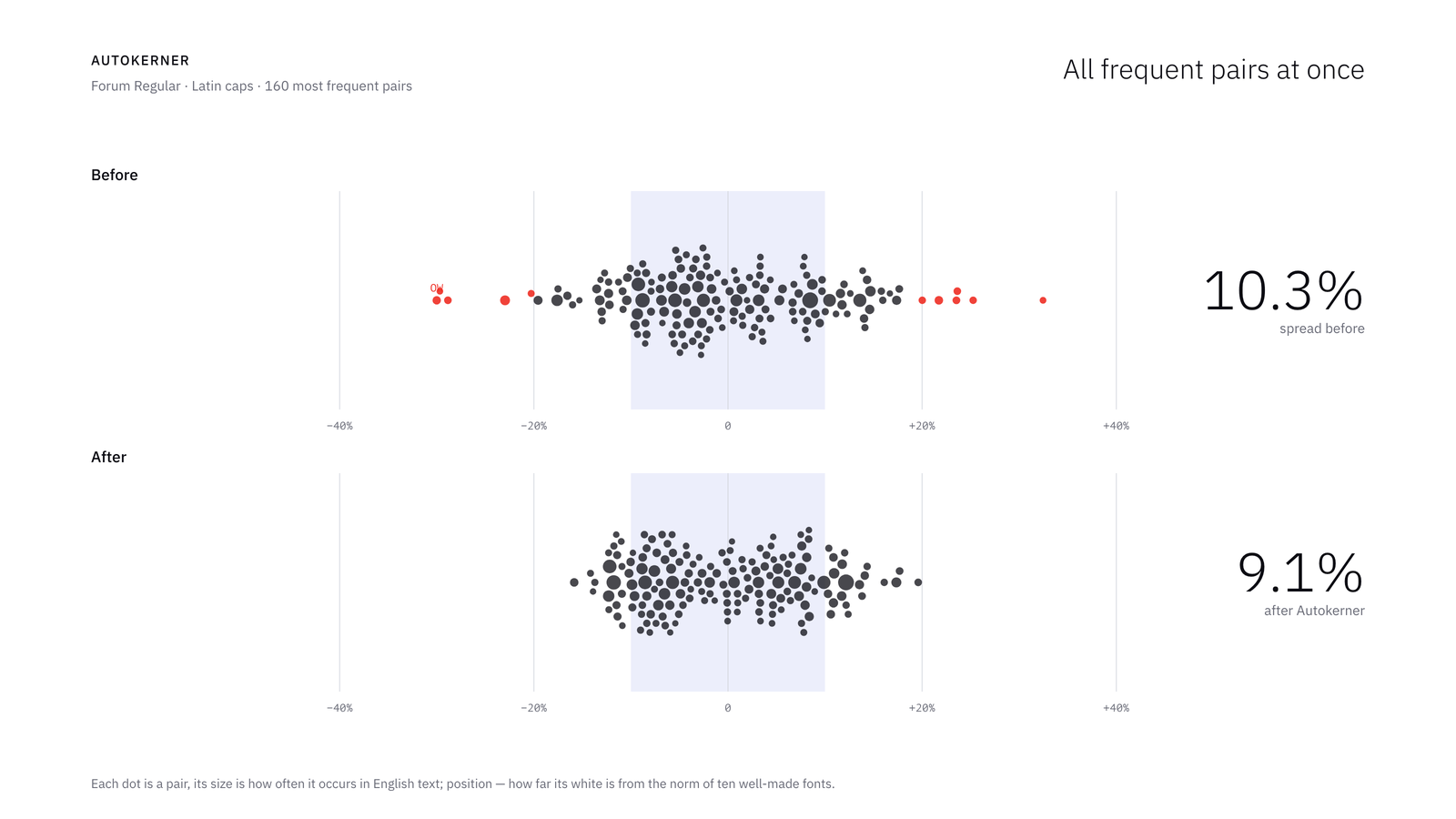
The 160 most frequent Latin cap pairs of Forum, each dot sized by how often the pair occurs in English text. The spread drops from 10.3% to 9.1%; 12 pairs were off by more than 20% before the run, none after.
Browser version
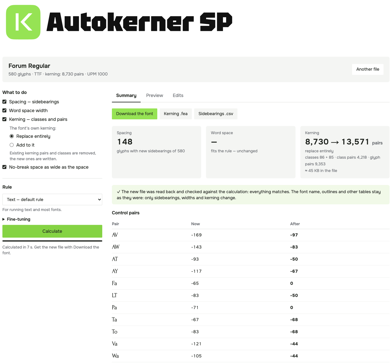
The same Forum file in the browser version: the same 148 glyphs and 8,730 → 13,571 pairs as in FontLab.
The calculation also runs on my site: pavljenko.ru/blogs/tools/autokerner. Drop a static TTF, OTF, WOFF or WOFF2 file, choose the settings and download the respaced and rekerned font. Python runs in the browser through Pyodide (WebAssembly), so the font never leaves your computer.
The browser version writes the sidebearings, the word space and a new kern lookup into GPOS (with Add to it, the font's own kerning is kept, including an old kern table). It moves mark anchors with their glyphs, reads the new file back and checks it against the calculation; the outlines and the other tables stay as they were. I compared it with the FontLab script on six fonts and 34 combinations of settings: sidebearings, widths and every calculated kerning pair are identical. Variable fonts and multi-master sources need the FontLab script.
When to use it, and when not
- It is most useful on fonts whose spacing or kerning is uneven: early versions, fonts with partial or missing kerning, a script added to an existing Latin (Cyrillic without kerning is a common case), or a quick first pass before manual work.
- On fonts that are already carefully spaced, the rule tends to give letters with open or diagonal sides (t, r, k, v, w, A, the ear of g) slightly more space than designers usually do. For such fonts, calculate only the glyphs you select, or use Add to it for kerning.
- The overall tightness of the font is kept. To make the whole font tighter or looser, use Looseness or the Display preset.
- Connecting scripts are not supported: new sidebearings break the joins.
- Only horizontal metrics change. Outlines are not redrawn; a glyph moves as a whole, with its anchors and components.
- Pairs are measured one at a time, so a pair can still collide with a third glyph. Figures with
, . :are protected by default; other sequences are worth checking in Preview.
Known limitations
- FontLab's Kerning, Classes and Features panels don't refresh by themselves after a script writes. Close and reopen them.
- A font opened from OTF or TTF keeps its old kerning as text in the
kernfeature, and FontLab exports that text instead of the kerning. Autokerner removes thekernfeature when it writes kerning, so FontLab builds it from the kerning on export. Revert restores the feature code. - In FontLab 8 kerning classes belong to each master. Calculate all masters of a variable font at once, so the classes stay the same.
- It is pure Python, as FontLab has no numpy: a font of 500 glyphs takes a few seconds per master, 2,000 glyphs about a minute.
- Developed and tested with FontLab 8.4.3 on macOS. It should work on Windows, but this has not been tested yet.
Download, license, feedback
Autokerner is free and will stay free, under the MIT license.
- Download and source: github.com/pavljenko/Autokerner
- Bug reports: GitHub Issues or pavljenko@ya.ru (Report a bug in the window copies the address). Please mention the font, what you pressed and what you saw.
I'd be glad to hear how it works on your fonts, and especially where the rule disagrees with your eye.
Sasha Pavljenko
Translated and edited by Claude (AI).
Comments
-
I think there's promise in this, but to my eye the results posted here have issues.- Third letter in the Forum Cyrillic feels closer to its predecessor than its follower.- First three letters of WINDOW in Kelly Slab seem much tighter than last three letters.- Last letter of Ledger Cyrillic is too detached from the others.- First two letters of following in Poiret One may be a touch too tight.1
-
Spacing only improves about 1/2 the time, and gets worse in at least 1/4 of cases — though often in the reverse direction.
Kelly Slab is pretty interesting; the original DO was far too tight, but the final one is too loose, at least in comparison with other pairs in the same word.2 -
Craig Eliason said:I think there's promise in this, but to my eye the results posted here have issues.- Third letter in the Forum Cyrillic feels closer to its predecessor than its follower.- First three letters of WINDOW in Kelly Slab seem much tighter than last three letters.- Last letter of Ledger Cyrillic is too detached from the others.- First two letters of following in Poiret One may be a touch too tight.
Agreed, thank you. The four pairs come from three things in the rule:
- Open sides (С–Л, е–л). White is counted only 7% of the em deep; С, Л, л and е have about as much again just past that line, so these pairs stay loose. #1
- Serifs (WIN vs DOW). The white behind a slab counts as space: about 5% of the em per serifed side in Kelly Slab, under 1% on the rounds. So the slabs crowd and D, O stay loose. #2
- Overhangs (fo). Kerning closes a fixed 45% of the pocket under an arm; with a thin arm the eye takes its tip as the edge. #3
My ±14% check measured area too, so it missed all three. They will be fixed in a future update, and I'll post the same words here again.
Thomas Phinney said:Spacing only improves about 1/2 the time, and gets worse in at least 1/4 of cases — though often in the reverse direction.
Kelly Slab is pretty interesting; the original DO was far too tight, but the final one is too loose, at least in comparison with other pairs in the same word.That's close to my own count: 17 of the 25 pairs got better and 6 got worse by area, and by eye it's worse than that. DO is the serif case (#2): with no slabs on either side, it ends up looser than its neighbours.
I've filed all three as issues on GitHub. I'd be grateful for more tests: if you try it on your own fonts in FontLab, or in the browser version on my site, please post what you see here or open an issue.
Translated and edited by Claude (AI).
0 -
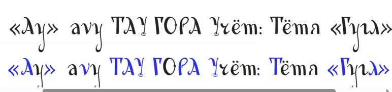 Very interesting!I must say, I’ve always dreamed of a sort of "magic bullet" that could bring auto-kerning to modern font-editing software—something with a quality comparable, at the very least, to what’s already available in Adobe’s programs.However, it seems to me that some of the decisions made by your algorithm are a bit odd. Take a look for yourself: I fed it a rather rough, work-in-progress project of mine—a sort of exploration inspired by the legacy of Konashevich. I haven’t even begun to address the kerning yet (not all the glyphs are even drawn!), and the kerning itself presents an interesting challenge due to the abundance of thin entry strokes.I can spot at least two strange instances: in the sequence "avy," the "v" has been pushed away from the "a," whereas, to my eye, it should actually be moved closer. In the word "Тётя," there’s an awkward gap between the "т" and the "я"—and for some reason, that has been left completely untouched.That said, I haven’t adjusted any settings, and—as I mentioned—the font itself is still quite raw at this stage.0
-
I'm sure this gives "OK" output. But I'm not terribly surprised that, as Thomas noticed, the accuracy is a coin flip. Nathan Willis' PhD thesis describes letter fitting as the careful balancing of multiple axioms (profile similarity, reflection, area equality, triplet centering, interior/exterior balance, collision avoidance, vertical stroke rhythm). I'm always suspicious when someone claims that all of these concerns can be satisfied with a single simple rule. Especially if that simple rule also includes magic numbers that work for all fonts.3
-
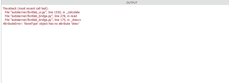
I installed it exactly as described in the instructions. Unfortunately, the script isn't working; I'm getting the following message.
1 -
Craig Eliason said:- Third letter in the Forum Cyrillic feels closer to its predecessor than its follower.- First three letters of WINDOW in Kelly Slab seem much tighter than last three letters.- Last letter of Ledger Cyrillic is too detached from the others.- First two letters of following in Poiret One may be a touch too tight.
Version 0.3 fixes all three causes (release): the white past the 7% line now counts with a falling weight (#1), the white between a short serif's tip and its stem counts three quarters (#2), and the hook of f no longer makes a pocket over a lowercase letter (#3). The numbers are fitted on eleven well-spaced text faces and five slab serifs, so that their own spacing changes as little as possible. The same four words with 0.3:
Poiret's fo comes from the long crossbar, not the hook. Against Futura, Jost, Avenir Next and Montserrat it is within their range, so I left it.
Thomas Phinney said:Kelly Slab is pretty interesting; the original DO was far too tight, but the final one is too loose, at least in comparison with other pairs in the same word.DO was the serif case: compared with 0.2, WIN now gets about three times as much extra space as DOW. By area, 21 of the 25 pairs are now better than the originals and 4 worse. It still won't replace the last pass by eye: in Kelly Slab I'd take a few units off both sides of O by hand. Good slab faces don't agree on this either (Roboto Slab and Superclarendon set their O 15–20% tighter than the rule would, Rockwell looser), so there is no single number to aim for. The script takes care of most of the routine; the final decisions stay with the designer.
Dsche said:I can spot at least two strange instances: in the sequence "avy," the "v" has been pushed away from the "a," whereas, to my eye, it should actually be moved closer. In the word "Тётя," there’s an awkward gap between the "т" and the "я"—and for some reason, that has been left completely untouched.Thank you for trying it on such a demanding design. That run was 0.2, which counted the white behind thin entry strokes in full, much like slabs; 0.3 weighs it less, so avy may already come out differently. A pair is kerned only when its pocket is deeper than the font's usual one, which may be why т–я was left alone. I'd need the font to say more: if you can share a few glyphs (pavljenko@ya.ru or a GitHub issue), I'll look. Meanwhile the Edits tab lets you untick any glyph or pair.
Simon Cozens said:I'm always suspicious when someone claims that all of these concerns can be satisfied with a single simple rule. Especially if that simple rule also includes magic numbers that work for all fonts.Fair, and I don't claim that. It covers area equality and collision avoidance, plus a pocket rule for kerning, and it only moves glyphs that stand out from the font's own median, so it is a first pass for uneven fonts, not a finished fitting. The numbers in 0.3 are not picked by hand: they are fitted on sixteen well-spaced fonts. Thanks for the pointer to Nathan Willis' thesis.
Typedesigner said:I installed it exactly as described in the instructions. Unfortunately, the script isn't working; I'm getting the following message.Thank you, that was a bug: FontLab returns an empty contour for some shapes, and the script stopped on it. Fixed in 0.3.1: please download dist/Autokerner.py again and replace the old file. If it still fails, please post the message with your FontLab version and system.
Translated and edited by Claude (AI).
2 -
Autokerner is now working well. However, the results could be improved, particularly with italic fonts. Please take a look at letter combinations such as VAV, YAY, and WAW, as well as ete, oto, and similar patterns.
Otherwise, you’re absolutely on the right track, and your script runs fast.
2 -
That's one hell of a proviso that you didn't mention anywhere in your description.1 -
Typedesigner said:Autokerner is now working well. However, the results could be improved, particularly with italic fonts. Please take a look at letter combinations such as VAV, YAY, and WAW, as well as ete, oto, and similar patterns.
Thank you, that was a real gap. The script measured italics as if they were upright, so every slanted stem left a triangle of white on one side and a wedge on the other. Version 0.3.2 measures italics along the italic angle of each master. It also recognises a cursive structure from the outlines: lowercase stems that start with an entry stroke at the top left and have no foot serif. The white behind such entry and exit strokes now counts like the white behind a serif, from the body of the letter rather than from the tip of the hook.
Checked against the designers' own spacing and kerning in well-made italics: AV, AY and AW were 63–92 units tighter than the designers', now within 3–21 of them (median of seven fonts); te and to were 24 looser, now 0–1; all lowercase pairs are 18 → 14 units off on average across nine fonts. Upright fonts are not affected.
Dsche said:doneThank you, it was the most useful test so far. It showed five real faults of the rule, all fixed in 0.3.2: a swash on one letter threw off the x-height, a curl rising over the left letter was kerned like a pocket, the collision guard pushed apart strokes meeting outside the line, punctuation was spaced against a stem far behind an entry arc, and the white behind entry arcs was undercounted (your avy). Details by email.
Simon Cozens said:That's one hell of a proviso that you didn't mention anywhere in your description.Fair, I put it badly. The description says it changes only glyphs that stand out from the font's own median. What follows from that: a well-spaced font is left almost as it is, an uneven one is evened out, and the last look by eye stays with the designer, as with any automatic spacing.
Edit: the result slides in the first post still show 0.2. The same words and charts with the current version:
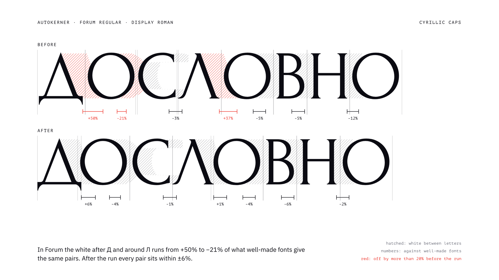
Forum, Cyrillic caps: the white after Д and around Л ran from +50% to −21%; after, every pair is within ±6%.
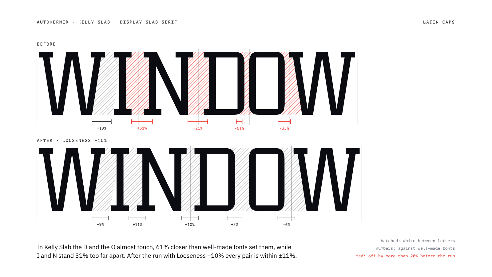
Kelly Slab, Latin caps: D and O were 61% too close, I and N 31% too far apart; after the run with Looseness −10%, every pair is within ±11%.
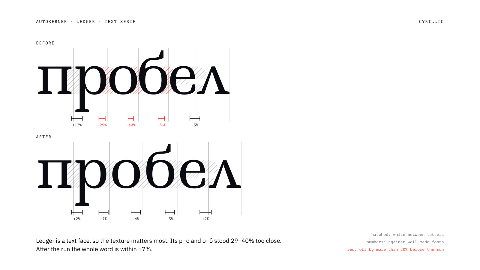
Ledger, Cyrillic lowercase: р–о and о–б were 29–40% too close; after, the whole word is within ±7%.
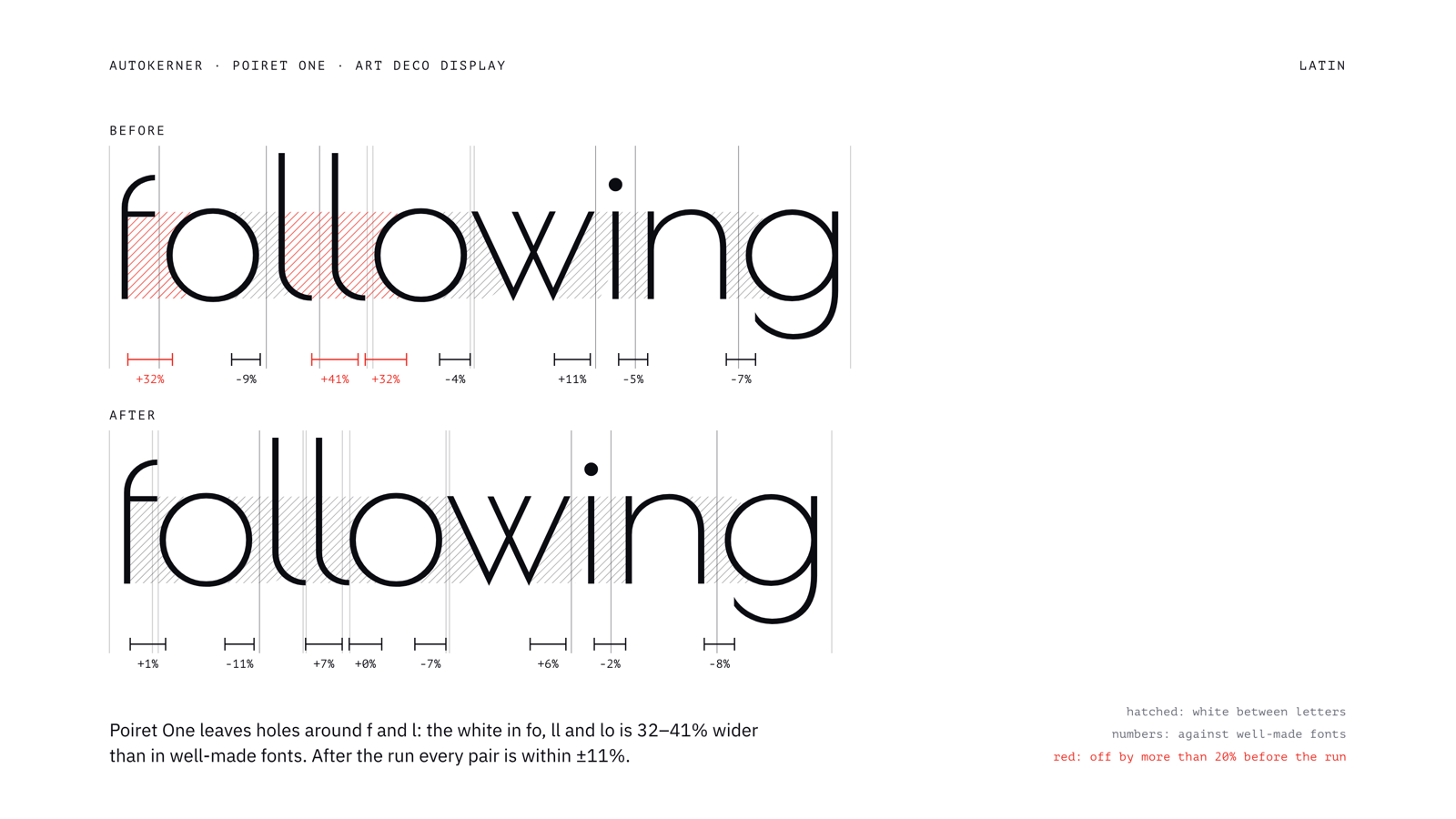
Poiret One, Latin lowercase: fo, ll and lo had 32–41% too much white; after, every pair is within ±11%.
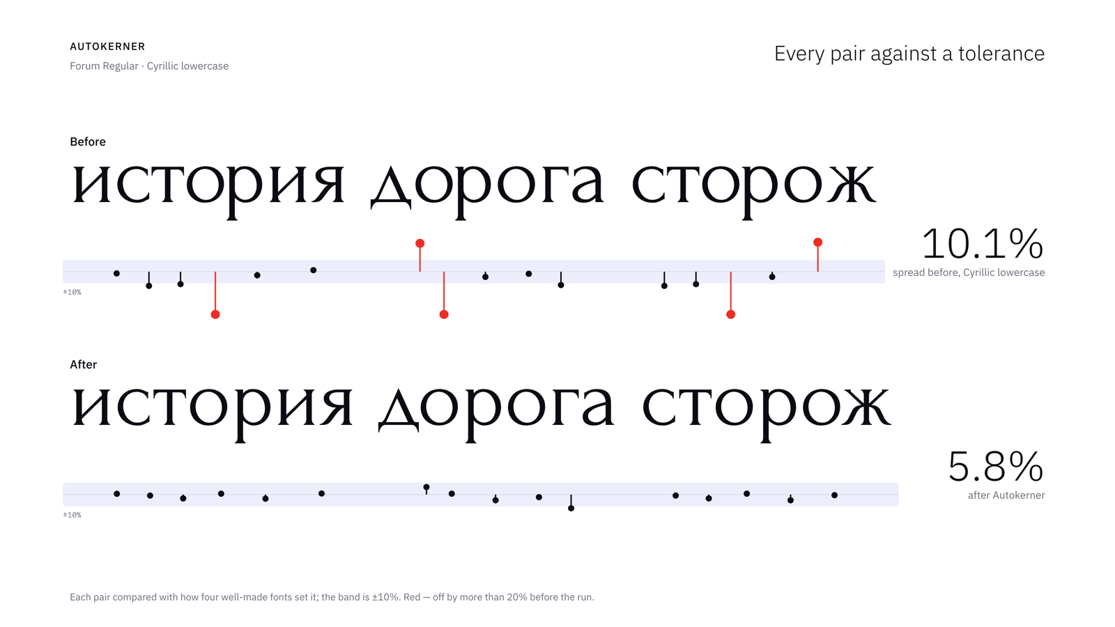
Forum, Cyrillic lowercase pairs against a ±10% band: the spread drops from 10.1% to 5.8%.
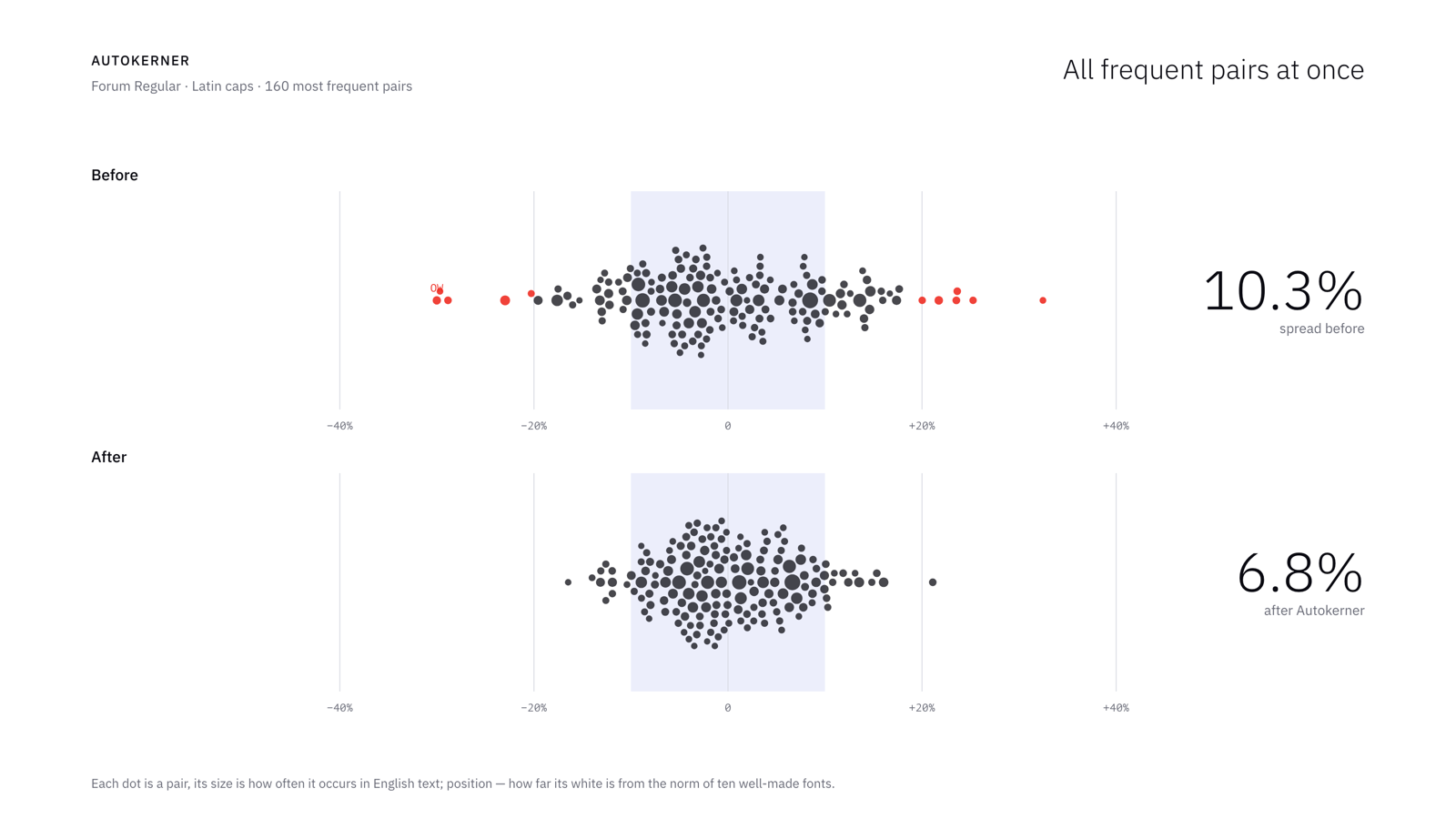
Forum, the 160 most frequent Latin cap pairs: the spread drops from 10.3% to 6.8%.
Translated and edited by Claude (AI).
2 -
For anyone interested: https://centaur.reading.ac.uk/117028/Simon Cozens said:I'm sure this gives "OK" output. But I'm not terribly surprised that, as Thomas noticed, the accuracy is a coin flip. Nathan Willis' PhD thesis describes letter fitting as the careful balancing of multiple axioms (profile similarity, reflection, area equality, triplet centering, interior/exterior balance, collision avoidance, vertical stroke rhythm). I'm always suspicious when someone claims that all of these concerns can be satisfied with a single simple rule. Especially if that simple rule also includes magic numbers that work for all fonts.
Some (weirdly low res) samples can be found starting on page 223
4 -
Simon Cozens said:Nathan Willis' PhD thesis describes letter fitting as the careful balancing of multiple axioms (profile similarity, reflection, area equality, triplet centering, interior/exterior balance, collision avoidance, vertical stroke rhythm). I'm always suspicious when someone claims that all of these concerns can be satisfied with a single simple rule. Especially if that simple rule also includes magic numbers that work for all fonts.
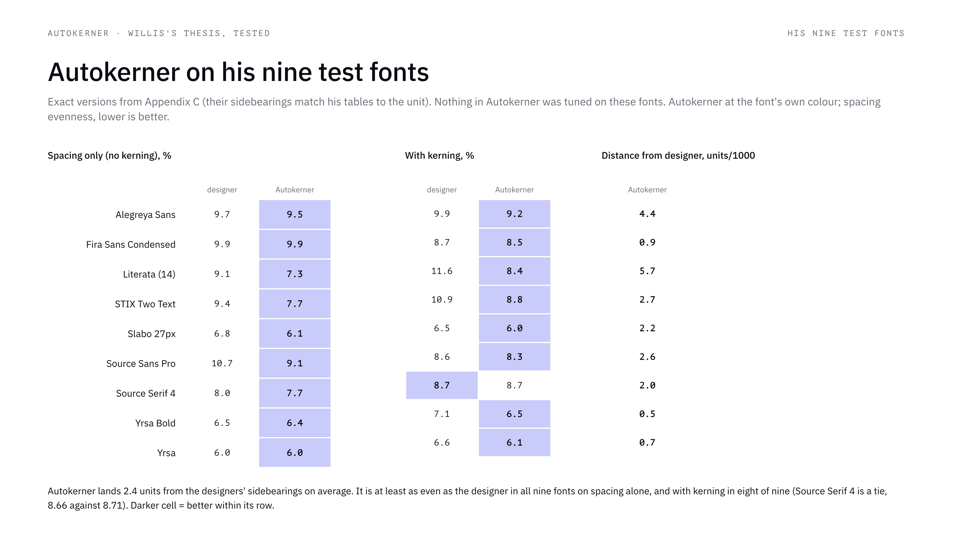
Thank you, Simon, and Jasper for the link. Rather than argue, I tested it: the nine open fonts of the thesis in the exact versions of Appendix C (their sidebearings match his tables to the unit), plus 47 fonts of my own, all run with the same code.
On his test set, which nothing in Autokerner was tuned on, the script lands 2.4 units per 1000 from the designers' sidebearings on average. It is at least as even as the designers in all nine fonts on spacing alone, and in eight of nine with kerning (one tie).
I wanted to put his two algorithms next to it, but the thesis does not allow that: the sidebearings printed in Appendix D do not reproduce his own sample pages. In Literata the kf table makes STRAWBERRY! 23% narrower than the control, his kf page shows 7%; the composite column does match its page. In Fira Sans Condensed it goes the other way: the table gives T a positive left sidebearing, yet on his composite and kf pages the word space before T is almost gone.
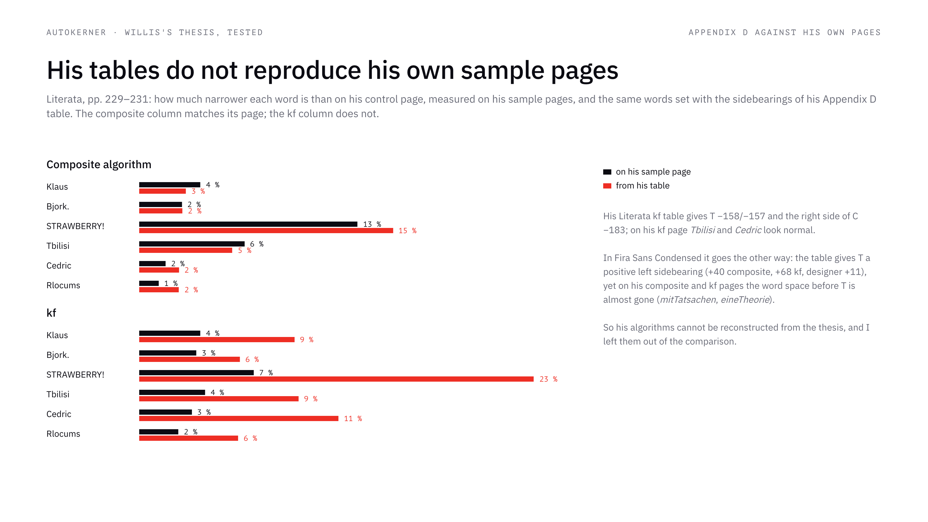
The reader test does not separate the methods either: 143 of its 162 pairwise comparisons show no significant difference, with no correction across the 54 separate tests, and the algorithms were shown without kerning next to controls with the designers' kerning. The second polar moment in Appendix B (p. 205) is summed from first moments.
The axioms are still a useful checklist, so I turned the testable ones into options and ran them on all 56 fonts. No enclosure (L-14) and proportional figures are clear gains and are on by default in 0.4.0. Open counters (L-7) and single-stroke letters (L-9) change almost nothing; serifs on diagonals (L-12) helped as many fonts as they hurt.
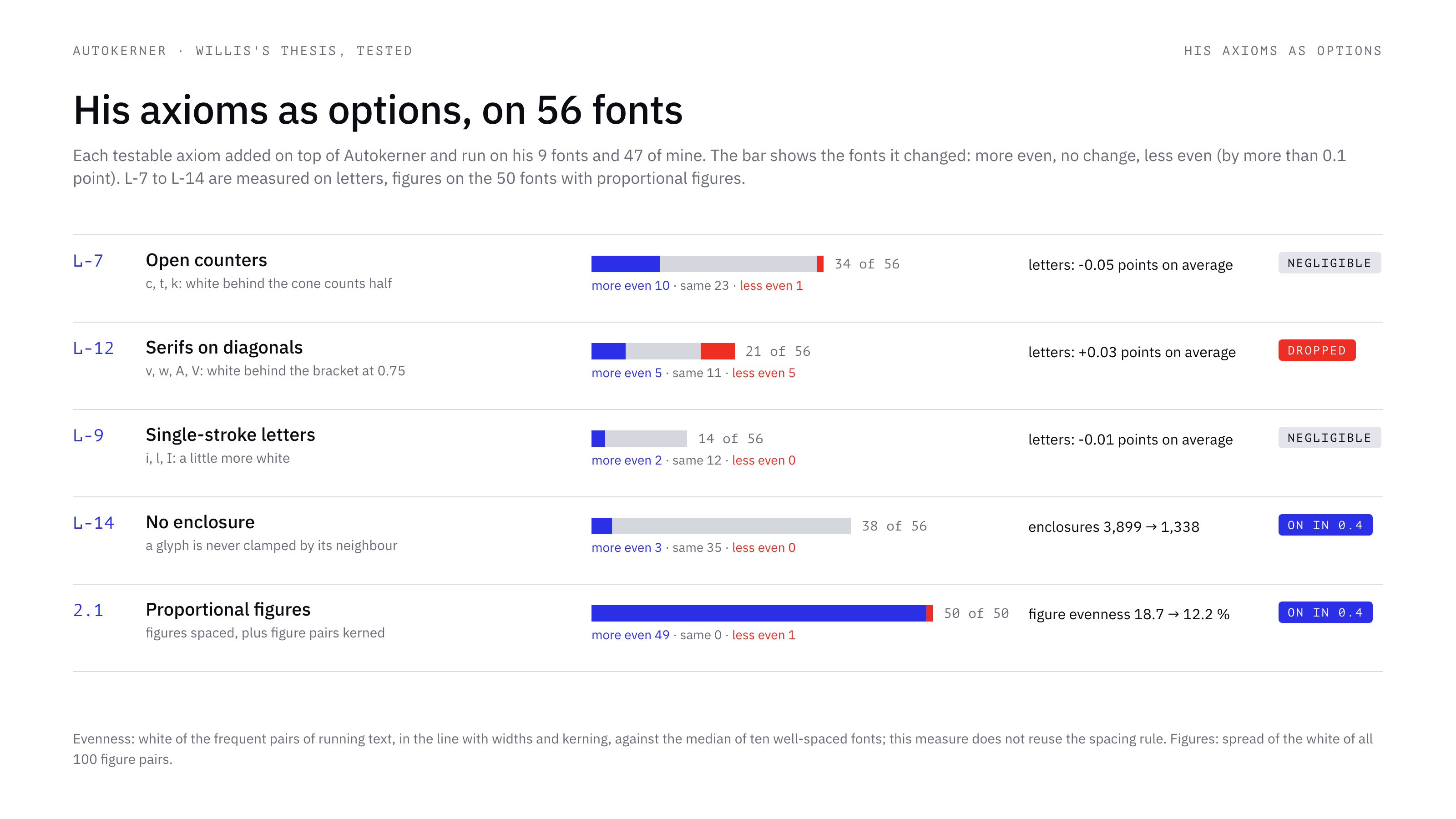
On magic numbers: they were set on 26 well-spaced fonts, and Willis's nine were a holdout. The comparison is at each font's own colour; the default of 0.4.0 is 10% denser (Looseness +11% keeps the original).
Translated and edited by Claude (AI).
0 -
Autokerner 0.4.0 is out, in FontLab and in the browser: proportional figures are now spaced and kerned, a glyph is no longer clamped by its neighbour, and the default colour is 10% denser (Looseness +11% keeps the font's own).
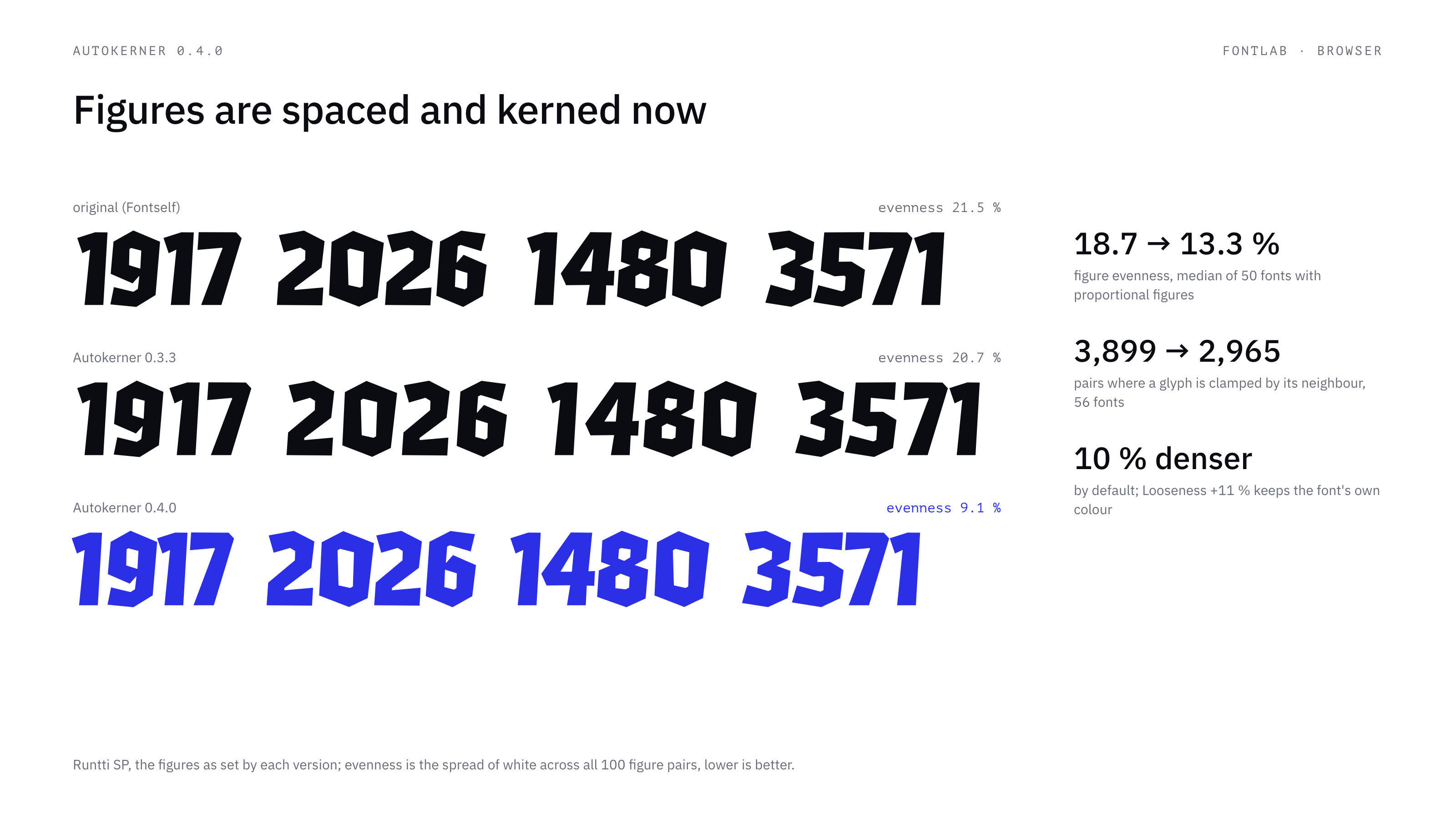
Translated and edited by Claude (AI).
1 -
Another area for improvement is kerning pairs involving j, such as Pj and nj. If the left sidebearing of the j has already been set correctly (e.g., to -50), no additional kerning adjustment should be necessary. Applying kerning in such cases could make the spacing between the letters too tight.1
-
Your AI has done some sums and told you that your AI is correct, and you seem incurious as to why.pavljenko said:On his test set, which nothing in Autokerner was tuned on, the script lands 2.4 units per 1000 from the designers' sidebearings on average. It is at least as even as the designers in all nine fonts on spacing alone, and in eight of nine with kerning (one tie).
"What follows from that: a well-spaced font is left almost as it is."
3 -
What happened to the TypeDrawers rule that use of AI in writing a forum post must be clearly labeled?
All these posts are just copy-paste Claude Code responses, which are really annoying and tiring to read.4 -
SCarewe said:All these posts are just copy-paste Claude Code responses, which are really annoying and tiring to read.
Labels are added. English isn't my language, so yes, Claude translates and edits what I write. If my posts annoy and tire you, just don't read them. Nobody is making you 😘
Translated and edited by Claude (AI) 😁😉
0 -
Claude is not just translating, Claude is clearly writing your entire responses.
Thanks for adding the labels.-3 -
Another area for improvement is kerning pairs involving j, such as Pj and nj. If the left sidebearing of the j has already been set correctly (e.g., to -50), no additional kerning adjustment should be necessary.
Right, the j hook was read as a pocket. Fixed in 0.4.1: on nine fonts, pairs with j went from ~25 units off the designers' kerning to ~4.
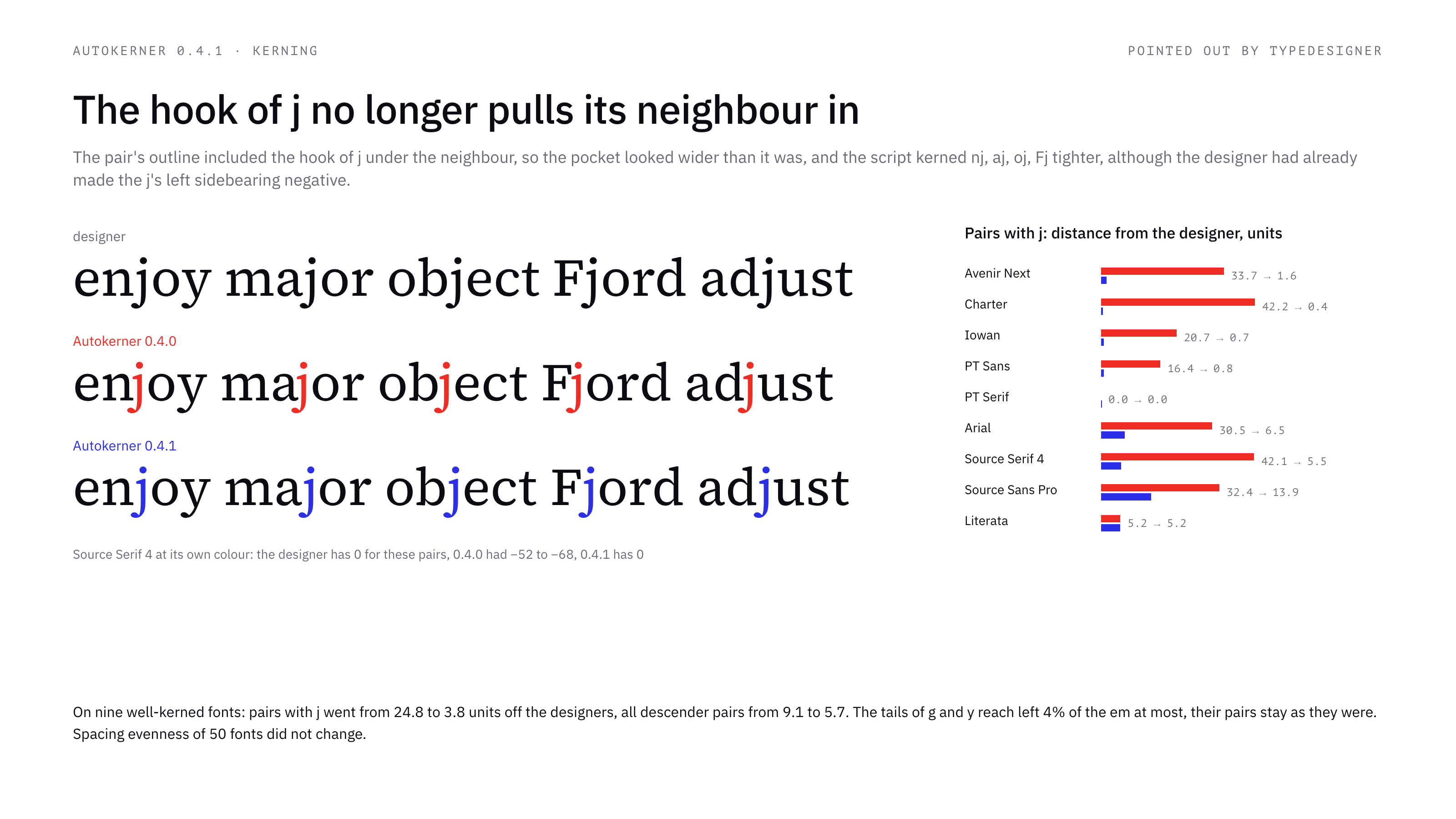 Your AI has done some sums and told you that your AI is correct, and you seem incurious as to why.
Checked it another way: copies of three fonts from Willis's set, 16 of 52 letters damaged by 5–40 units, then the script. Errors of 40 came back to ~7 off the designer, 20 to ~8. Anything under 12 units it leaves alone.
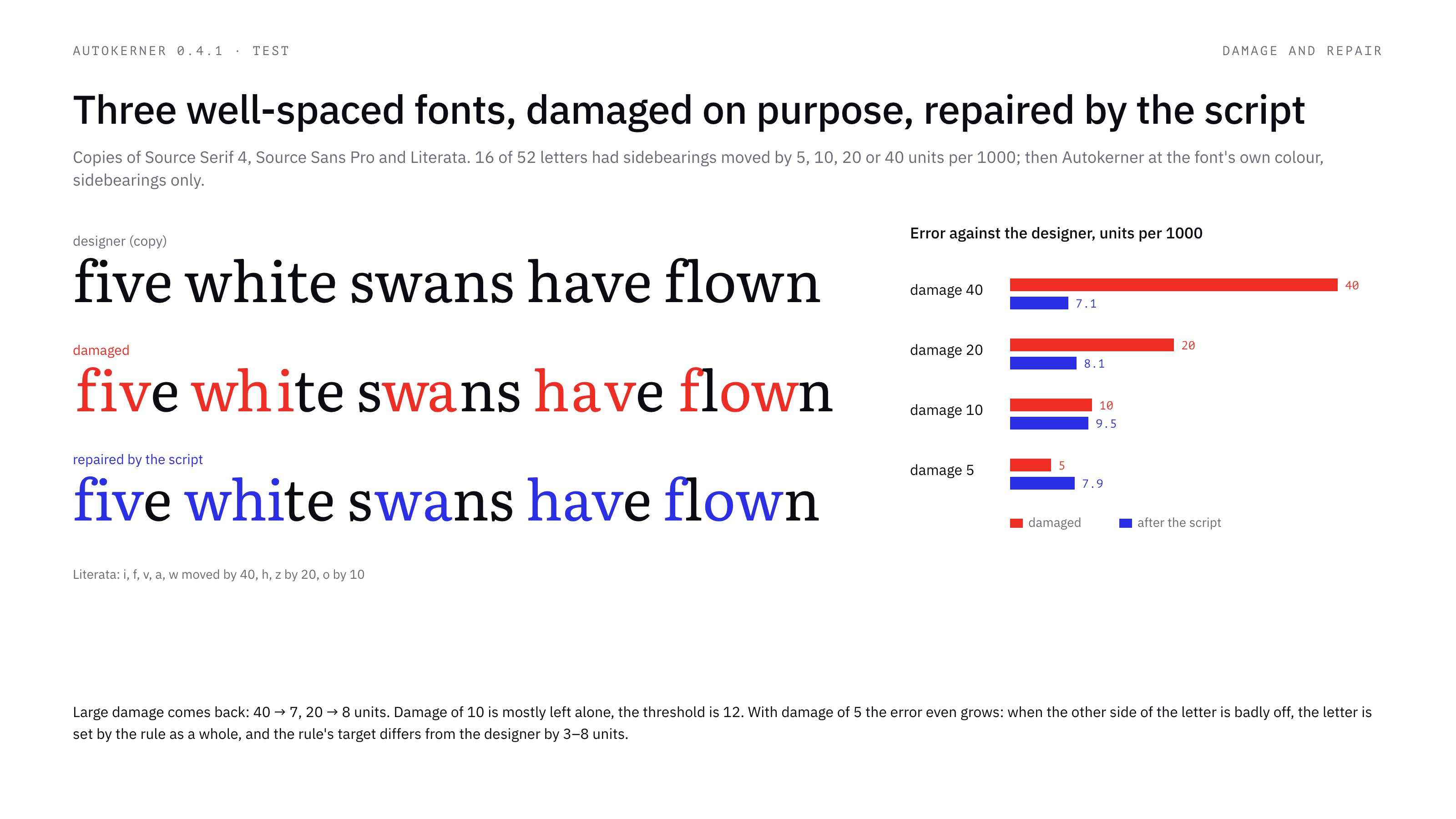
Simon, your replies read as somewhat dismissive of this tool. Still, between the lines you give good advice on how to improve it, and thank you for that. I think it would be more productive if you gave that advice directly, without the scepticism: I want to make a useful and completely free tool that helps type designers. If you have time, please try it and post any bugs you find. I will definitely try to fix them.
Translated and edited by Claude (AI).
0 -
This is from a bit earlier in the conversaion, and it seems likely I misunderstand something, but… why is it desirable to have the default be 10% tighter spacing? And how exactly do you assign a percentage to how much tighter it is?0
-
The “Spacing – sidebearings” function does not work correctly for all glyphs. Please fix this issue and test the script as follows:
- Set both the left and right sidebearings to 0 for all glyphs.
- Run the script and verify that the function works correctly for every glyph.
- Identify and fix any issues that prevent the function from being applied consistently across all glyphs.
The enabled rule “Keep glyphs with a color mark” does not work.
Thank you!1 -
Set both the left and right sidebearings to 0 for all glyphs. Run the script and verify that the function works correctly for every glyph.
Done in 0.5.1: a font with zero sidebearings is now spaced from scratch. Letters, figures, punctuation, symbols, accented letters and composites get sidebearings. Space n and o by eye first and the rest follow them; otherwise the colour is guessed from the shapes. Box-drawing characters, the fraction slash and standalone accents are left alone.
The enabled rule “Keep glyphs with a color mark” does not work.Checked in FontLab 8: a glyph flagged with Glyph → Flag keeps its sidebearings when the option is on. Its kerning is still calculated. If a flagged glyph moved for you, which glyph was it and how was it flagged?
Translated and edited by Claude (AI).
0 -
why is it desirable to have the default be 10% tighter spacing? And how exactly do you assign a percentage to how much tighter it is?
It wasn't needed. 0.5.0 went back to the font's own colour.
The percentage is of white area: the script measures the white at glyph sides, and −10% made the target 10% smaller than the font's median.
Translated and edited by Claude (AI).
1 -
You’re making really good progress. The changes in 0.5.1 are working really well.
For kerning, there needs to be a way to exclude specific glyphs from the automatic kerning performed by your script. Currently, even when a glyph is flagged via Glyph → Flag, the script still calculates and applies kerning to it. So the exclusion doesn’t work for kerning yet, although it works correctly for Spacing → Sidebearings.
2 -
Currently, even when a glyph is flagged via Glyph → Flag, the script still calculates and applies kerning to it.
Done in 0.5.2: with “Keep glyphs with a color mark” on, a flagged glyph keeps its kerning too — its pairs stay as they were, in replace, add and selected-glyphs modes. Accented letters built on it (Á for A) are kept along with it.
Thank you very much for your help with testing. I hope the tool will be useful to you.
Translated and edited by Claude (AI).
0 -
My intention was not to be somewhat dismissive. I feel like I am having a conversation with someone who is clearly cutting and pasting my answers into Claude and cutting and pasting its responses back (and then claiming the credit for it). There is no way you understood, evaluated and implemented a PhD thesis in a day. It just isn't true. In those circumstances I don't feel the need to be polite. It is not, after all, your work.
If you were taking the time to understand what was involved, you would create a fair test. You would understand why damage-and-repair on the side bearings is actually not a fair test. Think with your brain: why is it not a fair tear? You would understand the difference between a principled approach and a set of ad hoc fixes, and why magic numbers for "common" shapes is a bad idea. The problem with AI development is that AI is biased towards giving you the answers you want to hear. AI loves to write tests that pass. It will tell convince you that your tool is better than it is, and you will believe it.
I'm happy to give advice and encouragement to human beings working on spacing techniques themselves. This project is not that.3 -
You see, Simon, the only essential characteristic of a tool is whether it works and produces results. As Deng Xiaoping used to say, it doesn’t matter what color a cat is, as long as it catches mice…Simon Cozens said:
My intention was not to be somewhat dismissive. I feel like I am having a conversation with someone who is clearly cutting and pasting my answers into Claude and cutting and pasting its responses back (and then claiming the credit for it). There is no way you understood, evaluated and implemented a PhD thesis in a day. It just isn't true. In those circumstances I don't feel the need to be polite. It is not, after all, your work.
If you were taking the time to understand what was involved, you would create a fair test. You would understand why damage-and-repair on the side bearings is actually not a fair test. Think with your brain: why is it not a fair tear? You would understand the difference between a principled approach and a set of ad hoc fixes, and why magic numbers for "common" shapes is a bad idea. The problem with AI development is that AI is biased towards giving you the answers you want to hear. AI loves to write tests that pass. It will tell convince you that your tool is better than it is, and you will believe it.
I'm happy to give advice and encouragement to human beings working on spacing techniques themselves. This project is not that.0 -
That explains why we still use asbestos for home insulation, since it is a remarkably effective tool for that purpose. And don't forget DDT, CFC aerosol sprays, lead paint, lead pipes, all very effective tools that certainly produce results.pavljenko said:
You see, Simon, the only essential characteristic of a tool is whether it works and produces results.
6 -
So you think a font program can have the same side effects as the things you listed? If so, you’re missing one more thing — a camera that might steal your soul.Qwerasd said:
That explains why we still use asbestos for home insulation, since it is a remarkably effective tool for that purpose. And don't forget DDT, CFC aerosol sprays, lead paint, lead pipes, all very effective tools that certainly produce results.pavljenko said:
You see, Simon, the only essential characteristic of a tool is whether it works and produces results.0








Categories
- All Categories
- 47 Introductions
- 4K Typeface Design
- 505 Type Design Critiques
- 597 Type Design Software
- 1.1K Type Design Technique & Theory
- 679 Type Business
- 911 Font Technology
- 29 Punchcutting
- 544 Typography
- 129 Type Education
- 333 Type History
- 82 Type Resources
- 114 Lettering and Calligraphy
- 33 Lettering Critiques
- 81 Lettering Technique & Theory
- 588 Announcements
- 102 Events
- 118 Job Postings
- 179 Type Releases
- 188 Miscellaneous News
- 270 About TypeDrawers
- 54 TypeDrawers Announcements
- 114 Suggestions and Bug Reports