New angular typeface: Kristal
Comments
-
I like the idea of the catchwords, but they look a little puny. Can you scale them up (lower the bottom)?
I thinksaltmight be the best place for the code.0 -
Thanks for your comments Alexis. Not entirely sure about the /at, since I do have a lowercase (a slightly lower and smaller variant of the uppercase). In the lowercase it's of equal height. But you do have a point there, it doesn't align great in the uppercase combination.
Maybe I can solve that with a contextual alternative? Create a slightly higher placed /at for use in uppercase combinations - surely something like that should be possible? The question of course is whether someone would use it...
Good call about the /N by the way! Just fixed that one.
The /M and /H will require some more testing on my side I think. Same with the /5
Also did a heap of extra short words (as discretionary ligatures, dlig) and ordinal combinations (ordn).
0 -
Hey Craig, just saw your post - I guess we posted at the same time
")
Why would you go withsaltand notdlig? I had assumed that the former is intended for single letters (e.g. providing an alternative form for one letter) and the latter is meant more for combinations (seeing that it is a ligature) - I assumed this after a bit of googling but I can definitely be convinced otherwise!
I kinda like the catchwords a little smaller, but I might be overdoing them right now. See for some example use the last pages of this specimen. An alternative might be to make them a bit upward slanted or something?0 -
I think of
dligas more specific--it's where I'd expect I might find a /t_z/ ligature, for example, or another place to put the historical ligs /c_t/ and /s_t/. Whereas to me "stylistic alternates" feels like something more general that you'd reach for if you wanted to trigger, well, an alternate style, which feels like a better match for your catchwords. But that may just be me.
Keep in mind that an option, indeed maybe the best one, is to put these in both features.
Of course, the main thing is to include the lookups inaalt, since my understanding is that the majority of font users will just be selecting these from the Glyphs menu.
This typeface wants to be as blocky as possible, which is why I suggest bigger thicker catchwords. For the same reason I'm skeptical that slanting them will fit in well.
Hey, here's another idea: scrap the lowercase you have, and make these raised underlined letters be the lowercase. That way instead of a few precomposed words the user can type whatever he or she wants. If you can get these letters to hold their own, mass-wise, I think they're far more interesting and useful than the "smallcap" lowercase you have.0 -
Whoah, Craig, that's an awesome idea for sure. Thanks! Now why didn't I think of that!? I'm definitely going to explore this. One thing that comes to mind is that I might try and consider some kind of system where the underline can be connected even though the words are typed separately? Right now what I would be able to make would result in a set of underlined letters that would be typed separately, so you'd end up with separate bars (see attachment). Will definitely update soon with some examples for lowercase!
I'm thinking this might be solvable by creating a list of 'lowercase' letters (underlined I mean) that have longer underlines that will connect with the next one, and create some kind of 'end of word' variants that are used only if there's a /space or punctuation (is that how one could do it?). Or vice versa, create variants that connect with the previous letter and use 'start of word' variants that are opentype coded to be used if there is no letter before?
Some of the smaller ones might now be interesting still as an alternative or quirky extra - even though I am starting to agree that they need more size.
Also thanks for the comments ondlig,saltandaalt. I'm going to have to read up onaaltsince I'm not sure how that works - why would including the lookups there help users to select the glyps from the glyph menu? Without usingaaltright now I can see them in the glyph menu (in Illustrator this is, you might be talking about a different glyph menu?)0 -
Here's some preliminary images and a limited specimen to showcase where I'm at now. It's intersting that you can type whatever word and switch between upper- and lowercase and create interesting combinations that way. Kerning is going to need a lot of extra work now I feel. And I don't like the collection of separate underscore bars that you get when you type whole words - going to look into OT coding for that. Maybe something like the code for Swashes at the beginning of words but reversed? Suggestions and examples more than welcome!0
-
Oh, including the lookups in
aaltgroups them in the glyphs palette, but that's not relevant for many-to-one substitutions like this, so never mind what I said.
Yes, I'm confident you can figure out the OT coding for continuous underlines!0 -
Thanks Craig!
Maybe I should write the code for this inaaltthough? This is something you'd want the lowercase to do whenever you use it maybe. Or should it be considered part of standard ligatures inliga? So the normal lowercase would be an underlined letter (all separate as shown above) but if you turn on ligatures, all words would become connected and become underlined as totals.
I'm thinking I'll have to work with inclusive classes (i.e. classes containing all glyphs that are considered part of a word) and not with exclusive rules (i.e. using /space and punctiation as stoppers - because if a sentence stops without punctuation or something it won't work...).
Is there some kind of trick to create a class that includes all excisting glyphs (except /space /nondef /NULL)? Or just a case of coding that by hand?0 -
Just found out that in the Classes Window you can actually drag and drop glyphs from the glyph palette... that helps a lot
I think I have a test version working for now with one simple rule of code that I put inligafor now:substitute @underscore' @underscore by @underscore_slurf;
where @underscore is a class containing all lowercase letters and @underscore_slurf is a class containing variants for each of those letters with longer bars (crossing over the right sidebearing of a glyph).
I've relocated the 'old' lowercase letters in to the smallcaps feature as that is in fact what they were (good call Craig).
Now wondering whether I should add a few ligatures for odd cases that occur now such as "eTo" (combinations with /T /P etc)...0 -
Also @Alexis - have been trying different /5's but they look really odd with a bifurcating incision
Have been working on the /H but in fact at the moment it's already a rhombus form that is the crossbar - but it's not very obvious I would say. I've made the crossbar slightly thicker but am not sure whether it should become larger still...0 -
New /M and /m ?
I like the last version (bottommost) but it does completely loose the stroke direction. Not sure if that matters, it does differ more from the /N in this way which might be a good but also a bad thing...
in a word: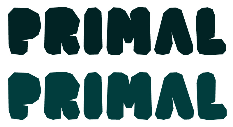 0
0 -
New specimen with a few samples of the new lowercase in combination with uppercase...0
-
I like the new /M.
In your samples further up on the page, the counter of the /A strikes me as too light compared to the other letters. I don't see it in the "PRIMAL" example, though. Did you change it, or is the impression size-dependent?0 -
Thanks Christian! That's odd about the A - haven't changed that the last couple of rounds. What sometimes happens when viewing a pdf is that acrobat renders the zoom really odd (this is some kind of weird thing acrobat does while rendering, never understood why). Sometimes letters can appear slightly smaller, bigger, higher or lower than others even though in reality they aren't - do you see it at 100% zoom as well?0
-
I don't think it's a scaling issue... looking at the PDF again, it might just be the lowercase/smallcaps. How about trying an inverted /V /v for /A /a, just to see what it's like?0
-
Here's a real quick test with inverted /V and/v (smallcaps that is) - it feels a little weird. What do you think? Seems like the counter in /V is smaller than the one in /A if that is what you mean?0
-
Hmmm. Have been working on creating accented characters both in the underlined lowercase as in the smallcaps. Running into a wee bit of OT coding issue now with the /ccedilla
Is this bit of code (in liga) correct or is there something wrong?ignore substitute @underscore' ccedilla; substitute @underscore' @underscore by @underscore_slurf; substitute @underscore ccedilla.slurf' by ccedilla.slurf.both;
I'm replacing all underscored letters by their elongated counterparts if they are followed by another member of @underscore (to make sure the underline connects). However, this creates an overlap for /ccedilla so in that case I want the it to be ignored (even though /ccedilla itself will be replaced). Then there's the case where a /ccedilla with underscore is part of a word where it is preceded by other 'lowercase' letters that have an underscore (that haven't been replaced because of the ignore rule) - in that case I want the /ccedilla to have elongated underscores on both sides to make sure there is no gap.
The third rule of the code doesn't seem to work even though the case itself is present in my sample text, see attachment, for example the word Glaçon > the /ccedilla is replaced by /ccedilla.slurf but is preceded by a member of @underscore which hasn't been replaced because of the ignore rule. I would think that in this case the rulesubstitute @underscore ccedilla.slurf' by ccedilla.slurf.both;
is active and that it would replace the current /ccedilla.slurf by it's double counterpart?0 -
After a night of pondering it occurred to me that the order of the substitute rules might work better if changed. Here's a new scheme that seems to work (yay!):
		ignore substitute @underscore' ccedilla;
		substitute @underscore ccedilla' @underscore by ccedilla.slurf.both;
		substitute @underscore' @underscore by @underscore_slurf;
It looks first if there is a ccedilla in between other substitute candidates, if so, it changes it, and then substitutes all others.0 -
Is this still under development? Pretty cool typeface. The only thing I notice which I might change is the inner shape of C and U. Perhaps it's my dirty mind to blame, but with these characters I feel like I'm looking between a lady's legs from two different angles.
Also, are you sticking with the name Kristal? Because Eyal Holtzman already has a typeface with that name. Two in fact if you also count Kristal Open Caps.0 -
This is really cool! I agree with Alexis on the @, M, and H. But 5 and N look fine to me. Perhaps for N, try a version with thicker verticals, and a thin diagonal. Keep it up!0


Categories
- All Categories
- 47 Introductions
- 4K Typeface Design
- 495 Type Design Critiques
- 577 Type Design Software
- 1.1K Type Design Technique & Theory
- 670 Type Business
- 885 Font Technology
- 29 Punchcutting
- 539 Typography
- 125 Type Education
- 333 Type History
- 81 Type Resources
- 113 Lettering and Calligraphy
- 33 Lettering Critiques
- 80 Lettering Technique & Theory
- 569 Announcements
- 100 Events
- 116 Job Postings
- 170 Type Releases
- 182 Miscellaneous News
- 270 About TypeDrawers
- 54 TypeDrawers Announcements
- 114 Suggestions and Bug Reports