New angular typeface: Kristal

Jan Willem Wennekes
Posts: 148
Hey guys,
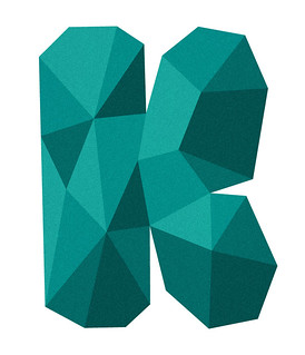
in the meantime I'm working up another typeface called "Kristal". This is quite an angular/polygonal typeface, intended for display purposes. I am trying to keep the anchor points to a minimum while retaining some legibility but most importantly a distinct look.
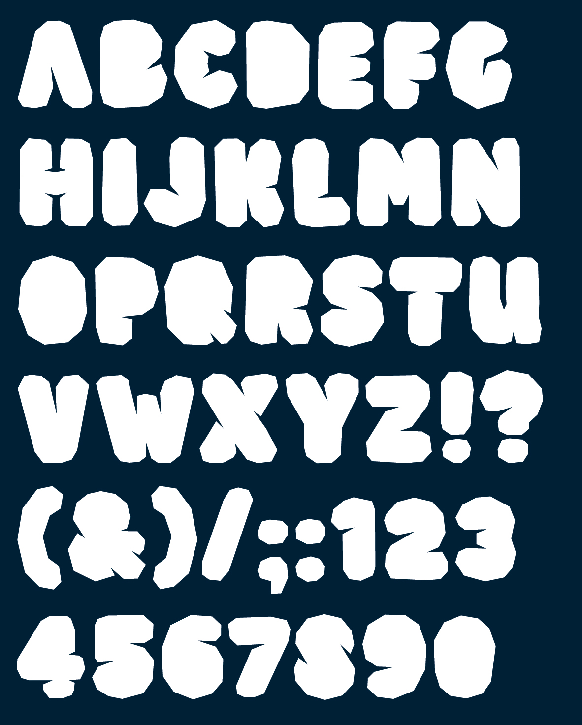
What do you think so far? I'm using a slightly smaller and lower variant of the uppercase as lowercase for now.
Any characters that seem wildly out of place right now? I've had the most trouble creating the /C /G /H /U but can't conceive of better options right now (suggestions welcome of course!)
in the meantime I'm working up another typeface called "Kristal". This is quite an angular/polygonal typeface, intended for display purposes. I am trying to keep the anchor points to a minimum while retaining some legibility but most importantly a distinct look.
What do you think so far? I'm using a slightly smaller and lower variant of the uppercase as lowercase for now.
Any characters that seem wildly out of place right now? I've had the most trouble creating the /C /G /H /U but can't conceive of better options right now (suggestions welcome of course!)
0
Comments
-
I suggest that those characters which don't currently have counters should have them, for instance /D, /O, /P, /Q, /R, and maybe /B. A treatment such as you used on the /A would probably work well for them but they need something.0
-
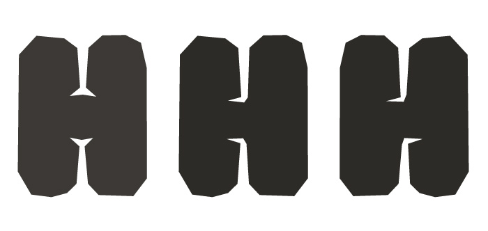
/U/ and /H/ let the contour come in much farther than the other letters. Perhaps if that were adjusted, and the /C/'s definitely-too-big counter too, you could get away with no closed counters in the letters George mentioned.
I would try out other structures for the /Q/'s tail.0 -
Thanks for your quick replies George and Craig, awesome. I've been considering counters but I find it very hard to get them to look good. I'm not sure if they should be in this typeface.
Judge for yourself here: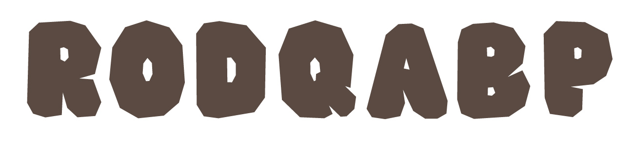
Some work on the /H /U /C and /Q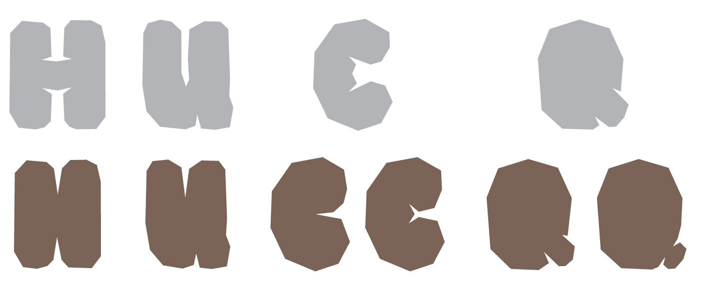
Not sure what else to do about the /Q's tail. As far as I would make out, this is how it would be constructed. Is the tail too big/wide?0 -
I want to see chromatic or shaded layers of polygon forms that make them look like boulders. This is fun.0
-
Thanks Brock! Did you mean something like this? That's more crystal than boulder though - but you could use it in a similar fashion I'd say... I've been experimenting with the idea already, though I'm not sure how one would set up a typeface that way. Is there a certain way to do that?0
-
Would letting the /Q/'s tail descend be possible?
Hmm, that /H/ and /U/ become much less legible, don't they. Try them in words to see if they retain enough identity in context.0 -
Yeah too bad huh?
Here are some alternate Q's (the lighter one is the original). I'm not too convinced just yet to be honest. Maybe it's the angle under which the tail is sticking out?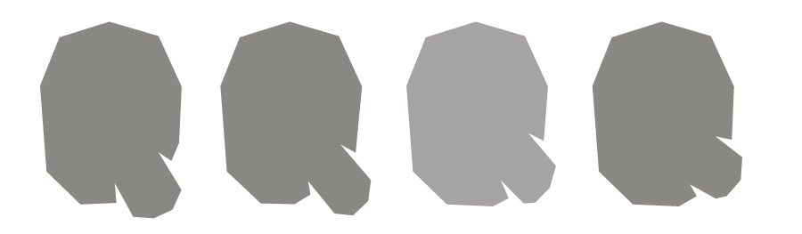
Some words with the /U and /H - I think you are right, they lost their legibility and their form/uniqueness. So maybe they are the odd ones out in this typeface. Or find a way in between without loosing too much character. (haven't replaced the /C just yet here but I do feel that those newer versions I just posted above are better) 0
0 -
I like the first /Q/ best of those.
Yeah, revert to the /U/ and /H/ you had, but maybe narrow the white channels in the /H/.0 -
Thanks for your comments Craig! I'll let the matter of the /Q sink in for a bit, see how I think about it tomorrow. The old /U and /H feel better for now.
Although this might be interesting too (based on the solution for the /C that feels most appropriate at the moment). Looking forward to reading your comments tomorrow (seeing that it's way past bed time in this part of the world") )
) 0
0 -
That works for the /H/ but not for the /U/ to my eyes.0
-
Yes the /H is getting there I feel. The /U seems to stay a little problematic. I was thinking the shoulder (?) of the /U is actually leaving the stem so it might be more consistent to create incisions in the stem instead of in the shoulder:
/H and /U variants - I feel the last /H is the way to go at the moment.
More /U experiments, the last /U is where the incisions change location from shoulder to stem.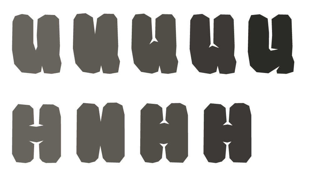
Word tests: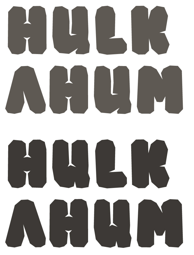 0
0 -
Nice, I like that solution for /U/.0
-
Thanks! I take it you mean the solution where it leaves the stem? I still kinda like the bottommost version in the last image, even though it's inconsistent with the rest. /H is getting better but still needa a little tweaking I think...0
-
Why not use a "L" shaped counter instead of the "T" in the /H? A bit like the /U in the upper lines of the last image.0
-
Would you mean something like this?
To me this doesn't feel right. It's not how I would write/construct the H... What do you think?0 -
Maybe keep L-shaped counter in the /U, but use the old solution for the lower right spur?
I agree that the new /H solutions don't quite feel right. Maybe you could use the middle one if the white spikes pointed into the other direction, and the crossbar was heavier?0 -
Thanks for your comment Christian. I did try that with the /U but felt that it wasn't ok. Tried it again and now that I look at it, it doesn't look that bad right now. It's still odd though, the system/logic of the typeface would dictate both parts leaving the stem (so both incisions in the stem). Anyway, logic is there to be defied, not?
Not so sure about that /H suggestion, it's still wonky to my eyes.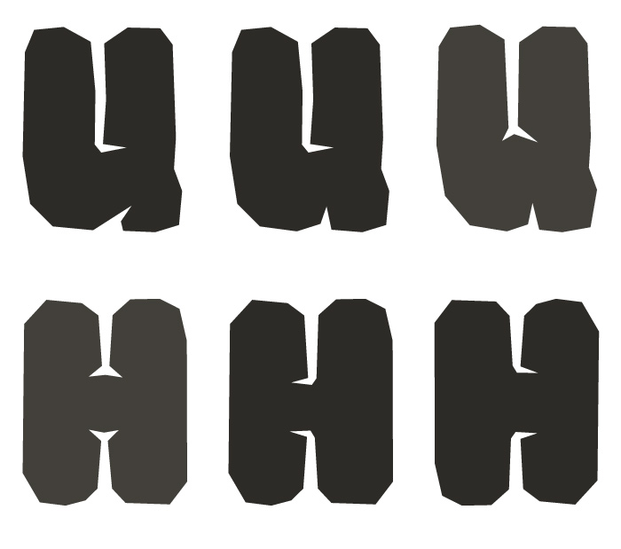 0
0 -
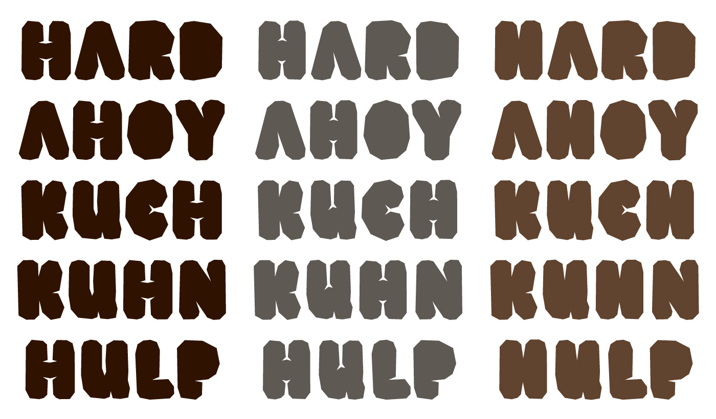
Set in a few words:
 0
0 -
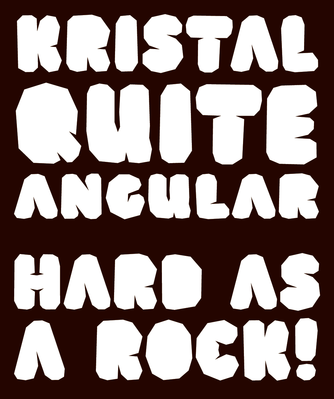
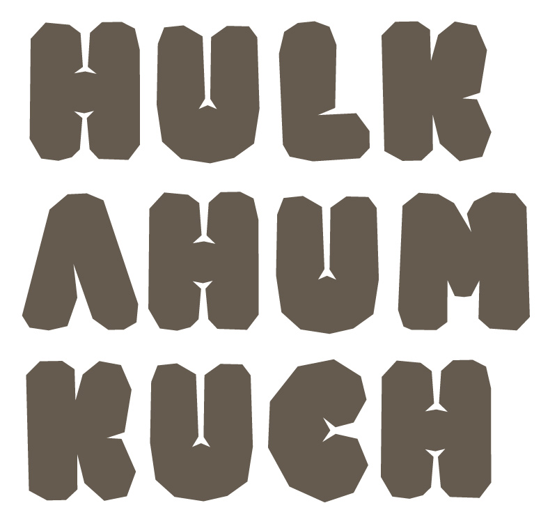
Testing words and text with that last /U and /H (both slightly tweaked). Here's a first type specimen. Obviously setting a lot of text with this isn't going to work that well, still I'd love to hear your thoughts!
0 -
-
Looking very good.
I'd consider renaming at some point - this doesn't look very crystalline to me. More boulder-ish (though note that Boulder has already been taken). It makes me think of this iPhone game.
The comma and period may be a little too round (i.e. segments too short). You might want to introduce some variation instead of just copy-and-paste to doubled glyphs like guillemets and double-quotes.
0 -
Thanks for the comment Craig. Boulder is a name I would have assumed to be taken already indeed. Same with Crystal btw. The name Kristal (Dutch for Crystal) I had in mind because of the crystalline look you could create with this if you treat it right:
Also, I'm just pretty fond of drawing crystals. Might be too farfetched though.
Good points about the comma etc - you should see the asterisk, way too smooth now. That happens a lot, working on it too much makes a number of the forms become too smooth and balanced. Good point about variation, will look into those.
That looks like a fun game by the way! That polygonal style is pretty hot these days.
1 -
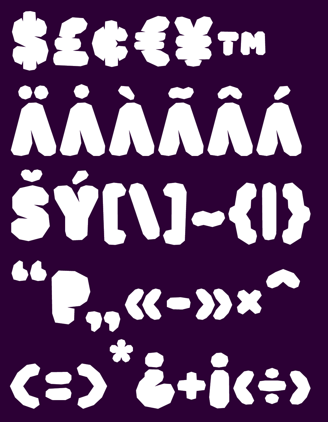
In the meantime, worked on the punctuation marks for some variation.
What do you guys think about the numbers? I set them slightly lower than the uppercase letters - is that problematic?
Here's a new type specimen. The /U still stands out a bit to me...
0 -
Trying a different approach to the /U, more in line with how the /C is solved...
 0
0 -
/C/ and /G/ look rougher than the rest of your crystals; I'd add a few more edges in-between. Also, it may not be a bad idea to get rid of their symmetry and imitate the unevenness of /O/.
Looking great!0 -
Thank you Alexis, good catches with the /C and /G - that's definitely something to remedy.0
-
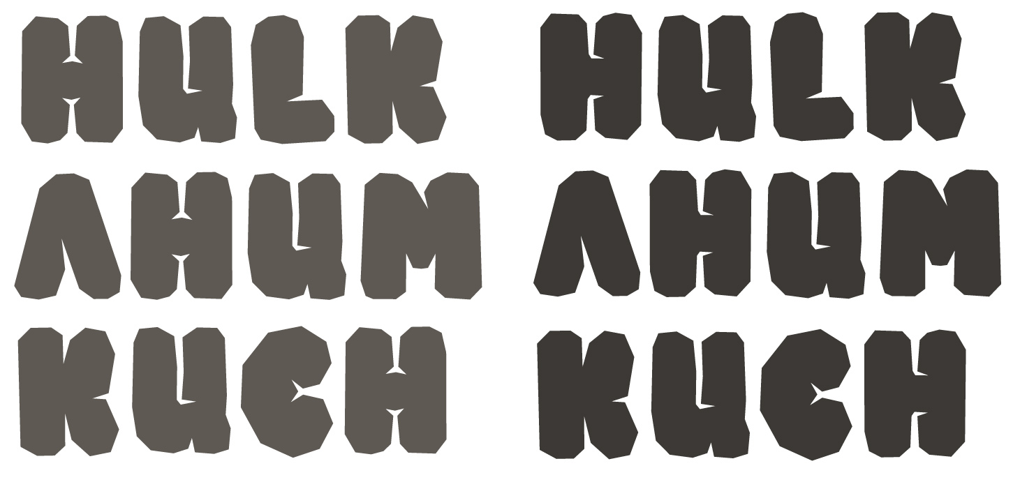
Specimen update, with new /C /G and /O and using that last /U to see how that works out - also added a 'fake' concert poster at the end - Primal might be an alternative name maybe, if Kristal doesn't work well?
0 -
Decided to raise all the numbers to be of equal height as the caps. Created stylistic alternatives for /at and for words such as /pm /am and /the
Should the latter three go into liga, salt or dlig? I went for dlig now because it might be annoying if you're writing 'regular' body text and words with "pm", "am" or "the" as part of the word are being replaced...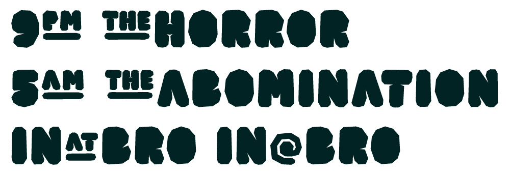 0
0 -
I would make sense to center the /at/ vertically within the cap height, as you are only dealing with the uppercase here. See what looks better to you.
The right "stem" of the /N/ looks thinner than the left one.
I think the /M/ could look better if the upper cut would point (more) to the midde, or if the cut was translated a bit to the left. Right now the cut isn't as successful in suggesting stroke direction as the other rocks IMO.
The /H/ could improve by thickening the crossbar. Im curious to see how it would look like if the crossbar didn't resemble a line, but a rhombus.1 -
I just noticed: The /5/ looks "weird", specially towards the bottom left. To me it is not yet distinctive enough to easily identify it as a /5/. I'd add a second cut right next to the bottom-left cut in the same direction as in /3/ (bifurcating like in /U/ or /H/).0


Categories
- All Categories
- 47 Introductions
- 4K Typeface Design
- 495 Type Design Critiques
- 577 Type Design Software
- 1.1K Type Design Technique & Theory
- 670 Type Business
- 885 Font Technology
- 29 Punchcutting
- 539 Typography
- 125 Type Education
- 333 Type History
- 81 Type Resources
- 113 Lettering and Calligraphy
- 33 Lettering Critiques
- 80 Lettering Technique & Theory
- 569 Announcements
- 100 Events
- 116 Job Postings
- 170 Type Releases
- 182 Miscellaneous News
- 270 About TypeDrawers
- 54 TypeDrawers Announcements
- 114 Suggestions and Bug Reports