Brilliance — a glamorous blackletter with small-caps

Christian Thalmann
Posts: 2,059
Dear TypeDrawers,
here's my latest project, Brilliance. It's based on my calligraphic experimentation with the Pilot Parallel Pens my girlfriend got me for my birthday.
PDF specimen: http://www.cinga.ch/type/Brilliance_specimen.pdf
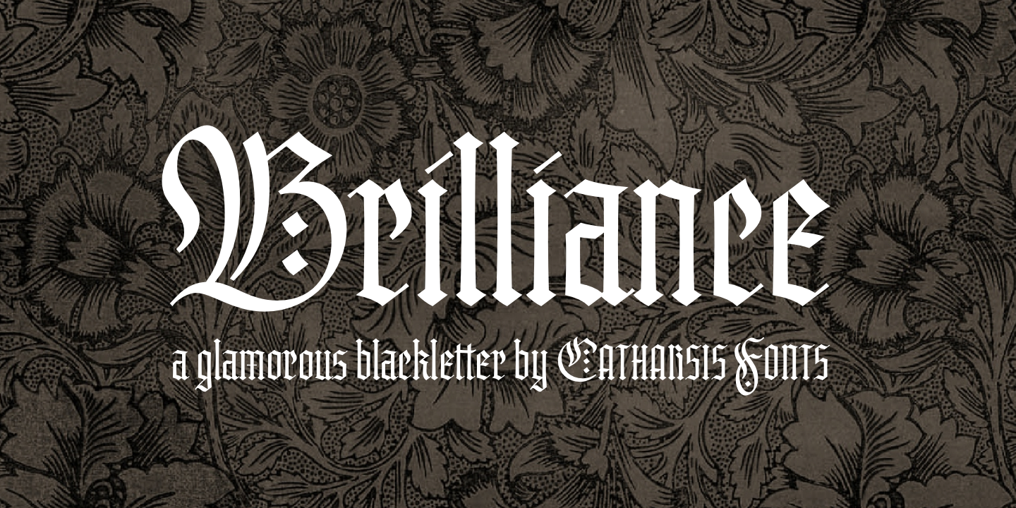
I'd be happy to hear your opinions.
here's my latest project, Brilliance. It's based on my calligraphic experimentation with the Pilot Parallel Pens my girlfriend got me for my birthday.
PDF specimen: http://www.cinga.ch/type/Brilliance_specimen.pdf

I'd be happy to hear your opinions.
2
Comments
-
I like the tall x-height. Visually the lowercase c comes out looking a bit short even though the top most point is level with the rest. I also wonder about the dash treatment for the dot of the eye. I realize that's popular among calligraphers. Besides the fact that it could be confused with an í (iacute), a diamond dot would be more in sync with the design.1
-
Hi Stephen,
thanks for the feedback! I didn't realize my x-height was unusually high for a blackletter. Maybe I should market it as a "humanist blackletter"?
I can see what you mean about the {c}. In fact, it's already raised above the x-height by a few ticks for precisely that reason. I guess I could give it a few ticks more.
As for the tittles, I am offering diamonds as a stylistic alternates, so I got that covered. Personally, I visually prefer the diagonal dashes; they somehow seem a bit more sophisticated to me. But the diamonds certainly work better at small sizes! Good to have both.
Cheers0 -
Is this a critique or marketing?
3 -
@ Jackson: Critique. Since I didn't hear any showstoppers for a few days, though, I've submitted the font for MyFonts to put on the test server. I could still change a thing or two before it goes live, if you see any specific flaws.
Edit: Incidentally, I just noticed that \e\x needed a touch of kerning, so I will definitely make another update before publication. I also raised the apex of the \c a tad as suggested by Stephen.0 -
Christian, I like it very much.
My only concern is the uppercase /G. It's a bit hard to distinguish as a G, and may be mistaken for an /O0 -
@ Pablo: Thanks! I can see what you mean about the /G, insofar as it has a completely closed outline. However, that architecture seems pretty common among blackletters, especially those of the Wilhelm Klingspor Schrift, which is probably my primary influence, and Old English fonts in general. For Brilliance, I've decided to prioritize texture over legibility, which is also why I have the space-filling /r and /c designs that modern readers might trip over at first. Finally, I rather like that /G shape, so I think I'm going to stick with it.
@ Frode: I'm sorry to hear that. In what way?0 -
I think with the terminal, pinch-points and thin strokes are all over the place in thinness, and it makes the face sparkle differently at different sizes.
This also means it will not sing at any one size as it is.2 -
@ David: I think I see what you mean, and I believe it is the result of a deliberate design choice to make the font deviate as little as possible from the logic of pen-and-paper calligraphy. For instance, the upper left tail of the /B does not taper down to the thinness of the lower right spur of /e, since the former's stroke deviates from the thin diagonal almost instantly, whereas the latter is drawn along the thin diagonal for more than a pen-width, allowing its weight to be limited by the pen's sharpness rather than the stroke. The pinch points in the top of the /n and the /e are not equally thin, because they are made from overlapping broad strokes, and I intentionally overlapped the strokes in /e less than in /n to counteract the greater blackness of the steeper downstroke in /e.
Are you suggesting that departing from the restrictions of pen calligraphy and regularizing all thin parts of the glyphs would result in an improved overall impression? I can well imagine that trade-off to be worth it. I can certainly give it a try.0 -
In the future please post your critique threads before you finish typefaces.0
-
@ James: I generally do that — on Typophile. My impression with Typedrawers is that critique threads are tolerated rather than welcomed, so I waited until I had a PDF specimen to show (which is a prerequisite for a critique thread on this board), and could keep the discussion short and to the point. It hadn't occurred to me that asking too little advice, rather than too much, might be a problem...
In any case, Brilliance is not published, so I can keep it on hold and as long as necessary until it works.0 -
Once you start making marketing materials and banners, you're probably not sincerely looking for feedback.0
-
I've remade those banners quite a few times in the past two weeks or so, and I'm happy to do it another time. I find they help me with motivation. For instance, I've since implemented Stephen's suggestion to raise the /c, added kerning in a few places, built the previously missing /c_h and /c_k ligatures (they're subtle; I don't like the clustered look of those traditional blackletter), and added a round /r since the last edition of the banners.
Admittedly, I didn't expect the need for a structural review of all glyphs, but I can accommodate that.0 -
@ Frode: I suppose that's what makes you a professional.
Personally, I find I have to forge my inspiration while it's hot. If I had to wait years for the gratification of finishing a font, I doubt I'd have the tenacity to do this in the first place. I'm trying my hand at a long-term project with Traction (see that other thread), and often feel daunted at the scale of it all... especially when I see how much effort other people are putting into perfecting their fonts in countless cycles of iteration. So when the inspiration for Brilliance struck recently, I was thankful for the opportunity for a shorter-term intermezzo.
Of course, delaying Brilliance another two weeks or so is a small price to pay if it significantly improves visibly in the process.0 -
@ David Berlow: I've started regularizing the thickness of the thin strokes in a few letters. I think it's an improvement on the visuals, without sacrificing too much of the calligraphicity. Is this what you were suggesting?
Right is new: 0
0 -
@ Frode: Thanks! I would also like to see that. At some point, though, I fear it would stop feeling like creativity, and more like grinding.0
-
Edison might as well have been talking about type design when he made that quip about 1% inspiration and 99% perspiration.2
-
Then again, Edison was a jerk. I'd rather be a Tesla.

But point taken.0 -
As a typographer — and one that likes blackletter more than one should circa 2013 — I prefer fonts that have grinded all night long. Creativity may get you past the bouncer but it only goes so far on the dance floor.1
-
Yes. Much nicer.0
-
Alright, I've gone through the font, regularized the thin strokes, and cleaned up some curves on the way. Very much worth the effort. Thanks for the pointer, David!
I've uploaded the specimen:
http://www.cinga.ch/type/Brilliance_specimen.pdf
Anything else that leaps off the page? Otherwise I might start making another generation of promotional posters... ;o)0 -
Pretty good work. I would do something on the |c and r| seems hard to read to me. Keep in mind the readability or legibility.2
-
I like! A glamorous blackletter is a delightfully twisted idea... kind of like putting skinny European models in monks' habits. Actually, I could see that... some leggy blondes in Carthusian garb to sell Chartreuse. The tall x-height definitely works to evoke such images.
Anyway, I think the diagonal slashes on /i and /j are a good idea (traditional, after all), but said slashes seem a bit thin. I also agree with AndreSimardFont that /c and /r could use a bit of tweaking.0 -
I don't know why you'd say that, Frode. This design is better than it was, because of the constructive feedback that this thread elicited (e.g. David's correction about the relative weight of the thins). That's doing good.
I get that the impression of having the answers already that comes from the promotional graphics meant this thread started with a faux pas. And I agree generally that the more decisions that are already made about a design, the less satisfying it is to critique it. But I see feedback of substance here, I see the original designer improving his work, and I see a conversation that is helpful for me as a third party, too. So the idea of pulling the section seems way off base to me.
Maybe you can say more about your perspective and rationale, Frode. Your comments so far here are kind of oblique.1 -
I agree with Craig; I feel that Brilliance has greatly benefited from this critique thread. The Misurina critique thread a while back was also an eye-opener for me — someone correctly pointed out the font lacked a coherent theme, so I ended up splitting it into a coherent Roman and a coherent Upright Cursive. I would never have made that step on my own, but it was for the better.
I do apologize for the faux-pas of presenting an almost-final font for critique. Things work a bit differently here than on Typophile, and I'm still adjusting.
@ Andre, Michael: I realize the shapes of /c and /r are more similiar to each other than Antiqua readers are used to — I remember finding that confusing too when I rediscovered blackletter a few months ago. However, I largely followed the example of the grand old Wilhelm Klingspor Schrift and the widely used Old English in those letters... I particularly like the concept of a rightward-pointing foot on the /r, so I wouldn't want to give that up if it's not necessary (though I guess I could shorten it?). I found the swashy upper right terminal a bit awkward at first, but now after the fine-tuning I find it looks pretty sharp.
What changes would you suggest to make these letters more legible while preserving the textura flavor?
EDIT: I just tried out some changes on the /c and /r: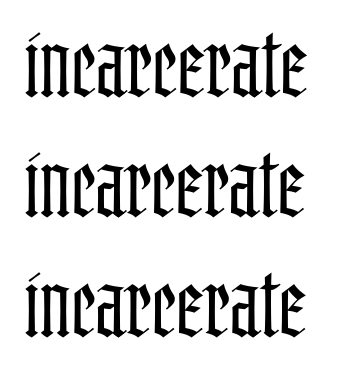
The first row is the previous status quo. In the second row, I've narrowed the /c and reduced the foot of /r. I like the first change, but the second one tears a hole into the closely-woven texture of the font. I think I'm only going to keep the first change (==> third row).0 -
The S and s are leaping into the 5's slot in my brain.
At smaller sizes, the extremely high-waisted R, B are not helping.
I don't accept the "dots" on i and j and useful. I tried.0 -
I would use a straiter top right stroke on the /c, a bit like the top right part of the /e.
The "dots" on the i are indeed strange. Two of them would be correct for the umlaut but in the /i I would use something more diamond shaped.1 -
@Georg: Good suggestion for the /c. I agree with the suggestion for the /i, or it should be larger.0
-
@CHristian:
"I think I'm only going to keep the first change (==> third row). "
Good call! That adds just enough difference between /c and /e to aid legibility, while still remaining Textura. As for /r, maybe a longer foot and/or head for more distinction between it and /c? Than again, the more acclimated to this sort of blackface I become, the more I like the consistency between the two.0 -
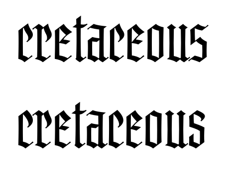
Alright, I did some more tweaking. How do you like it? The /c is rounder, the /e is narrower, and the /s is completely redrawn:
I tried lowering the waist of the /r and /b in SC, but I didn't like it much. They ended up just a bit lowered, and somewhat reinforced at the waist.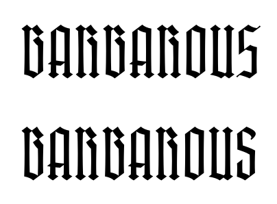
As for the tittles, I've now moved the diamonds to the default positions (they were a stylistic alternate before). I've kept my original thin diagonals as a stylistic alternate, because frankly I really like them at large sizes.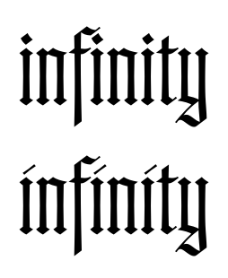 2
2 -
Oh, and I updated the specimen: http://www.cinga.ch/type/Brilliance_specimen.pdf .0
Categories
- All Categories
- 46 Introductions
- 3.9K Typeface Design
- 489 Type Design Critiques
- 572 Type Design Software
- 1.1K Type Design Technique & Theory
- 663 Type Business
- 875 Font Technology
- 29 Punchcutting
- 529 Typography
- 121 Type Education
- 328 Type History
- 80 Type Resources
- 111 Lettering and Calligraphy
- 32 Lettering Critiques
- 79 Lettering Technique & Theory
- 561 Announcements
- 96 Events
- 116 Job Postings
- 169 Type Releases
- 179 Miscellaneous News
- 269 About TypeDrawers
- 53 TypeDrawers Announcements
- 114 Suggestions and Bug Reports


