How to design a curve

mauro sacchetto
Posts: 353
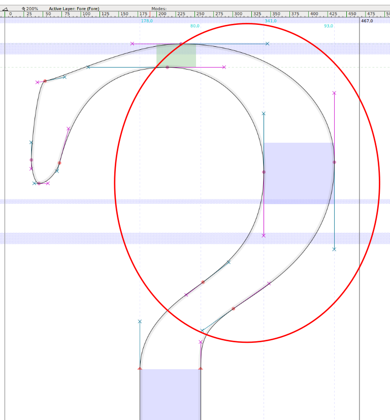
Which is the most efficient way to design a curve, so that it is symmetrical, harmonious? Are there basic criteria to be met?
I enclose an example of what I mean here by "curve"
Thank you

Thank you

Tagged:
0
Comments
-
I generally take a circle, convert it to outlines, break the nodes and use one quarter segment to form sections of the curve. I shape one segment, then duplicate the segment and flip it, and continue stretching and shaping. It works for most segments, except those like the one forming the top left of your example. I would add an extra inflection point where the curve changes direction.
2 -
The user and all related content has been deleted.11
-
There are two ways to answer this question, a facetious one and a serious one.
The facetious answer is: yes, there exists a mathematical description of an efficient, pleasing curve that you describe. The challenge is to find a point on a given ellipse such that the curve of the ellipse is tangent to a given straight line. The mathematics are actually more complicated than you would think, but a full derivation is given in Knuth’s 1980 article “The Letter S” (Mathematical Intelligencer 2:114-122).
The reason this is facetious is that nobody ever designs curves like this, because type design is not a matter of mathematical logic. The true test of whether a design is right is whether or not it looks right, and learning whether or not it looks right is far more useful than learning the algorithms that ought to make it look right.
The serious answer is the one James gave you.4 -
I draw a curve (In Glyphs) by placing the extrema points, shift+opt clicking on the lines to convert them into curves, then push and pull everything into place.1
-
What @James Montalbano said but also make sure you're looking at a black and white preview without construction lines. Bezier handles and guidelines will often try to convince you that a curve is better than it really is.4
-
I start with the pen tool in FontLab and click and drag while watching the curve form. I then tug and shift handle around until it improves. When I get an almost something. I copy it to the mask layer for a reference. I putz I pull, I look and putz again. I keep doing this until I fall asleep. The next day, I look at it in dismay and work on it more. I keep this up until it seems correct. I repeat the process until I learn how to see the curve. Seeing is believing but that will come eventually.
3 -
What James, Ray & Chris said, but I'll share a little trick I've learned over many years of tweaking shapes and adjusting curves digitally. First off, you need to train your eyes to see good shapes—this takes some time and experience. Nothing worth while comes easy. It helps to learn how to draw good shapes on paper—hand and eye coordination.
That said, let's get right to the issue. OK, so you've drawn a glyph using digital vector points. You're looking at it and you notice a few spots where the inside curves are not working exactly well with the outside curves and overall movement. Ok, so how do you quickly make the adjustment to the overall curve in that location without adjusting the vector point itself or the support shift handles around it. I'm not saying you cannot do it that way, just that it's difficult to do.
Realize that most times the shape is not awful, just slightly off. Better to focus first on where the spot is bad. Then, use FontLab "Knife Tool (3)" and click on the before and after the bad spot. try to be careful and not change the original curve while you are placing these two additional curve points to the overall curve (keep a copy of the glyph in the background Mask area). If you slightly are changing the shape "undo" until you add these two new points on either side of the curve without altering the original overall shape. Now you can delete the extreme vector point on the bad spot, keeping the 2 support vector points you've just added to the curve. If you've done this correctly, you will immediately see the bad shape improve. If not to your satisfaction, play with the handles (of the 2 added points)... pulling one out which seems more obvious to your eyes. If not that one..."undo" try the other handle of the second added point. If the shape finally looks good now, go to the menu and select "nodes at Expremes". Done. You can try to delete the added perious 2 points to make this adjustment, but sometimes you will need to keep them to keep the improved shape. That's it!
You can try this technique on bad curves at extremes, or anywhere along a curve. Same principals apply. It just takes some practice. After awhile anyone can get really good at this.
I'm attaching 2 visuals to illustrate this all clearly.
Here is a figure "eight" I was working on. I see that the inside of the top inside curves look a bit flat on the inside extremes of the curve.
So, see the adjustment I made as indicated in my discussions above.
I added the 2 RED new vectors on either side of the bad spots. Then, deleted the original extreme points. And, had the application create new extreme points. I still had to adjust one of the 2 support points (on the right inside upper spot on curve) to get the overall shape just right. But, this was the general technique I used.
I always leave the original shape (in the background Mask layer) so that I can visualize the adjustments I've made.
If you decide to try this, please let me know how this works for you.
If needed, you can contact me directly at akaczun@verizon.net with your problem glyphs and I'll make the adjustments for you in FontLab and send you back your data as a learning exercise.
Good luck, I hope this helps. —Alex4 -
Thank you very much for your excellent advice. Give me some time to do some tests and exercises - as @Kaczun prescribes
 - , then I'll report ... In any case, are sometimes more points better than less? 0
 -
The fewer points you have, the easier it is to make the transitions from point to point smooth. On the other hand, more points allow for curves that you simply could not make with fewer points. Use the fewest amount of required points, but no less.4
-
Notan.0
-
At the risk of going slightly off-topic, I'd say the question of the arch (shoulder? spine? belly?)
 is slightly less alarming than the terminal
 which I'd rather see more like this:
 (Though you probably know it since you already told us to focus on the arch). In this quick draft I changed the character of the finial considerably, but what I meant to do was mainly add the indicated node.Over time I developed a intuitive fondness towards control points that are, for lack of a more proper scientific term, „equally responsible for the shape of the curve”, i.e. I like to have comparable areas between the handles of the control points and the curves. (This might not work for the spines, though, and probably many more cases).To me the node I pointed out feels more important even than the inflection point, because it makes for a smooth corner (as in: actually affects the curve itself, not just its rendering).As for the arch: I don't know what are your experiences with calligraphy, but in general, take broad-nib calligraphy, learn it, and then use typography to improve on everything calligraphy can't do or makes difficult.1
 -
My example comes from EBGaramond. I see that the corner, after @Adamjagosz correction, is more smooth. But should I consider the original version technically imperfect, or simply made with a different propensity and a different aesthetic taste?0
-
Disclaimer: my experience in type is much shorter than a lot of wise people’s here, so I’d love to hear other opinions.To me the finial as it is looks a bit unintentional (a bit random, I woke up like this kind of way). I wonder whether there were glottal stops in original (pre-digital) Garamonds.Then again, I think Garamonds are meant to have a certain degree of organicity. Compare it with the finials in letters that certainly received much more designer love. It doesn't stand out particularly, unless you zoom in really close, or inspect the actual curves and nodes.
 0
0 -
That’s right. From Mauro's reply I think his question is also not just about the harmony of the curves "per se", rather the basic question for those of us which have to transfer the curves (or directly draw them) with bezier-based tools.James Montalbano said:First you must imagine the curve in your mind. Then you draw the curve. When it matches what you first imagined you are done.
So I believe he might have been asking the recurring more specific question as well, are there methods to arrange my control points and handles in the most correct way? I admit I have never dug deeply for this.
Here’s an old thread with suggestions: https://typedrawers.com/discussion/967/beziers (some links no longer work).0 -
The user and all related content has been deleted.1
-
@James Montalbano I agree. I think this is the artistic side of this craft, everyone’s got their own technique(s), just like painters, or even musicians.@mauro sacchetto I wonder whether the original question was maybe about what should be the weight distribution (harmony) of this particular glyph, as it’s one of a kind really?0
-
no, I mean the technical tricks ... art achieves an adequate realization only if you are able to handle the technique well ...1
-
I sometimes remove one or two nodes at extremes, and draw the curve with fewer control points, to make the entire curve more smooth. Once satisfied, I'll put the nodes at the extremes back in of course.
That, and lots of RMX's Harmonizer tool.4 -
It also clearly depends on whether one has started from an already accurate pencil drawing or if he’s drawing directly with the bezier curves.James Montalbano said:@Claudio Piccinini The better one gets at manipulating drawing tools, the closer one gets to my original statement. We all have our bezier techniques, are mine the same as yours? Who can say?
In the last case, the question goes directly to your reply. Otherwise, since you have already obtained the desired curve, it’s a matter of redrawing it with the curves, and thus the question becomes both technical and of getting accustomed to them, as you said.0 -
My own experience of drawing curves is abysmally tiny, but one thing I’ve noticed is that I always fail miserably when drawing with nodes at extremas.
I get much better results when placing nodes at “corners”. I mean as if I drew a Bezier circle and rotated it 45 deg. Something like:
If I try to do this with nodes at extremas, I always end up having frustratingly ugly shapes
I use the FontLab 7 node sliding (Shift-Alt-drag) to get a node to a position where the angle of the handles makes visual sense (often at the point of highest and lowest contrast). I can get sensible shapes then. The longer the handles the better.
Once I’ve drawn something, I copy to mask and “Clean Up”. Then I get “technically correct” curves with nodes at extremas, but that means that something is lost — somehow those resulting curves no longer “create” the shape, merely “describe” it.5 -
@Adam, try eliminating one of the on curve points and using the other handles, shape the curve. After you see what you like, place a point at extrema. Copy this curve to mask and go back and delete the point that you did not touch before and adjust neighboring handles to see the curve as you like it, the place a point at extrema. This balances the tension in the curves between points so the curve appears smoother.
0 -
Having nodes at ~45° makes it very difficult to keep the stems in sync.
2 -
Perhaps I wasn't fully clear. If there are obvious stems, I place the nodes at H/V extrema. But in characters such as S or 8, the contrast is usually atypical — then I try to place the nodes at the contrast extrema, not the technical extrema, and try to keep them there for as long as possible.
 0
0 -
As much as I like the ring of this statement, with which I generally agree... on rare occasions, there are situations when vectors reveal issues you couldn’t expect to anticipate in your mind or even on paper. Or put differently, sometimes the final solution, even if it implements the mental image somehow, differs from what you expected.James Montalbano said:First you must imagine the curve in your mind. Then you draw the curve. When it matches what you first imagined you are done.2
Categories
- All Categories
- 46 Introductions
- 3.9K Typeface Design
- 489 Type Design Critiques
- 572 Type Design Software
- 1.1K Type Design Technique & Theory
- 663 Type Business
- 875 Font Technology
- 29 Punchcutting
- 530 Typography
- 121 Type Education
- 328 Type History
- 81 Type Resources
- 111 Lettering and Calligraphy
- 32 Lettering Critiques
- 79 Lettering Technique & Theory
- 561 Announcements
- 96 Events
- 116 Job Postings
- 169 Type Releases
- 179 Miscellaneous News
- 269 About TypeDrawers
- 53 TypeDrawers Announcements
- 114 Suggestions and Bug Reports


