Hi all,
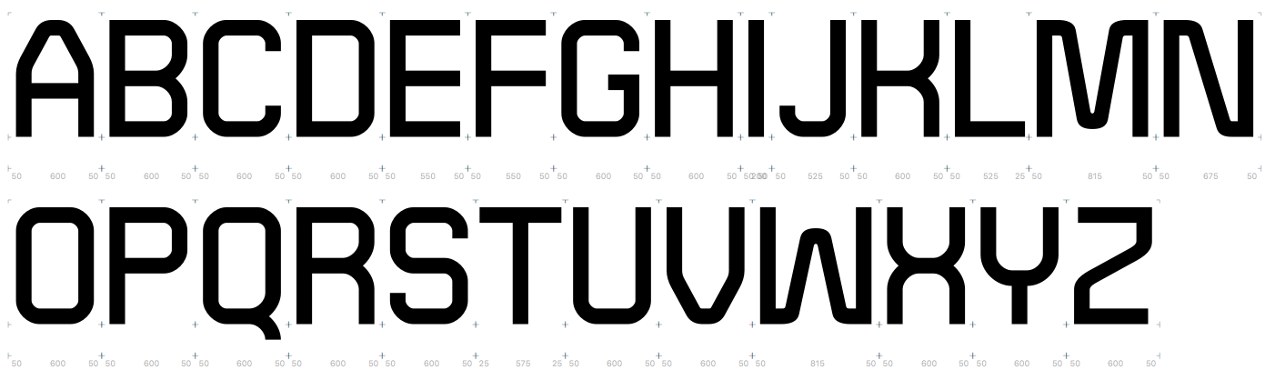
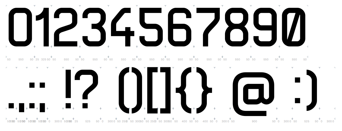
I've been working on this idea I had about combining a strict grid with rules for radia; from a few specified ones, a radius is chosen based on the specific situation (end of stroke, lowercase curve, lowercase intersecting curve, uppercase curve, uppercase intersecting curve).
For example, look at m, B, or 8, and the multiple different radia occurring inside those single characters.
The goal of such a system would be creating an impression of precise industrial machine-etched type.

This is of course very much a work in progress and still early at that, please consider it as such. I will increase the weight difference between upper and lower case; some characters are not quite there yet; I have to think about the way MNVWXYZ fit in with the rest.
I've had to pause the work on this for two months and now I'm resuming it, so I thought it would be a good time to hear what advice or criticism someone more knowledgeable than myself could offer.
Thank you.Here are some current samples:


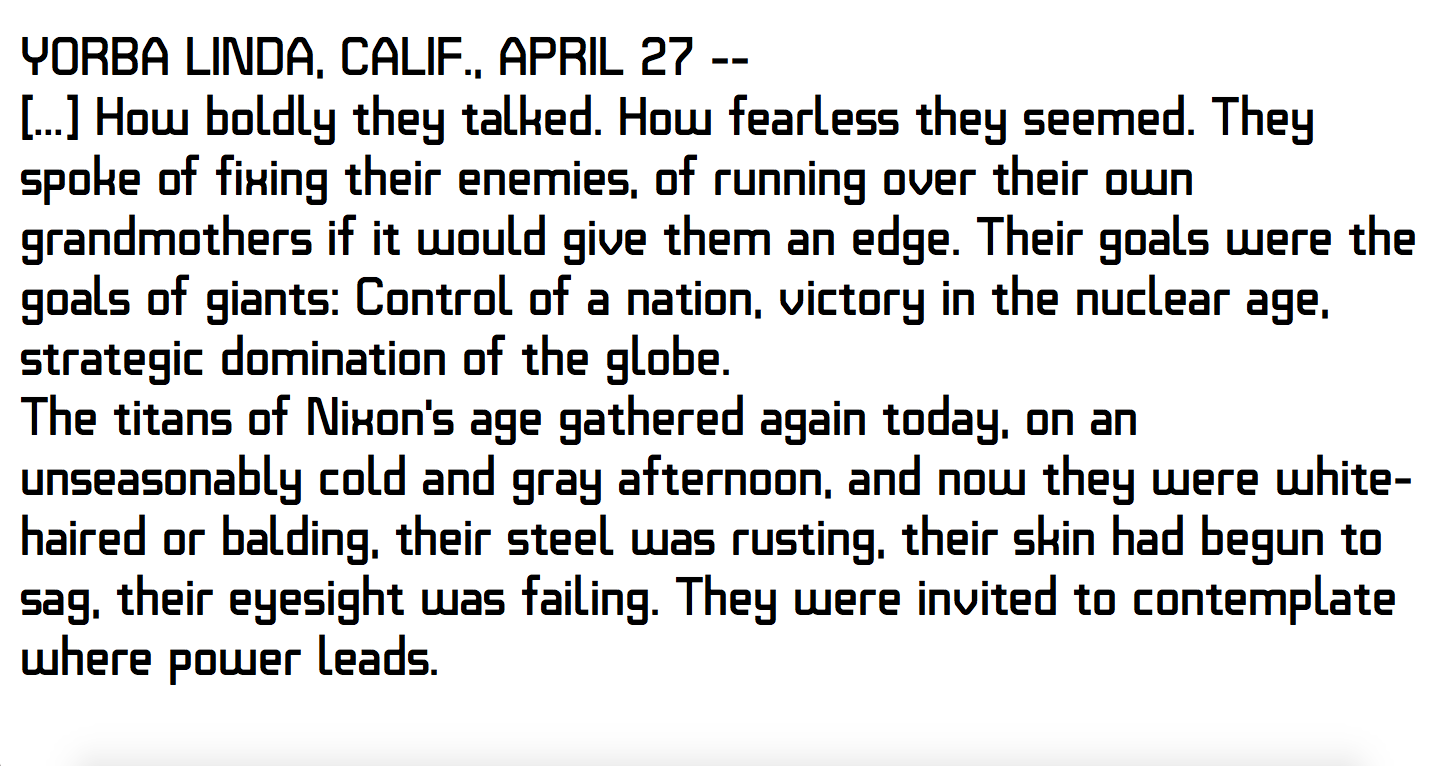
And a chunk of text:

Comments
Is anyhing sticking out too much?
Some other advice on taking this further? Any suggestions for a name?
Thank you!
Admittedly, it would make them go less deep than the /j, but the /p and /q are a bit too deep for my taste anyway.
Thanks a lot for your insight
What would be that category, the overall look? Is there any name/tags for it? Asking so I can find examples and learn more about it.
Thanks for trying it out. Absolutely! It bugged me a little, but after @Paul Miller pointed it out, I noticed how strong the impression is. Working on it right now. I think a big clue to solving /X/ of this font is what the natural way of writing it is; two separate diagonal strokes, instead of two curves. So the letter should be more in tune with the Z than the U. Tuning and trying out! Thank you both!
Thank you for your suggestions! I'm now tuning the ascending and descending characters:
Any thoughts on this direction? I feel these shorter and simpler descenders are much more pleasant! Still looking at lowering /p/q/g/y to baseline, not sure yet.
Trying out a few paths now, but not quite there still.
As for the /l/ tail problem, I didn't notice it before you pointed it out, but now I see how distracting it is. Trying out a shortened one now. I've also matched the /t/ to it, but not sure about that one:
Hmm, yeah the /4 is tough, not sure any of these are clicking yet like you said. Maybe something less vertical on the left stroke and perhaps with more diagonal to it? Would take some playing. The right stroke may need to be a little taller in some cases.
This is the current state of /X/ and /x/, both intended to look as composed of originally two diagonal strokes, that are interpreted in the style of this typeface (straight beginning and end, and matching radius):
and in context of XYZ:
What do you think about it now?
For those interested, here is the current state of the basic set for further criticism, as well as a map of all the glyphs so far in the attached pdf:
The new K and R are not really working as yet.
For example; if you have a low resolution pixel font and one of the letters goes "off-grid" like an M or a W, that rule break could be easily noticed. If the rest of the font is barely perceptibly already off-grid, the M or W is more likely to harmonize.
Another example: picture a classic monospaced typewriter font. Except one letter isn't monospaced. There's a wide m. The gaps in the m are identical to those in the n. That's going look odd and stand out to the reader. Now look at ITC American Typewriter. The monospace rule is broken all over the place so we don't even notice that the m is wide. The rules are bent just enough that the reader still perceives it as a typewriter font.
When I look at this, the and H and U look wider than the O. The top of the B looks larger than the bottom. and the "crossbar" looks thick. If you optically adjust the crossbar like Helvetica, that's probably bending the rule too far. But you can give it a subtle nudge higher and thinner to a degree that it doesn't spoil the effect of the rule. If you keep making those adjustments all across the typeface within a consistent perception threshold, you'll have more flexibility in dealing with troublesome characters like K, R, V and X.
Thank you!