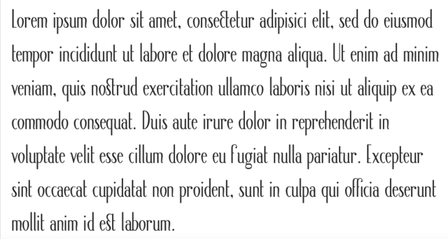
A fancy font
Johan Chalibert
Posts: 1
Hello TypeDrawers,
I am new on this forum. My name is Johan, I am 19 years old and I'm a student in literature and history. For almost one year now I have been trying to design a font. I have already tried to improve it a lot (I have redrawn the whole font twice) but I believe that there are still many things that don't work, and I feel a bit lost about what I should keep and what must be redesigned. Therefore I would be glad to have your opinions.
As you can see in the proof PDF file, there are two versions of the "e". I have been trying to improve its design lately. The old version is the fully-rounded one.
I thank you all for your precious critiques,
Johan


0
Comments
-
Neat
 It gives me a warm art deco meets prerrafaelitas feeling. The G and g can use a bit of work, the g more so. The end of the tail of the y seems a bit off, I do not see the same droplet shape anywhere else in the font.
The diacritics match the style, only slightly adjust the horizontal positioning.
Print out a mirror version and you will see inconsistencies yourself. Nice first try! Bravo! Can't wait to see wider and bolder versions. 0
 -
"Print out a mirror version and you will see inconsistencies yourself." -- That's very useful advice. Thanks.
0 -
I liked it, I believe the cartoon surperman would also like,
Or just print and see inside outVasil Stanev said:Neat It gives me a warm art deco meets prerrafaelitas feeling. The G and g can use a bit of work, the g more so. The end of the tail of the y seems a bit off, I do not see the same droplet shape anywhere else in the font.
The diacritics match the style, only slightly adjust the horizontal positioning.
Print out a mirror version and you will see inconsistencies yourself. Nice first try! Bravo! Can't wait to see wider and bolder versions.
I agree with Vasil Stanev: the / g seem to have a very ‘large head’, /y was done in an incongruous way and the / Y looks a lot like the / V advise you to try to increase the rod width
0
Categories
- All Categories
- 46 Introductions
- 3.9K Typeface Design
- 489 Type Design Critiques
- 572 Type Design Software
- 1.1K Type Design Technique & Theory
- 664 Type Business
- 877 Font Technology
- 29 Punchcutting
- 530 Typography
- 121 Type Education
- 328 Type History
- 81 Type Resources
- 111 Lettering and Calligraphy
- 32 Lettering Critiques
- 79 Lettering Technique & Theory
- 562 Announcements
- 97 Events
- 116 Job Postings
- 169 Type Releases
- 179 Miscellaneous News
- 269 About TypeDrawers
- 53 TypeDrawers Announcements
- 114 Suggestions and Bug Reports


