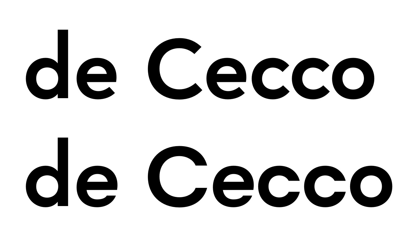
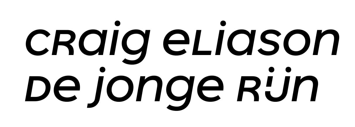
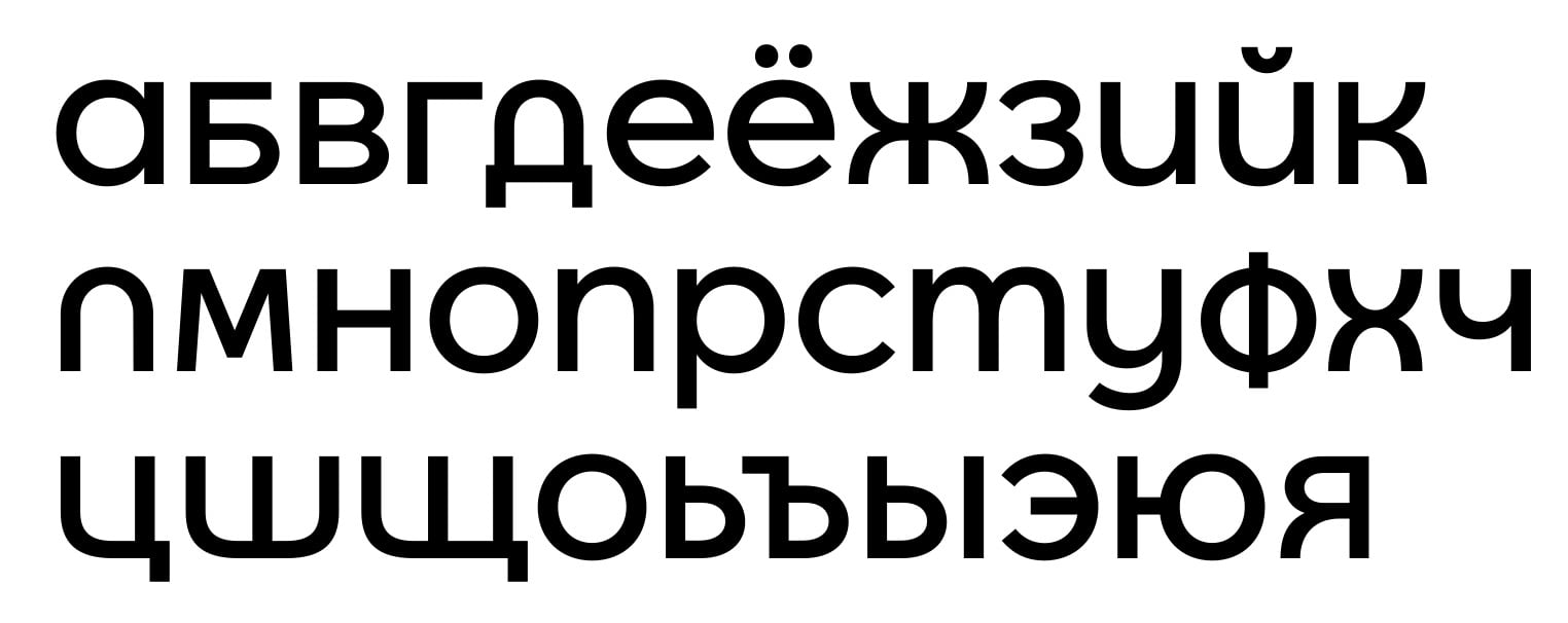
Freitag — toying around with a geometric display sans
Comments
-
Yeah, I don't like /1's without at least a hint of an onstroke. In my handwriting, I start the /1 almost at the baseline, with a ginormous onstroke. I bet that would parse as a /7 for most Americans.
/W: I see what you mean, but that archy /W has been bugging me next to those /U/V. The angular /W doesn't stick out like that, so I prefer it.
0 -
Fair game on both accounts if you ask me
 0
0 -
I'm impressed with the evolution of this project. It has become something so much more interesting than the initial description! I'm digging the occasional rounded corners (although maybe the radius is too larger?)
The numerals are an unexpected surprise... nicely done.1 -
Agreed!The numerals are an unexpected surprise... nicely done.0 -
I've tried a different design for the alternate /g, after space got too tight to reasonably pull off the two-ellipse design. Would you rather describe it as ridiculous our laughable? ;o)

3 -
While I really love that shape, it's rather difficult to read. Could have been a /q too, or a greek letter (phi). What if you move the small top stroke to the side at a 45 degree angle? And maybe that bottom one too? It will differ a lot from the approach of the other glyphs though?0
-
Interesting, and nice catch Kent. The angle on the two strokes/stems definitely helps it's readability, so it could be worth a try Christian.0
-
Hi Christian, as a newcomer to this forum (Hello everybody!) and to Latin type design, I really like your geometric sans, especially the attempt to create a unicase feel for a portion of the caps.
A few ideas:- The consistent "big Os" in /ACEGOPQÞ look great, which is the defining feature of your font. I'm tempted to kick as many caps into this "big O" league as possible, but it seems the current proportion of big Os vs. conventional caps is just fine.- In /MNUWY of the default caps, everyone except /W have feet/spurs. How about adding one to /W to make it consistent? Accordingly, in the "well-behaved" or NASA-like caps, should /U be footless for consistency?- About your struggle with /B, what about a shape that is similar to Cyrillic /Б. I'm not sure how could it match your style, but that's how I design the /B in one of my futuristic geometric sans.- Agree with Jan that /G and /Y stand out because the descenders look too heavy compared to /P and /Q. How about make the descenders half, like that in /J ?0 -
Thanks for the feedback, Bert!
I also like the «Big O» capitals, but I'm not going to force such components on letters that don't want them.
On /W: The UU-shaped /W only appears in SS01 now, in which all related letters are also spurless. I've tried a spurred UU-style /W, and it looks horrible. I've made the default angular /W a bit wider to better match the wide caps in the default cut, though:
I think a /Б-shaped /B would look positively freaky... sure, my current default caps are not conventional in any way, but I think they're weird in a self-consistent way that /Б wouldn't be.
As for half descenders on /G/J — I gotta say that Interstate's vestigial half-descenders give me the creeps, so I'm hesitant to try it out. I have lightened the descenders ever so slightly, though.
0 -
Alright, I've got a first dual-master version of Freitag finished. I've exported six weights, as well as dedicated font families for SS01 (spurless arches) and SS02 (regular-style capitals), which I'm calling «Freitag Round» and «Freitag Roman» for the time being.
Here are some testing PDFs and some screenshots of the whole glyph inventory from within Glyphs. Feedback welcome!

1 -
I've started with an Italic now. It takes more manual work than I expected; simple «Cursify» doesn't work out for most of the glyphs.


0 -
I wonder if the /C/s should be more closed. The /C/ and the /S/ too feel less geometric than the other caps.1
-
Hi Craig,
I sort of see what you mean, especially about the /C in Italic. I've given a more closed /C a try, and while I like the look of it, I find it changes the flavor of the font quite strongly:
If I adapt other letters to the design philosophy of that /C, the effect becomes even more pronounced:
Obviously that /e would need more work, but I think the overall effect is clear. I find the lower line stuffier, colder, more Helvetica-esque than the original. Not what I'm going for.
I'll try coming up with another way of closing the /C a bit, maybe preserving the orthogonal cuts. Problem is, the current design works very well with a following round capital (see «COCOA» above), and that's likely to take a turn for the worse if I close the aperture.
0 -
I don't think Craig meant to go all the way to a horizontal terminal. Definitely changes the design too drastically.2
-
Oh, OK, I'm starting to see what you mean. Is this better?


As for the /S, I rather like its current form. What would you suggest to make it more geometric? (I'd rather sacrifice geometricity for humanism than the other way round, though.)
1 -
Similarly more closed, with curves that are closer to circular (recognizing that this rubs against the desire to keep the glyph wide). Rounder top and bottom, maybe spine closer to flat, smaller apertures.Christian Thalmann said:
As for the /S, I rather like its current form. What would you suggest to make it more geometric?
I think those most recent /C/s look better.0 -
Craig, is this what you had in mind? Unlike the /C, I'm not sure it's an improvement. Although both designs are equally wide, the new /S (top) feels narrower to me and seems to pick up the flow of the other letters less readily, probably due to the smaller counters.

0 -
Yes that's basically what I envisioned (though it's leaning forward a touch). I think it's character is more fitting, though I agree that it looks narrow.1
-
*its0
-
Hi Craig,
I've tried to widen the /S, and I think it worked very well.


0 -
Nice, I like it.
Any thought of throwing a tittle on the /I/?1 -
Good idea! I've put the tittles in SS05, since they look horrid in mixed case.

0 -
Contextual alternates for /Q.ss02... less geometric than the default /Q.ss02, but I have a weakness for long-tailed /Q.


0 -
Is this Cyrillic working? The first is the more experimental unicase-like style, the second the «well-behaved» SS02 (which I now expect to become the primary style).


0 -
Changed the /El-cy and /U-cy to be more legible (hopefully!).

1 -
Ge/г, Che/ч is slightly wide.0
-
Hi Alexander,
thanks! I've made them narrower.
Meanwhile, here are the new versions of the unicase cut and the roman cut, now with lowercase. Does that work?

Oh, and I'm thinking of simplifying the /б as follows. Does that work?
0 -
I have no Cyrillic expertise, but all the /Ш/ш/s look wide to me.0
-
Hi Christian.Oh, and I'm thinking of simplifying the /б as follows. Does that work?No, it does not work
 You can try next:

(Example: Journal Sans)Uppercase U/У is heavy bottom and narrow. Maybe you should try something else.Here (download the archive) are tips from CSTM Fonts:
Although I do not agree on all points.2
Categories
- All Categories
- 46 Introductions
- 3.9K Typeface Design
- 489 Type Design Critiques
- 572 Type Design Software
- 1.1K Type Design Technique & Theory
- 663 Type Business
- 877 Font Technology
- 29 Punchcutting
- 530 Typography
- 121 Type Education
- 328 Type History
- 81 Type Resources
- 111 Lettering and Calligraphy
- 32 Lettering Critiques
- 79 Lettering Technique & Theory
- 561 Announcements
- 96 Events
- 116 Job Postings
- 169 Type Releases
- 179 Miscellaneous News
- 269 About TypeDrawers
- 53 TypeDrawers Announcements
- 114 Suggestions and Bug Reports


