Howdy, Stranger!
Categories
- All Categories
- 39 Introductions
- 3.6K Typeface Design
- 765 Font Technology
- 1K Technique and Theory
- 590 Type Business
- 435 Type Design Critiques
- 527 Type Design Software
- 30 Punchcutting
- 132 Lettering and Calligraphy
- 79 Technique and Theory
- 53 Lettering Critiques
- 462 Typography
- 289 History of Typography
- 111 Education
- 62 Resources
- 480 Announcements
- 74 Events
- 104 Job Postings
- 147 Type Releases
- 154 Miscellaneous News
- 259 About TypeDrawers
- 52 TypeDrawers Announcements
- 109 Suggestions and Bug Reports
Options
Does that “y” exist?
Sometimes I see that kind of “y”, but usually in non-professional typefaces. Does it really exist in the world of “good typography”?


Tagged:
0
Comments
Do you know any? What do you think about it?
Your form is actually what's known as the Koch "g" (after Rudolf Koch, who probably didn't invent it, but certainly brought it to the general consciousness of designers, via his highly popular Kabel). Many type people look down on it, but I think it's often highly desirable. Look at FF Ernestine's for one.
BTW:
I moved the discussion here.
All designers of those typefaces I referred to were German, except Benton. Some experts believe that the design of Benton’s Souvenir was influenced by two German faces—Schelter-Antiqua and Schelter-Kursiv—from the eponymous foundry’. I suspect, the reason of German designers’ experimenting with the form of the l.c. g was their desire to hybridize two conventional varieties of the g—monocular (in Fraktur) and binocular (in Antiqua).
When the German typefoundries collectively agreed to a standard baseline, they instituted changes to Genzsch & Heyse’s proposal. From a design point-of-view, these changes look bad today. German printers wanted blackletter and roman type to share a common baseline, even though blackletter types had traditionally had much lower baselines on the body of a piece of type, due to its usually-short descenders.
The German standard baseline does not fall at the same uniform, fixed proportional position for all sizes of type, they way it would in a scalable digital font. Certain sizes of type got very, very short descenders, which really only work for blackletter typefaces. Other point sizes have quite generous descender space allotted to them. This was not done for optical considerations, such as “small-sized text should have short descenders” (as in Monotype hot-metal Plantin, or many newspaper typefaces). Instead, the baseline was repositioned at each side in a way that would allow multiple type sizes to be combined on a single line, with the help of standardized spacing material being placed above and below the smaller type (allowing for e.g., the easy combination of 8 pt and 12 pt type on the same line).
This is important because the message eventually filtered down to the type designers (who did NOT prepare size-specific variants of letters in their drawings). The result of the short-descenders-in-certain-random-type-sizes was that German type designers (in my opinion) opted for simpler forms of the g in roman and sans serif type designs.
I have a bunch of images to back this up; most of them are toward the end of the presentation I gave at Kerning in Faenza last June:
(I don’t think Dan meant to imply as much; I just thought I’d clarify for anyone who is unfamiliar with this history and who might have read it that way.)
Here’s an illustration of the scheme.
I do not have “proof” of this; meaning that I have never read an article or letter where a designer said, “I make my g look like this because of the availabile baseline space,” but I have developed a hunch.
Given the examples cited, the bobtailed form seems to have found greater reception with the Germans. The few experiments by Benton did not seem to have any lasting influence in general among American designers, anyway.
—or horror stories on struggling with the Monotype’s 18-unit system. Yikes.
The number of German type designers who designed for Linotype was (basically…) limited to those who designed for D. Stempel AG. Intertype adapted several German designs for their machines, but as far as I know, the designers of those typefaces did not work on the adaptations themselves; I have not double-checked this, though. The number of German type designers who worked with Monotype in the U.K. during the foundry type era was also relatively small, at least in comparison with the number of German type designers who worked with German type foundries. What I am getting at is that I have not uncovered so many complaints in that direction. I suspect that the young Hermann Zapf may well be on the record for comments like you suggest, however.
As I mentioned in my Kerning talk, I have not run acrosss German type designer criticism of the standard baseline, which is something I would be more expectant to find than German designer criticism of typesetting machines’ design requirements. Thanks to Jan Middendorp, I know that there were Dutch type designers who DID complain about the German standard baseline, although not as much as Van Krimpen complained about Monotype’s 18-unit system (is it possible for anyone to complain about anything as much as he went on about that?).
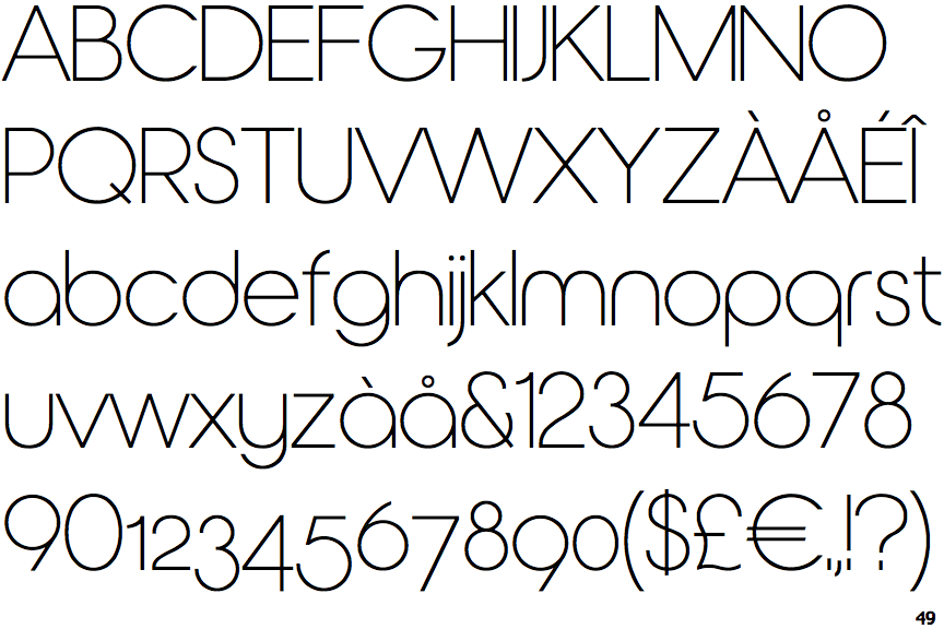
Now, the typeface is unusual in that the upper case is a conventional geometric sans-serif, while the letterforms in the lower case have a special rounded shape. Since the specimen given shows the two alphabets separately, I can't judge whether their juxtaposition will be problematic.
As for the lowercase w, it looks like the lowercase v, not the lowercase u, in most typefaces, so I don't see that the wrong shape was chosen for it.
Obviously, if anything actually happened, then it is possible for it to have happened.
However, I am still surprised that the 18-unit system is a significant cause for complaint. I had not found the coarseness of the 9-unit system of the IBM Selectric Composer to be visibly apparent.
That does not mean that it did not have limitations. The letters M, m, and W should have been 11 units wide, not 9 units, to be in correct proportion. Also, unlike the situation with the Monotype caster, all typefaces were spaced the same way, which led to the same painful limitation for italics as found on Linotype - and further problems for any typeface other than Times Roman, for which they spacing chosen was appropriate.
However, that an 11-unit system would not have caused problems for the reader of a text doesn't mean that it could not have meant much more work for the type designer.
I searched for historical information on Van Krimpen's objections, and I see that it was his preference to design directly for the unit system, even though the usual practice at Monotype was for designers to make their drawings without reference to it, with the letterforms then being adjusted by other hands.
This suggests that Van Krimpen's more serious objection was to the reworking of his designs in a significant respect by others, but I have not yet read his comments on this subject.
As to Monotype's practice, this is quite understandable given historical precedent. At ATF, the widths of characters also fit into a grid, but quite a different type of grid than used by Monotype. There, the width of each character was a multiple of 1/4 point (this is actually an oversimplification; in larger type sizes, quantization to a unit of 1/2 point or 1 point would be used if it seemed reasonable, and in the other direction, 1/8 point may have been possible).
This meant that for a given size of type, the widths of the characters had more flexibility than in Monotype's system.
At Monotype and ATF, when a typeface was produced in different sizes, the smaller sizes were optically adjusted; they were slightly wider in proportion to height, and also usually slightly bolder. In the case of Monotype, the width adjustment had to go in steps of 1/4 point of "set width".
But in the case of ATF, this meant that the relative widths of the characters had to be altered, admittedly only slightly, for every type size.
Given this precedent, Monotype may have felt that the aspect of design workflow noted above, where someone other than the typeface designer would adjust the face to fit within the constraints of the unit system, would be workable and acceptable.