American lettering between Atkinson and art deco

James Puckett
Posts: 2,051
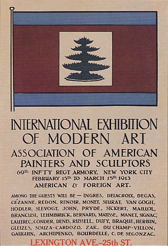
I’m interested in the American style of lettering that seems to fit inbetween Atkinson style sign lettering and art deco. It has the high-style look of art deco, but the letters are usually serifs with jazz-age swing. It lacks the restraint I associate with Futura-affected modernism and Benton’s tight deco types. It’s something I mostly see in architectural lettering (see attached) but also turns up in stuff like the New Yorker’s logo. Is there a name for this?
Tagged:
0
Comments
-
Neo classical, perhaps.0
-
Also appears a lot in silent movie titles and intertitles.0
-
1918 Lettering for commercial purposes - William Hugh Gordon
http://archive.org/stream/letteringforcomm00gordrich#page/n5/mode/2up
1927 Samuel Welo - Studio Handbook Letter
(1960 2nd Edition) http://archive.org/stream/studio00welo#page/n15/mode/thumb3 -
Thanks for the great links, Pablo. I might turn this into a research project and article. This seems to be an area of design history that was disappeared for the sake of writing design history around modernism.1
-
James, you should get in touch with Nick Curtis. I have a sweet spot in my heart for him, as he has digitized/preserved pretty much everything from that era. And by naming the original authors in the descriptions, he has also preserved some of the history as well.
After looking at those books (and others from the same time period) you may want to have a second, more detailed, look at Nick's fonts. I think the man deserves much more recognition for what he has done, that what he actually gets. There are a lot of undervalued gems in Nick's library.1 -
 0
0 -
James, the Fargo letters are American Arts & Crafts (the F leaves little doubt), whereas the New Yorker logo is squarely Art Deco. Paul Shaw has a large collection of pictures of New York architectural lettering. If you'll recall, he did that series of brief books for the Society of Scribes some years ago.0
-
Another important source is Frank Chouteau Brown's "Letters and Lettering" (1902). Brown was an architect in Boston and was in the circle of D.B. Updike and Bruce Rogers, during his Riverside Press years. Matthew Carter suspects that Brown's book was the source of the Trajan-like forms for the Society of Printers logo drawn by Rogers in 1905.1
-
Lots of Lettering books, only the names and pictures of the covers, but should be good enough to initiate your research http://tedhaigh.com/stacks.html1


Categories
- All Categories
- 47 Introductions
- 4K Typeface Design
- 493 Type Design Critiques
- 575 Type Design Software
- 1.1K Type Design Technique & Theory
- 669 Type Business
- 884 Font Technology
- 29 Punchcutting
- 537 Typography
- 124 Type Education
- 332 Type History
- 81 Type Resources
- 113 Lettering and Calligraphy
- 33 Lettering Critiques
- 80 Lettering Technique & Theory
- 569 Announcements
- 100 Events
- 116 Job Postings
- 170 Type Releases
- 182 Miscellaneous News
- 270 About TypeDrawers
- 54 TypeDrawers Announcements
- 114 Suggestions and Bug Reports