Need a pair of eyes on these numerals

AbiRasheed
Posts: 260
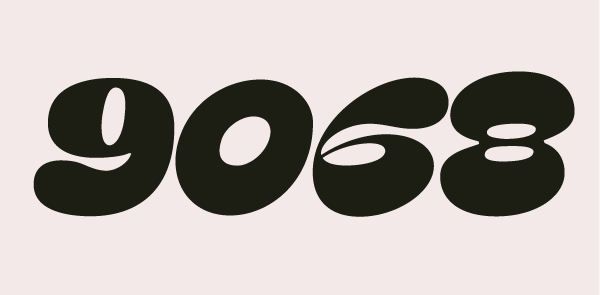
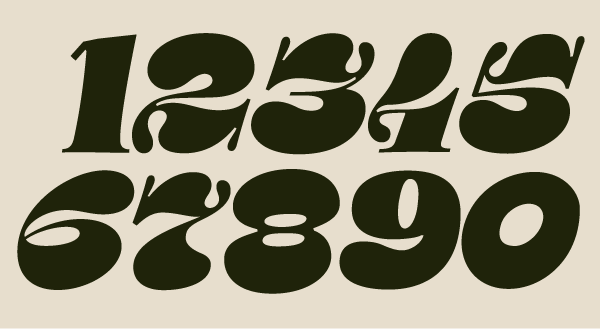 hello folks! been awhile since I got on here and also been awhile since I did any typedesign
I'm back to trying to finish my numerals I left off in 2018. Need some help with the weighting specially the /0 and /8/9/. the counter is mixed is where I'm confused on how to proceed.
any help will be appreciated gratefully!
thank you
Tagged:
0
Comments
-
These are so fun! I hope you are enjoying doing them as much as it looks like you could have.
I would probably go full reversed-contrast on the zero, which is not totally unusual for the zero anyway. (Unless that would make it the same as the cap Oh in the same font, in which case… do the opposite.)
The right side of the lower counter on the 6 is looking just a little tiny bit too pointy like the sharp end of an egg. Which could be fine, but feels incongruent with the bottom right parts of 3 and 5.
2 3 5 and 7 are so darn great! But the related treatment at bottom left part of the 4 is not working so well for me, it feels like something odd added on, and not as much just an exaggeration of something that in itself is not so unusual. Maybe that is just me, though.
9, like current zero, feels like it is coming from a different place than other numerals. It doesn’t need to be a pure rotation of the 6, but its energy currently feels very different. This may be in part because the thins are not as thin as other numerals.
The baseline serifs on 1 and 4 feel a bit out of place — maybe consider making those bulges instead? On the 4 that could also take up some space from the current ornamental swashy terminal at lower left.1 -
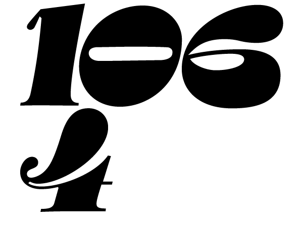
hey @Thomas Phinney thanks for the very insightful feedback and critique. please look at the attached image to see if i'm going in the wrong direction. changed counter on zero but may require further fine tuning. still not sure about 1/4 at the base, i changed the arm on the 1 but im not convinced adding that drop terminal is the way to go, something i have to sit down and sketch to see what actually works for 1. there is an alt for 4 btw which is in the attached image. hope that helps.
 0
-
I agree that this version of the one is still not there. I am thinking something more prominent and less timid, and without a corner at top left — more flamboyant! But perhaps some other solution entirely could be better.
The general idea of the zero counter is good, but the straight edge of the top and bottom of the counter feel out of place with the rest of the numerals. At least a bit of curvature is needed, I think.1 -
@Thomas Phinney i fixed the counter on 0 and add another version for 1 (borrowed from 4)
please let me know how this fits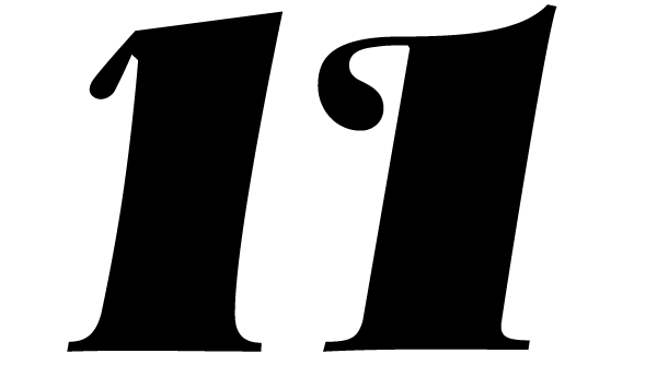 0
-
The top could be something like this.
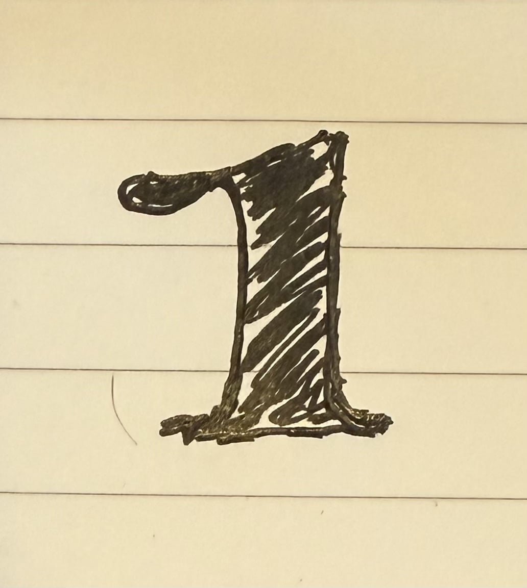 This make the teardrop shape part of the ductus of the numeral, as it is in the others, rather than a kind of appendage.3
-
@John Hudsonthanks for the suggestion, it is what i did but i think you mean to turn the tear drop going straight. noted! thank you
Edit: just added based on your sketch. let me know what you or anyone thinks. much appreciated.
attached image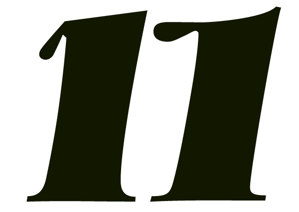 0
-
This is much better! (And the previous one was pretty good.)2
-
@Thomas Phinney thank you! trying to fix weighting on 3, 4 and 4.alt at the moment
update: made some changes to the weighting and added 2 other glyphs like the comma and period.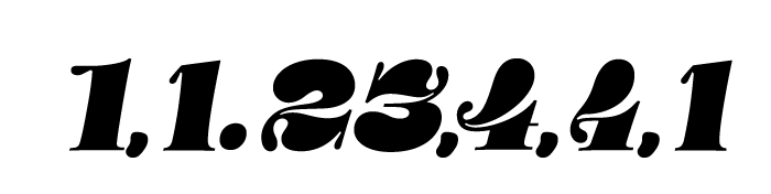 0
-
It surprises me that in a face with such dramatically attenuated teardrops everywhere that the /comma is so uniformly thick.2
-
@Craig Eliasonthanks for pointing that out, had the same thoughts. working on that as we speak!
edit: how does this look? attached img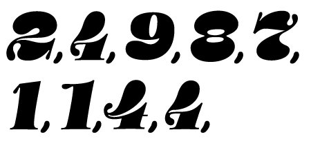
added some ordinal suffixes, please let me know the proportional weight is okay or not, attaching img: lc /d could use some fine tuning i believe. thanks again for all the help all of you guys!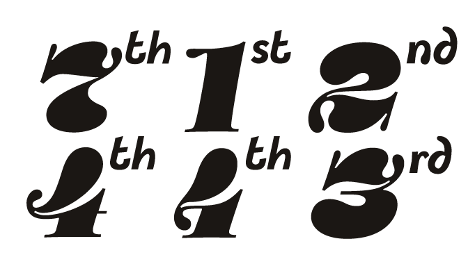 0
-
have a look at Bodoni figures, or other fat numerals from the 19th century.3
-
The 4 still needs work; it is off-balance in my view. The top of it needs to go more to the right, even extend out a little for better balance.
3 -
@Andreas Stötzneri have. particularly motter and stilla by mr boltana and andy mangold as well. besides that i've looked at tony di spigna's work and plenty others in the same genre. thanks!0
-
For the commas, I meant making the thin parts thinner, not the thick parts thinner. In other words making something that read as high-contrast. But looking at your monoline ordinal suffixes, it may be that I'm not understanding your intentions with this project.1
-
@George Thomasnoted! will rectify that but which 4 though? there's 2 of them.
@Craig Eliasonnoted too, yeah the contrast is a bit mixed as you will see with 9 and 0, not very didone/bodonish. just made the change, let me know what you think or anyone for that matter thanks.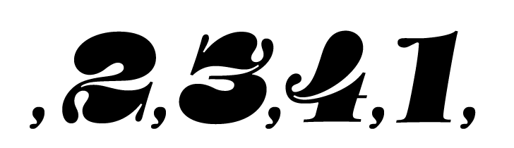 0
-
@AbiRasheed Both of them. The second one has a larger gap at the right but both need correction.
2 -
@George Thomas ok thanks for the feedback. i'm guessing this has more to do with width! but i'll update and keep you posted!
edit on the /.4 alt. please let me know if this suffices. still fine tuning the curve but this works?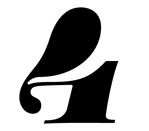 0
-
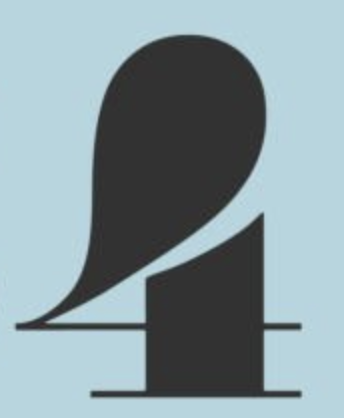
The biggest issue is in the top right. The large bulb shape has to extend further right, so that it’s weight sits more above the straight stem below. It can even extend a bit further right than the stem, but it can’t sit so far to the left like this, or else the shape does not read as a 4.
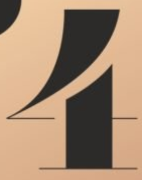
2 -
@John Hudsonthanks for the exemplar. I moved the bulb more to the right but it's like it's tipping over now. you guys aren't seeing the slant in this? i just modified it and it looks weird and off balance completely. the exemplar is very upright not slanted, makes it a bit more complicated to simply just keep moving the bulb to the right without creating a severe off balance. every which way i try it looks horribly imbalanced or it creates a huge negative space moving the bulb to the right. If I tried to adjust the left too then it looks totally different than the type dna here.0
-
Can you try to introduce the sense of a crossbar in the way the hairline interacts with the stem? That would help reinforce the identity of the numeral.1
-
@John Hudson something like this? this matches where the stem cuts it off
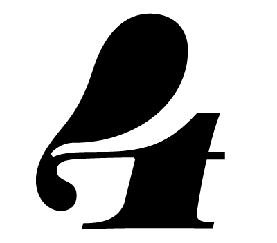 0
-
Yes, that helps. I still think the bulb can move to the right, even shortening the overhang on the left so the whole thing is slightly narrower. The drop feels heavy, and could be coordinated closer to the element in the top right of the 3.0


Categories
- All Categories
- 47 Introductions
- 4K Typeface Design
- 504 Type Design Critiques
- 595 Type Design Software
- 1.1K Type Design Technique & Theory
- 675 Type Business
- 911 Font Technology
- 29 Punchcutting
- 544 Typography
- 129 Type Education
- 333 Type History
- 82 Type Resources
- 114 Lettering and Calligraphy
- 33 Lettering Critiques
- 81 Lettering Technique & Theory
- 585 Announcements
- 101 Events
- 118 Job Postings
- 179 Type Releases
- 186 Miscellaneous News
- 270 About TypeDrawers
- 54 TypeDrawers Announcements
- 114 Suggestions and Bug Reports