Chernikhov’s Academic alphabet: why treat the module as law?

I’m drawing a typeface based on Yakov Chernikhov’s construction drawings: Table 21, the “Academic” alphabet, from his book on letter construction, published posthumously in 1958.
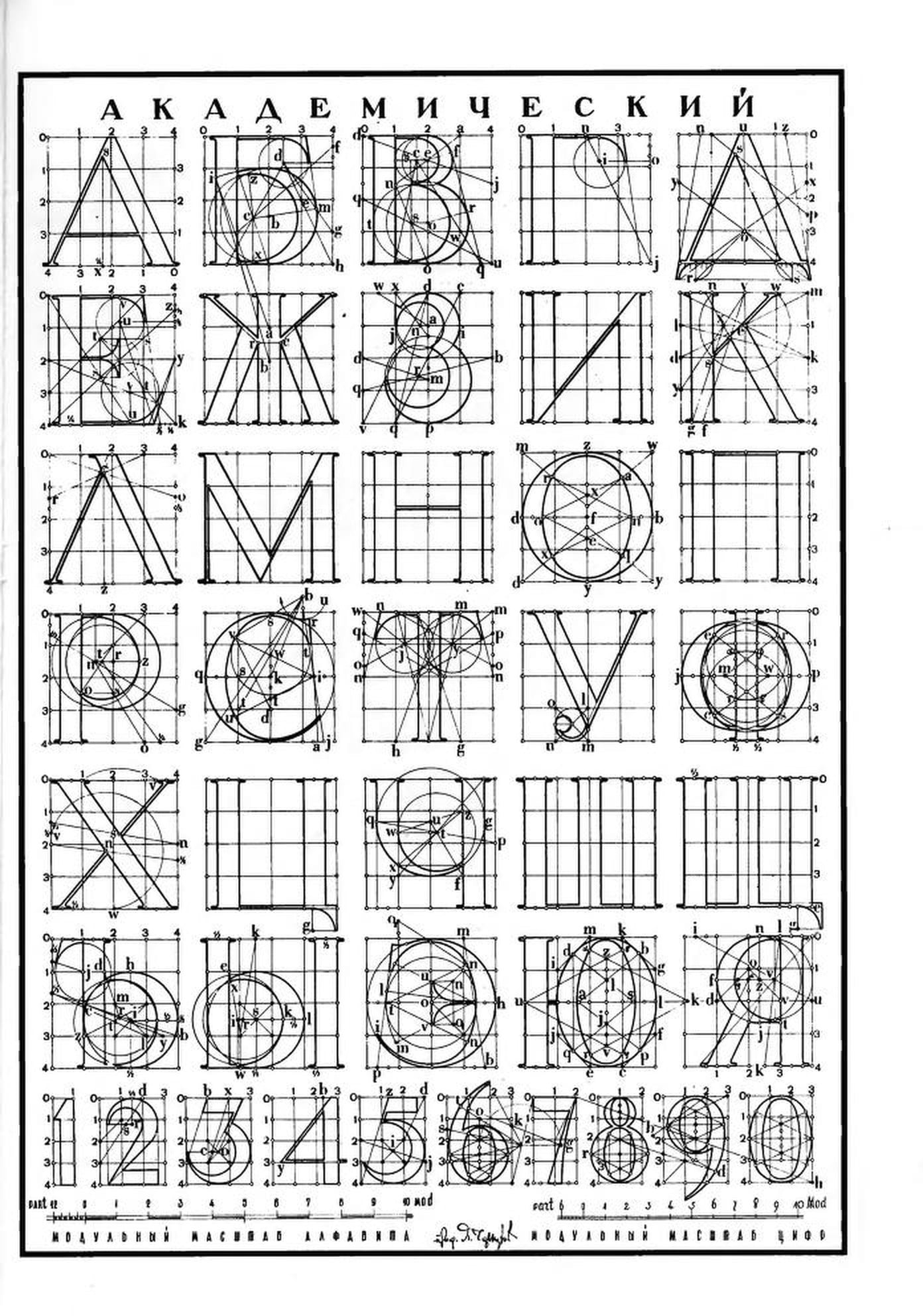
Every letter sits on a modular grid. The cap height is four modules, main strokes are 2/3 of a module, thin strokes 1/12, serifs project 1/5. Bowls and terminals are drawn with compass and ruler from named centres. The text accompanying the table calls the alphabet “carefully worked out” and gives the proportions as plain rules, with no hint that they might need adjusting by eye.
I rebuilt the table in code, letter by letter. Every circle, tangent and stroke follows the drawing, and the result is checked against the scan.
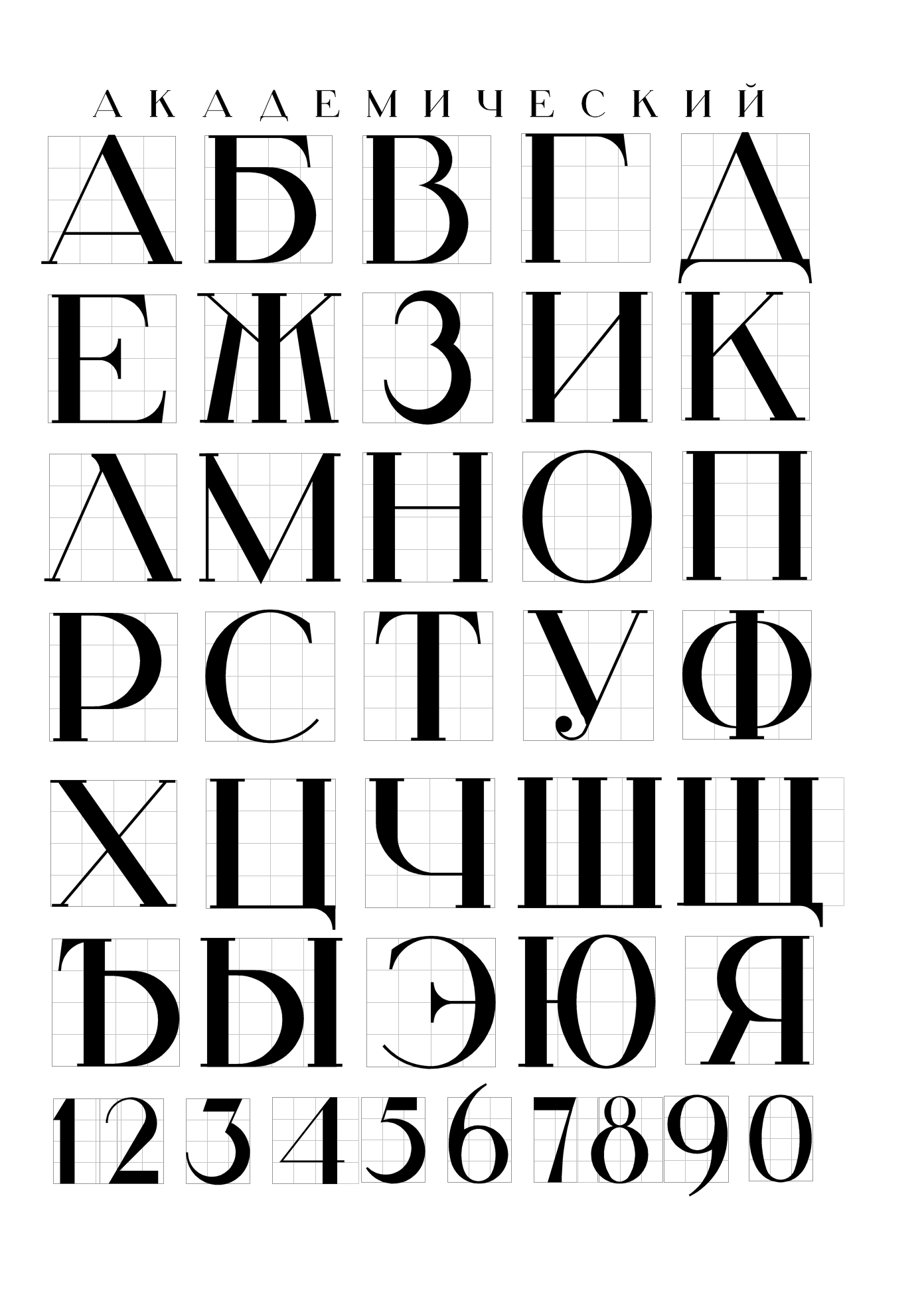
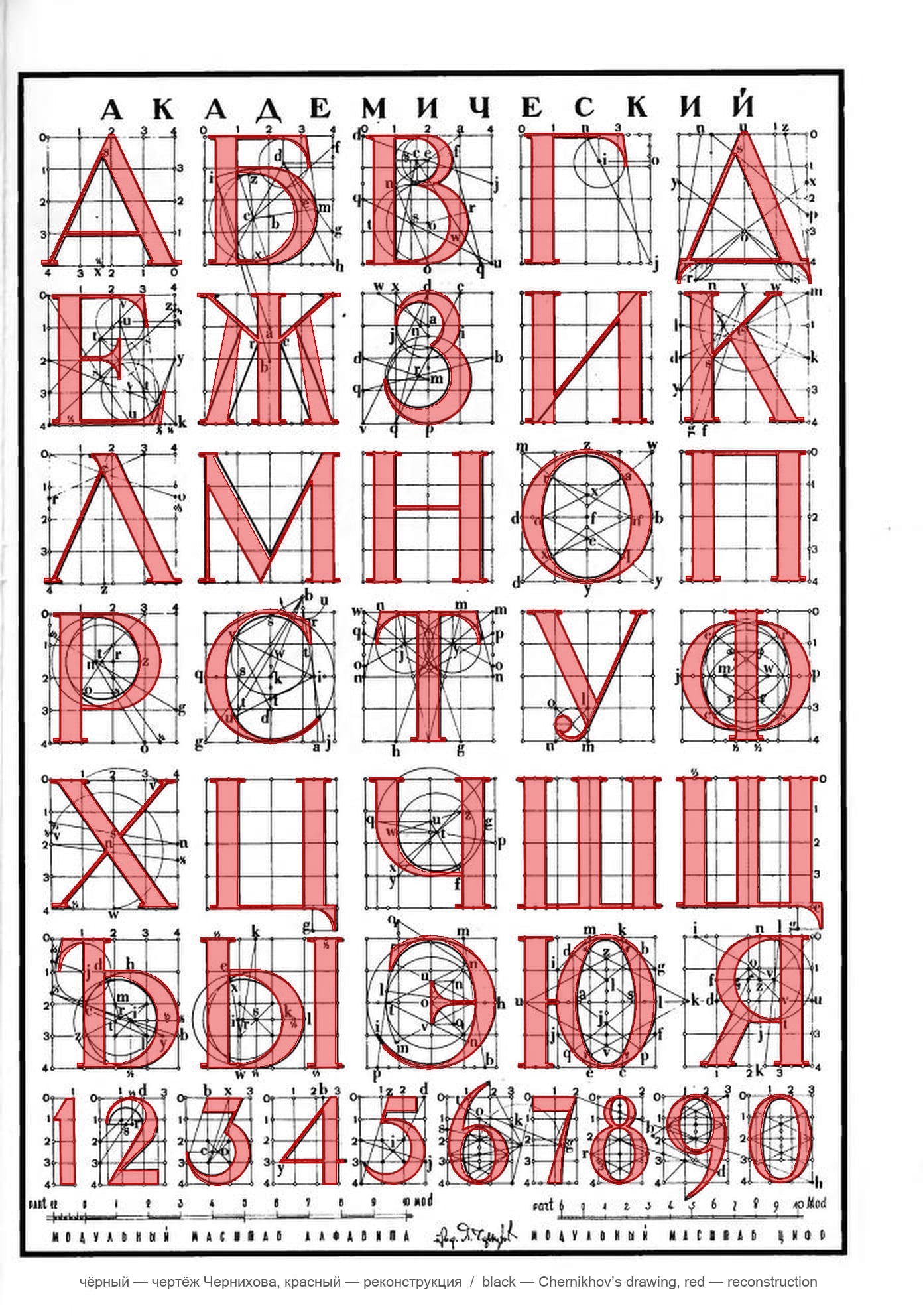
Set as a font, the literal construction looks uneven. The sample below is a rough first draft with some errors; I made it to see the overall composition and how the letters look together.
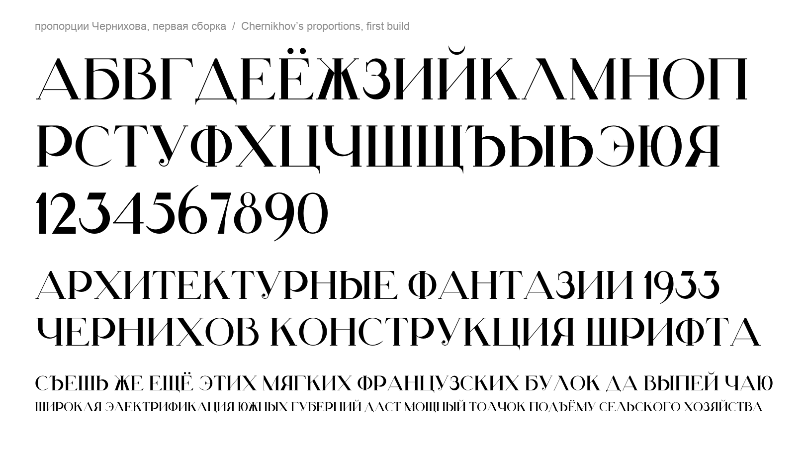
The straight stems (117 units at 1000 UPM) are heavier than the round strokes (the side of O is only 109), so straight letters look darker than round ones. Ink piles up at the joins: the stem-to-bowl junction in 6 and 9 reaches about 140 units, the flag of 1 about 130. Curves leave straights with an abrupt jump in curvature. The only optical correction I found in the drawing is that the steep diagonals of М and Х are drawn wider than the rule says. This sample is my first build, straight from the drawing, with no corrections at all.
So my question is: why does Chernikhov present these proportions as a fixed truth? Was the table meant for draughtsmen who would correct the shapes by eye when inking, or for lettering on architectural drawings, where one module for every element mattered more than even colour? Is anything known about how it was actually used? I’d be grateful for sources.
In my version the construction stays as the base, with a separate optical layer on top. Stems are 100 units, round sides 105–109, thick diagonals 94, bars in the figures 90, and stems in dense letters (Ш, Щ, Ы, Ю, М, Ж) 97. Heavy joins in 1, 2, 6 and 9 are reduced, and straight-to-curve transitions are smoothed by balancing the handles along Tunni lines. Outer edges and widths stay where Chernikhov put them; spacing is unchanged.
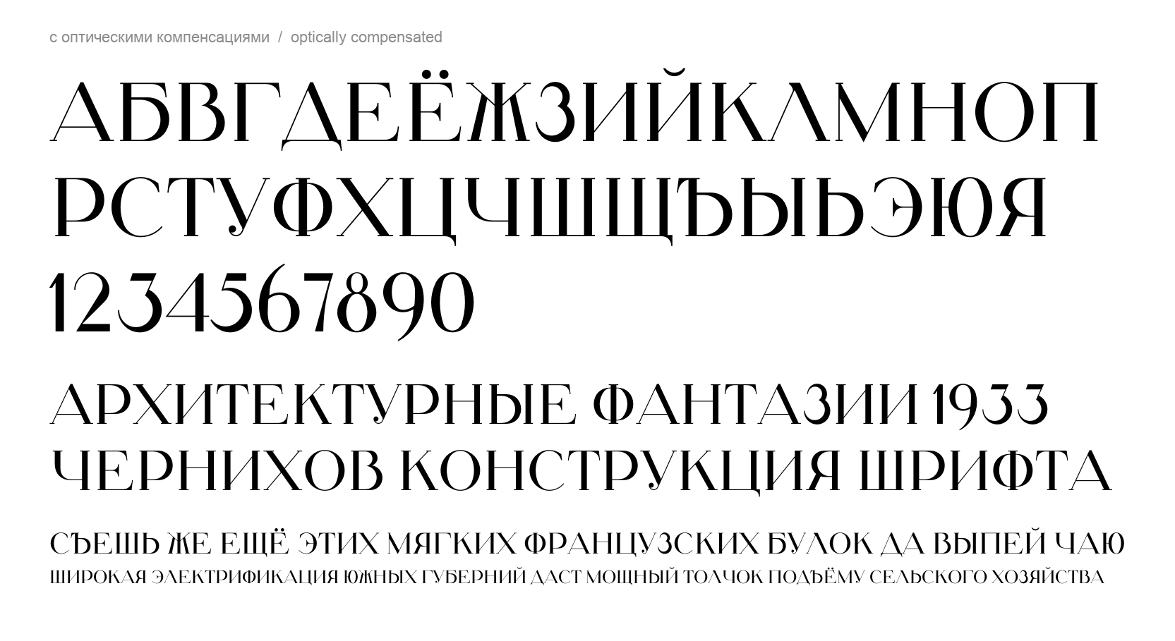
The table has no Latin. The Latin here is my own adaptation: it is built from the refined specification of the Cyrillic and loosely after Chernikhov’s drawings, not from his original proportions.
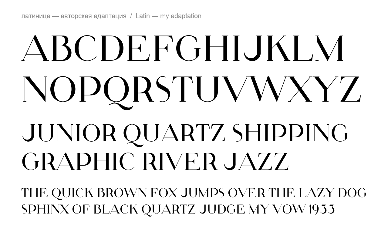
I’d welcome advice on how to take the proportions further in both scripts: how to keep the reference to Chernikhov’s drawings and forms while respecting type tradition and doing the optical compensation properly. Which letters look most off to you, and where would you depart from the drawing first?
Comments
-
Maybe I missed something (as to be honest, I only scanned your writeup without reading every word), but it sure looks to me like you have made one other optical compensation: you added a little overshoot for rounds at cap height and baseline, which is missing in the original drawings.
Of course this is an improvement!
That said, you could stand to have a bit more overshoot; you could have at least half again, perhaps even double, the amount you have now. Have to try it and see. (Mind you, you could also just leave it as you have it now, as a bit of a nod to the original.)
There are different routes you could take; leaning in to the original hard, vs a reinterpretation that has the arguably-needed optical compensations, or something in between.
The other main feature you need to think about would be the abrupt transition from straight to round, where the curves look… well, “glued on” is a phrase I sometimes use for this effect. One sees it in letters such as B D P J, top of R, and their Cyrillic visual analogues. One could of course decide to leave this as-is for effect, even lean into it—or to “fix” it.1 -
Thomas Phinney said:Maybe I missed something (as to be honest, I only scanned your writeup without reading every word), but it sure looks to me like you have made one other optical compensation: you added a little overshoot for rounds at cap height and baseline, which is missing in the original drawings.
Of course this is an improvement!
That said, you could stand to have a bit more overshoot; you could have at least half again, perhaps even double, the amount you have now. Have to try it and see. (Mind you, you could also just leave it as you have it now, as a bit of a nod to the original.)
There are different routes you could take; leaning in to the original hard, vs a reinterpretation that has the arguably-needed optical compensations, or something in between.
The other main feature you need to think about would be the abrupt transition from straight to round, where the curves look… well, “glued on” is a phrase I sometimes use for this effect. One sees it in letters such as B D P J, top of R, and their Cyrillic visual analogues. One could of course decide to leave this as-is for effect, even lean into it—or to “fix” it.Thank you, Thomas, good catch. Yes, I added overshoots early on and only mentioned them in passing: round letters go 1/16 of a module past both lines, about 11 units at a 700-unit cap height; the pointed vertex of М and the flat apex of А and Д have their own amounts.
I tried both of your suggestions.
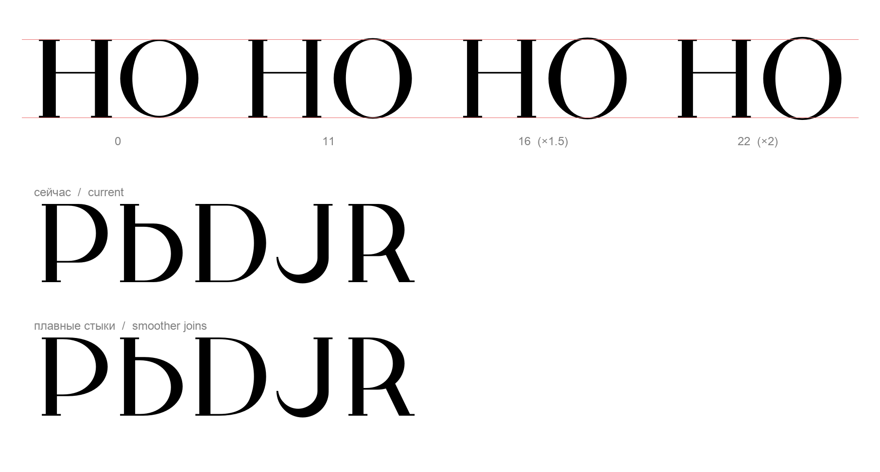
Top: the overshoot of rounds in units: the first build (none), the current one (11), ×1.5 (16) and ×2 (22). Bottom: the straight-to-round transitions, current and reworked; the same change is applied to B D P J R and the Cyrillic Б В Р Ь Ъ Ы Я Ч. Instead of the compass arc starting with full curvature right where the straight ends, the curve now begins a little earlier on the straight and builds up its curvature gradually. The hairlines keep their full thickness. I’d value your eye on which amount of overshoot works better, and on whether the joins go far enough or the bowls need to be redrawn more radically.
As for the routes, I’m aiming for something in between: Chernikhov’s construction and silhouettes should stay recognisable, but with the compensation a reader’s eye expects.
One more thing I’m struggling with. Chernikhov prescribes З in a form that doesn’t sit well with the rest of the alphabet. It feels as if it was drawn on the principles of another typeface, and it is noticeably heavier than its neighbours. I decided to keep it as a distinctive feature and drew J on the same principles: its tail is the lower bowl of З. But I can’t get either of them to settle. Even after lightening З by 7% and thinning the stem of J to 100 units, both still look heavy and slightly foreign in words.
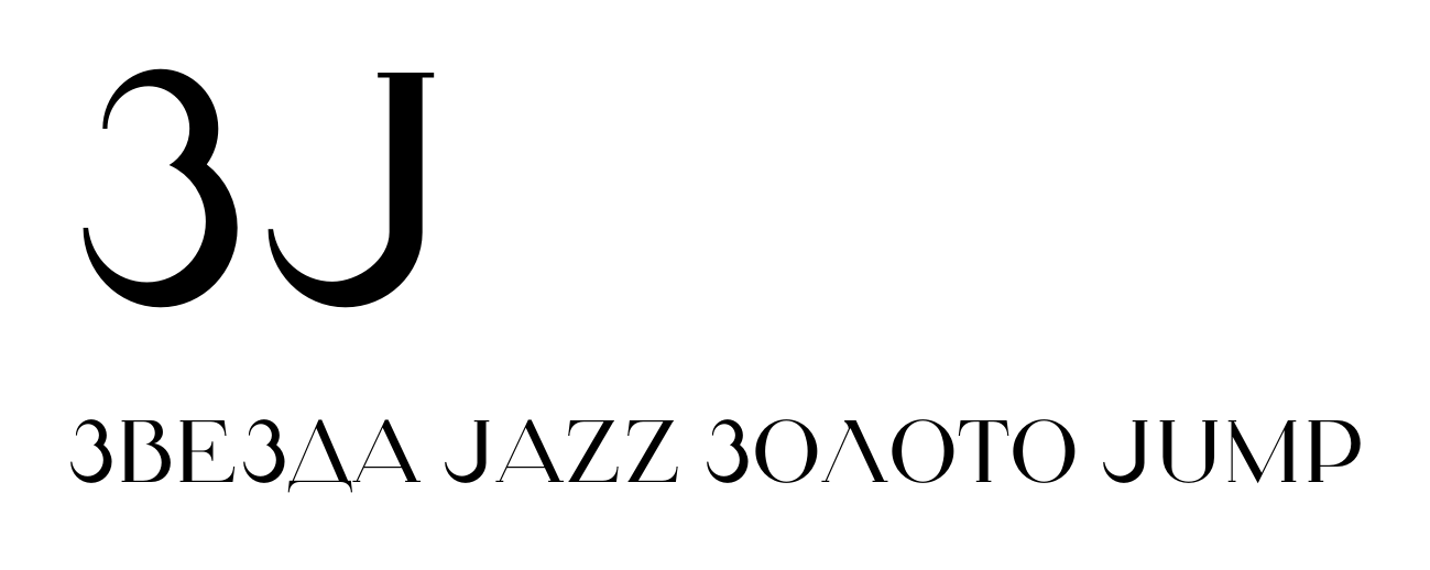
Any thoughts on how to compensate them, or whether I should drop the idea? Have you seen a typeface in a similar style with letterforms that stand out like this?
0 -
Also, back to your other question (I drafted this right after my other reply, in between meetings, have yet to read your next missive)… pavljenko said:
I am no expert on Chernikhov, but a bit of light reading suggests that he was an architect first and foremost, and only very secondarily a graphic designer. It sure seems like he translated his ideas into lettering without knowing about optical compensations. Or if he knew about them, he ignored them. Which would just make him, well, arguably “wrong” in some details. But I do not mean to suggest that makes his letterforms uninteresting, or mean we should dismiss them completely.So my question is: why does Chernikhov present these proportions as a fixed truth? Was the table meant for draughtsmen who would correct the shapes by eye when inking, or for lettering on architectural drawings, where one module for every element mattered more than even colour? Is anything known about how it was actually used? I’d be grateful for sources.
It is interesting that right around the same time, the same thing happened in western type design! Paul Renner was also an architect, who wanted to design a typeface, and produced what would become Futura. In adapting Renner’s drawings, the Bauer foundry not only tamed his more extreme/experimental letterforms, but also added exactly the kinds of optical compensations we are discussing. This is very apparent if one compares Renner’s original drawings (which, thankfully, survived) to the final typeface.1 -
There is a long history of grid-based alphabets in various scripts, including many examples for Latin dating from the Middle Ages on. They are often linked to more-or-less esoteric beliefs about the origins and nature of both writing and geometry, so proceed from fundamental misunderstanding of the character of written forms, which evolve not from underlying geometry but from the movement of specific tools.1


Categories
- All Categories
- 47 Introductions
- 4K Typeface Design
- 501 Type Design Critiques
- 591 Type Design Software
- 1.1K Type Design Technique & Theory
- 674 Type Business
- 908 Font Technology
- 29 Punchcutting
- 544 Typography
- 129 Type Education
- 333 Type History
- 82 Type Resources
- 114 Lettering and Calligraphy
- 33 Lettering Critiques
- 81 Lettering Technique & Theory
- 580 Announcements
- 101 Events
- 116 Job Postings
- 176 Type Releases
- 186 Miscellaneous News
- 270 About TypeDrawers
- 54 TypeDrawers Announcements
- 114 Suggestions and Bug Reports