MFB Oldstyle (and ahistorical Greek)

Daniel Benjamin Miller
Posts: 121
Two years ago, I released MFB Oldstyle. I didn't post about it, since it is just an open-source (PD via CC-Zero) revival of Century Oldstyle (MFB = "Morris Fuller Benton"), and, while useful (I hope!), it was nothing groundbreaking in terms of design. The font is available on GitHub and CTAN.
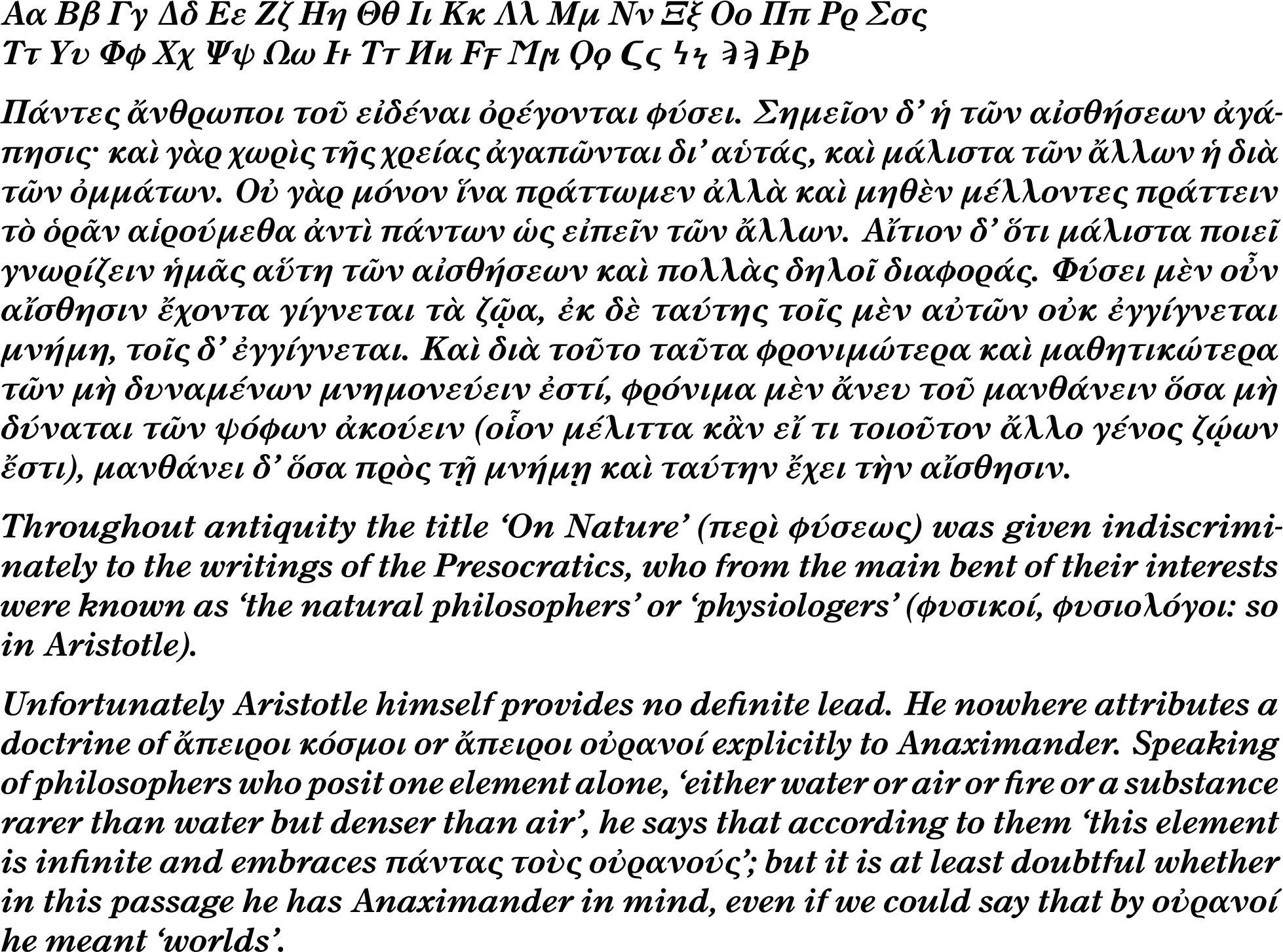
This year, I released some updates. Besides finally finishing the bold italic I'd been working on (and making a few tweaks/fixes more generally), I also added Greek support to the font. The bold italic was not my own original design; while not part of the original release of Century Oldstyle, it was put out in later revisions and I in fact worked from the ATF specimens of it.
My Greek, however, is totally new. It's also, I would say, ahistorical. Not only was Century Oldstyle never released with Greek characters back in the day (I don't know about other modern digital versions, but that's not really my concern), it wouldn't have really fit in with the paradigm of the day in a number of ways. The typical practice when a text called for both Latin and Greek alphabets to be included was to just mix two typefaces; a book set in Century Oldstyle could set Greek words or passages in, say, Porson. The idea of getting the Greek to match the Latin within the same family wasn't really that common then, as far as I know.
Additionally, while there are plenty of slanted Greek fonts (I suppose "italic" could be said to be a misnomer if applied to the Greek script), I don't believe that the upright–slanted distinction would have been present in a single font family (or used in the same Greek text) until fairly recently, so that's another way in which this Greek typography is not in line with the common practice of the early 20th century.
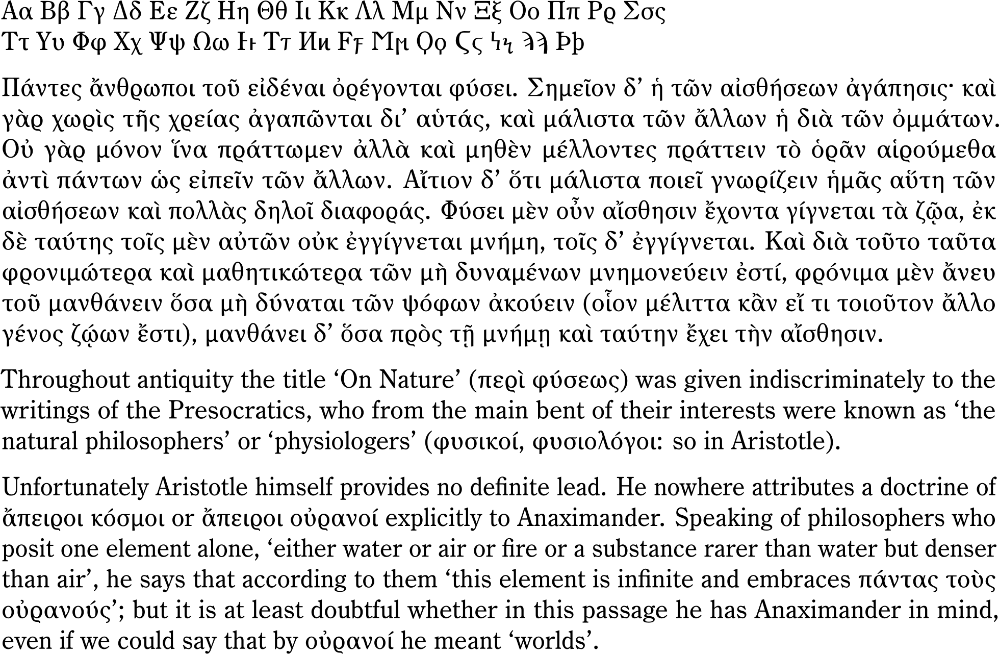
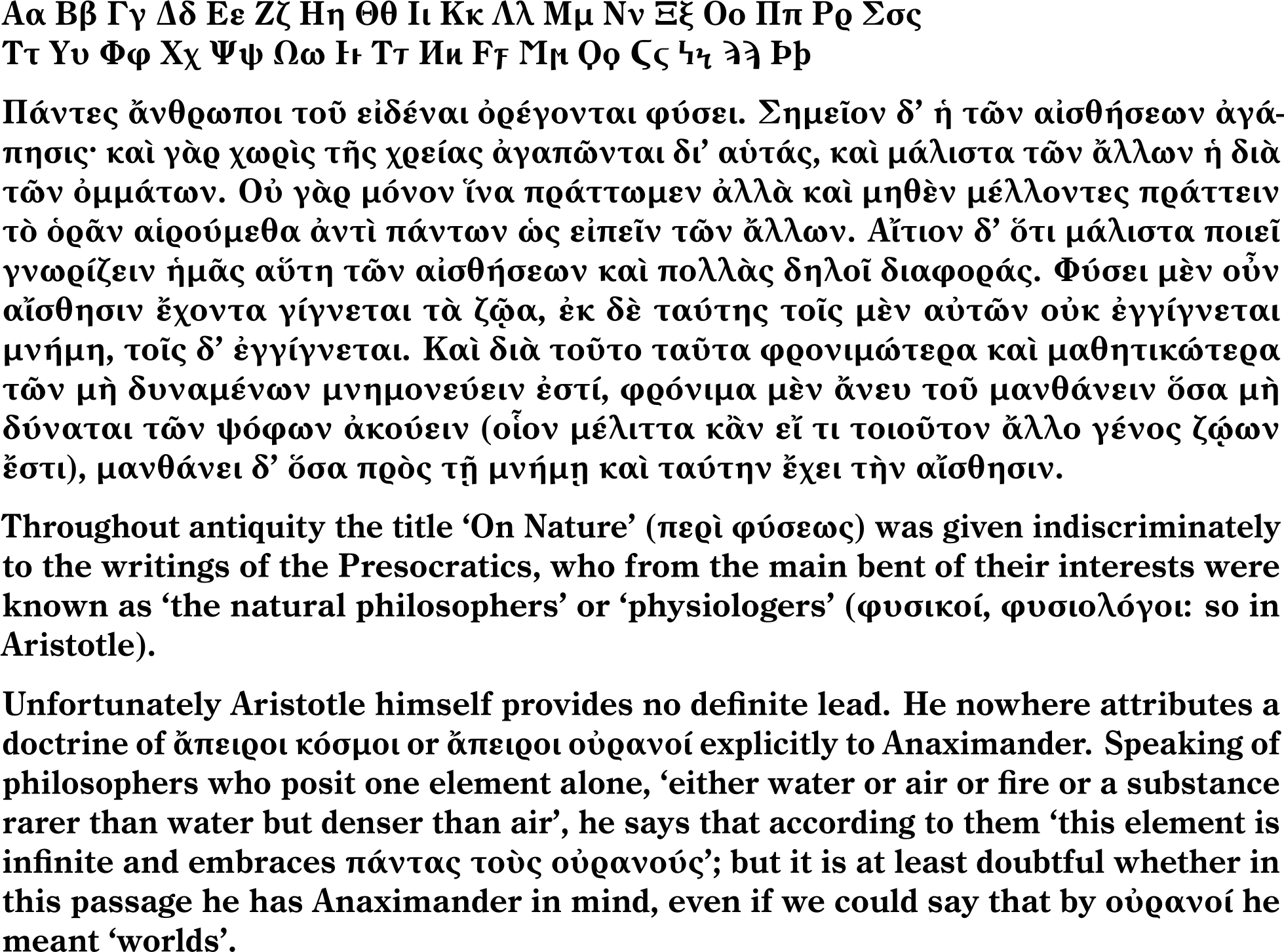
That said, it's 2026, not 1909, and many font families have Greek across the four standard variants. Users might not necessarily expect it, but it's useful to have, and so, like many others who have done font revivals, I've decided to diverge from the source material (at least in this respect). I hope that my Greek designs are a good visual match (more or less) for my Latin ones; they are a bit different, in line with what I expect when I read Greek. They are not based on any existing design in particular, though you might see what my influences were!
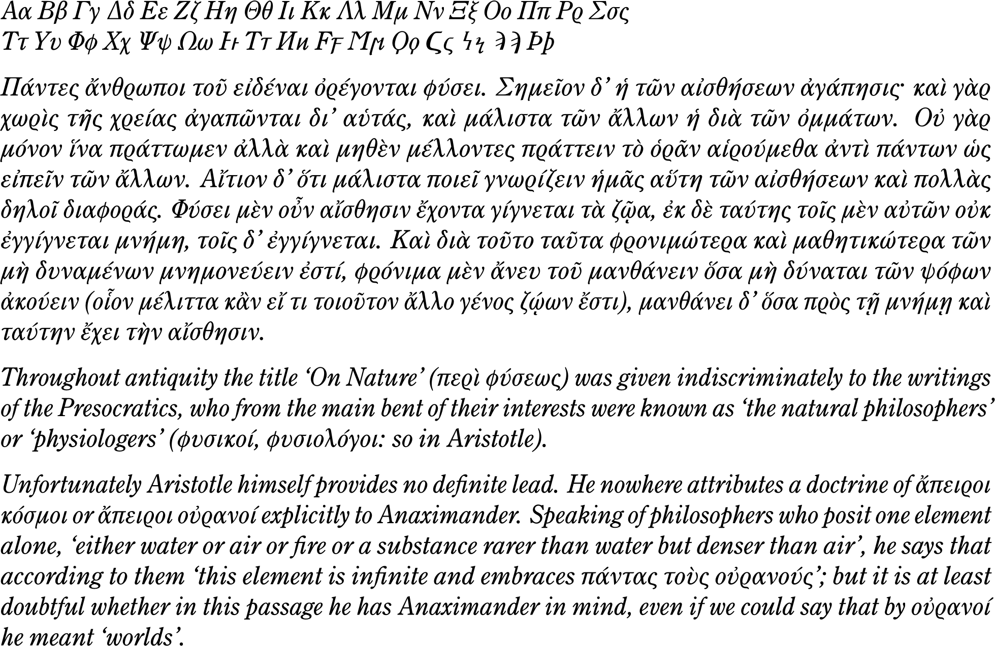
The italic, I'll admit, is funky; standard slanted Greek would normally be more like Porson, and, indeed, I wouldn't really enjoy this design for extended passages in Greek, unlike the regular, but I wanted it to fit well with my Latin italic font.
I welcome anyone's thoughts on the design (though it's already been released!), and on the general points relating to adding Greek to an existing Latin typeface.
***
Anyway, here it is (as present in version 2.1 of the font). I hope you'll excuse the long-ish sample; here, you can see the alphabet, a Greek sample (from Aristotle) and two short English quotes with Greek mixed in (both from W. K. C. Guthrie).
Regular
Italic
Bold
Bold Italic
Tagged:
2
Comments
-
out of curiosity, what led you to choose CC0 over 0BSD, unlicense, or other public domain-equivalents? it's been a while since I've evaluated these kinds of licenses, but was recently thinking about 0BSD for a project just out of familiarity with other BSD licenses..0
-
jeremy tribby said:out of curiosity, what led you to choose CC0 over 0BSD, unlicense, or other public domain-equivalents? it's been a while since I've evaluated these kinds of licenses, but was recently thinking about 0BSD for a project just out of familiarity with other BSD licenses..Functionally, there is no difference between these. They all result in your work being usable without any restrictions whatsoever.To be clear, CC-Zero is not just a public-domain-equivalent license, but first and foremost a waiver, stating explicitly that the copyright has been given up, plus an extra fallback which gives a robust equivalent license just in case this is not legally effective (even though it should be most places if not everywhere, and certainly is in the United States, but the efficacy of copyright waivers is a subject for another time and place). This is why I say it's public domain via CC-Zero.If you want to put your work in the public domain ("or equivalent"), it comes down to your preference, but here's why I made this choice specifically:
- In the US (and some other places), typefaces are not copyrightable. Despite what many font people think (or want), I think it's pretty likely that digital outline fonts aren't actually copyrightable either (see also Matthew Butterick's comments on Laatz v. Zazzle). I say that I am disclaiming any copyright I may have, which means I'm explicitly avoiding making a copyright claim to begin with.
- Relatedly, the BSD-0 license says "this software." The Unlicense also uses the terminology of "software." While I don't think any reasonable court would interpret it restrictively, (a) it's arguable that outline fonts aren't properly "software" at all (see above), and (b) in any case, I want my dedication to be as explicitly broad as possible.
- The Unlicense in particular is written in a confusing and poorly thought out way.
- CC-Zero is a copyright waiver which is as comprehensive and explicit as they come, which is why it's the most generally recommended copyright waiver, as far as I can see.
- "Public domain" is a much clearer way of expressing what you can do than "BSD-0" or "unlicense." "Unlicense," in particular, is an extremely confusing name, because being Unlicense-licensed ("Unlicensed") is the opposite of being unlicensed.
In short, if you want to waive all copyright, why not just say so? That's what I wanted to do, so it's what I did.That being said, I'd prefer to keep the focus on the font design here, rather than make this thread about CC0 or licensing or whatever.2 -
that makes a lot sense to meIn short, if you want to waive all copyright, why not just say so?I have seen large projects/organizations that are explicit about which third party licenses are blanket approved to be used vs. require some kind of approval. so I guess "speed" and/or "risk-averse legal teams with other priorities" could be one somewhat flimsy answer to this question, but I imagine CC0 is well-covered these days. the shaders in vello are an interesting case where they both state what they want ("The intent is for this research to be used in as broad a context as possible") while also providing unlicense, MIT, and apache licenses, presumably so that such an approval process isn't necessary at organizations/in projects that are already fine with those licenses. but that seems a bit cumbersome to me, and I would imagine confusing for some end-users.
anyway, I don't mean to get off topic - thanks for sharing your reasoning, particularly around the specific lack of "software" language0 -
@Daniel Benjamin Miller Very interesting. With a few minor adjustments, it could even be turned into a variable font, allowing for the creation of intermediate weights.
 1
1 -
Having the Greek lowercase follow the notional pen angle of the Latin always feels wrong to me now, which makes it difficult to look past at the details. One thing that stands out is the shallowness of the oxia and varia accents, which should be a lot steeper.There are some problems in relative proportions of letters: e.g. the uppercase Ξ looks massive, while its lowercase ξ — and also the ζ — feel pinched and too narrow. The spacing feels a bit uneven — also the Latin to a lesser degree — but that may be a result of the pattern of light and dark caused by the pen angle.0
-
Not a native user of Greek so take these comments with a grain of salt!
The head serif on roman /eta (and I suppose /kappa) strikes me as stiff and Latin-y. Is it a intentional link to the Latin?
All four styles feel lighter than the Latin counterparts. Were you trying for matching weight, or a little contrast?
The little thin turn south at the very bottom of italic /rho feels a bit brittle and out of scale to me.
Lowercase italic /psi looks too weighted towards the left side, and all the capital /Psi’s look quite dark.0


Categories
- All Categories
- 47 Introductions
- 4K Typeface Design
- 499 Type Design Critiques
- 591 Type Design Software
- 1.1K Type Design Technique & Theory
- 674 Type Business
- 907 Font Technology
- 29 Punchcutting
- 544 Typography
- 129 Type Education
- 333 Type History
- 82 Type Resources
- 114 Lettering and Calligraphy
- 33 Lettering Critiques
- 81 Lettering Technique & Theory
- 580 Announcements
- 101 Events
- 116 Job Postings
- 176 Type Releases
- 186 Miscellaneous News
- 270 About TypeDrawers
- 54 TypeDrawers Announcements
- 114 Suggestions and Bug Reports