Positioning of sups, subs, ordn and sinf

mauro sacchetto
Posts: 392
Here is yet another question I am raising after noticing inconsistencies in the settings of certain fonts.
It concerns the positioning of sups, subs, ordn, and sinf - sets of glyphs that, in reality, most fonts do not include.
Now, considering a single case — a font that contains all of them, namely EB Garamond — the situation is as follows (though, as I noted earlier, other fonts contradict this):
1) they all share the same size;
2) sups are positioned exactly at the height of numerators;
3) subs are positioned slightly lower than denominators;
4) ordn are positioned just slightly higher than numerators;
5)`sinf are positioned somewhat higher than denominators.
Setting aside the exact positioning, are these appropriate choices, and are there "objective" criteria involved? For instance, what is the reason for placing ordn slightly higher than numerators?
Thank you
Tagged:
0
Best Answer
-
On principle, I always consider numerators and deonominators as completely distinct entities unrelated to superiors and inferiors, because these classes of forms are used for entirely different purposes. This is not to say that they might not be of identical shape and size, or even that the superiors and numerators might share alignment, in some fonts.Numerators and denominators need to be sized and aligned to form fractions. That is their only function. Fractions commonly align to the lining numeral height of the typeface, which is commonly the cap height (although there are also typefaces like Bell with three-quarter height numerals). So the only consideration of numerator and denominator size and alignment is that they fit to the top and bottom of that vertical space, form into fractions with the slash, and are legible at target design sizes.Superiors may be of different size (typically a bit larger) than the numerators, and involve letters as well as numerals, so must account for alignment of a raised baseline as well as x-height, ascenders, and descenders. The set of superior characters required in a font will depend on the intended use of that font. So, for example, the Brill fonts include full upper- and lowercase Latin and Greek, as well as support for accented diacritics (also for inferiors). A lot of more typical fonts include only superior numerals and a small set of lowercase letters used as ordinals.That latter observation leads me to this important point: ordinals are just a particular use of superior letters. There is no reason for ordinals to be a different size or alignment from other superiors. [From Kent’s otherwise excellent illustrations, I think he and I might disagree about that.]As discussed elsewhere, inferiors should straddle the baseline, as used in molecular chemistry, etc.2

Answers
-
You might want to read this very recent topic:
https://typedrawers.com/discussion/comment/72363
0 -
Thanks for the reference—illuminating in some respects, while leaving room for different solutions in others.Here, then, is a list of the issues that still seem unresolved or unclear to me:1) superscripts: above (~ halfway up) the x-height, but symmetrical (i.e. specular) to subscripts?2) subscripts: half above and half below the baseline (straddling it), or resting on the baseline?3) ordinals: not covered in that thread. At the same height as superscripts and numerators, or slightly higher to distinguish them (like in EB Garamond)?4) scientific inferiors: obsolete. Can they be left at the same height as subscripts, simply for the sake of completeness?5) denominators: resting on the baseline (or are they too similar to old-style numerals?) -and thus identical to subscripts?
0 -
Here is a representation of my practice in aligning these. It is not deterministic — i.e., none of these is at any prescribed numerical percentage of any of the vertical metrics. It is dependent upon the proportions of the typeface.
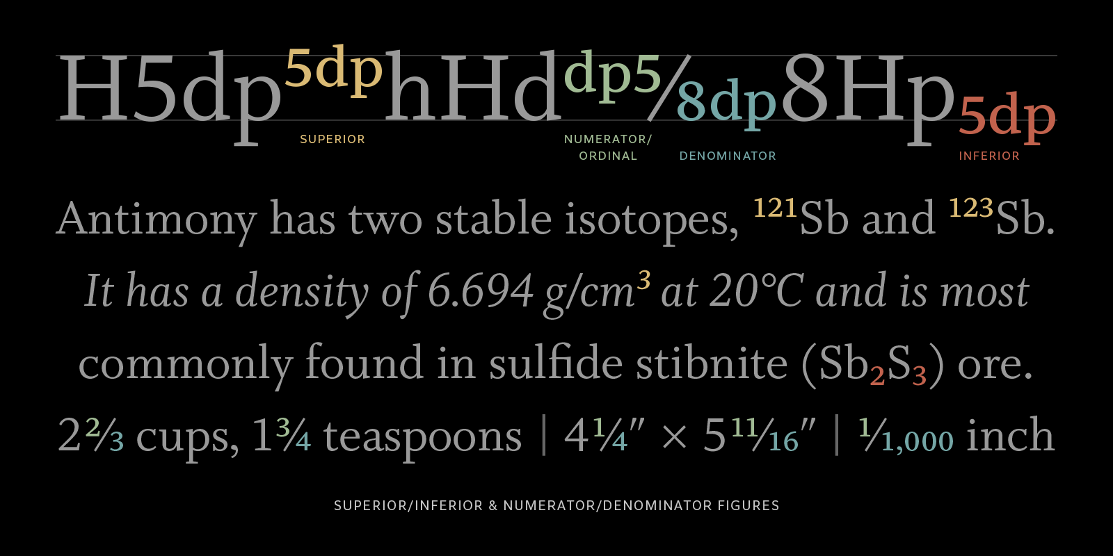
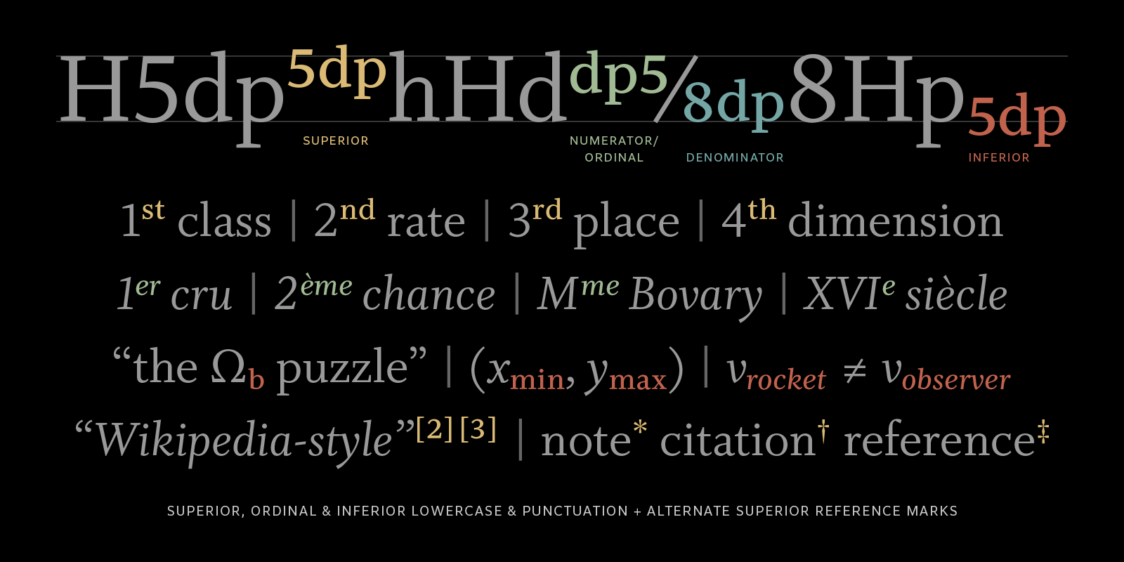 (Also, for what it’s worth, I disagree with Nick Shinn’s comment in that other post. I do not think that denominators on the baseline are in serious danger of being confused for oldstyle figures. If they appear too similar, then redesign them.)9
 -
John Hudson said:[From Kent’s otherwise excellent illustrations, I think he and I might disagree about that.]Not really, or at least not in any substantial way, I don’t think. As my second illustration shows, I consider either the superior-aligned letters or the numerator-aligned letters to be suitable for ordinal use.Personally, I don’t generally deviate in the size of my numr/dnom from sups/sinf (but I also recognize that they may diverge if the design demands and would not hesitate to do so if I felt it warranted.)Given this overall harmonization, I generally provide the raised letters at two different alignments to provide options.The superior alignment generally relates to ascenders, quotes, asterisk, the top of parentheses, etc., that occupy the upper region, in whose company footnote superiors generally appear. (And footnotes are more my frame of reference [ahem] than mathematical superiors, as I am making general-purpose text fonts.)And, as you outlined, the numerator alignment is related to my lining figures (which is usually, but not necessarily always, the cap alignment).The alternate, numerator alignment for raised lowercase has two potential purposes: a fraction that happens to include a lowercase variable in the numerator (🤷♂️), or more commonly perhaps a better fit for oldstyle figures. The typographer can decide how they want to represent their raised letters, as the situation warrants. (I don’t try to implement anything related to this in {onum}.)As a practical matter, the {sups} feature deploys the superior-aligned. This leaves the {ordn} feature as a reasonable place to deploy the numerator-aligned. In this regard, I must say that I view the “ordinal” name for the feature as more descriptive rather than prescriptive.
1 -
I must say that I view the “ordinal” name for the feature as more descriptive rather than prescriptive.In fact, FontForge - which I use on Linux - does not even include 'ordn' in the (admittedly long) default list of lookups it contains.
0 -
my preferences:
- fraction figures are larger than sups/subs
- Superiors (figures, lowercase and capital letters, some puntuation, +, [], #, $, €…) form a consistent sub-set; figures being aligned (top) at lc asc. height, uc.sup and lc.sup ascenders reaching a little higher
- Subscripts [I define them as .inf] (figures, lowercase and capital letters, some puntuation, +, [], #…) form a consistent sub-set with their baseline being below the main baseline
- I see no reason for seperating an “ordinal” set from the superior set
- numerators sit above the math beam* and reach beyond the lc ascender height
- denominators sit on the base line
- numerators and denominators stand properly on either side of the fraction slash (2044), kerned
- the predefined fractions (00BC…BE; 2153…215F) as nut fractions, here the denominators are shifted downwards to fit under the fraction bar (= math beam).
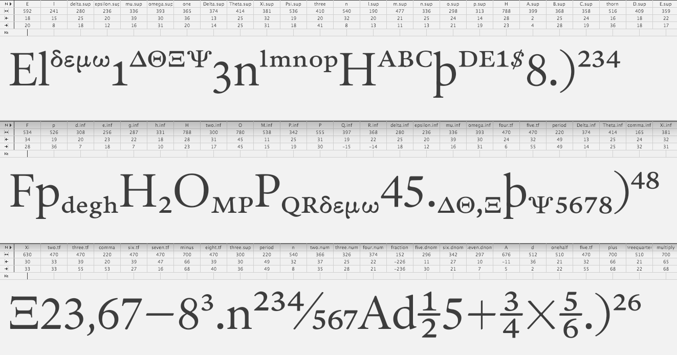 * vertical space required by horizontals of + – etc., vertically centered on the math axis.
1 -
Note that there are different conventions between typical text faces and those intended to display mathematics, to varying degrees of complexity. Both Kent and Andreas have shown or referred to some things that I consider first level maths typography: Kent’s consideration of alphabetic variables within a fraction (very unusual in a slanted fraction format), and Andreas’ vertical fractions arranged around a math beam (note also the size of Andreas’ math operators such as +, and their alignment to the same math beam). I probably wouldn’t approach a typical text face in that way, unless I knew that the client had particular needs to handle some basic maths.0
-
Agreed. (Hence the *shrug*). Any expression beyond simple fractions is probably rare, if not nonexistent, among the needs/uses of my target market. But having derived the inferior lowercase, it costs me virtually nothing to include the numerator alignment, having already determined that height, and the lowercase forms already being related in size.2
-
The theories are countless, but the actual practice is even more varied.1) An example of "superiors" (superscript characters) from EB Garamond:
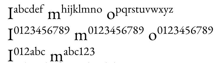 (a) the glyphs are very (too) thin: it looks as though they were generated by a program’s automatic scaling function (which reduces stroke thickness along with size) and then left uncorrected; (b) letters and numbers are placed on the same baseline; (c) the proportional scaling of lowercase letters and numbers maintains their original ratio, resulting in numbers that are significantly taller; (d) all superior rests exactly on the high-line of the lowercase letter.2) An example of "superiors" from Garamond Premiere Pro:
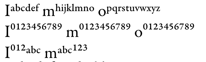 (a) here, the stroke thickness of the superiors appears well-proportioned relative to the other glyphs; (b) letters and numbers are positioned at noticeably different heights (why?); (c) the scaling relative to the "standard" glyphs (lowercase letters and lining figures) is much more pronounced for the numbers, meaning that a combination of a letter and a number looks different when using "standard" glyphs versus these superiors; (d) the superior letters are positioned such that the midpoint of its height rests on the high-line of the lowercase letter and superior digits over the high-line of the lowercase letter.What do you think of these approaches? To me, both seem to have flaws. I ask because I am trying to learn by studying some of the most celebrated fonts, yet I sometimes encounter design choices in them that leave me puzzled.
0 -
2) Subscripts should go some amount below the baseline, ~ straddling it. I normally do them about 1/3 of their height below the baseline, which is (or was) the Adobe practice.mauro sacchetto said:Thanks for the reference—illuminating in some respects, while leaving room for different solutions in others.Here, then, is a list of the issues that still seem unresolved or unclear to me:...
2) subscripts: half above and half below the baseline (straddling it), or resting on the baseline?...4) scientific inferiors: obsolete. Can they be left at the same height as subscripts, simply for the sake of completeness?5) denominators: resting on the baseline (or are they too similar to old-style numerals?) -and thus identical to subscripts?
Subscripts should absolutely NOT rest on the baseline (and if they do rest on the baseline, then you need scientific inferiors, and your 'sinf' need to be different — incorrect baseline subscripts are why the scientific inferiors feature was invented in the first place).
4) If you make subscripts correctly, then there isn’t much reason to include scientific inferiors. But then again, making them a clone of subscripts is pretty easy and costs you little.
5) Denominators do indeed normally rest on the baseline. But that makes them different from subscripts. If denominators do in some case go below the baseline, it will be by less than subscripts.1 -
Thanks for the information.Actually, what I need right now isn't so much theoretical discussion - interesting as that may be - but rather concrete, practical advice."I normally do them [subscripts] about 1/3 of their height below the baseline, which is (or was) the Adobe practice." And what about superscripts? Is there a specific, widely accepted practice? Because, as I noted in my previous post, I’ve observed a significant lack of consistency in how these are set...0
-
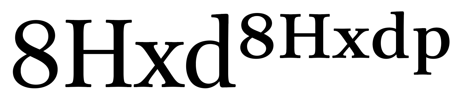
I find a lot of superscripts in fonts to be too small to be practically useful. I am reading a history text at the moment, and the note references in the text are tiny, which makes them difficult to find if I want to go back and look for one on a page.Superiors letters and numerals should sit on a common baseline. Those misaligned superiors in Garamond Premiere Pro are a problem.If you plan to provide support for more than a basic set of superscript numerals and a few common ordinals, look at norms in academic publishing, especially things like linguistics in which superior characters are part of transcription system, and also pay attention to the use of raised modifier letters in the orthographies of Indigenous languages in North America.This is how the superiors in Brill are sized and positioned. This typeface is used in a lot of books and journals with complex typography every year, so I am pretty confident in suggesting this as a model.
3 -
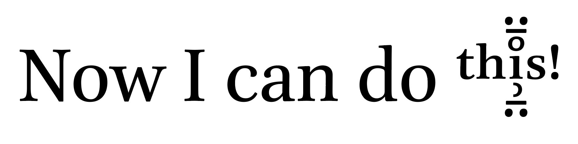
In v5.00 of the Brill fonts, I added above and below anchors to all the super- and subcript letters and numerals, and also a variant subset of the more common combining mark characters to be used with them (when such a variant is not available, the regular mark glyph is used).
 2
2 -
Indeed, some fonts contain only superscript and subscript numerals, while others include uppercase and lowercase letters, as well as additional symbols like punctuation, etc. Accented characters are included only very rarely.How far should one go? In other words, should characters like "thorn" (þ) or "oslash" (ø), etc., also be included? Should superscripts and subscripts be thought of as another "complete" alphabet?I’m going to take another look at Brill, which is known for being an extremely comprehensive font.Thanks for the advice, which is always precise and invaluable.PSDid I just not look carefully enough, or is version 5 of Brill not yet available?0
-
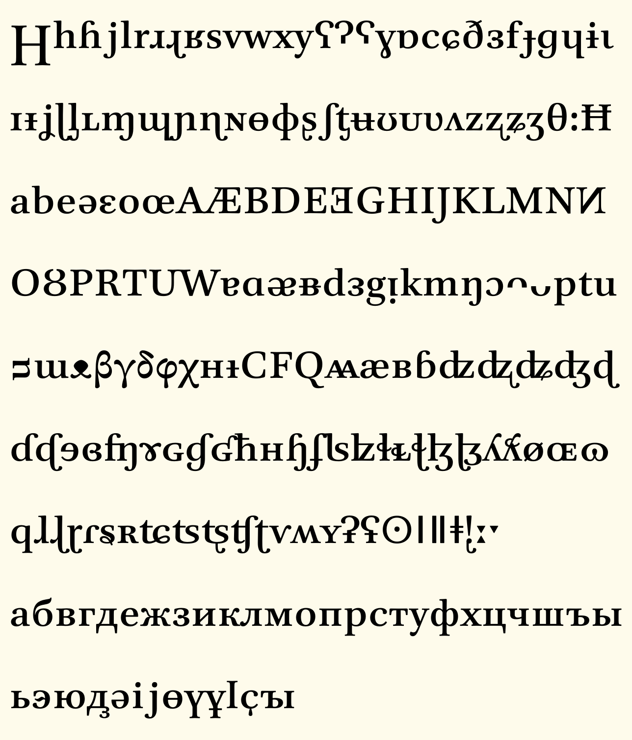
De Gruyter Brill, for unknown reasons, have not made v5.00 available for no-fee non-commercial use, but are still providing only the previous version in that way. They are using v5.00 internally, and customers can purchase commercial use licenses for it from Tiro.Regarding the super- and subscript sets in the Brill fonts, these were determined by the publisher’s own needs, so the sets are based on attested but specialised use. On that basis, we decided to include full basic alphabets, both upper- and lowercase, for Latin and Greek, as both super- and subscripts. Not all individual letters were attested, but enough were that it made sense to include complete a–z and α–ω sets.Extensive diacritic letters are not included as sups and subs glyph variants, but a lot of raised diacritic letters are included as encoded modifier characters from various phonetic transcription systems and related alphabets. There is also a large set of Cyrillic modifier letter characters, although that would only be needed in a font for transcribing specific Old Slavonic texts.
0


Categories
- All Categories
- 47 Introductions
- 4K Typeface Design
- 499 Type Design Critiques
- 591 Type Design Software
- 1.1K Type Design Technique & Theory
- 674 Type Business
- 907 Font Technology
- 29 Punchcutting
- 544 Typography
- 129 Type Education
- 333 Type History
- 82 Type Resources
- 114 Lettering and Calligraphy
- 33 Lettering Critiques
- 81 Lettering Technique & Theory
- 580 Announcements
- 101 Events
- 116 Job Postings
- 176 Type Releases
- 186 Miscellaneous News
- 270 About TypeDrawers
- 54 TypeDrawers Announcements
- 114 Suggestions and Bug Reports