Fractions

mauro sacchetto
Posts: 383
What techniques do you use to produce fractions?
Let’s start by looking at Adobe Garamond Pro. Here, numerators and denominators have sidebearings that are determined "reasonably" and are identical for both. However, this yields some odd results. Just look at the image:
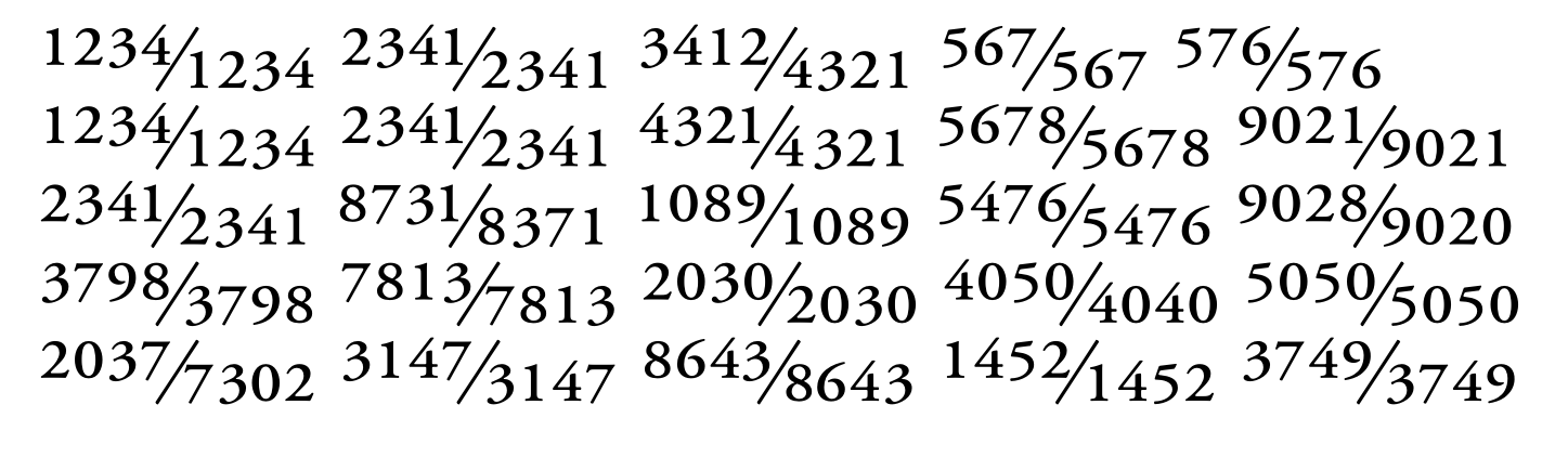
The huge spacing in the second fraction of the fourth row (7813/7813) or the asymmetrical spacing in the denominator of the first fraction in the last row (.../7302), where the 7 is spaced far apart from the following digits.
In the first fraction of the last row (2037/7302), there is a marked asymmetry between the 7 at the end of the numerator (spaced far from the slash) and the 7 at the start of the denominator (which almost touches the slash). And so on...
Now, certain glyphs, like the 4 and the 7, pose problems; they require significant right sidebearing when they appear at the start of a denominator (.../7), yet this results in excessive spacing from subsequent digits when they are part of a multi-digit denominator (.../7302, .../1452).
How do you handle this? Do you use the same sidebearings for numerators and denominators, or different ones for each category? Do you make subsequent kerning adjustments? Or do you simply accept a certain lack of uniformity?
Thanks
m
Tagged:
0
Answers
-
I would space the numbers and the fraction as usual and add a few kerning pairs (e.g. 7+4).0
-
THIS IS A DUPLICATE THREAD. MODERATORS PLEASE REMOVE.The other thread, with more responses is, here.0


Categories
- All Categories
- 47 Introductions
- 4K Typeface Design
- 497 Type Design Critiques
- 591 Type Design Software
- 1.1K Type Design Technique & Theory
- 674 Type Business
- 906 Font Technology
- 29 Punchcutting
- 543 Typography
- 128 Type Education
- 333 Type History
- 82 Type Resources
- 114 Lettering and Calligraphy
- 33 Lettering Critiques
- 81 Lettering Technique & Theory
- 579 Announcements
- 101 Events
- 116 Job Postings
- 175 Type Releases
- 186 Miscellaneous News
- 270 About TypeDrawers
- 54 TypeDrawers Announcements
- 114 Suggestions and Bug Reports