jalt feature in Arabic fonts: support and practical experiences?
Hello everyone,
I'm an Arabic type designer. One of the best OpenType features for the Arabic script is the jalt (Justification Alternates) feature.
However, documentation and tutorials about it are very scarce, and few fonts implement it effectively.
In various forums, I've heard that the HarfBuzz engine doesn't support it. To investigate this, I tested several Arabic fonts that include this feature (such as Arabic Typesetting) with different engines, and it appears that HarfBuzz indeed ignores this feature.
Do those of you with experience in Arabic typeface design have any information or experiences to share? Is there a workaround for implementing it in open-source projects?
Any help is greatly appreciated.
Note: I used AI assistance to help draft and translate this post.
Comments
-
There is no implementation specification for the jalt feature (or, indeed, for OpenType Layout in general), which means neither application nor font makers have clear guidance on how it might work. It is one of those features that were registered fairly early, in a kind of speculative way: someone looked at Arabic text traditions and saw that sometimes wider forms of letters were used to justify lines of text, and thought ‘We should have a feature for that’, without considering further how the feature should be applied.As it stands, the jalt feature is just a discretionary feature that a user could apply manually to characters within a line of text to improve justification (presuming that software provides access to the feature in the UI). There is no interaction between the jalt feature and justification algorithms in apps, and there can’t really be such interaction without radically changing how line-breaking and justification works in software. The problem is that all OpenType Layout GSUB and GPOS shaping is finished at the point when software applies line-breaking, because it is only after that processing that the software knows how many of the shaped glyphs will fit in the measure (the available line length). So there is no possibility to access GSUB after line-breaking, and the risk that if one were to run GSUB — or some portion of GSUB — again after line-breaking to improve justification, that could change the number of glyphs that fit on the line, triggering a change to line-breaking, triggering a new round of GSUB, triggering a processing loop.Back in the mid-2010s, the ad hoc OTL working group that existed at that time spent a lot of time talking about this problem, and about how post-linebreak glyph layout could be applied and how it would have to work in order to avoid processing loops. Various ideas were discussed — my notion was a single OTL feature that ring-fenced post-linebreak substitutions and positioning, applied within algorithmic rules that ensured the output remained equal to or shorter than the measure — but in the absence of any more general implementation specification for OTL, there wasn’t any clear way forwards.There is also the complication that justification mechanisms needs to be prioritised, especially in the case of Arabic, where several different methods are observed in calligraphy. That prioritisation needs to be applied as part of a justification algorithm, so that different methods can be applied in sequence to achieve best results, e.g. word-final extended forms first, then word-internal extended forms, then spacing adjustments. And if extended forms of different widths are available, one might want to balance them across the line. And these methods are always to some extent design-specific, and certainly style-specific: the methods of justifying naskh text are not the same as justifying nastaliq, for example. So that means that individual fonts may provide different methods, and expect different priorities. In my idea for ring-fenced post-linebreak OTL, lookup ordering could provide basic prioritisation: the layout engine would apply the first lookup, then the second, etc. and stop and step back when then resulting glyphs would exceed the measure.The prioritisation complication is the reason why the JSTF table exists in OpenType. It too was defined very early in the history of OpenType, and like the jalt feature was sort of speculative. But it was at least defined by someone who understood the problem space and the kind of solution that would probably be needed, i.e. one in which individual fonts could contain information about what glyphs were available for justification and how to prioritise them, and for this to exist independently of GSUB. But no one implemented support for the JSTF table in applications, and to my knowledge @Simon Cozens is the only person who has seriously tried to implement it to determine if it could work or what else might be needed to make it work.3
-
Thank you, John. This is exactly the clarity I was hoping for.What I understand from your explanation is that the entire problem comes down to the ordering of OpenType rules — shaping happens before line-breaking, and once shaping is complete, there is no way to go back to it. Any attempt to re-run shaping after line-breaking creates an infinite processing loop.I had been thinking that if shaping knew the measure in advance, it might be possible to control it with two simple rules:1. The total advance width of the shaped glyphs should divide evenly into the measure (no fractional remainder).2. Each line should always end with a space.But as you've explained, this is not possible in OpenType. The jalt feature has effectively become a manual feature, not an automatic one.It seems LuaTeX has found a solution: by using Callbacks, it allows the layout engine to add Kashida nodes to the final line after line-breaking, without re-running shaping — thus avoiding the loop entirely.My question about jalt was because I am developing a tool that automates feature generation for complex-script fonts, and I wanted to see how jalt might fit into it. But it seems I cannot — at least not within the current OpenType architecture.One thing I did not fully understand from your explanation: why was JSTF never implemented? Was it a technical obstacle, a lack of interest from application developers, or both?Thank you again for your time.0
-
It seems LuaTeX has found a solution: by using Callbacks, it allows the layout engine to add Kashida nodes to the final line after line-breaking, without re-running shaping — thus avoiding the loop entirely.‘Tatweel’ insertion is the common mechanism used to justify Arabic text on computers, which is done as you say: after line-breaking and without re-running shaping. Of course, this means it only works in Arabic type with a flat baseline stroke. It is also algorithmic at the software level, so is ignorant of the particular rules for different styles of Arabic script, and not adaptable to individual designs. It is applied at the character string level, not the glyph level, so may also break the shaping by inserting tatweel extenders between letters that form non-linear contextual shapes or ligatures.It should also be noted that word-internal kashida between joining letters is not the common priority in the Arabic text tradition. Word-final extensions are much more frequent, with word-internal extensions only applied secondarily.One thing I did not fully understand from your explanation: why was JSTF never implemented? Was it a technical obstacle, a lack of interest from application developers, or both?Both, I think. It is technically complicated, without a clear implementation specification, and a lot of software already had some kind of tatweel-based justification algorithm.1
-
The crucial point is not that callbacks are involved or that no aspect of shaping is re-run. (Callbacks are just a coding mechanism for managing how logic is organized). Rather, the key is that there is a paragraph-level layout process controlling everything.Azizmohseny said:...It seems LuaTeX has found a solution: by using Callbacks, it allows the layout engine to add Kashida nodes to the final line after line-breaking, without re-running shaping — thus avoiding the loop entirely.
When doing paragraph layout, an implementation could first call a line-layout API that does shaping with mandatory and discretionary typographic features (not related to justification), which is necessary to get measurements, and then evaluate alternatives for breaking lines, using hyphenation, or applying other justification-related shaping (glyph substitutions). In the latter case, OpenType processing could be done again, but not the same processing that was done earlier.
(In principle, the earlier processing wouldn't even be possible at that point not because it isn't desirable but because it is done on character sequences and at this point the implementation has a sequence of glyph IDs, not characters.)1 -
John Hudson said:It seems LuaTeX has found a solution: by using Callbacks, it allows the layout engine to add Kashida nodes to the final line after line-breaking, without re-running shaping — thus avoiding the loop entirely.‘Tatweel’ insertion is the common mechanism used to justify Arabic text on computers, which is done as you say: after line-breaking and without re-running shaping. Of course, this means it only works in Arabic type with a flat baseline stroke. ...Thank you, John.I spent many years practicing calligraphy and studying Arabic scripts. I believe kashida (tatweel) is one of the primary elements of line justification in the Arabic calligraphic tradition. As you know, calligraphy operates in three distinct branches:1. **Artistic calligraphy** — purely for aesthetic display, sometimes without regard for legibility (e.g., Siah-Mashq in Nastaliq).2. **Applied calligraphy** — for everyday uses such as shop signs, tombstones, or architectural inscriptions in mosques.3. **Bookhand (Kitabat)** — for writing texts and books.A calligrapher's hand differs across these three branches. Justification is primarily relevant in the bookhand branch, where kashida is abundant — though it also appears at the artistic level, where it has become an aesthetic element in its own right. In older typeset books, kashida was used effectively for justification, as Titus Nemeth has shown in his excellent article.But kashida in Arabic has a specific geometry: it is not flat. In fact, two-thirds of it descends, and the final third ascends. Unicode addresses this partially with the `kashidaFina` glyph (U+FE73), which represents that final ascending third. Unfortunately, there is no rule in OpenType that allows a kashida to be defined as two parts — beginning and end — so this code point remains practically unused.A kashida can be defined using GSUB Lookup Type 2 (multiple substitution), but longer kashidas cannot be composed from it. That is, one could define a normal curved kashida with a descending path, plus a kashidaFina with an ascending path, and thereby move kashida away from a flat line and closer to the calligraphic tradition. But one cannot increase its length: if a user applies six consecutive kashidas, there is no way to replace them with two parts representing three kashidas each.If such a rule existed in OpenType, it would greatly help the Arabic script.What I am currently doing is building a tool based on the decomposed method, with two goals: first, to prevent glyph explosion; second, to control kashida more effectively and to address the justification problem at the font layer, as far as possible.I begin by defining three layers in the font: skeletons, marks, and the anchors that connect them. This is not new — Iranian designers have been building such fonts for years, and it is the same approach proposed by Kamal Mansour, Jonathan Kew, and Attash Durrani between 2003 and 2005, which was not adopted by Unicode.Currently, I have built a proof-of-concept font and a tool called FFB (Font Feature Builder), which takes a UFO file based on the proof-of-concept font and generates GSUB and GPOS tables automatically.The next step is to decompose each character into two or more glyphs — for example, splitting `ain` initial into its head and its base — and to design that base so it can be shared with `hah`, `sad`, `seen`, and other letters. This may allow me to control kashida and move it away from a flat line, without glyph explosion — all defined within the font layer, on top of existing OpenType infrastructure.I do not want to invent a new engine or a new infrastructure.I had great hope for the `jalt` feature. It seems it is not feasible.Thank you again for your time and for sharing your knowledge.0
-
Peter Constable said:The crucial point is not that callbacks are involved or that no aspect of shaping is re-run. (Callbacks are just a coding mechanism for managing how logic is organized). Rather, the key is that there is a paragraph-level layout process controlling everything. ...Thank you, Peter. It is a privilege to discuss this with you and John. Your explanation of paragraph-level layout — where shaping is called twice, the second time on glyph IDs — is very clear.But I want to make sure I understand where my project fits.FFB works at the font layer: it automates GSUB/GPOS generation for complex scripts. It does not run shaping, and it does not control line-breaking or justification. It prepares fonts so that shaping engines can use them.So my question is: does the two-pass approach you described have any implications for what a font should contain? Specifically:1. If an application wants to apply justification-related substitutions (like kashida variants) in the second pass, what should the font provide? Should these be defined as a registered feature (like jalt), or as standard GSUB lookups that the application explicitly invokes?2. Is there anything in the current OpenType specification that a font can do to support this second pass — without requiring changes to shaping engines or the specification itself?3. Or is this entirely outside the scope of what a font can express, and therefore outside the scope of FFB?I am trying to understand whether FFB can contribute to this problem at the font layer, or whether it is purely an application-layer concern.Thank you again for your time and for your patience with my questions.(Note: I used AI assistance for translation and drafting.)0
-
There are lots of things one can do with regard to manual tatweel* insertion at the glyph level, to resolve graphical kashidas into more or less graceful forms. Of course, all these methods are applied before linebreaking, so are not available to automated justification algorithms.One method is to resolve a sequence of multiple tatweel characters to a kashida ligature, which is probably the best option for a strongly cascading style like nastaliq or diwani (one can maximise the length of the tatweel sequence resolved in this way by contextually swallowing any tatweel glyphs beyond the widest kashida ligature). That is what I did in the Aldhabi font:
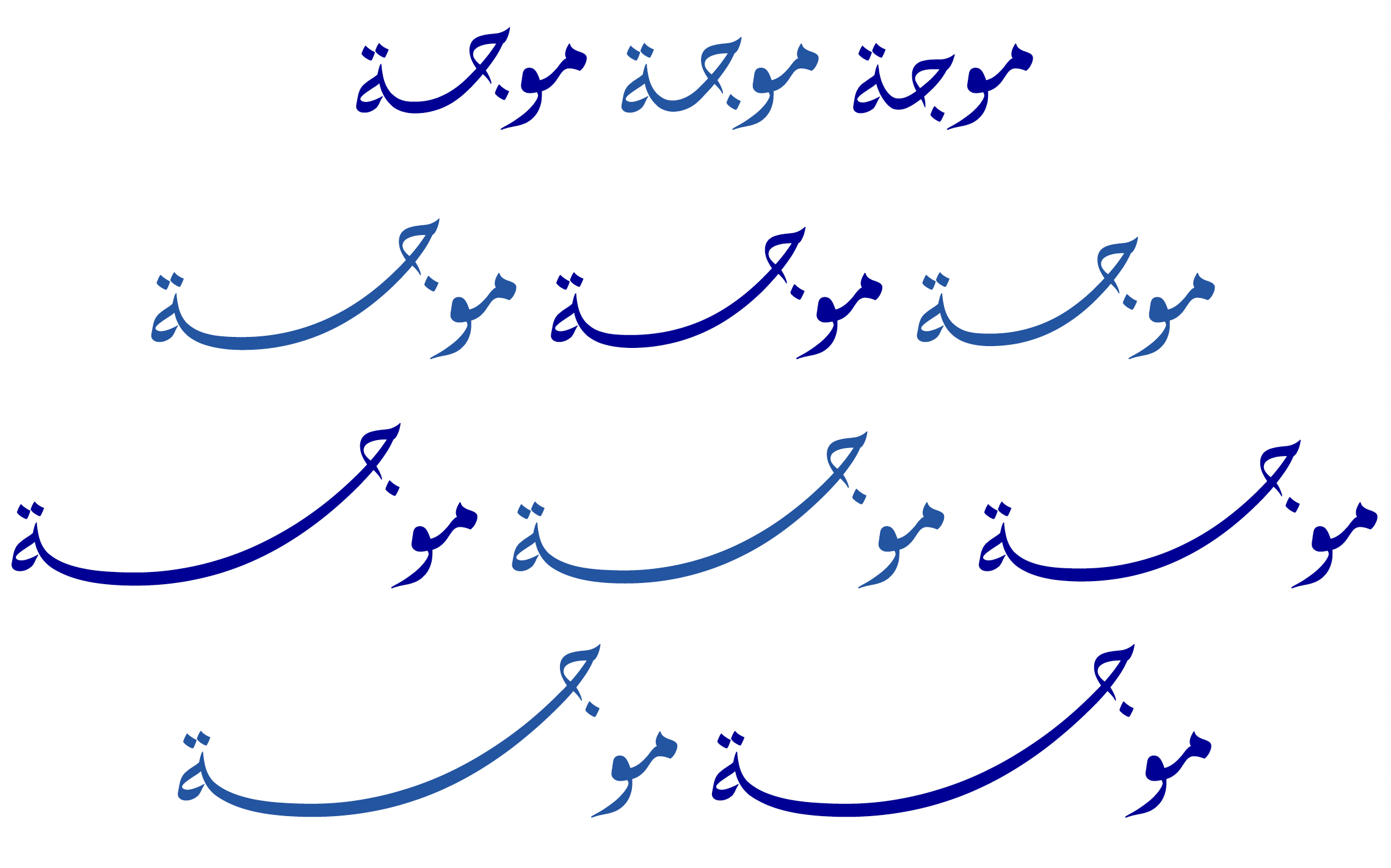 [That image is illustrating two things: the kashida ligation, but also the problem of adjusting spacing between the same glyphs sitting at different heights.]You can also contextually compose sub-sequences of tatweels to kashida initial and final stroke shapes that clip together, which might work okay for flatter styles.A note about U+FE73: As I understand, the intent of that was to provide a crude mechanism to make final form elongations by adding one or more tatweel letters at the end of a lettergroup, followed by that final upturned shape:
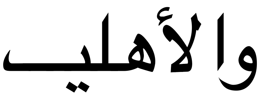 Like most of the Arabic Presentation Form codepoints, its use is discouraged and most fonts do not include it._* I am going to use the term ‘tatweel’ to refer to an inserted text element, the Unicode character U+0640, and the term ‘kashida’ to refer to a graphical elongation between joining letters.0
 -
I described conceptually what a paragraph layout implementation could do, in principle. I'm not sure any implementation takes exactly that approach.So my question is: does the two-pass approach you described have any implications for what a font should contain?
A different way to achieve the same effect would be to do the first shaping pass I mentioned, determine line breaks, then evaluate justification-related features by re-shaping a line with the additional feature(s) enabled to get a revised line length. Again, though, I'm not sure what implementations take that approach.
As John mentioned, the JSTF was designed but then not implemented. My understanding (slightly different from John's) is that the original designer for the OpenType layout tables had planned to implement all of the functionality in Word, including BASE and JSTF tables, but the project lost funding as other priorities took over.
From your earlier message:
Azizmohseny said:
First, regarding U+FE73: That character was added to Unicode for round-trip data compatibility with some legacy IBM implementations. Apart from legacy data, is not expected that character would be used.But kashida in Arabic has a specific geometry: it is not flat. In fact, two-thirds of it descends, and the final third ascends. Unicode addresses this partially with the `kashidaFina` glyph (U+FE73), which represents that final ascending third. Unfortunately, there is no rule in OpenType that allows a kashida to be defined as two parts — beginning and end — so this code point remains practically unused.
...
I begin by defining three layers in the font: skeletons, marks, and the anchors that connect them. This is not new — Iranian designers have been building such fonts for years, and it is the same approach proposed by Kamal Mansour, Jonathan Kew, and Attash Durrani between 2003 and 2005, which was not adopted by Unicode.
The role of the Unicode Standard in all of this is just having an encoding for text, not covering all aspects of text display. All of the Arabic Presentation Form characters, like U+FE73, are in Unicode only for compatibility with legacy encodings. Anything needed for quality presentation of Arabic text belongs to other implementation layers that sit on top of Unicode.
In the OpenType specification, the MATH table was added to support high-quality presentation of math equations, comparable to TeX. It needed to provide a way to support operators such as the integral sign that need to vary in size, and one way it does that is to allow defining glyph components that can be combined to construct the whole. Something like that potentially could be done for extending skeletal elements in Arabic script, though that hasn't been defined.
But I've thought that that approach is still limiting in regard to geometry and ductus of ink. Ever since font variations was added to OpenType 1.8, I've thought it might be interesting to use the same basic mechanism in justification contexts, using continuous variation to stretch a glyph as needed. Sahar Afshar and José Solé gave a talk at the TypoLabs Berlin conference in 2018 ("On Extending Connections (aka Making it Fit)") illustrating that very idea with a variable font (albeit manually controlling the variations).1 -
John Hudson said:There are lots of things one can do with regard to manual tatweel* insertion at the glyph level, to resolve graphical kashidas into more or less graceful forms. Of course, all these methods are applied before linebreaking, so are not available to automated justification algorithms.Thank you, John. This is extremely valuable — and it clarifies something I had not fully understood.So the distinction is:- **Tatweel** is a text element (U+0640) inserted at the character level, before line-breaking. It can be resolved into kashida ligatures at the glyph level, but this happens before line-breaking, so it is not available to automated justification.- **Kashida** is a graphical elongation between joining letters, which can be resolved at the font level through GSUB ligatures or contextual composition.I have actually implemented this approach in my own Abnoos font. Here is a GIF showing the result:
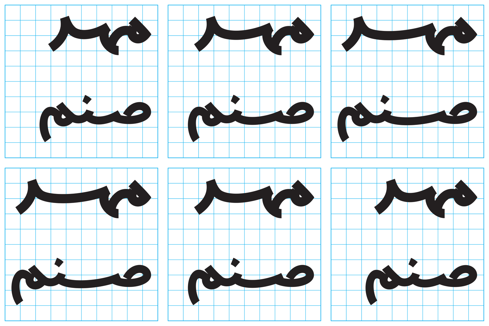 In Abnus, I resolved sequences of tatweel characters into kashida ligatures at the glyph level, using GSUB. This is the first method you described — resolving a sequence of multiple tatweel characters to a kashida ligature.My project, FFB, works at the font layer: it automates GSUB/GPOS generation. So these methods are exactly the kind of thing FFB could generate automatically — defining kashida ligatures and contextual compositions for a given font.A question: for the second method (composing sub-sequences of tatweel into initial and final stroke shapes), does this require a specific number of tatweel characters to be present, or can it be defined flexibly — e.g. any sequence of two or more tatweels resolves to a kashida of the appropriate length?Thank you again for your time and for sharing your work on the Alhabi font.(Note: I used AI assistance for translation and drafting.)0
 -
A question: for the second method (composing sub-sequences of tatweel into initial and final stroke shapes), does this require a specific number of tatweel characters to be present, or can it be defined flexibly — e.g. any sequence of two or more tatweels resolves to a kashida of the appropriate length?It can be flexible, but you would need multiple contextual lookups to handle input strings of different lengths, starting with the longest supported sequence, then progressively shorter, then a final lookup to remove any trailing tatweels.I am not sure there is any real benefit to this approach over full kashida ligatures, unless you have very flat strokes. As your aniumated illustration with ligatures shows, even a modest curvature affects the whole shape, including the terminals.Thank you again for your time and for sharing your work on the Alhabi font.Aldhabi. Fixed in edit.Does FFB tackle automation of contextual dot and mark repositioning?0
-
Peter Constable said:
I described conceptually what a paragraph layout implementation could do, in principle. I'm not sure any implementation takes exactly that approach.Thank you, Peter. Your mention of variable fonts and the MATH table is very interesting — and it connects directly to something I've been exploring.The geometry of calligraphic strokes — in Arabic or in Latin — is not flat. A continuous variation axis could stretch a glyph, but it would not, by itself, respect the ductus of the pen: the path the calligrapher's pen actually takes. This is precisely the limitation you described.So I started exploring this from a different angle. Instead of treating elongation as a glyph substitution or a variation axis, I began treating it as a calligraphic operation — a kind of "machine calligraphy," where the stroke is generated according to the rules of the pen, not just as a stretched outline.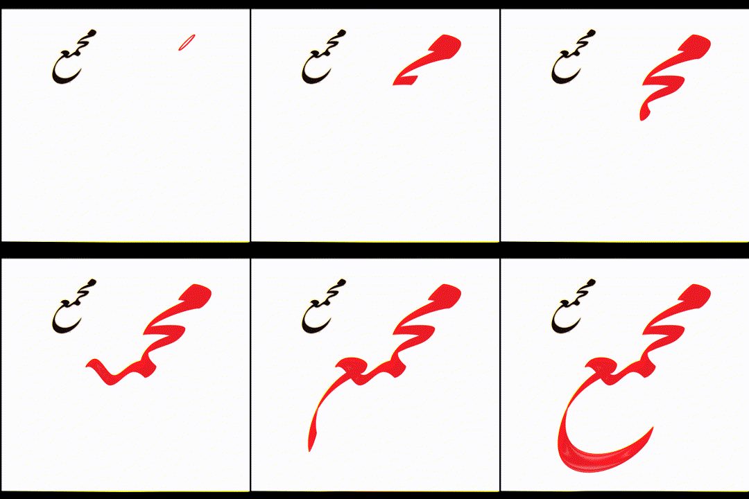
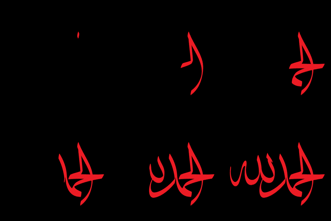
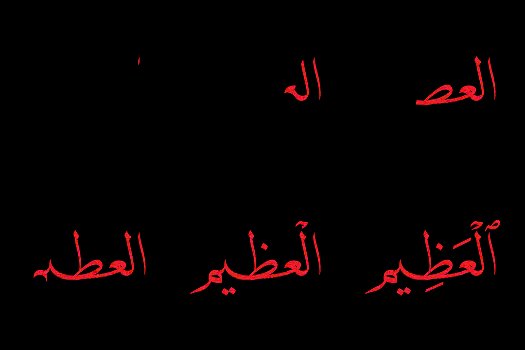
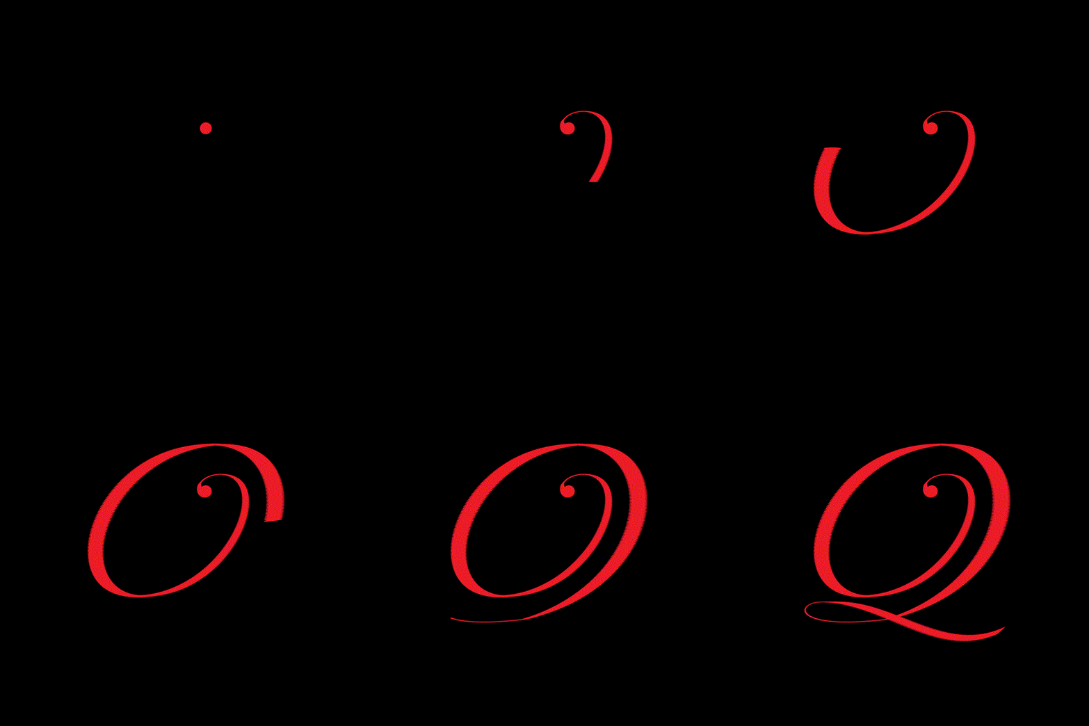 I eventually realized that calligraphy can be done by machine (Adobe Illustrator). I built some examples — the ones below were calligraphed by a machine. (Of course, to make it fully automatic, it would need a small AI model that could learn and analyze any script.)The core problem, I think, is that shaping and line-breaking happen separately. If they were done together, perhaps jalt would be more promising.As for Arabic kashida: the elongations actually used rarely exceed 8 tatweels. Managing 8 tatweels can beautifully justify about 90% of lines. In my Abnus font, I ligated tatweels from 1 to 8 and coded them in a cascading manner. The result was promising. However, I could not get InDesign to use my ligatures for justification.I believe AI will soon enter the font space and take over the management of font engines — as it has in many other domains.Thank you again for your time.(Note: I used AI assistance for translation and drafting.)0
 -
Thank you, John.John Hudson said:It can be flexible, but you would need multiple contextual lookups to handle input strings of different lengths, starting with the longest supported sequence, then progressively shorter, then a final lookup to remove any trailing tatweels.Just to clarify: the image was not generated by that method. Let me explain.The Abnus font was built exactly with that cascading approach. But regarding the point you raised about flatness — if we look at characters in the traditional way, then yes, one cannot introduce curvature into the font through the old metal-type method. But we are in the computer age now, and we are not obliged to follow metal-type conventions.In Abnoos, I used curved kashida without any problem — because I did not cut the glyphs in the conventional way. The connections happen at non-standard points, which allowed me to manage the curvature.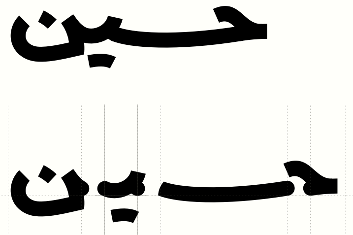 In my view, the only current solution is kashida ligatures — provided that InDesign and Word cooperate in using them. Of course, all of this is suitable for print typography. For on-screen display, the main issue is hinting — even a slight curve can be problematic.Thank you again for your time.(Note: I used AI assistance for translation and drafting.)1
 -
So I started exploring this from a different angle. Instead of treating elongation as a glyph substitution or a variation axis, I began treating it as a calligraphic operation — a kind of "machine calligraphy," where the stroke is generated according to the rules of the pen, not just as a stretched outline.I think you will be interested in the work that the designers at Underware have been doing using parallel movement of variable axes to draw stroke paths. This video is one of several presentations they gave on the topic: Scribo Ergo Sum (ATypI, 2023).0
-
John Hudson said:I think you will be interested in the work that the designers at Underware have been doing using parallel movement of variable axes to draw stroke paths. This video is one of several presentations they gave on the topic: Scribo Ergo Sum (ATypI, 2023).
Thank you, John 🙏
I looked at the work the Underware team has been doing — it's genuinely valuable. But what I'm working on has a fundamentally different nature.
Here, we're not dealing with a font. We define the path traced by the pen, and at each node we define the pen's angle and size. This way, a machine — a CNC or a robot — can perform calligraphy directly. This is outside the domain of fonts and OpenType altogether.
It's a new, independent infrastructure that requires funding and research facilities. I'm not sure whether it can be presented commercially, but from a research perspective, I believe it could be valuable.
In parallel, I've been focusing more on font effects, and I've also built a tool that turns letters into neon lights: neony.top
I'd be glad to hear your thoughts on this independent approach.
0


Categories
- All Categories
- 47 Introductions
- 4K Typeface Design
- 497 Type Design Critiques
- 591 Type Design Software
- 1.1K Type Design Technique & Theory
- 674 Type Business
- 906 Font Technology
- 29 Punchcutting
- 543 Typography
- 128 Type Education
- 333 Type History
- 82 Type Resources
- 114 Lettering and Calligraphy
- 33 Lettering Critiques
- 81 Lettering Technique & Theory
- 579 Announcements
- 101 Events
- 116 Job Postings
- 175 Type Releases
- 186 Miscellaneous News
- 270 About TypeDrawers
- 54 TypeDrawers Announcements
- 114 Suggestions and Bug Reports