Looking for a Caslon Font

John Savard
Posts: 1,261
I had picked up several fonts from Google Fonts. But despite Libre Caslon being from Impallari Fonts, I had passed it by. So I decided to remedy that.
On first glance, though, I wasn't happy with it. The lowercase o did not render well, and the typeface looked more like a generic roman face than a Caslon. I may just not have looked at it carefully enough, so this shouldn't be considered criticism.
Anyways, though, I did a search for other Caslon fonts. And I found one on a free fonts site. But it was by someone by the name of George Williams. Although I downloaded it, I thought that I wouldn't be able to use it; it must be a pirated copy of Williams Caslon, even if the site claimed it was licensed under the SIL Open Font License.
Doing some more searching, though, I was reminded that William Berkson was the designer of Williams Caslon - and that Font Bureau got gobbled up by Monotype, but they left Williams Caslon with Type Network.
And that George Williams was the author of another open-source free font-related thing... FontForge!
Small world.
EDIT: Later, I found another result; someone was commenting that although he had a font for the typeface "Big Caslon" installed on his computer, it wasn't showing up in Word. This was on a Microsoft support site. The response claimed that this font came with Microsoft Word, but wasn't installed by default. Also, a site was given where it could be downloaded from.
While that link didn't work, the font was elsewhere on the site pointed to. However, it didn't belong there; the font was by Matthew Carter, sold through Carter and Cone, and was not a free font. That there are pirated fonts out there is not news, but I'm surprised Microsoft is pointing people to them. Of course, Microsoft did license several fonts to include with Windows, so, for all I know, they might have licensed Big Caslon for Microsoft Word.
I also encountered Caslon OS. This was from Hanken Design. They have several free fonts on their site, but Caslon OS isn't one of them. But it isn't one of the paid fonts on their site either. So I have no idea what its status is.
Tagged:
0
Comments
-
I’m not sure what your question is (if you have one).Caslon by George Williams has nothing to do with Williams Caslon. The former is indeed licensed under the SIL Open Font License. I don’t have anything good to say about its quality.Caslon OS by Hanken Design Co is available under the SIL Open Font License, too. It says so in the font’s meta data.Font Bureau gave the rights to Williams Caslon back to its designer, William Berkson, who continued the distribution deal with Type Network.
5 -
Thank you for the information. My post was basically a comment on the confusing situation on trying to find free fonts that aren't pirated if you go outside of Google Fonts - or other known good projects, like GUST or the Greek Font Society. And on how many 'Caslon' typefaces don't look a lot like Caslon.0
-
Also, Apple licensed a single style of Big Caslon for distribution with MacOS. But I don’t believe it is installed by default and may need to be downloaded/activated through the system app Font Book.1
-
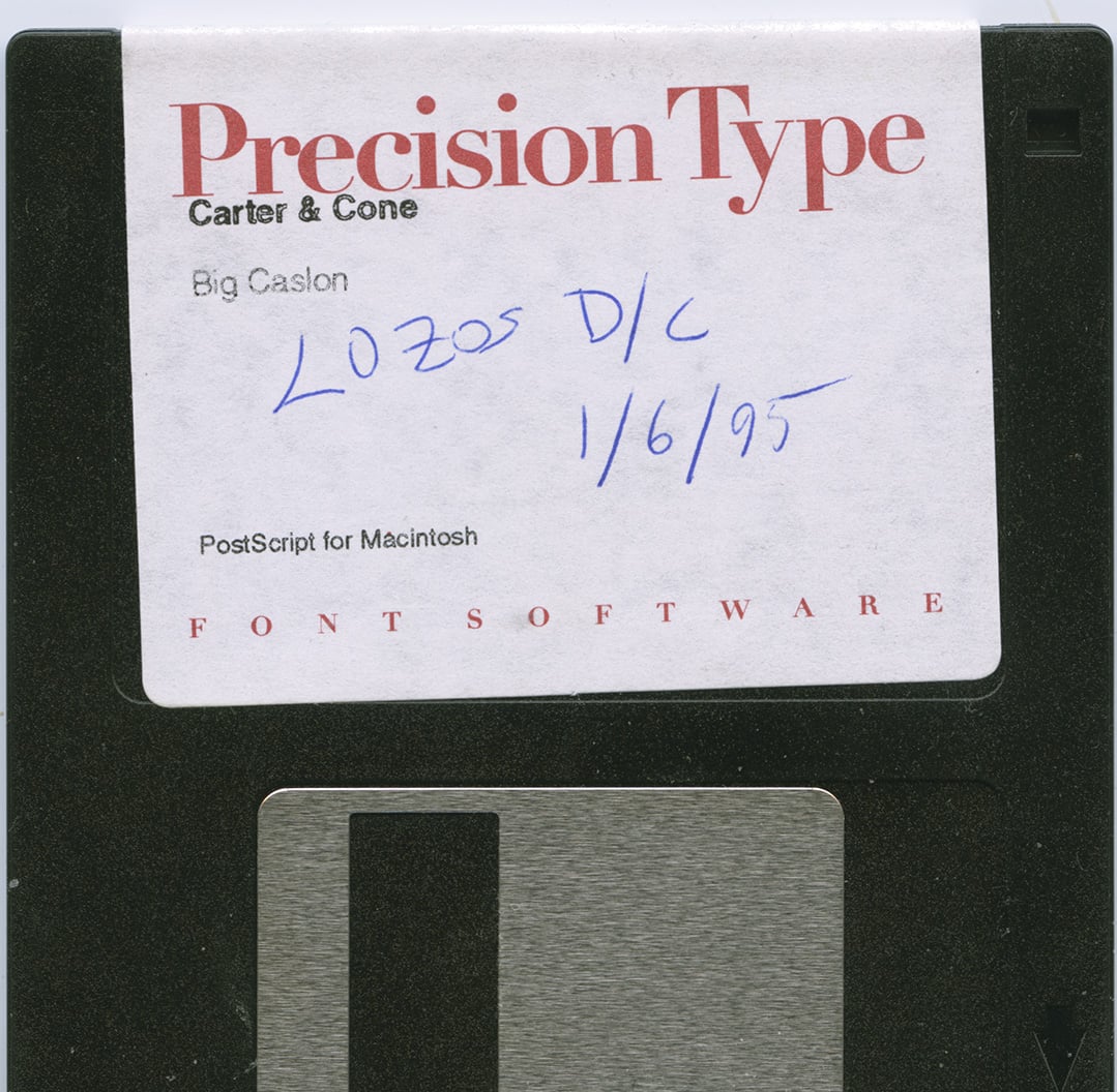 @Kent, I purchased Big Caslon decades ago on a floppy disk ;-) 3
 -
What was. Caslon 540, 1986.
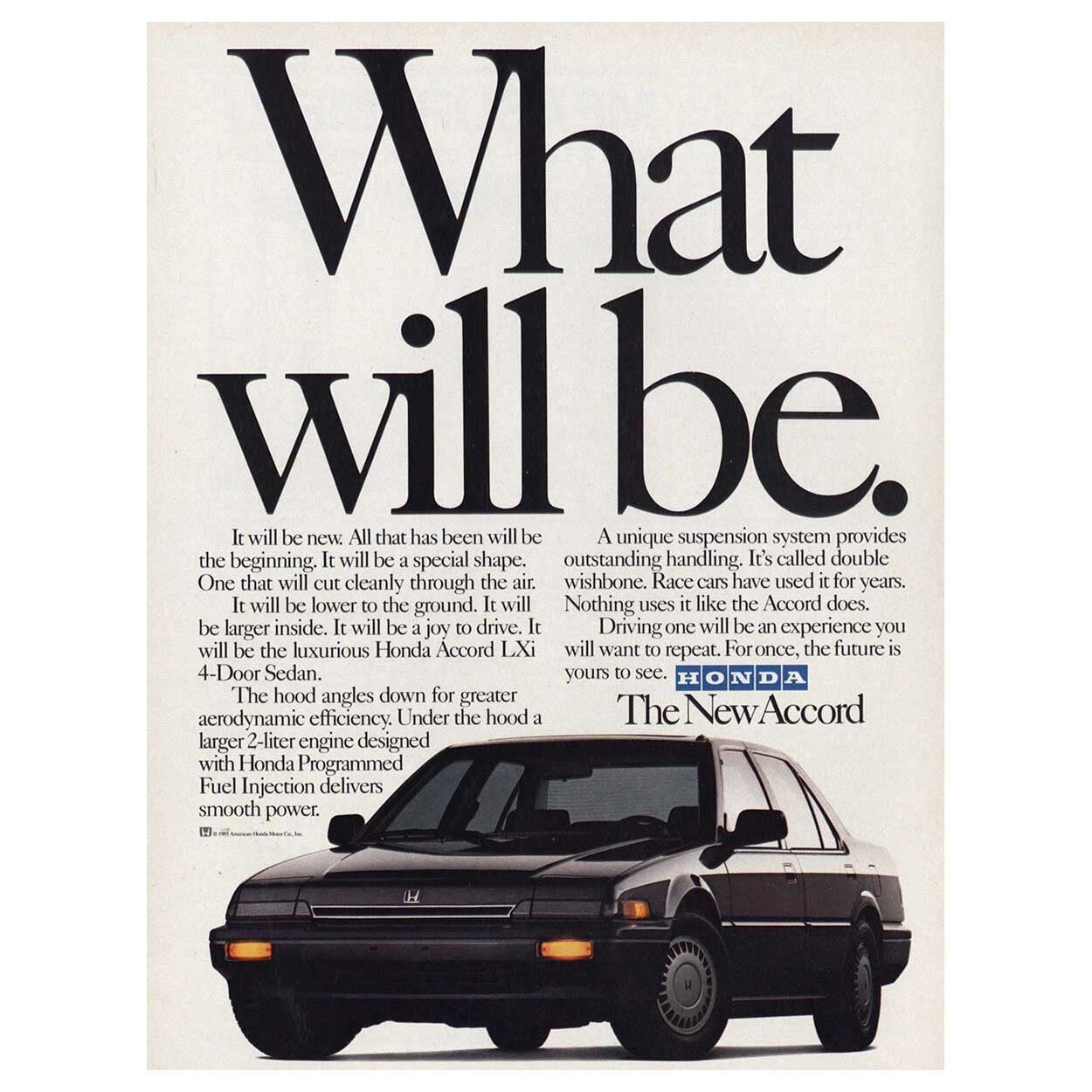 2
2 -
I also came across some Gothic-style typefaces while looking through older and more distinctive font styles. If you're comparing different historical-looking styles alongside Caslon, this Gothic fonts collection may be useful for exploring some related styles.
-2 -
That’s not a ‘Gothic fonts collection’. It’s a slop hack of Unicode blackletter mathematics characters.2
-
Off-topic: That was a nice car by the way.Nick Shinn said:What was. Caslon 540, 1986.0 -
@Nick Shinn "Close but TOUCHING" in this case. Not the best use, even for that era ;-)0
-
@Chris Lozos I don’t know. I still have a fondness for that super-tight-to-the-point-of-sometimes-overlapping spacing.2
-
@Mark Simonson So do I ;-) But that example Nick showed was overkill to me. That genre works best with a Sans, not as well with a classic Roman. I still pine for the old U&lc pulp rag printed copies coming to my inbox at work ;-)0
-
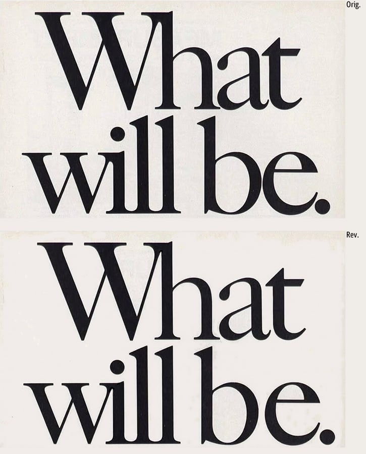
"What will be" was a missed opportunity for decent optical spacing. Maybe it was "the look" of that campaign, but the b-e combination is waaay too tight compared to the rest of it. Yes, the i dot was lowered. Here's an alternate, with additional "editing" or "handwork".
 There was Caslon blackletter in the famous 1734 specimen, reprinted here. The alternate r was an antecedent to the now famous Instagram r.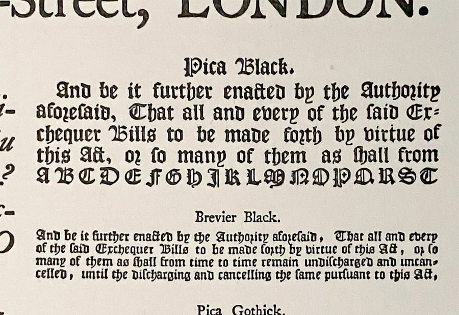
1 -
The round r (rotunda r) originated in the early Middle Ages and appeared after a round letter such as an /o. The /r in the Instagram logo is, in my opinion, a direct descendant of humanist cursive, later italic, and of the /r from 19th- and 20th-century school scripts.Peter Bain said:There was Caslon blackletter in the famous 1734 specimen, reprinted here. The alternate r was an antecedent to the now famous Instagram r.
1 -
@C.Fransen Your point, generally, about the influence of handwriting is correct. My modest understanding of textura manuscript history leads me to claim that the alternate form of the r (following o) in the Caslon blackletter, is directly descended from scribal practice. This form of r in textura is typically written outward from the preceding o at the upper right, not separated. I tried signaling by antecedent rather than ancestor in my post since it's not a direct link. The closest ancestor to the current letterform is the "Australian typeface" era of the Instagram wordmark, with the unconnected but cursive r.
0 -
@C.FransenThe /r in the Instagram logo is, in my opinion, a direct descendant of humanist cursive, later italic, and of the /r from 19th- and 20th-century school scripts.Yes. But reads too much like a “z,” for those not familiar with cursive.
Still, props to Instagram for educating popular taste on such matters!
1








Categories
- All Categories
- 47 Introductions
- 4K Typeface Design
- 497 Type Design Critiques
- 591 Type Design Software
- 1.1K Type Design Technique & Theory
- 674 Type Business
- 907 Font Technology
- 29 Punchcutting
- 544 Typography
- 129 Type Education
- 333 Type History
- 82 Type Resources
- 114 Lettering and Calligraphy
- 33 Lettering Critiques
- 81 Lettering Technique & Theory
- 580 Announcements
- 101 Events
- 116 Job Postings
- 176 Type Releases
- 186 Miscellaneous News
- 270 About TypeDrawers
- 54 TypeDrawers Announcements
- 114 Suggestions and Bug Reports