Subscripts vertical alignment

pereelmagne
Posts: 17
I see different implementations as for the vertical placement of subscripts. Noto Serif places the figure centered to the baseline, whereas IBM Plex Serif makes figures rest entirely on the baseline. See the image.
I haven't found any "authoritative" reference regarding the vertical alignment of subscripts. Does anyone know of any? Maybe in chemistry the IBM Plex solution would be preferable, but Noto Serif's would be the general implementation. I don't have a clue.
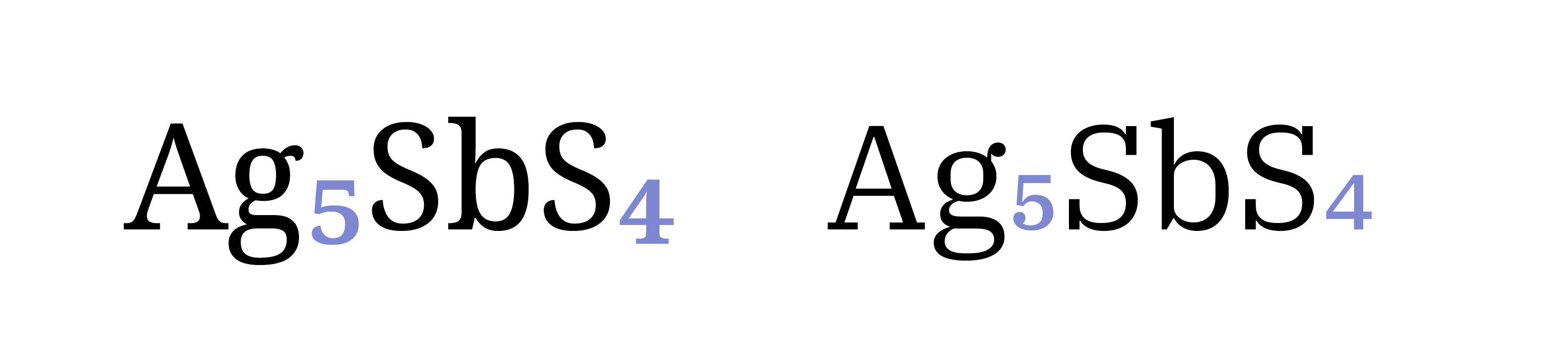
I haven't found any "authoritative" reference regarding the vertical alignment of subscripts. Does anyone know of any? Maybe in chemistry the IBM Plex solution would be preferable, but Noto Serif's would be the general implementation. I don't have a clue.
1
Comments
-
I would expect subscripts to straddle the baseline (though not necessarily vertically centered). That is the convention I have always seen for chemical typesetting. And how I approach them in my fonts.The example from Plex would be more appropriate for denominators in my view, not subscripts. But I have seen other similar treatment before. So perhaps there is some other use intended in those cases.3
-
1
-
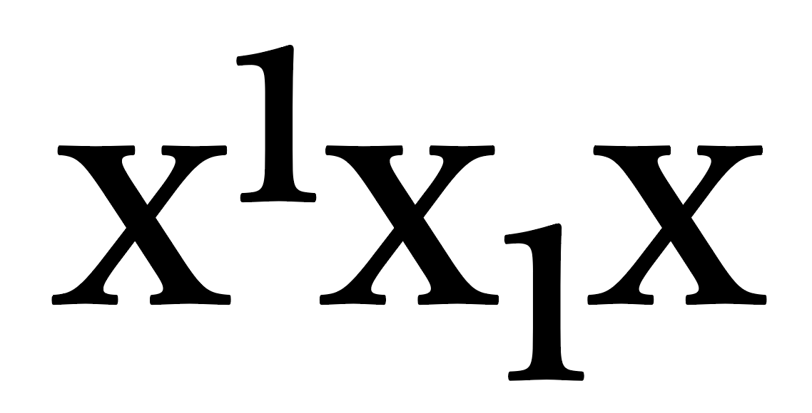
The only really standard use of subscript numerals is in molecular formulas in chemistry, where they always straddle the baseline (partly above, partly below). This alignment is also seen for the use of subscript letters and other signs found in some kinds of scholarly publications. To my knowledge, there is no standardised use of subscript characters in which they conventionally sit on the baseline. [Denominators in diagonal fractions sit on the baseline, but these are distinct forms from subscript numerals.]When the first set of OpenType Layout features were defined, Adobe and Microsoft submitted two distinct features: sinf (Scientific Inferiors) for the chemistry subscripts, and subs (Subscript) for subscripts that they imagined would be distinguished by sitting on the baseline. If fairly soon became evident that there wasn’t a practical use for the latter, and hence the sinf feature was unnecessary because the subs feature could be used for all conventional subscripts in chemistry and elsewhere. A lot of fonts do not bother to implement the sinf feature, and instead just use subs.One way to think about this is that the superscript and subscript overlap the vertical area of the x-height in a typical text face, although not necessarily by the same amount, as they also relate in some way to cap ascender height, which is usually proportionally greater than descender depth.
3 -
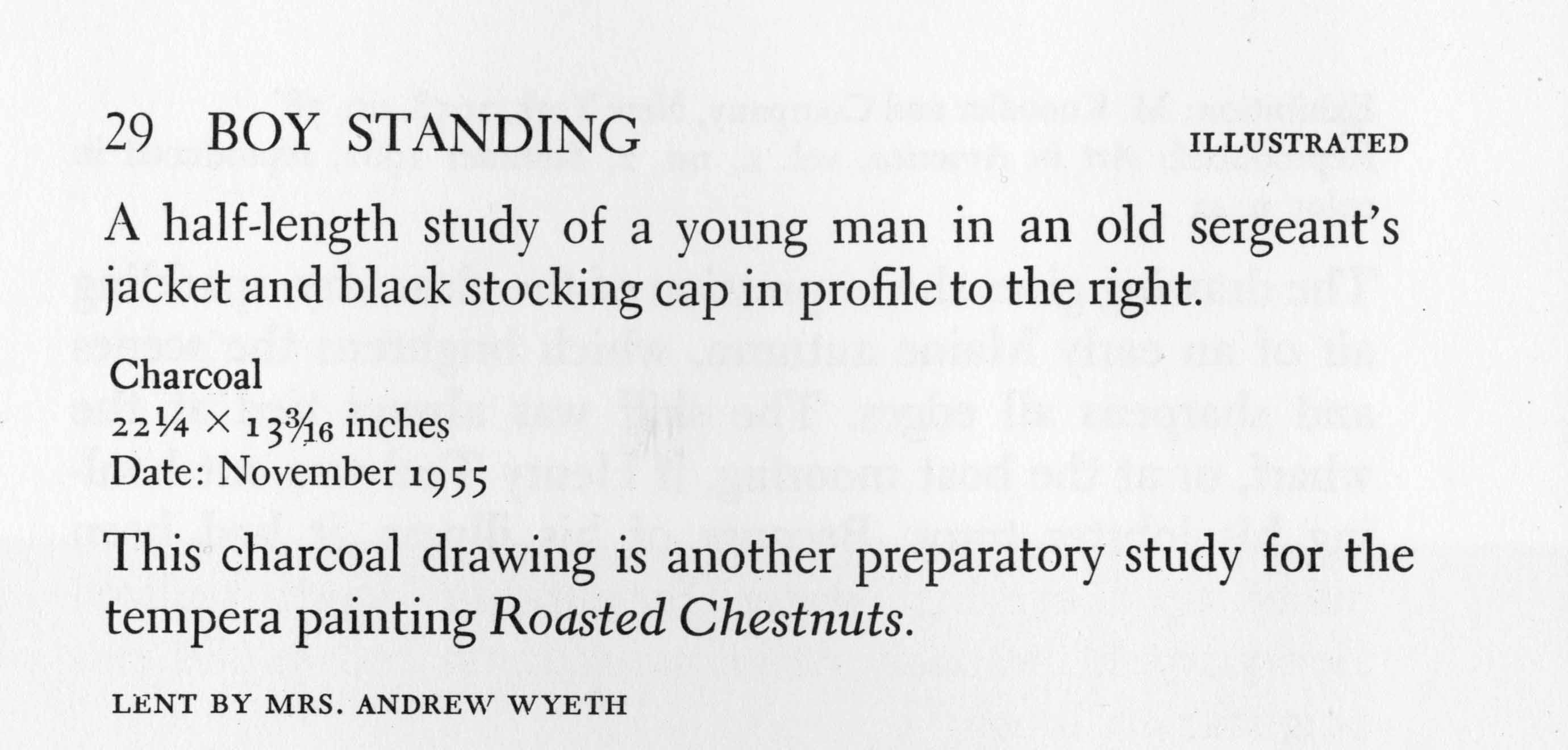
Denominators (in slash-virgule fractions) that sit on the baseline can be too similar to old-style numerals, as can be seen in this example of Electra.
Note also that sixteenths were not included in that typeface, which leads to the observation that there may be some merit in making the denominator and subscript glyphs identical, and straddling the baseline—when the typeface includes old-style numerals.
2 -
I remember there was a debate about subscript in the beginning of OpenType in the late 90s and very early 2000s.
The only reason the 'sinf' feature even exists is, at the time, Microsoft folks involved with the OpenType feature registry insisted that subscripts should be defined/implemented as being on the baseline, and Adobe folks insisted they needed subscripts that went below the baseline. So we ended up with two features, that at least back then were used differently.
6 -
I would be curious to learn Microsoft’s basis for arguing a subscript that does not descend (and thus, in my view, not really “sub” 🤷♂️). It would be interesting to see their documented precedents.1
-
I don’t think they had documented precedents, and some time later acknowledged via the OT develop mailing list that the sinf feature was in fact unnecessary and sups could be used for properly lowered subscripts. It’s possible that some software faking subscripts by scaling full size numeral glyphs was not lowering them below the baseline, which would have been a kind of precedent for the error.1
-
It was… odd. I had the feeling that there might well be just one MS person, in a key decision-making role, who was very sure about the necessity for it. I’d bet Simon would know.
Stuff happens. People make mistakes. This is hardly the only thing that is embedded in the OpenType specification for what now seem to be wacky reasons.2 -
Remember the diphthong feature?
 1
1 -
That too!
Although I was thinking of the 2048 em square for TT when I wrote that. Another long story.... 0 -
Many thanks to all of you for your knowledgeable comments. Very useful.0




Categories
- All Categories
- 47 Introductions
- 4K Typeface Design
- 496 Type Design Critiques
- 589 Type Design Software
- 1.1K Type Design Technique & Theory
- 674 Type Business
- 901 Font Technology
- 29 Punchcutting
- 542 Typography
- 127 Type Education
- 333 Type History
- 82 Type Resources
- 114 Lettering and Calligraphy
- 33 Lettering Critiques
- 81 Lettering Technique & Theory
- 575 Announcements
- 101 Events
- 116 Job Postings
- 173 Type Releases
- 184 Miscellaneous News
- 270 About TypeDrawers
- 54 TypeDrawers Announcements
- 114 Suggestions and Bug Reports