Math: horizontal delimiters, vertical alignment?

Andreas Stötzner
Posts: 843
My question is about the pairs of horizontal delimiters in the 2300 Unicode block. This overview is taken from the UTR#25 (technical report):
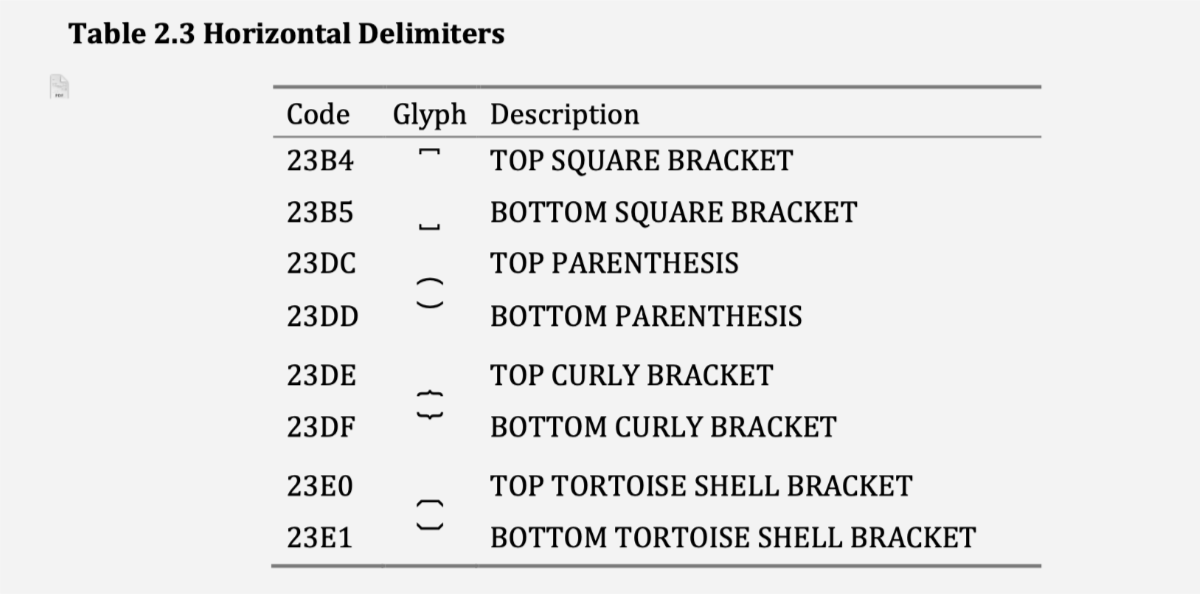
I wonder about the difference in the vertical positioning of the first pair 23B4-23B5, in comparison to the other pairs, where the ‘top’ sorts sit below the baseline but the ‘bottom’ sorts sit very high. If that is intentional, I couldn’t find an explanation anywhere, why this is so. It seems illogical to me but I may be missing an important detail. – I also noted that in the STIX Two Math font, differently to the Unicode materials, all top sorts sit on top and all bottom sorts sit at the bottom.
Has anyone ideas about this?
0
Comments
-
Have you looked at the original encoding proposal docs for any clues?
23B4..23B5 were added in Unicode 3.2, whereas 23DC..23E1 were added in Unicode 5.0.
The relevant proposal doc for 23B5..23B5 appears to be L2/99-244R. These are identified in that doc as AX25 and AX26. There isn't much other information, but references in the bibliography could be relevant. In this doc, the representative glyphs are exactly as shown in UTR #25. Also related is the document that was submitted to JTC 1/SC 2/WG 2, N2191. In that time frame, the initial STIX font project was in progress. Note that these documents do not contain images showing examples of attested or intended usage for these characters; any such information would be in the bibliography references.
For 23DC..23E1, the proposal doc is L2/04-329. This proposed five of the six characters. (The code points differ from what were finally assigned.) The representative glyphs had vertical positioning similar to 23B4 and 23B5: TOP characters appear near cap height while BOTTOM characters are at the baseline. Importantly, though: this doc provides an example taken from Donald Knuth's The TeXbook that shows that the characters are not expected to be typeset directly in math layout, like sorts of a typical font. Rather, they are displayed using a math layout engine.
That applies to all of these characters: they are expected to be displayed by a math layout engine, not simple font sorts. The importance of the of the characters themselves are in raw (source) representations of formulas. This is described in section 3.8 of UTN #28. You can also see a demonstration of this at UnicodeMathML Playground: try entering
⎴(x+⋯+x)^(k " times")
1 -
Thank you very much, Peter, also for pointing at those older documents.I was aware that these ch.s are intended for Math engine processing in the first place; however, it could still happen thet someone also wants to put them in ‘plain’ text lines here and there, and in that case my mind will be more relaxed if the glyphs appear in a possible consistent positioning.May this group (23DC…23E1) be a candidate for a glyph change update proposal to Unicode?0
-
If you think you have a case to make that a change to the representative glyphs would be beneficial.0

Categories
- All Categories
- 47 Introductions
- 4K Typeface Design
- 497 Type Design Critiques
- 591 Type Design Software
- 1.1K Type Design Technique & Theory
- 674 Type Business
- 907 Font Technology
- 29 Punchcutting
- 544 Typography
- 129 Type Education
- 333 Type History
- 82 Type Resources
- 114 Lettering and Calligraphy
- 33 Lettering Critiques
- 81 Lettering Technique & Theory
- 580 Announcements
- 101 Events
- 116 Job Postings
- 176 Type Releases
- 186 Miscellaneous News
- 270 About TypeDrawers
- 54 TypeDrawers Announcements
- 114 Suggestions and Bug Reports