The “ti” ligature

Tofu Type Foundry
Posts: 84
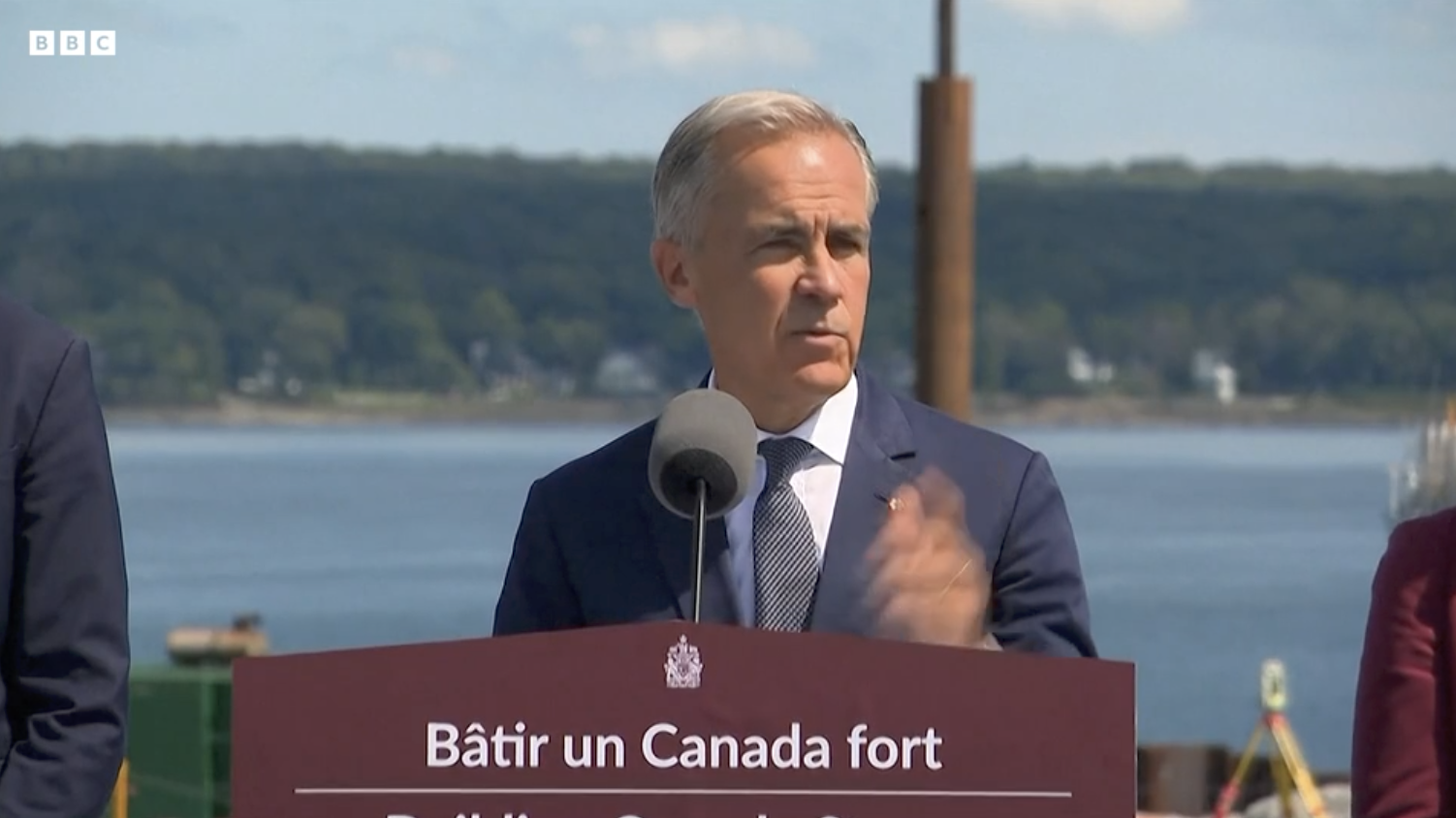
I noticed in a recent video of Canadian prime minister Mark Carney that his pulpit featured a “ti” ligature (in a sans serif, nonetheless!). In general, “fi” ligatures seem to be given special treatment in Latin fonts, even receiving their own Unicode points and general inclusion with many fonts. Is the reason that this is not extended to the “ti” ligature because of historical metal type constraints? i.e. many text faces cast in metal would have had issues with the spacing of “fi” but not “ti”, so this ligature wouldn’t be needed?
Tagged:
0
Comments
-
This is what I consider a stylistic ligature rather than a functional one. It doesn’t affect spacing, and is really just a mimicking of handwriting behaviour in which a crossbar naturally connects to the top of a following downstroke.receiving their own Unicode pointsThe presentation form encodings for ligatures in Unicode only exist for round-trip backwards compatibility with pre-existing 8-bit codepages. They’re obsolete and best ignored.
5 -
In the fourteenth century "ti" was a ligature regularly used in calligraphy.
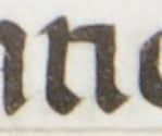 In the 16th century it was used by Aldo Manuzio (italic), but I believe it quickly fell into disuse thereafter. I had only found the "tt" ligature for subsequent centuries.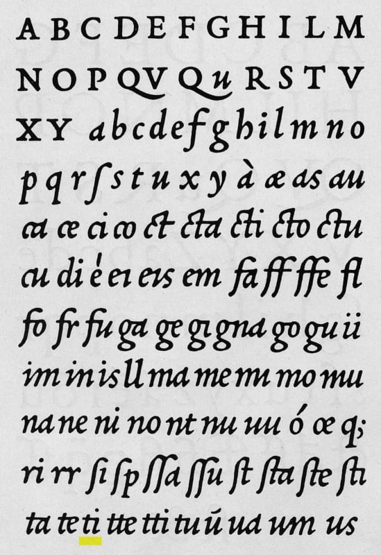
8 -
The presentation form encodings for ligatures in Unicode only exist for round-trip backwards compatibility with pre-existing 8-bit codepages. They’re obsolete and best ignored@John Hudson I’ve always wondered why they exist in the first place!0
-
Note also the rt “ligature” in the photo.
I usually put a positive kern there.
1 -
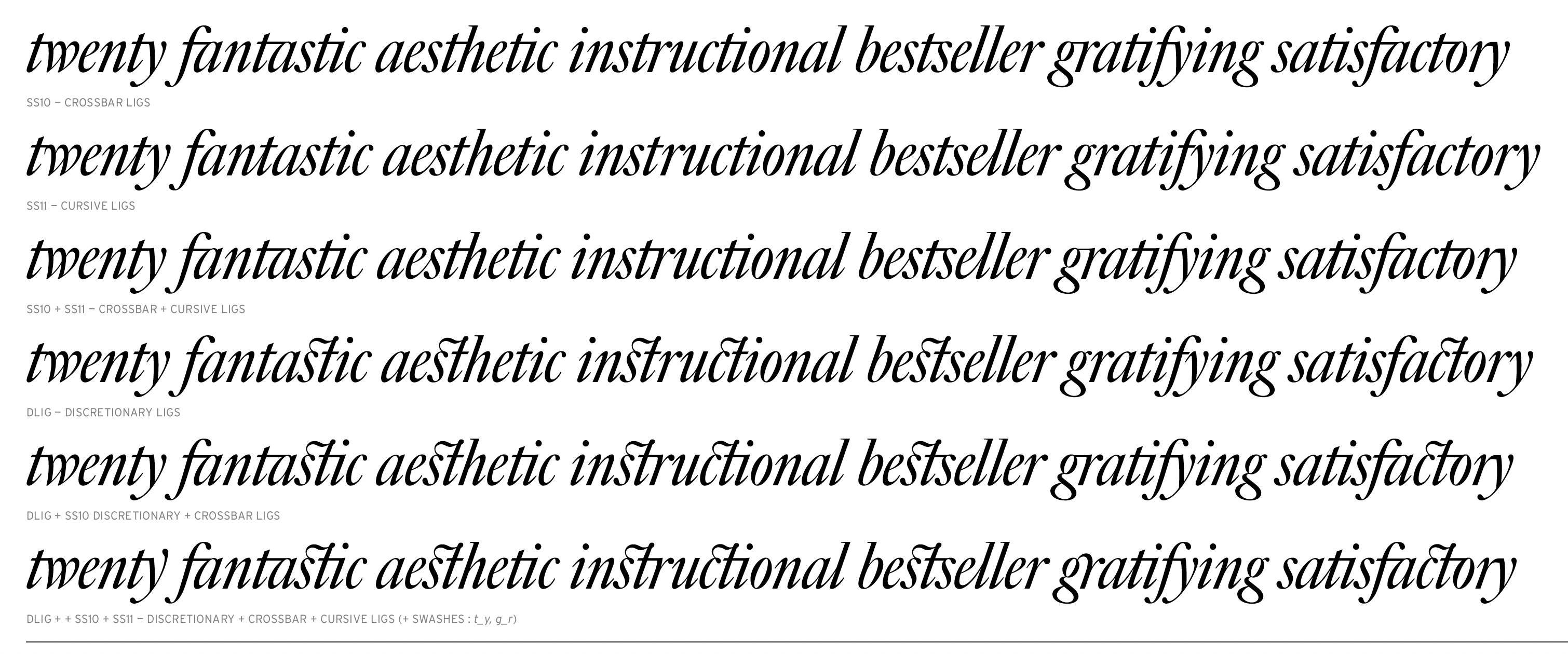
Big Caslon Italic features a “ti” ligature. It is one of several alternates that Matthew Carter included, borrowing freely from the tradition of the English writing masters. There were so many that we grouped them into different stylistic sets — primarily “crossbar” ligatures {ss10} and “cursive” ligatures {ss11}.Part of the fun of this project was working out with Matthew the hierarchy & logic of contextual interactions between all the different options.
 4
4




Categories
- All Categories
- 47 Introductions
- 4K Typeface Design
- 496 Type Design Critiques
- 587 Type Design Software
- 1.1K Type Design Technique & Theory
- 674 Type Business
- 897 Font Technology
- 29 Punchcutting
- 542 Typography
- 127 Type Education
- 333 Type History
- 82 Type Resources
- 114 Lettering and Calligraphy
- 33 Lettering Critiques
- 81 Lettering Technique & Theory
- 574 Announcements
- 100 Events
- 116 Job Postings
- 173 Type Releases
- 184 Miscellaneous News
- 270 About TypeDrawers
- 54 TypeDrawers Announcements
- 114 Suggestions and Bug Reports