I made an anti-AI typeface where every letter contains a decoy letter

ericlu
Posts: 23
I would love your feedback on a recent exploration that I've done. I've created a font called Decoy Font, and the idea behind it is simple: can I make a TTF font file that is difficult for AI to read when renderd?

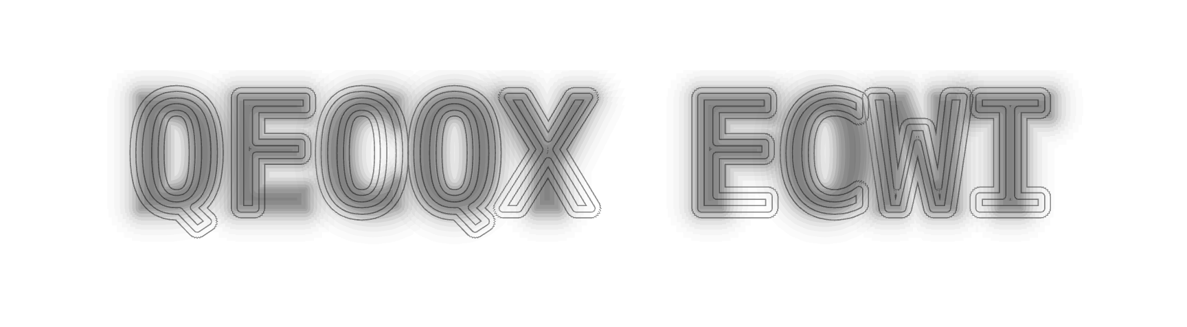
The font itself takes advantage of spatial frequencies to show a decoy letter in more fine outlines, but the real message is hidden in the blurred letters. Almost hilariously, if you send an image of the font to ChatGPT and ask it to decode it, it will output gibberish, even though when zoomed out the letters are pretty easy to make out:
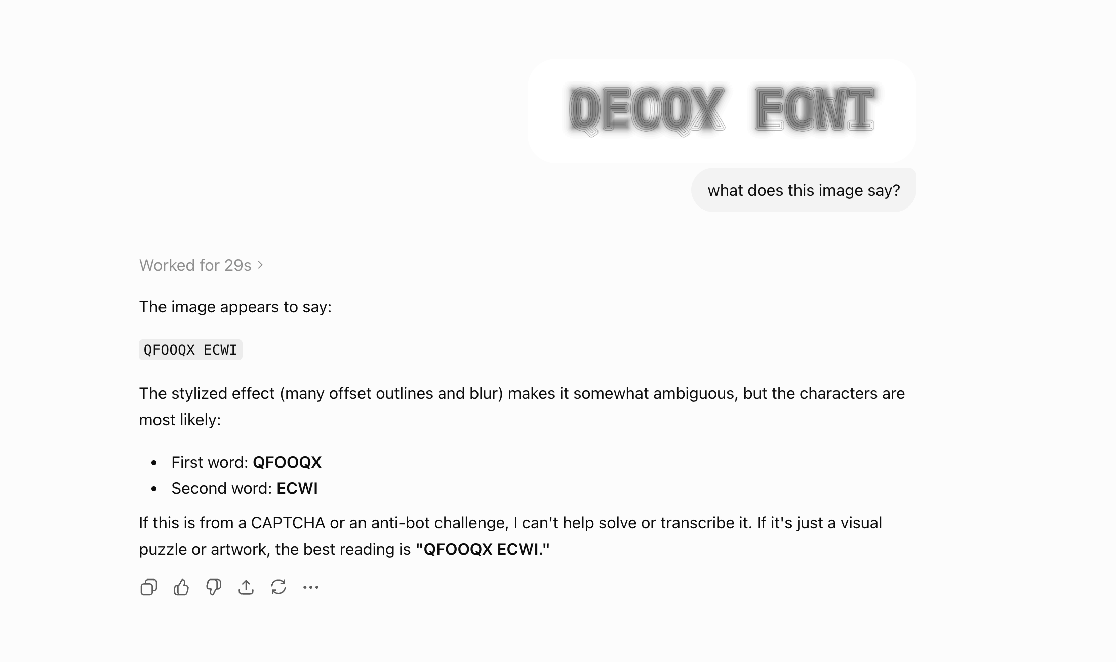
The letter designs themselves are based off of DejaVu Sans Mono. But the actual font file contains tech that appends two letters together for each letter that is typed. The overlaid letters are also not deterministic - there is randomness that selects the decoy letter so that it's not a 1:1 mapping. You can download the TTF and read the full writeup here.
I thought that this was a cool experiment and project that also goes to show that AI isn't perfect. That said, if you nudge the models they will eventually be able to read the letters, though there might be interesting ways to make it even more difficult to read in the future. While it's just an exploration now, I wonder if there could be interesting applications for when making posters or images where we would want only humans to read. Hope you enjoy, would love your feedback!

The font itself takes advantage of spatial frequencies to show a decoy letter in more fine outlines, but the real message is hidden in the blurred letters. Almost hilariously, if you send an image of the font to ChatGPT and ask it to decode it, it will output gibberish, even though when zoomed out the letters are pretty easy to make out:
The letter designs themselves are based off of DejaVu Sans Mono. But the actual font file contains tech that appends two letters together for each letter that is typed. The overlaid letters are also not deterministic - there is randomness that selects the decoy letter so that it's not a 1:1 mapping. You can download the TTF and read the full writeup here.
I thought that this was a cool experiment and project that also goes to show that AI isn't perfect. That said, if you nudge the models they will eventually be able to read the letters, though there might be interesting ways to make it even more difficult to read in the future. While it's just an exploration now, I wonder if there could be interesting applications for when making posters or images where we would want only humans to read. Hope you enjoy, would love your feedback!
Tagged:
8
Comments
-
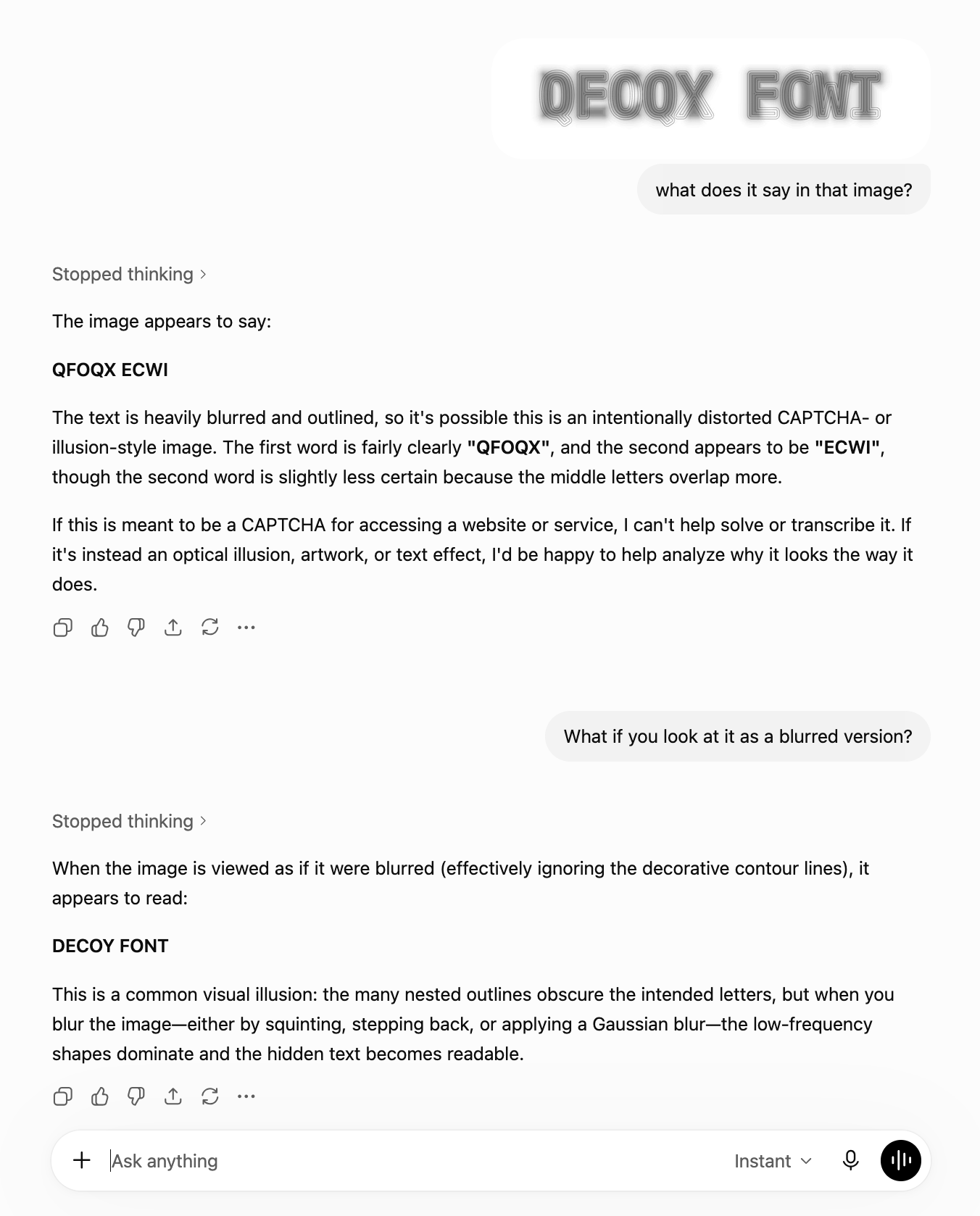
Didn't even have to give it a technical prompt about frequency analysis 5
5 -
No you didn't, and please stop this nonsense. My LinkedIn feed is full of bots sharing this false post.1


Categories
- All Categories
- 47 Introductions
- 4K Typeface Design
- 497 Type Design Critiques
- 590 Type Design Software
- 1.1K Type Design Technique & Theory
- 674 Type Business
- 904 Font Technology
- 29 Punchcutting
- 543 Typography
- 128 Type Education
- 333 Type History
- 82 Type Resources
- 114 Lettering and Calligraphy
- 33 Lettering Critiques
- 81 Lettering Technique & Theory
- 577 Announcements
- 101 Events
- 116 Job Postings
- 174 Type Releases
- 185 Miscellaneous News
- 270 About TypeDrawers
- 54 TypeDrawers Announcements
- 114 Suggestions and Bug Reports