CIↃ in print

Andreas Stötzner
Posts: 842
in Type History
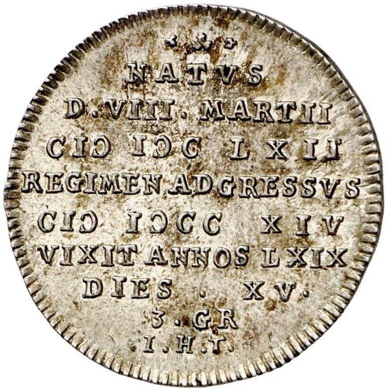
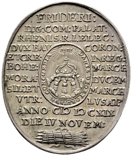
I try to chase specimen of this version of printing the number [Roman] M = 1000, which one finds sometimes on title pages. A quick search only got me two samples from coins (but the principle is the same).
image source: numista.com
2
Comments
-
yes thanks, this is what I meant.0
-
It's the letter c turned 180°. BTW (I guess you know) the old Roman numerals have code points in Unicode.
https://en.wikipedia.org/wiki/Numerals_in_Unicode#Roman_numerals
What I also have seen in old printed books: IIII as number 4, or in blackletter typeface iiij with j as end form.0 -
Of course, though, IIII instead of IV for four was used fairly often in one other specific place: clock faces. Supposedly it's due to a superstition concerning the name of Jupiter.0
-
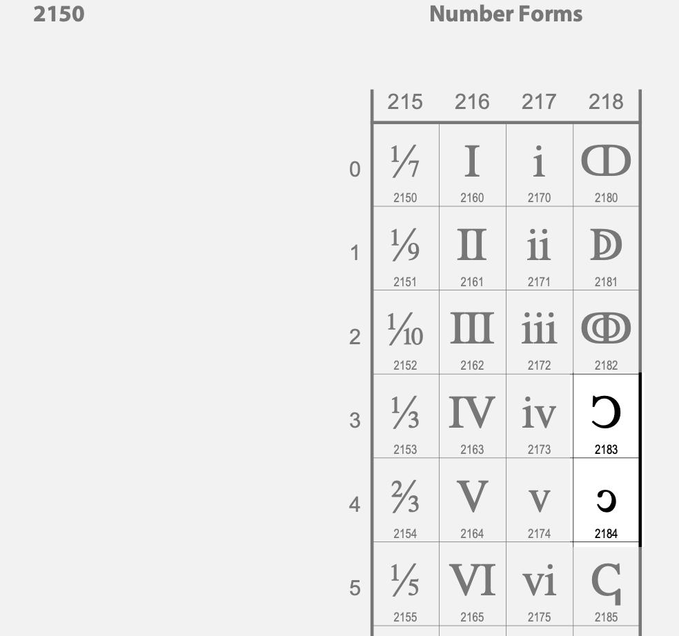
Helmut Wollmersdorfer said:It's the letter c turned 180°. BTW (I guess you know) the old Roman numerals have code points in Unicode.In letterpress printing that C is rotated, of course, because you can’t mirror a lead letter. Therefore I wonder why U+2183(-84) is flipped, not rotated. Depending on the typeface, the visual difference may be hard to notice, but it seems odd to me nonetheless.
0 -
It seems we have a Unicode-typical mix-up of different things here:
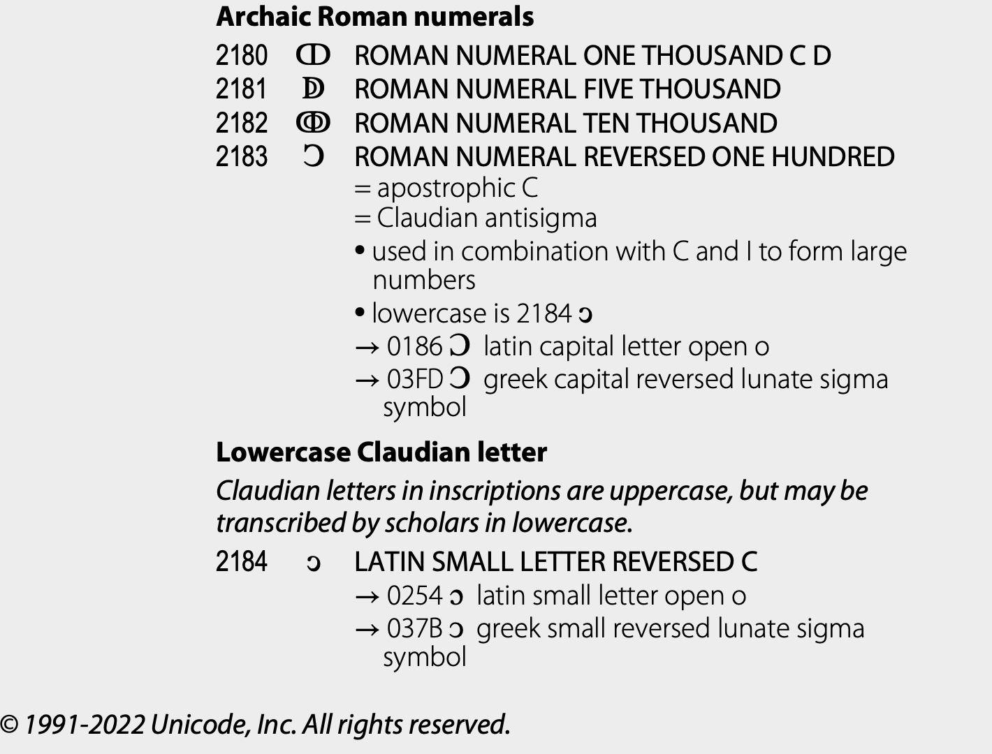 U+2183 is defined as “roman numeral one hundred” and “Claudian antisigma” which appears as a clear error to me. The two are not the same. The proper solution would have been
- to add the annotation “= roman numeral rotated one hundred” to U+0186
- to name U+2183 “LATIN CAPITAL LETTER CLAUDIAN ANTISIGMA” and
- group U+2183 together with U+2184 as a normal case pair; and
- maybe put the Claudian letter pair not in the “Number forms” block but elsewhere.
b.tw., the term “Lowercase Claudian letter” is a bad joke, considered the historic presence of lowercase letters in emperor Claudius’ times.I’d like to learn Peter Constables opinion on how this mess could get fixed.0 -
Based on the samples seen so far in this discussion, it isn’t at all clear to me that this is normatively a rotated form as opposed to a flipped form. Yes, in some typographic examples, the C sort has been rotated, but that is not the case in the second of the coins you showed, Andreas, where the form is more obviously flipped.
Given that there isn’t a clear distinction in use between flipped and rotated forms, I think the Unicode unification of this form with the Claudian antisigma is probably fine. I would want to see a lot more non-typographic examples, before concluding that those are separate characters.
0 -
By the way, this use of a backward C in roman numerals is generally known as "apostrophus":
https://en.wikipedia.org/wiki/Roman_numerals#ApostrophusAs for the design (flipped vs rotated): based on some late 16th–early 17th century examples (images and links to sources below), all of them look either ambiguous (due to unclear printing) or clear examples of the flipped (mirrored) C shape for the apostrophus, rather than a rotated C. It would be best, I suppose, to find type specimens where there is clearly a dedicated sort for the flipped C.Do note that the glyph designs shown for characters on the Unicode code charts are not normative-- font designers are free to implement the design however they see fit.
If your aim is to imitate the appearance of the Ↄ from printed works where the printer did not have a distinct sort for it and was forced to rotate the C then you may freely design it as such- but if your goal is to imitate the appearance in many engravings and on many a plaque and in printings where a distinct sort for Ↄ was available, then you can opt for the mirrored option. You can also opt for the mirrored option just because you think it looks better, since it's well enough attested.
Images of Examples: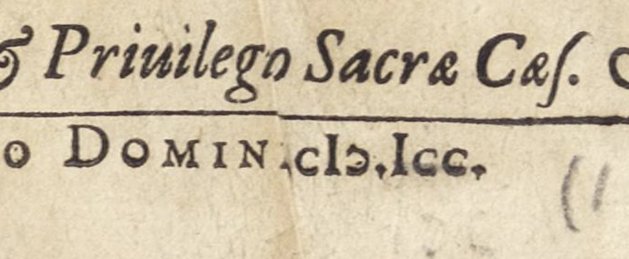
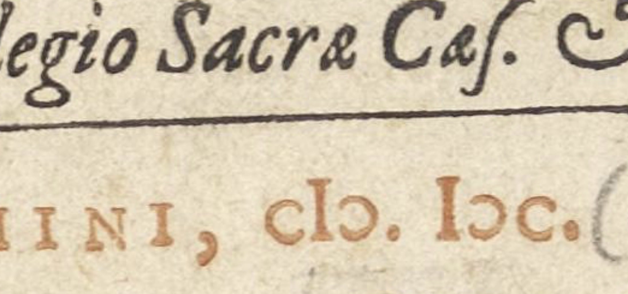
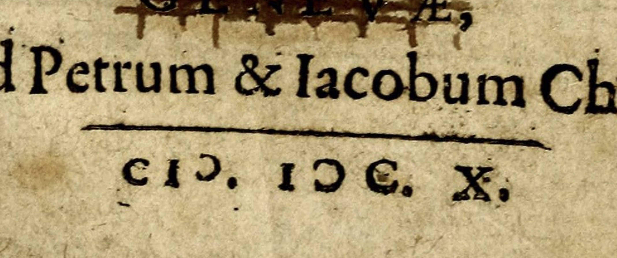
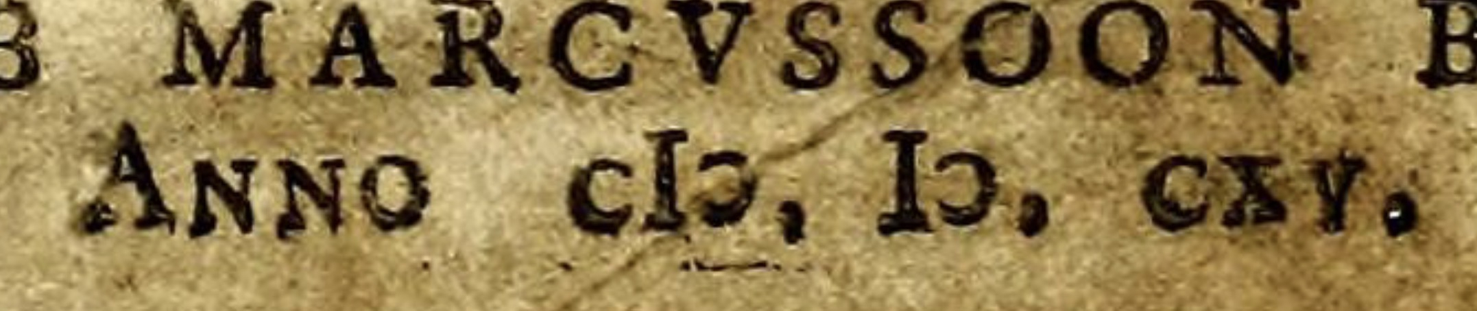
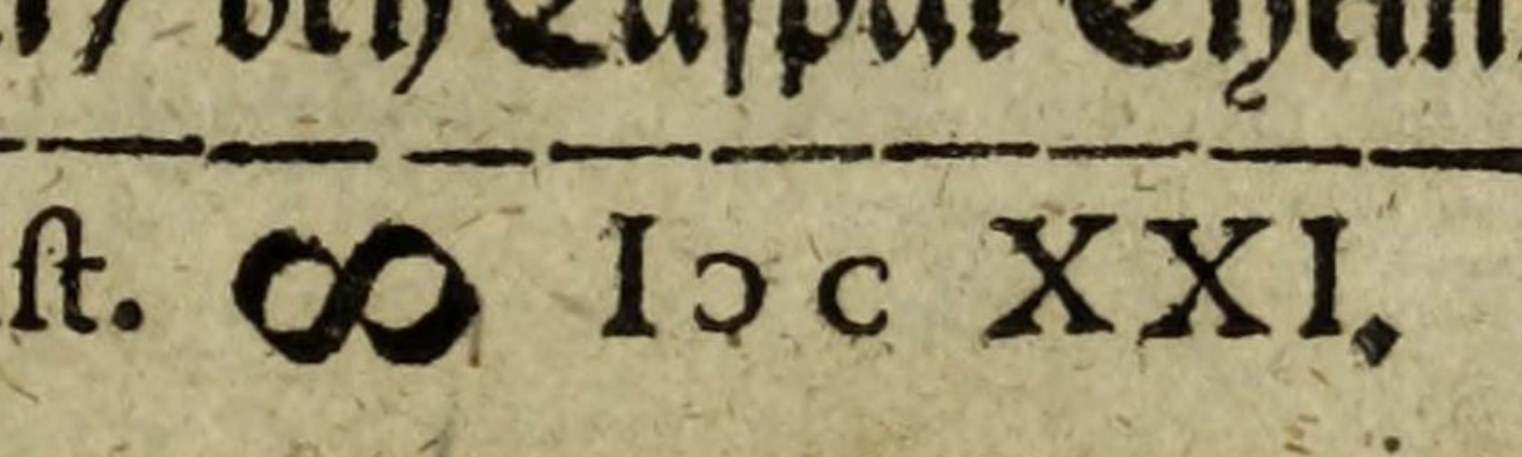
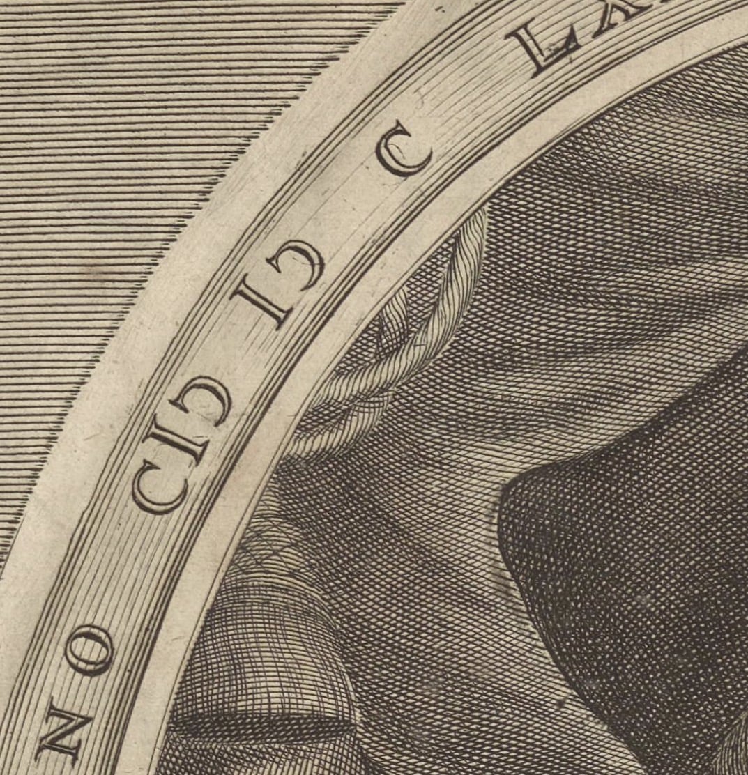
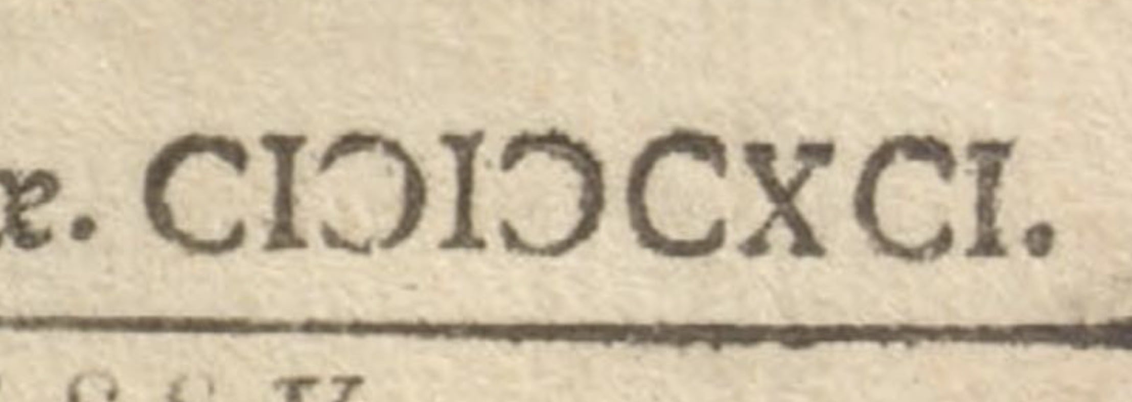
Links:
https://archive.org/details/rpatrisfrancisci02suar/page/n1/mode/2up7 -
To me, using the glyph for the "open o" would be more appropriate, but just because two characters look the same is no reason for a Unicode unification. That requires the characters to have the same function, so that they wouldn't look different in any typeface.John Hudson said:Given that there isn’t a clear distinction in use between flipped and rotated forms, I think the Unicode unification of this form with the Claudian antisigma is probably fine. I would want to see a lot more non-typographic examples, before concluding that those are separate characters.
0 -
How should they flip (mirror along horizontal or vertical axes) a metal form in the old times without a new cut? If the C has two different terminals (e.g. one serif), then we can observe rotation.John Hudson said:Based on the samples seen so far in this discussion, it isn’t at all clear to me that this is normatively a rotated form as opposed to a flipped form.
Historical books about typography like Gessner 1744 help. It contains drawings (woodcuts) of typecase layouts for different languages. Also casting lists with number of characters per pound. E.g. for German there are no quotes. They used 2 comma ("9-shaped") for begin quote and 2 rotated comma ("6-shaped") for end quote. As a curiosity the German end quote has the Unicode property "begin enclosing", because it's the English begin quote.'„' U+201E DOUBLE LOW-9 QUOTATION MARK [low double comma quotation mark]
'“' U+201C LEFT DOUBLE QUOTATION MARK [double turned comma quotation mark]
0 -
How should they flip (mirror along horizontal or vertical axes) a metal form in the old times without a new cut? If the C has two different terminals (e.g. one serif), then we can observe rotation.My point is that it isn’t clear from all the examples that a new sort wasn’t cut. There may well be instances in which an existing C was rotated, but that is an expedience that may not imply anything about the nature of the character. This is one one of the reasons why I prefer not to rely only on typographic examples when researching text, but to look also at engraving, lithography, manuscript, inscribed, etc. forms. Such media also tends to be of higher quality than much printing from type, making it easier to see the details.This is very obviously not a rotated form:
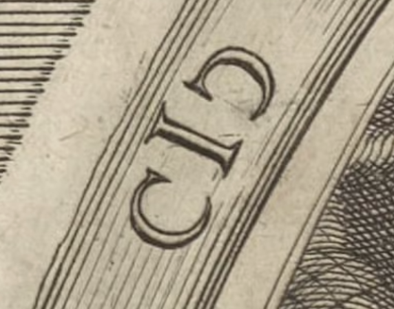 Historically, we can probably say that this character was either a flipped or rotated form of C, both of which are attested.
1 -
Thank you all, for your insights and thoughts. And for the excellent samples. What I learned about it: it is indeed not clear per se when/if this char. was thought of being flipped or rotated. Both ways seem to be historically evident or relevant.There may even a specific lead type sort being casted, some of the detail images produce that impression. The letter shape of any capital does not sit on its lead block vertically centered, because, while it reaches near to the top edge, the bottom still leaves some empty space which is needed for the lc descenders. So, when you flip a capital C sort it does not align with the unflipped C if the two lead pieces are aligned physically.1
-
If I recall correctly some foundries cast caps-only "titling fonts" which eliminated the unnecessary extra descender space. Those may have been closer to matching vertically when rotated. But I think of those as mostly a 19c phenomenon.0






Categories
- All Categories
- 47 Introductions
- 4K Typeface Design
- 497 Type Design Critiques
- 590 Type Design Software
- 1.1K Type Design Technique & Theory
- 674 Type Business
- 904 Font Technology
- 29 Punchcutting
- 543 Typography
- 128 Type Education
- 333 Type History
- 82 Type Resources
- 114 Lettering and Calligraphy
- 33 Lettering Critiques
- 81 Lettering Technique & Theory
- 577 Announcements
- 101 Events
- 116 Job Postings
- 174 Type Releases
- 185 Miscellaneous News
- 270 About TypeDrawers
- 54 TypeDrawers Announcements
- 114 Suggestions and Bug Reports