Does Surrealism have a Typographic Language?

I have been reflecting on the connection between typographic styles and broader movements in art and architecture.
For many historical periods, there seems to be a fairly clear typographic counterpart: for example, Renaissance and humanist typefaces, Modernism and geometric sans-serif typefaces, and so on …
But what about Surrealism?
Are there any typefaces, type styles or typographic movements that could seriously be described as ‘surrealist’? If so, what characteristics would distinguish them? Are there historical examples from the Surrealist period itself, or later typeface designs that embody Surrealist ideas typographically?
Or does Surrealism differ fundamentally from movements such as Art Nouveau, Art Deco or the Bauhaus, in that it manifests itself primarily through visual language, composition, collage and visual context, rather than through the design of the letterforms themselves?
Would you consider Surrealism a missing category in typographic classification, or simply a movement that never developed its own recognizable typographic language?
Comments
-
A Copilot search gave me some answers to your question.-3
-
My more recent release Fillmore takes inspiration from (among other sources) the biomorphic abstract art of Surrealists like Jean Arp and Joan Miró.
If I recall correctly, the typography of Surrealist journals like La Révolution Surréaliste was quite conventional, certainly in comparison to contemporary publications like De Stijl, Vesch'-Gegenstand-Objet, etc. Having writers rather than visual artists in the lead of the movement (Andre Breton as “pope”) probably influenced that.
One literal translation of “Surrealism” could be “the reality above,” and a key part of the power of their creations was the uncanny suggestion of alienating weirdness that lurked in or above reality. So a realistic baseline was often useful for their art. Think of Salvador Dalí’s hyper-realistic painting style. Magritte’s famous pipe had to be rendered realistically to work (his late-career experiments with an Impressionist painting style were kind of a flop). And along those same lines, the style of lettering he used for “Ceci n’est pas une pipe” was taken I think from primary school writing instruction—its goal was to evoke (and defamiliarize) the very familiar ways that everyday institutions established our expectations of reality.
5 -
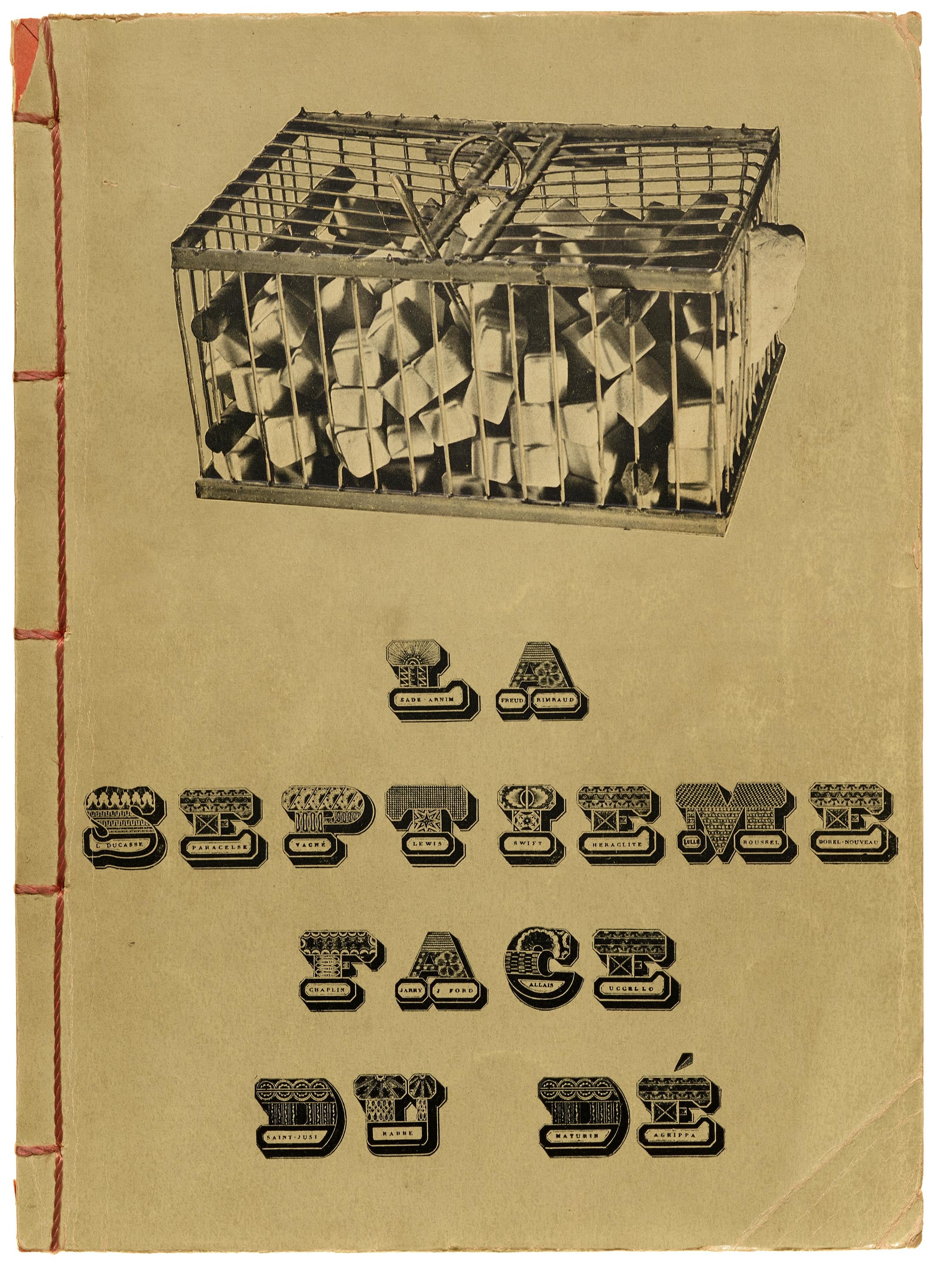
In 2010, Rick Poynor curated an exhibition titled Uncanny: Surrealism and Graphic Design. There is a catalog. As far as typographic works are concerned, I recall seeing the pictorial alphabets by Jindřich Heisler and Roman Cieślewicz.Marcel Duchamp used a similarly complex alphabet for the cover for George Hugnet’s La septième face du dé.Fonts In Use has 60+ Uses tagged with “Surrealism”. This includes items by or about André Breton, Man Ray, Salvador Dalí, etc., but most of it is works featuring surrealist imagery.
There are obviously many different typographic styles, but if there’s a recurring theme, then maybe that’s ornamental/pictorial letterforms, or such that were treated with 3D and perspective effects.6 -
Craig, your link to Fillmore is broken.0
-
John Hudson said:Craig, your link to Fillmore is broken.
Thanks, fixed now I think. Florian, your "60+ Uses..." link returns "503 Service Unavailable" for me.0 -
Surrealism’s immediate precursors, dadaism and futurism, certainly developed typographic dialects (in the layout of text, rather than in identification with specific styles of type). I wonder if surrealism engaged less with text because those movements had already explored type as a disruptive medium pretty thoroughly?0
-
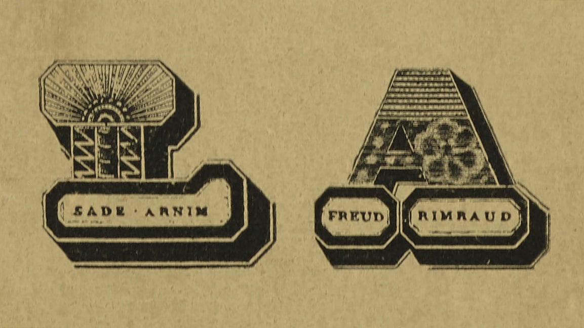
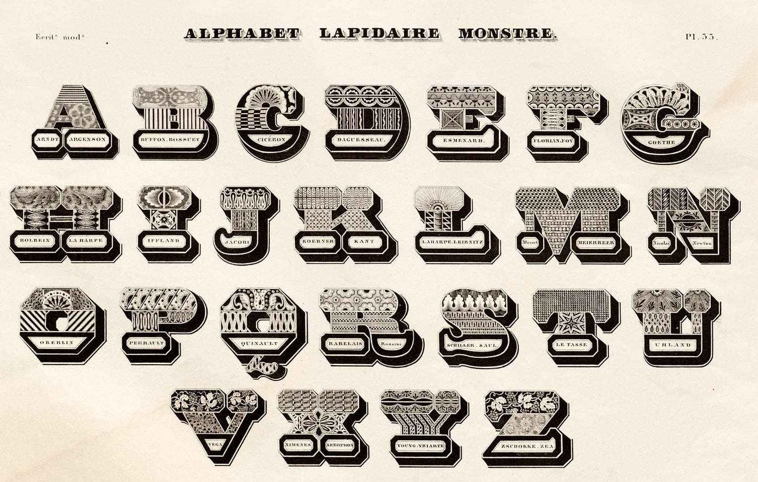
One iconic piece of Surrealist graphic design I’ve been meaning to post to Fonts In Use is Georges Hugnet’s La Septième du De. The interior is a scatter of poems using many different typefaces – in a style that I would normally associate with Futurism. The cover by Marcel Duchamp (with photography contributed by Man Ray) uses Jean Midolle’s Alphabet Lapidaire Monstre, but replaces the original artist and writer names with Surrealist celebs, including including Sade, Freud, Rimbaud, Paracelsus, Swift, Heraclitus, Roussel, Chaplin, Jarry, Uccello, and Saint-Juste. When hosting tours at Letterform Archive, I enjoy setting this book on the table next to the Midolle lithograph for comparison.
 7
7 -
A hovering flaming pear gave me some answers to your question.
I know you're asking about specific historical period, but I think through a modern lens, there's some psychedelic era overlap, even though that's commonly associated with Art Nouveau. A Rick Griffin, Stanley Mouse, Alton Kelley, Wes Wilson, or Victor Moscoso poster usually doesn’t look Surrealist in the Dalí/Magritte sense. I guess it doesn’t usually have the crisp "impossible object in a desert" setup. But it often shares Surrealism's method: the image is associative, irrational, dreamlike, sometimes collaged, sometimes grotesque, and not primarily concerned with normal readability or normal space. And there's a certain type of lettering that goes with that. And then you have Roger Dean's surrealistic landscapes and associated lettering style.
So maybe from a modern viewpoint, that psychedelic lettering could be associated with surrealism...but not in a historically accurate way.6 -
Thanks, Craig. It had a sorting parameter that only works when being logged in on Fonts In Use. Now fixed.Craig Eliason said:Florian, your "60+ Uses..." link returns "503 Service Unavailable" for me.0 -
I might classify Miles Newlyn’s early stuff like Missionary and Democratica, as well as lots of Jeremy Tankard’s stuff—Disturbance, Blue Island, Alchemy, Nick Shinn’s Merlin, and Jonathan Barnbrook’s Manson/Mason, Priori, and Exocet—as “surrealist,” though others might call them “postmodern,” which seems less meaningful to me. I love all those designs. They all have serifs or something analogous to serifs (imagine equating serif type with standard realism) but with chimerical letter structures analogous to the monsters found in surrealist paintings.5
-
I proffer University Roman as a surrealist typeface. Although published much later, it’s based on the lettering of Ross F. George from the 1930s (the heyday of the Surrealist movement), stemming from the free association of his subconscious.2
-
I was surprised to see this question here, as it is one of the questions I keep asking myself for ten years. Also I kinda think that I'm doing surrealist typefaces, in the sense of what surrealism tried to explore back in the beginning of the century. So… here's my 2cts.
I think you guys think too much in terms of aesthetics. A typeface mimicking surrealist aesthetic would not be a surrealist typeface. As I think a typeface mimicking modern or post modern aesthetics are just aestheticizations of artistic real questions from those eras. Futura isn't about looking geometrical, it really embraces the modernist questions, and thinks about how a typeface, in its own way of being and functioning, could address those questions. Any destructed typeface from dafont isn't post modern, while Keedy is.
From there, the question is not what surrealism looks like, but what surrealism is about? As @Craig Eliason said, surrealism is about the hidden meaning of reality. It is a deeply esoteric movement even if not really described as such, the same way Mondrian / De Stijl was influenced by Theosophy. Surrealists wanted to explore the unconscious, connect with this intrinsic poetic nature of the world, they would experiment with drugs, with spiritism, etc. But surrealists didn't want just to look like psychics, they wanted to be ones. So in order to produce a typeface in that sense, you would need not to think how could I do a typeface that looks like a psychic made it, but how could I do a typeface through psychic means? How could a typeface be influenced by how dreams work? How could a typeface be used by a drugged writer?
Type design has a long tradition of engineer, Cartesian, logical thinking. Arriving here now (or at the beginning of the last century) saying that you did a revival thanks to a ouija board by talking to Francesco Griffo, would be mocked, not taken seriously, while it would be a true surrealist workflow. I've got the feeling that in type design, there's always this unspoken rule that there's real serious type design, and that if you don't meet those expectations, then you're either rejected, or at best, if the project is interesting, regarded as a kind of experiment fun to watch but not on the same level as a real typeface.
Surrealism is attached to the hidden meaning of things. While in type design, the main perspective is that meaning is given by the author of the text. How could a typeface, a font family, explore unconscious territories? It's not an easy question that cannot be solved by pure aesthetic mimicking. It isn't natural for us to imagine a surreal type work. Type design is so anchored (and kinda still is) in the perspective of technical craftsmanship that the very idea of letting yourself dive into your unconscious to imagine a typeface would make you feel a bit ridiculous, because of type design's systemic cultural pressure. Then how can it develop, if one can't even picture what such a statement would mean?
I think the most surrealist works, not in type design per se, but in alphabet drawing, would be asemic writing. First and foremost Henri Michaux's work, but also Christian Dotremont are true explorations of the unconscious of the alphabet itself. Even if Michaux never wanted to be associated with the surrealists (which was a movement under the control of André Breton's theories [see the rejection of René Daumal and Roger Gilbert-Lecomte]) Michaux has all the characteristics to be described as such. It gave birth to a project of mine, Michaux published by Plain Form. You can read the article describing the whole idea of this family here: Mystery, Michaux and Mystic.
Then of course, if you're not afraid of esoterism, I guess that some things that inspired the surrealists could be seen as pre-surrealist perspectives about drawing. I'm thinking about John Dee's Enochian alphabet, channeled by angels in a state of trance, or the whole work of Austin Osman Spare and his alphabet of desire. Once again, I think mimicking those esoteric aesthetics would not make a contemporary typeface surreal. In order to inscribe a work into this heritage, you would need to explore their core perspective, and think about how it could deeply influence a contemporary type system.
Another work of mine, Jester, could kinda be classified as surrealist I guess, as its whole way of working is rooted in a system not from our world.
2 -
Maybe not too relevant, but didn’t Dalí paint the Chuppa Chups logo? I wonder if he designed the lettershapes himself, or if he had help. But of course that more counts as marketing related work, not surrealism.0
-
By this do you mean something more specific than playfully unconventional proportions/details?Nick Shinn said:I proffer University Roman as a surrealist typeface. Although published much later, it’s based on the lettering of Ross F. George from the 1930s (the heyday of the Surrealist movement), stemming from the free association of his subconscious.0 -
Yes, I’m talking about doodling, about intuitive drawing.
Abstract artist and action painter Jackson Pollock was a surrealist, in that sense (channeling a universal, Jungian subconscious, or so he thought)—against which the stereotype of surrealism is incongruous, representational images that suggest the symbolism of Freudianism, or the irrational paradoxes of Magritte. This stereotype of Surrealist art is nonetheless grounded in the “reality” of traditional Western painting with its development of (subjects in) a coherent, 3D spatial environment, that eventually led to photographic realism. Surrealist dreamscapes that nonetheless look realistic.
Note the capricious variety of George’s sequence of iterations in his Stunt Roman, down the link I posted.0 -
Worth noting that such “automatic drawing” was a key part of Surrealism from the jump—see André Masson, Jean Arp, Joan Miró.
IMO capricious letterform variety—pretty much an inherent part of commercial lettering practice (vs. typography)—doesn’t evoke Surrealism if it’s not attached to some motivation to make psychic connection, reveal poetic imagery, surface what is repressed in the practitioner, etc.2 -
Thank you all for your detailed and insightful contributions!!
Based only on the discussion in this thread, I would summarize the question of whether Surrealism has its own typographic language as follows:
- There is no distinct historical type style that can be identified as Surrealist. In fact, the strongest typographic innovations had arguably already emerged in Futurism and Dada.
- Surrealist typography is primarily created through context, rather than through letterforms alone (as illustrated by the Magritte example).
- Certain letterforms can certainly be surrealist (pictorial, spatial, biomorphic, etc.), but they do not constitute a coherent formal system.
- The design process itself can be surrealist if the forms arise through free association and subconscious automatism.
- Unlike the Renaissance or Modernism, there are no clear correspondences between architecture, typography, and letterform design. In fact, a completely autonomous, instantly recognizable Surrealist formal language might even contradict Surrealism itself—the uncanny is often most effective when it emerges from the familiar.
- There was no direct influence from technological innovations such as phototypesetting or digital font technology.
- There are, however, influences from artistic techniques such as collage, montage, (frottage), as well as perspectival and three-dimensional effects.
Surrealism, then, should probably not be understood as a historically distinct type classification comparable to Renaissance roman, Didone, or geometric sans-serif.
It therefore seems unlikely that Surrealism possesses a single, unified typographic style. Instead, it may be more accurate to speak of a surrealist typographic language in a broader sense—one based not on a fixed repertoire of forms, but on recurring strategies such as:
- Defamiliarization of the familiar
- Juxtaposition of contradictory elements
- Pictorial transformation of letterforms
- Organic or biomorphic form generation
- Hybrid or chimeric letterforms
- Unstable spatial relationships
- Collage, montage, (frottage), and unexpected combinations as design principles
- Parallels with psychedelic typography through dream logic and irrationality
- Dissolution of stable spatial structures
Would you agree with this summary?
1 -
Most art movements do not generate a type style. There are type or lettering styles that coincide in history with them but I know of few that are causal. You can argue that Art Nouveau, Art Deco, Constructivism, Brutalism, or Futurism might have influenced the letterform, but I can't see a case for Surrealism. It is too illusionary, too whimsical, to have a set of representative components to form a typographic style.2
-
Craig:…doesn’t evoke Surrealism if it’s not attached to some motivation…Not necessarily. A work of art or design may evoke something quite unintended by its creator.
However, from an historiographic perspective, the maker’s intent—especially if they’re part of a formal movement—is useful in constructing narratives.
Therefore, while there was no recognition of Surrealist typography during the heyday of Surrealism, it is quite possible to describe typography with some of the features Arne lists, and say, “that’s surrealism—with a small ‘s’,” especially if it’s from that era.
Surrealism, with a large S, relished its precursors, and one that comes to mind is the decorated initials that appeared in Punch magazine during the mid-19th century. This from 1843, perhaps by John Leech: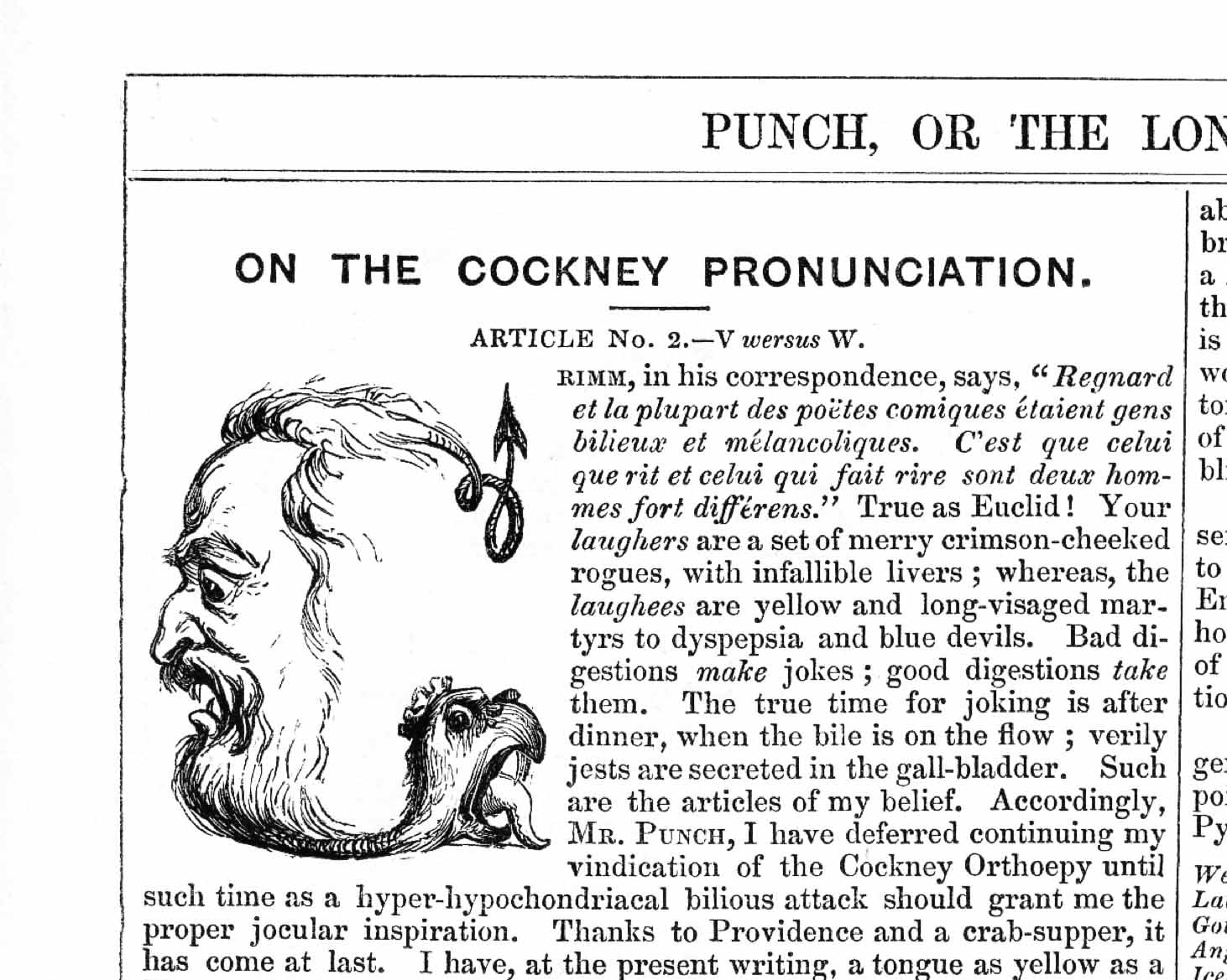
0 -
I just want to say that this thread has been one of the most educational and interesting topics I've ever read here. Thank you all. I've learned so much!4
-
That would have been a very good closing remark from James for our thread. – If I may, I have a few follow-up questions that have arisen.Formal questions:
- Can chimeric letter structures be described precisely?
- Is biomorphism a sufficient characteristic of surrealist writing?
- Must surrealist writing reveal a conventional basic model for the alienation effect to be effective?
- When is pictorial writing surrealist, and when is it merely decorative or illustrative?Methodological questions:
- Can automatic writing be adapted into a method for the automatic drawing of letters?
- Does the surrealist element lie in the result, in the design process, or in the use?Classification Questions- Can Surrealism be distinguished from psychedelia and postmodernism?Technical Questions
- Could variable or generative typefaces systematically implement Surrealist principles such as instability, transformation or chance?0 -
You answer first, Arne.2
-
This is one of those questions that is so far from measurable that it can only be answered whimsically or under the influence of psychedelic enhancement ;-)
Art movements are an after-the-fact concoction to me. Perhaps an amusement to you ;-)1 -
Yes, perhaps this is taking things a bit too far, but I’ll try to answer it anyway (without the influence of psychedelic substances); I’ll do my best:
- Can chimeric letter structures be described precisely?
Within a single character, formal logics collide that do not actually belong together… It is important to note: this is not simply a matter of mixing styles. The contradictory components must appear as an impossible unity.
- Is biomorphism a sufficient characteristic of surrealist writing?
In my opinion, this is not sufficient on its own. A script with soft, organic forms is therefore, at first, merely biomorphic. In my view, it only becomes surrealist when something is added: metamorphosis, contradiction, ambiguity, impossible physicality or a disruption of the expected letter structure.
- Must surrealist writing reveal a conventional basic model for the alienation effect to be effective?
Not necessarily – but I believe this would be particularly effective. An ‘A’ that is barely recognisable as an ‘A’ is, at first, experimental abstraction. A clearly recognisable ‘A’, whose crossbar, however, behaves in a spatially impossible manner, can appear surreal. I would therefore regard familiarity and impossibility as a powerful surrealist principle.
- When is pictorial writing surrealist, and when is it merely decorative or illustrative?
In my view, it becomes surrealist when the connection is not merely representational, but contradictory or impossible. Just as in the illustration in Nick’s example featuring the large ‘S’ in *Punch* magazine.
- Can automatic writing be adapted into a method for the automatic drawing of letters?
Perhaps so; this supports Nick’s argument that the design process phase also plays a role. (I don’t have any instructions either …)
- Can Surrealism be distinguished from psychedelia and postmodernism?
That’s probably difficult. Distorted writing is not automatically surrealist for that reason alone. Writing in which the letters naturally follow an impossible logic would come much closer to it.
1 -
Nick’s example featuring the large ‘S’ in *Punch* magazine.It’s a G (“Grimm”)! It is in fact an illustration to the article—as can be seen by reading the pre-amble that starts it off. However, interpreting the bilious tongue of the author as a serpent which morphs into their dyspeptic face and back into a devilish tail, that bizarre effect of using the shape of one object as part of the visual form of another, that is surely a Surrealist trick—one that Dali was fond of and no doubt swiped from Arcimboldo.
So this is a very conscious surrealism, mimicking the mutability of objects in the theatre of one’s dreams, quite distinct from subconscious automatism informing one’s physical actions.0 -
These questions of the role of conscious and unconscious intent have new relevance in a world that is increasingly full of generative AI content!It’s a G (“Grimm”)!1 -
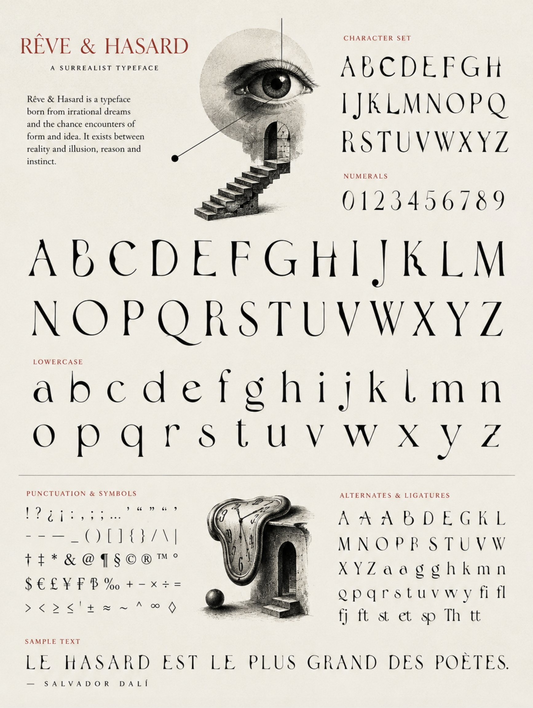
‘Hey, ChatGPT, make a specimen sheet for a surrealist typeface.’[Who would have guessed that a technology based on prediction would make something so predictable?]
 0
0 -
If you look at a very famous old film, Andalusian Dog, in the context of todays films big-time use of special effects, you can make the case that most films are Surrealism. The label quickly outlives its' usefulness and only becomes an amusement. Perhaps that is what this thread is about? I think James Montalbano had it figured out a while ago ;-)0
-
I don’t know what James has realised, but I’m not in this thread for a laugh …
0 -
John, never mind surrealism, your Chat effort is giving me 1992 Carsonian vibes!
A few more rounds of prompting would refine the task.
First, ask it what kinds of prompts would best create less cliché and predictability.
**
It’s a trope of old sci-fi films (and even “Desk Set”) that the omnipotent computer will self-destruct when asked to solve a paradox. That doesn’t work.0







Categories
- All Categories
- 47 Introductions
- 4K Typeface Design
- 500 Type Design Critiques
- 591 Type Design Software
- 1.1K Type Design Technique & Theory
- 674 Type Business
- 908 Font Technology
- 29 Punchcutting
- 544 Typography
- 129 Type Education
- 333 Type History
- 82 Type Resources
- 114 Lettering and Calligraphy
- 33 Lettering Critiques
- 81 Lettering Technique & Theory
- 580 Announcements
- 101 Events
- 116 Job Postings
- 176 Type Releases
- 186 Miscellaneous News
- 270 About TypeDrawers
- 54 TypeDrawers Announcements
- 114 Suggestions and Bug Reports