Critique Request for Gothic Gumdrop (100% AI-generated submission to Google Fonts)

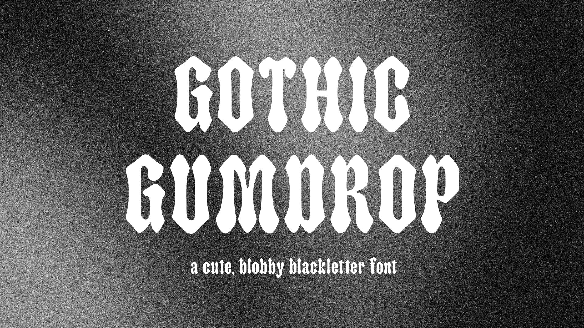
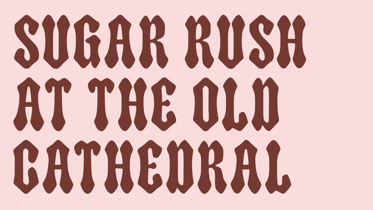
The Google Fonts contributor guidelines pointed me to this forum as a safe place to get feedback on my type designs. I was hoping to get feedback on a recent font I created called Gothic Gumdrop.
This project emerged out of an effort to combine unique and unrelated type styles. I noticed that in the Google Fonts collection there were a lot of cute fonts, some bubbly fonts, and many blackletter fonts, but there wasn’t any options that combined all three of those styles. After rounds of exploration this font emerged, which tries to be cute and bubbly but blackletter at the same time. One of the most difficult aspects was to preserve the blackletter styles while making it chunkier. I think the end result feels more blackletter than cute, but it was hard to preserve both.
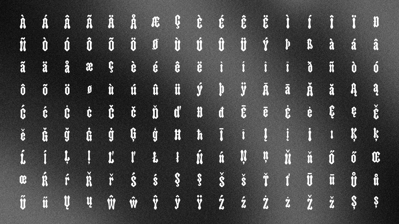
Another unique aspect of this submission is that this font is 100% generated with AI. I created it using the Mixfont font generation model. This also helped me ensure that the glyph coverage supports the 320+ glyphs required for the Google Fonts Latin core set.
I would love your feedback on the font overall, style direction, and whether there are areas that could be improved. I also would love to hear any thoughts on the usage of AI and if that is OK for a Google Fonts submission. I wanted to be transparent about it.
Thank you,
Eric
Comments
-
First off: great typeface name.
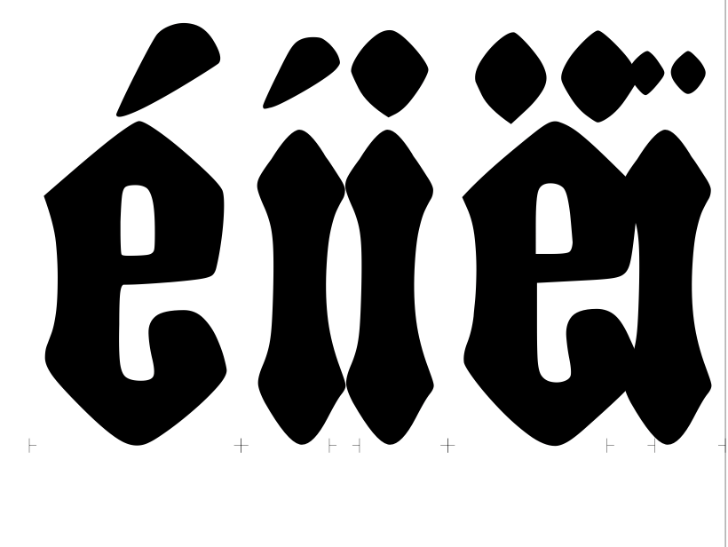
The link to the GitHub repo is broken, so I can only respond to the images you posted here. The last of these suggests there may be problems with the vertical alignment of the diacritic characters, but I am not sure how the image was created.
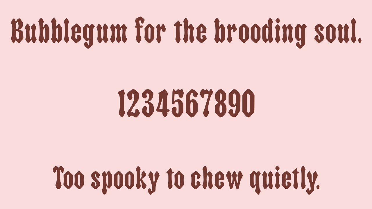
I think the project demonstrates that the notion of a cute, blobby blackletter is a viable design idea, and this is the sort of thing that AI can quickly establish. What AI isn’t good at is the detail work that goes into refining that idea perceptually, glyph-by-glyph and, especially, making optical corrections to balance the proportions, weight and texture between forms with differing spatial frequency.
‘Blobby’ is a challenging category in letter design, because you need to apply blobbiness as a quality to structure, while avoiding the structure itself becoming blobby. There are some places in this design where artifacts from blackletter ductus produce unnecessarily complex structures such as the hook of the y, and the top of the 5 and 7, which look awkward and unnatural when the blobbiness is applied.
I am not sure how you want to proceed with this project. If you are committed in some way to the experiment of having the font 100% generated with AI, then I think you will fairly soon hit the inherent limitations of the current state of AI tools with regard to refinement and stability or, to put it another way, maintaining what is good while trying to get the machine to understand what is not good. If you are interested in taking this AI output as the basis of something that you would manually refine in a font editing tool, I think you will get more useful glyph-by-glyph feedback here.
[I hope this is, indeed, a ‘a safe place to get feedback’ for you. There are indeed generous folk on this forum who help novice type designers with advice and critiques, but to my knowledge no one had previously shown up with a project that has been completely generated by AI. As you may have noticed, not everyone is a fan of AI, or even thinks it is morally defensible as a technology. I hope everyone manages to be kind.]4 -
John, I really appreciate your detailed feedback. The linked repository was accidentally set to private before and now has been made public. I think your feedback about the consistent blobby-ness across the glyphset makes sense, and I'm going to try to improve it to incorporate those ideas. It was difficult to continue with the cute and blobby motif though in many cases while still preserving the clear blackletter ideas.
I admit this is partially an exploration in pushing the limits of what's possible with AI font generation today. I think it will be an interesting milestone to see if a fully AI-generated font could potentially be submitted (and accepted) to Google fonts. The Mixfont model I used is quite capable. I would love to have a discussion about that as well, but it might be a better saved for another thread.0 -
I think we all should stop reply this thread, Eric, what you do is horrible.
screenshot descrition: (screenshot from ericlu's post on X.com )
"font licensing is kinda broken? screen-recording of my new workflow: when I find a font, instead of paying literally $2,221+ USD, I screenshot a few words, ai generate the typeface, and then download & use the new TTF. now just need to figure out how embed the model into design processes better..."
15 -
Xiaoyuan, I'm a real person trying my best to ethically explore AI use in font generation. I've sent you an email privately but I also want to share here publicly that I would truly love to have an open conversation with you (or anyone here) about how you feel, your concerns, and any thoughts you have on how things could change. I am trying to use AI ethically and in a way that can make typography more accessible.Xiaoyuan said:I think we all should stop reply this thread, Eric, what you do is horrible.
0 -
One factor of a well-designed font is consistency. The spacing and the design here is perplexing.
One feature of blackletter is a machine-gun staccato regularity. I suggest you try setting some text in this, and then the spacing problems will be obvious.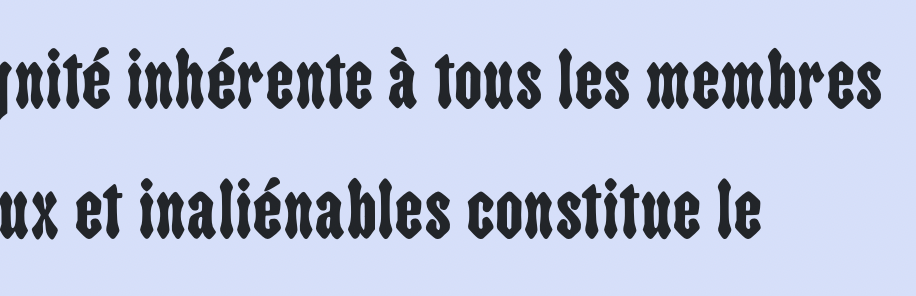
Compare to something like P22 Sting: I am trying to use AI ethically and in a way that can make typography more accessible
You should be aware that saying publicly that you're not going to buy designers' fonts but would rather rip them off, and then asking those same designers for design feedback, conveys a certain impression about what "ethically" means to you.18 -
…ethically explore AI use…This is an oxymoron.
There is very little about AI that is ethical.
You can debate the nuances of type design all you want, in our little neck of the woods, but in the big picture this is a ghastly, malignant, anti-human technology.
10 -
I am trying to use AI ethically and in a way that can make typography more accessible
What Simon says. Additionally: on your website you say the model was trained on about 100GB worth of fonts. You also write:
Luckily, there are many fonts available on the internet, many of which are free and open source like Google Fonts.That implies you trained on whatever you were able to download, whether it had an open source license or not. That is literally the opposite of "ethical".
So, we can dismiss your work as terrible without even looking at the output (which is also terrible).
17 -
what do you mean by accessible?1 -
Is this legal?0
-
This might constitute a new low on TypeDrawers, at least in my memory.
Xiaoyuan, thanks for pointing out what kind of a person is actually behind this claimed “ethical use of AI”.3 -
Perhaps there's some link between "I trained the model with every single dafont/Behance/CreativeFabrica font I could steal" and "gosh, the output of the model looks a bit crap".Just van Rossum said:
Additionally: on your website you say the model was trained on about 100GB worth of fonts... we can dismiss your work as terrible without even looking at the output (which is also terrible).2 -
I wanted to keep this discussion related to the Gothic Gumdrop font critique and I started this new thread in accordance with the forum rules to answer many of your questions and attacks towards me. I truly appreciate the feedback about the font itself and I will be working to improve it before I submit. Please remember that I'm a human being and I also have real thoughts and feelings myself.0
-
Why should people give feedback on something you couldn't even bother drawing?15
-
It is important that Google Fonts does not publish AI-generated fonts, neither now nor in the future.6
-
This is an excellent opportunity for the community (specifically large tech companies, distributers, and foundries) to refuse to publish AI-generated fonts as a matter of principle. If a declaration already exists please point me in its direction otherwise I will start something asap.
As to the matter of design feedback, I find it distasteful that someone would ask the feedback of the very same humans that one has written software to replace.7 -
I also think that's important, but I'm not sure whether Google sees it that way too. Dave seems pretty pro-AI.Typedesigner said:It is important that Google Fonts does not publish AI-generated fonts, neither now nor in the future.1 -
In the European Union, AI-generated content is generally not protected by copyright, since under European law a work requires a human intellectual creation.
5 -
(Disclaimer: I contract and provide technical assistance to GF, but I don't make decisions and I'm not speaking for GF in any way; personal opinion only.) I think the main factor for acceptance would not be the tool used but primarily the quality, and I don't believe this font - or anything produced by the current state of AI font generation - would pass that quality bar. At the same time, I'll also note that people are being asked to declare in their submissions whether AI was used in creating the font; which is not something you would do if you were tool-neutral about AI.4
-
Typedesigner said:
In the European Union, AI-generated content is generally not protected by copyright, since under European law a work requires a human intellectual creation.
I believe that the same is true in the United States as well, at least I remember hearing statements to that effect in news coverage.1 -
I am surprised that someone building a business on AI-generated IP is unaware of the implications of this.
At least under US copyright law, there is no copyright on AI-generated materials, and as far as I understand it, that means AI generated fonts cannot be licensed under the Open Font License. Public domain is not the same as open source. The OFL has restrictions which can’t be put on AI-generated works (at least, in the USA).
Given this, I can’t see how Google, which wants all new Google Fonts to be OFL-licensed, could accept any AI-generated font submissions.
Hybrid copyright situations when some portions of the work have been human-edited, and others have not, might be possible? But that still rules out simply licensing the font under the OFL.
I am not speaking for Google in any way here.11 -
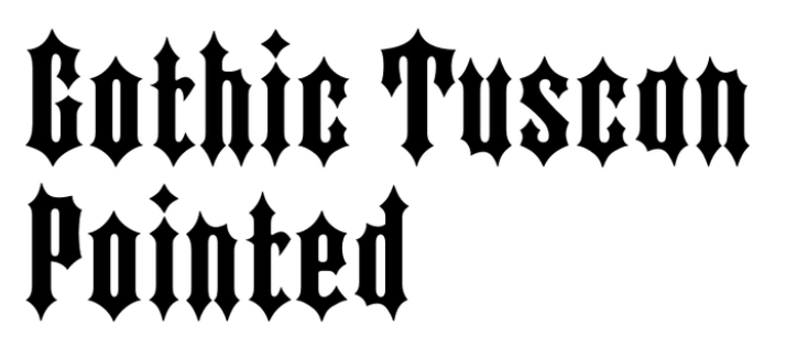
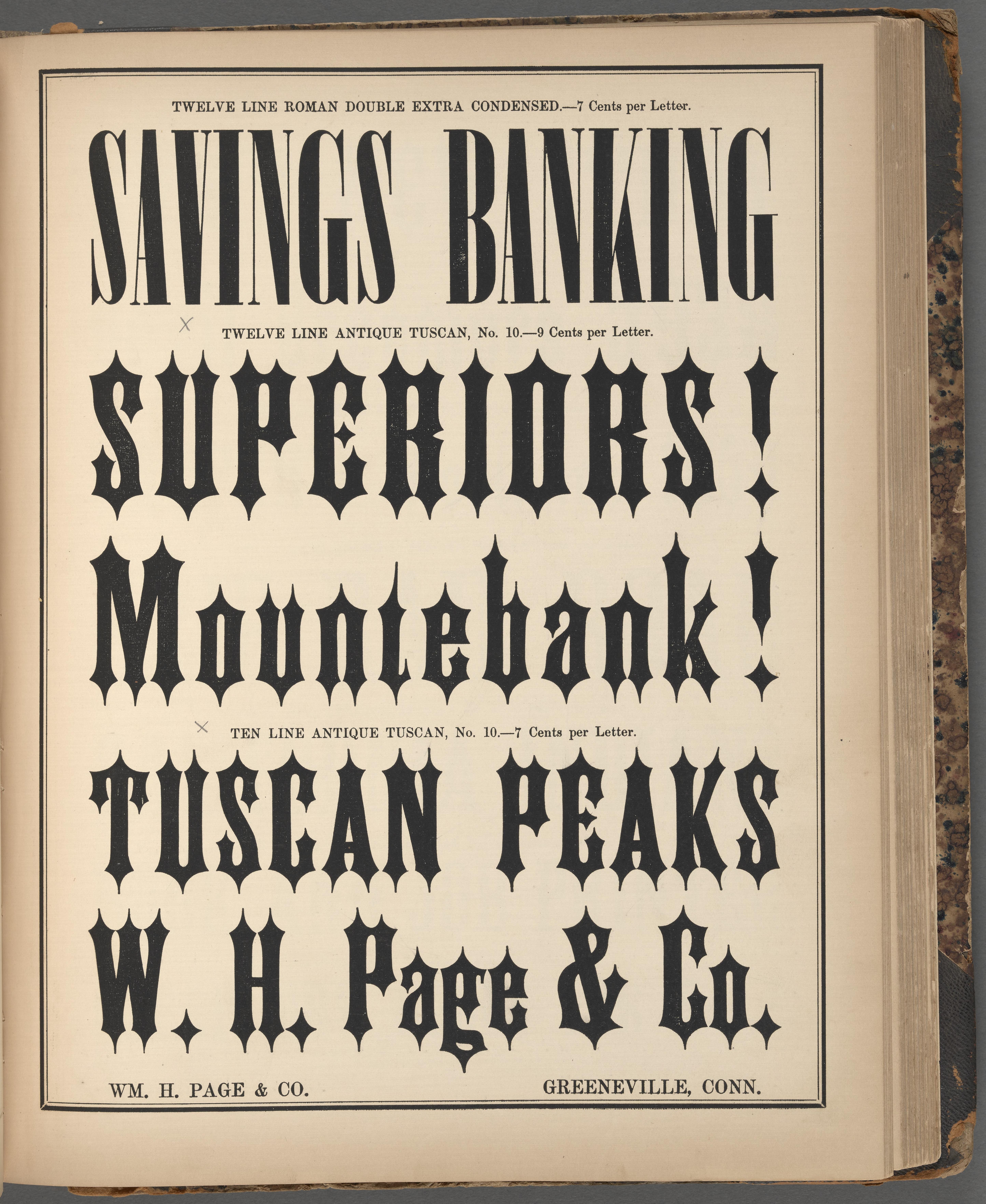
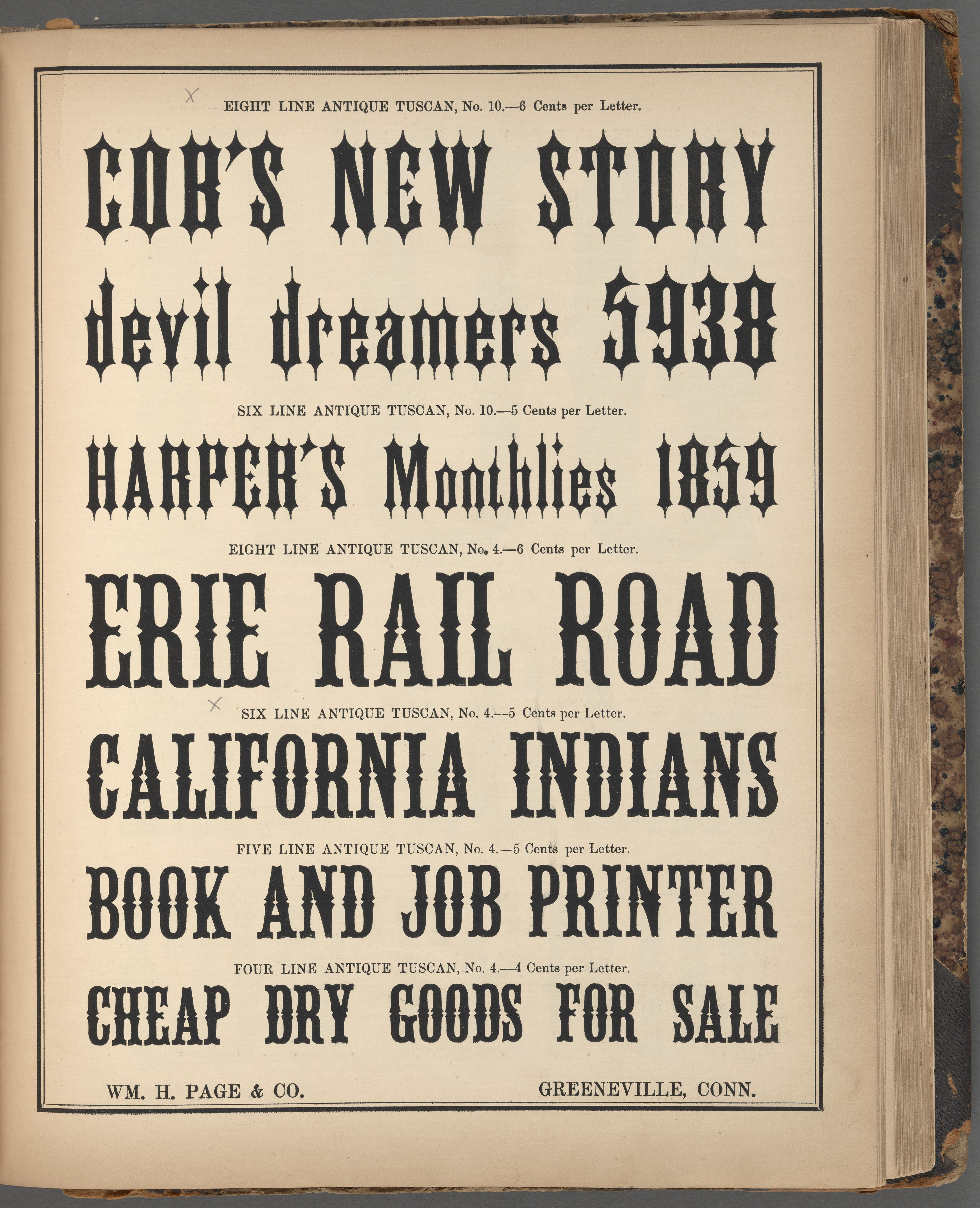
Something I've not seen mention of on this thread, which I think is important to draw attention to, is the fact that the glyphs in this font aren't really (at all) constructed like black letter. In fact, this font is pretty clearly a very close interpolation of a pointed tuscan. Fonts in Use has an entry for Gothic Tuscan Pointed (note that in this case "gothic" refers to sans-serif, not blackletter) which should get the point across. Many slight variations of this style were made and sold under different names during the 19th and early 20th centuries; evidently it was quite popular for some time.
A rounded ("blobby") pointed tuscan is a solid enough concept, and one that I think someone thoughtful should explore, with awareness of context and history and a human hand guiding the design choices for how to realize the premise in each letterform.
One of the many truly offensive things to me about AI-driven artistic processes is that they divorce the ostensible artist from their influences. All art draws on and builds on previous work in one way or another, and an artist had ought to be aware of their influences, and ideally share information about their influences with those who see their art. When you use AI, it obfuscates the sources of the ideas it shows you, and as a result you release things completely severed from their history and context, which is bad for everyone involved.
I figured I'd share the Gothic Tuscan Pointed lead here in case anyone reading this thread finds aspects of "Gothic Gumdrop" compelling and wants to explore the rich history of this style (because it's not blackletter).8 -
Gothic Tuscan Pointed (note that in this case "gothic" refers to sans-serif, not blackletter)I would consider Gothic Tuscan Pointed a kind of faux-blackletter, and don’t think the appelation gothic in that context refers to sans-serif. While the shapes of the letters do not follow the ductus of traditional blackletter scripts, the straight sides of the letters and the general impression fit with English Gothic types of the same period, and belong with the interpretations of the Victorian neo-Gothic revival movement in art and architecture.
 [The use of the term gothic to mean sans-serif is tangentially related: gothic was used in a derogatory sense during the period of neo-classicism, implying ‘ugly’, and so synonymous with grotesk/grotesque as terms for sans-serif. In this respect, Gothic Tuscan Pointed is more gothic than most!]I entirely agree with your point about AI obscuration of sources and influences.
2 -
I based my understanding of the use of the term gothic in that context (the nomenclature of tuscans) from this article, and the book it references, American Wood Type: 1828–1900, and the fact that "gothic" was used for sans-serif fonts alongside instances of this style being sold as "gothic tuscan" in the specimen books I was looking through. I do agree that this particular incarnation of the style is a sort of faux-blackletter, and I'll accept that I may have misunderstood the sense of "gothic", if you're confident in your stance that it doesn't refer to the underlying letterform that was tuscan-ized.
Here is an example of a pointed "gothic tuscan" (not a very good one, unfortunately) being sold alongside quite a few other fonts with "gothic" in the name, all of which are sans-serif:

(this is just one of many non-ornamented sans-serifs in the specimen book, all of them are referred to as "gothic")
Again- it's very possible I'm wrong, since my claim was based in only about an hour of reading on the subject, so I'd definitely defer to you if you're sure on this point.1 -
I agree with you, @Qwerasd. The wood type you reference above seems to have taken a condensed sans serif as its base, and apply odd terminals to it. I can’t think of a 19th century US typeface in wood or metal where Gothic didn’t mean sans serif. The terminals, though are quite like the decorative Victorian neogothic revival @John Hudson mentions, though. They would easily fit on a decorative textura/old English/etc. design – specifically the shape on the bottom of the vertical stroke on /P, /I, /T, /R, etc,
Wood type manufactures all had proper blackletter typefaces in their catalogs, though most of these tended to be based on various styles of German foundry type. These latter wood types were used almost exclusively for US German-language publications, of which there were still plenty in the second half of the 19th century.3 -
Ironically, Gothic Tuscan is an early example of mixfont.Was the original Gothic Tuscan caps-only? The underlying sans serif forms are easier to see when looking at the caps, while I was responding to the lowercase shown in the Fonts-in-Use link, which have the characteristic straight sides of English blackletter styles. Are these a later addition?I hadn’t considered the consistency of the use of gothic to mean sans-serif in the US. What American foundries called Old English is what the English call gothic, and I assumed there was some cross-over in terminology in this case.1
-
I would say that Gothic Tuscan was a modular design, rather than a mixfont. In his review of what The Pyte Foundry now calls its “Pyte Legacy” collection, Frank Grießhammer wrote: “To reach his goal of releasing a weekly typeface, [Stefan Elmer] devised a system that makes heavy use of components. Flipping, rotating, and scaling simple shapes can produce amazing results in relatively little time — the alphabet, after all, is a modular system. As Ellmer states on his website, the process is not new: William H. Page used a modular approach for producing wood type in the early nineteenth century. (One feature not found in wood type is nested components, which allow a simple shape to be used to build more complex shapes, which in turn can be reused to create even more intricate ones.)” https://typographica.org/typeface-reviews/the-pyte-foundry/
Stefan had a digital modular system with Glyphs(?) components, which allowed him to fundamentally change the appearance of a typeface quickly. Page’s system probably relied on a similar method, with multiple layers of drawings, I would guess. If he had a base “gothic design,” I guess that could be redrawn with all sorts of terminals applied. This created a strange visual mix. The capital /N, for instance, included three relatively monolinear strokes, which doesn’t align with any blackletter style.
The whole 19th century, at least looking at the time from the end of the Napoleonic wars to say, the Kelmscott Press, is highlighted by both letterers and type makers coming up with new display typefaces by mixing at least two genres together. This continued into the 20th century but, with a few exceptions, I doubt it was ever so mainstream as in the 19th. One could criticize the 19th century display types for a lack of taste, as so many printers and typographers throughout the 19th and 20th centuries did, but there is no doubting that at least one person, or some group of people, spent hours, days, or weeks at their desks developing each one. Seeing someone mine typographic history or Google Fonts or bitmaps rasterizations of proprietary fonts or whatever to train generative AI to produce something similar according to a few typed-in keywords is not the same thing, and can be criticized on many more grounds than the sheer lack of aesthetics that Updike, Morison, or Tschichold, etc. lobbed at the display types of the past.
I think that Gothic Tuscan did have lowercase letters, more or less from the beginning. David Shields shows thew design on pages 296 and 297 of his book. Kelly’s wood type font must did not have lowercase letters, and must have been manufactured by Page (from 1859). J. G. Cooley also had the design – with lowercase – in his c.1859 specimen, where the design was called Gothic Tuscan Pointed.4 -
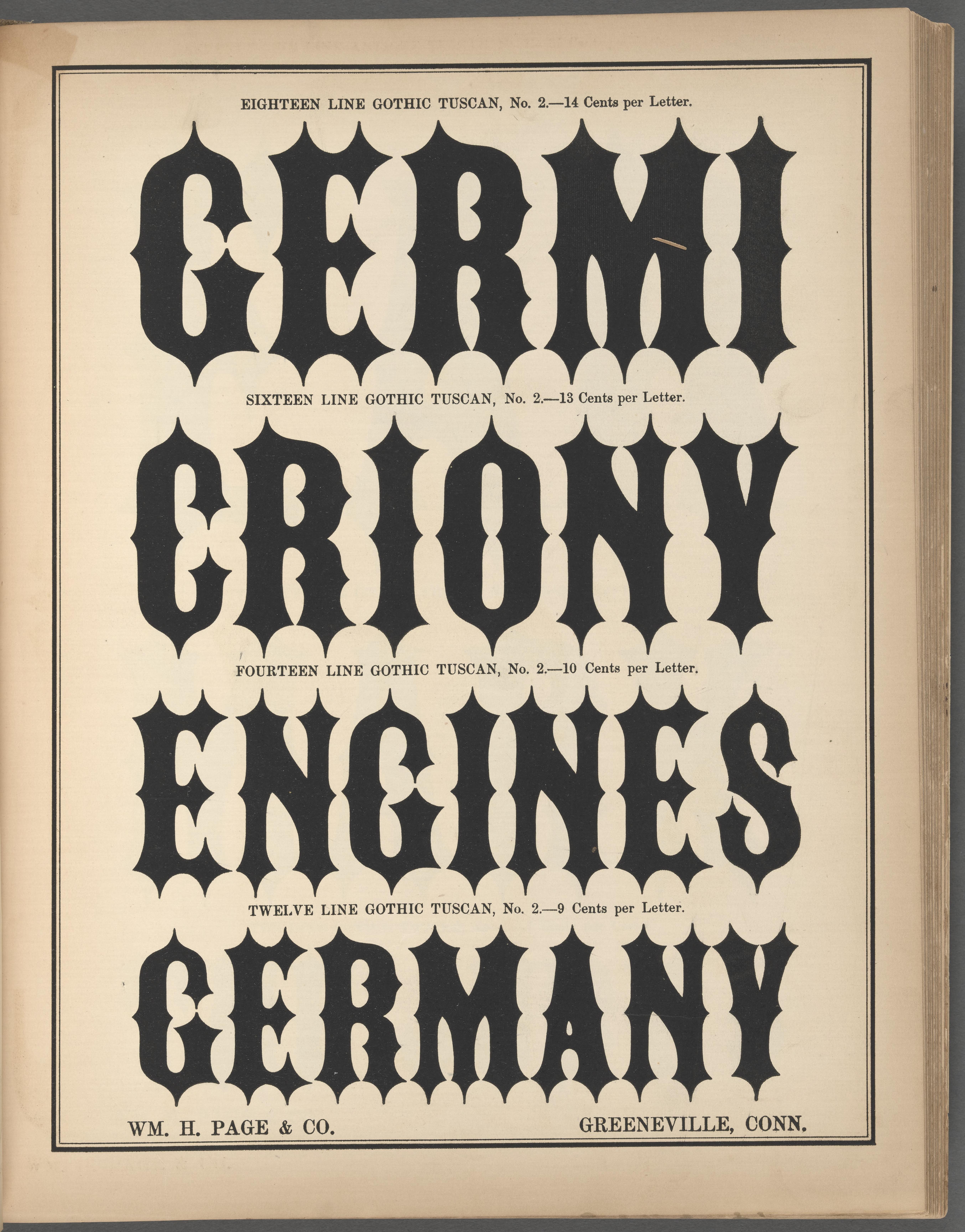
Hmmm. It may be telling that they used the word “Germany” in the specimen! Does anybody else think that is probably not a coincidence? At least somebody back then might have been thinking gothic-as-in-blackletter....
I also am inclined to wonder if maybe they had both meanings in mind when they named it. I don’t feel like I know, just saying it seems plausible.0 -
I think it is a coincidence. The letters British founders sold as Gothic types weren’t German in origin, and the crazy poster types you can find in German specimens from the 1840s are from French foundries. Large lettering and poster types in Germany during the 1850s was otherwise in roman styles, or in pretty standard condensed Fraktur, with some Schwabacher, Textura, and Midolline, etc. – none of which looks like this at all. The German blackletter styles were sold by US wood type makers, too, and David Shields’ book includes images of them. Otherwise, you can find them in 19th century catalogues from Page, Hamilton, as well as the most of the US type foundries.0
-
quite ironic to come ask for feedback to the people whose work has likely been ripped while training this thing.3














Categories
- All Categories
- 47 Introductions
- 4K Typeface Design
- 497 Type Design Critiques
- 591 Type Design Software
- 1.1K Type Design Technique & Theory
- 674 Type Business
- 907 Font Technology
- 29 Punchcutting
- 544 Typography
- 129 Type Education
- 333 Type History
- 82 Type Resources
- 114 Lettering and Calligraphy
- 33 Lettering Critiques
- 81 Lettering Technique & Theory
- 580 Announcements
- 101 Events
- 116 Job Postings
- 176 Type Releases
- 186 Miscellaneous News
- 270 About TypeDrawers
- 54 TypeDrawers Announcements
- 114 Suggestions and Bug Reports