Sycamore Humanist Sans (Regular) – Critique on Cap Kerning, Punctuation & Texture
Steven Liu
Posts: 5
Hi everyone,
I’m Steven, a self-taught type design enthusiast. Over the past months, I’ve been working on a humanist sans-serif named Sycamore. The Regular weight has now reached a stage where I’m fairly happy with its performance across large sizes (60pt), small sizes (8pt), on screen and in print — but I desperately need a pair of trained eyes to point out what I’m not seeing.
Sycamore draws inspiration from the warmth of Johnston and the rationality of Myriad, aiming for a humanist, slightly calligraphic tone while staying crisp and readable in body text. The design is still in its early stage, and I’m only posting the Regular weight here to make sure the foundation is solid before expanding to Light, Bold, and Italic.
What I’m struggling with:
1. Cap kerning – H-O, A-V are manageable, but combinations with large negative spaces like L-T, P-·, and T-· still feel inconsistent. Is there a logic or checklist you use when kerning all-caps, especially for tricky sidebearings?
2. Punctuation – I tried to make punctuation marks (comma, period, quotes) slightly lighter than lowercase, so they don’t jump out in text, but I’m not sure if this compromises their function. What’s your principle for the grayscle of punctuation in a text face?
3. Texture and overall rhythm – Are there any letters that feel too light or too heavy in the text block? I’ve looked at it for too long to be objective.
4. Punctuation-to-letter spacing – Period after a letter, right quotes after a character, colon between figures… I often feel the spacing is either too tight or too loose, and I can’t tell if it’s a kerning issue or a sidebearing problem.
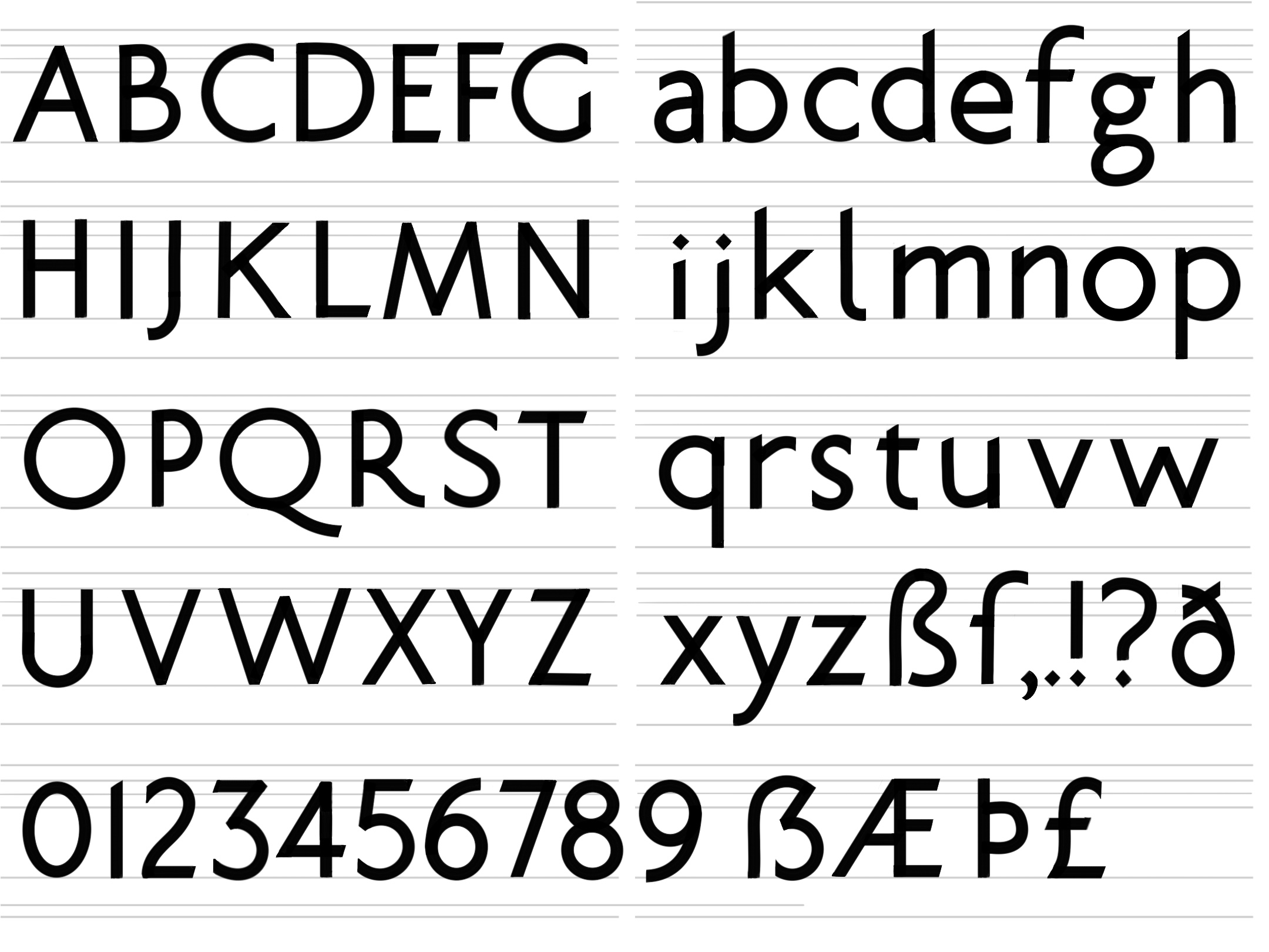
I’ve attached a lightweight PDF (4 pages, A3 size, under 2MB) that contains:
1. Character set overview
2. Text block sample at multiple sizes
3. Cap kerning combinations
4. Punctuation close-up comparisons
No font files are included — everything is open-and-view. Even a single sentence of feedback on any of these points would be enormously helpful. If you see fundamental issues that need solving first, please don’t hesitate to say so; I’ll take it as my to-do list.
I’ve also been keeping an early hand drawn sketch as a reminder of where Sycamore started.
Thank you for reading, and even more thanks if you choose to spend a few minutes on this. The type design community here has always been a lighthouse for me.
Best,
Steven Liu
Tagged:
0
Comments
-
After typing a bunch of feedback, I now realize I've been critiqueing your sketch, not the PDF. Idiot me. To be honest I think you've lost most of the original charm in the pdf. It feels too much like Myriad. My honest advice is to return to your original sketch with your newfound knowledge/skills/eyes and polish it without turning it into Myriad. Some feedback (that you probably already noticed yourself) below:
I like this. A lot of work to be done still, but it has a cool vibe. I would forget about kerning for now, focus on spacing and contours. Punctuation is is too light, especially the period. The comma is too short for text usage I would think. Some contours have nodes in the wrong position. E.g. the bottom-left node in 6 (the one closest to 5) needs to go up. There are tools that can help you with this like SuperTool (free for Glyphs I believe), but train your eye to see it, don't just rely on the tools. Many of your joints feel a little too thick to me. In part that monoline feel is a charming part of this design, but I think you can subtly thin some joints without losing the feel. E.g. m n h are too thick where they meet the stem on the left. e's curve is not really round on top, feels slightly pointy. Tittles on i and j are too small. I really like your lowercase s but I think that is by accident. It feels top-heavy (the top gap is larger than the bottom gap). The curves on the cap S are not smooth (again, something like SuperTool would show you this). Joints on B M N W V also feel too thick. Widen the apex to lighten it.
Good luck!
2 -
Jasper looked closely, and I believe in his opinion. Just to mention that you may develop Display and Text versions, where PDF is text, and sketch closer to Display. No effort would be wasted.Jasper de Waard said:
My honest advice is to return to your original sketch1 -
Sketch looks like Gill Sans, PDF like Myriad... both viable design principles, but quite different.The PDF version looks very polished for a first typeface. Just two really quick remarks:
- The numbers strike me as the least polished part of the typeface. You might want to revisit them, in particular /two (strange proportions) and /one.osf (too heavy).
- Where did the capital eszett go...? It looked promising in the sketch!
3 -
Thank you for this wonderful perspective! You just turned my dilemma into an opportunityIgor Petrovic said:
Jasper looked closely, and I believe in his opinion. Just to mention that you may develop Display and Text versions, where PDF is text, and sketch closer to Display. No effort would be wasted.Jasper de Waard said:
My honest advice is to return to your original sketch
I hadn’t thought about optical sizes, but it makes perfect sense. This way, none of the effort feels wasted, and I get to keep both the personality and the readability. Really appreciate you taking the time to share this.
0 -
Hi Jasper,Jasper de Waard said:After typing a bunch of feedback, I now realize I've been critiqueing your sketch, not the PDF. Idiot me. To be honest I think you've lost most of the original charm in the pdf. It feels too much like Myriad. My honest advice is to return to your original sketch with your newfound knowledge/skills/eyes and polish it without turning it into Myriad. Some feedback (that you probably already noticed yourself) below:
I like this. A lot of work to be done still, but it has a cool vibe. I would forget about kerning for now, focus on spacing and contours. Punctuation is is too light, especially the period. The comma is too short for text usage I would think. Some contours have nodes in the wrong position. E.g. the bottom-left node in 6 (the one closest to 5) needs to go up. There are tools that can help you with this like SuperTool (free for Glyphs I believe), but train your eye to see it, don't just rely on the tools. Many of your joints feel a little too thick to me. In part that monoline feel is a charming part of this design, but I think you can subtly thin some joints without losing the feel. E.g. m n h are too thick where they meet the stem on the left. e's curve is not really round on top, feels slightly pointy. Tittles on i and j are too small. I really like your lowercase s but I think that is by accident. It feels top-heavy (the top gap is larger than the bottom gap). The curves on the cap S are not smooth (again, something like SuperTool would show you this). Joints on B M N W V also feel too thick. Widen the apex to lighten it.
Good luck!Thank you so much for this incredibly detailed and honest feedbackYour notes on spacing, punctuation weight, joint thickness, and the contours are all gold. The "top-heavy s" observation made me laugh — I thought I liked it, but now I see the imbalance.I'll also look into SuperTool to train my eye. Really appreciate the time you took to write this. If I post an update in the future, I’d be honored to hear your thoughts again.0 -
Thank you for the kind words and the sharp observations.Christian Thalmann said:Sketch looks like Gill Sans, PDF like Myriad... both viable design principles, but quite different.The PDF version looks very polished for a first typeface. Just two really quick remarks:- The numbers strike me as the least polished part of the typeface. You might want to revisit them, in particular /two (strange proportions) and /one.osf (too heavy).
- Where did the capital eszett go...? It looked promising in the sketch!
Honestly the design of the numerical part is what confuses me the most. With letters, I can lean on well-established models and references, but with numerals, it feels like styles are various between every typeface. They handles proportions, weight, and character quite differently, and many are highly stylized. I struggled to find a solid "anchor" to judge against.
When you mentioned /two and /one.osf, it clicked immediately, but I'm still not entirely sure what principles to follow to make them feel truly integrated with the alphabet. If you have any guidelines or classic typefaces you'd recommend studying for numeral design, I'd be incredibly grateful for a starting point.And thank you for remembering the capital ẞ from the sketch! I forgot to include it in the PDF version.Really appreciate the encouragement — as a self-taught designer, hearing that the PDF looks "polished" means a lot. Looking forward to posting an update with the improvements0 -
Steven Liu said:
When you mentioned /two and /one.osf, it clicked immediately, but I'm still not entirely sure what principles to follow to make them feel truly integrated with the alphabet. If you have any guidelines or classic typefaces you'd recommend studying for numeral design, I'd be incredibly grateful for a starting point.Hey, I know that feeling. In some of my finished typefaces, the numerals are a sore point that I should probably revisit at some point. (In another typeface, they are strangely enough the best part of the typeface...) I think their design still reflects that they originally come from an entirely different writing system.As for recommendations, maybe just look at existing typefaces with a similar vibe to yours for inspiration?0


Categories
- All Categories
- 47 Introductions
- 4K Typeface Design
- 493 Type Design Critiques
- 576 Type Design Software
- 1.1K Type Design Technique & Theory
- 670 Type Business
- 884 Font Technology
- 29 Punchcutting
- 537 Typography
- 124 Type Education
- 332 Type History
- 81 Type Resources
- 113 Lettering and Calligraphy
- 33 Lettering Critiques
- 80 Lettering Technique & Theory
- 569 Announcements
- 100 Events
- 116 Job Postings
- 170 Type Releases
- 182 Miscellaneous News
- 270 About TypeDrawers
- 54 TypeDrawers Announcements
- 114 Suggestions and Bug Reports