Critique Request for Hibur Mono (a new Ethiopic Typeface)

Daniel Yacob
Posts: 26
Hello Everyone,
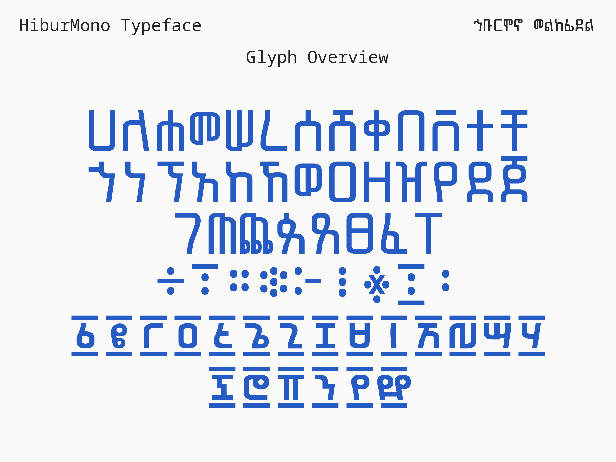
Along with the designer, Behailu Barento (@typehabesha ), we are very happy to introduce the Hibur Mono typeface, available for review from: https://github.com/typehabesha/HiburMono/
A synopsis: Hibur Mono is a single-weight, monospaced, Ethiopic typeface designed for columnar display environments such as computer terminals and software code development interfaces.
The Hibur Mono Ethiopic glyphs have been designed from the ground up and optimized for the fixed-width contraints of a monospaced typeface. Hibur Mono is compatible with the Noto Sans Mono geometric dimensions. The non-Ethiopic glyphs in Hibur Mono have also been leveraged from Noto Sans Mono.
Samples below, and a proof file attached.thank you kindly,


Tagged:
2
Comments
-
I don't know Ethiopic at all, but are the near-miss alignments such as in the W-shaped character (5th in line) necessary for the writing system? My intuition would be to flatten them into alignment or then dissimulate them further so it looks intentional.1
-
Thank you @Christian Thalmann, that is a good observation. The misalignment is an essential characteristic of the glyph (ሠ). I think we should adjust it to have a tad more separation so as not to look like a near-miss, and be more obviously deliberate.
1 -
It seems like you have remained strictly monoline, even when needing to squeeze four vertical elements in a glyph. This leads to those glyphs getting quite dark, and maybe somewhat less legible. I find it notable how in Latin monospaced fonts, in an arguably similar situation with the lowercase “m,” many designers reduce the stroke thickness of the verticals.
(EDIT: I am looking also especially at U+1238 Ethiopic syllable cha)6 -
Thank you @Thomas Phinney, we'll tinker with thickness in a few cases to see how it goes. Knowing now that this is done for Latin letters, we can feel comfortable about trying it with Ethiopic glyphs.
0 -
Great work! I look forward to making this more widely available in Google Fonts
") 2
2 -
Thank you @Christian Thalmann & @Thomas Phinney. We've made adjustments following the recommendations. The results are clearly better. @Dave Crossland love the enthusiasm 😀
 3
3


Categories
- All Categories
- 47 Introductions
- 4K Typeface Design
- 493 Type Design Critiques
- 576 Type Design Software
- 1.1K Type Design Technique & Theory
- 669 Type Business
- 884 Font Technology
- 29 Punchcutting
- 537 Typography
- 124 Type Education
- 332 Type History
- 81 Type Resources
- 113 Lettering and Calligraphy
- 33 Lettering Critiques
- 80 Lettering Technique & Theory
- 569 Announcements
- 100 Events
- 116 Job Postings
- 170 Type Releases
- 182 Miscellaneous News
- 270 About TypeDrawers
- 54 TypeDrawers Announcements
- 114 Suggestions and Bug Reports