Difference between Cyrillic Ef Ф and Greek Phi Φ

Wei Huang
Posts: 102
What's the recommendations on the design difference between the uppercase Cyrillic Ef Ф u+0424 and Greek Phi Φ u+03A6? I've noticed there’s 3 main differences:
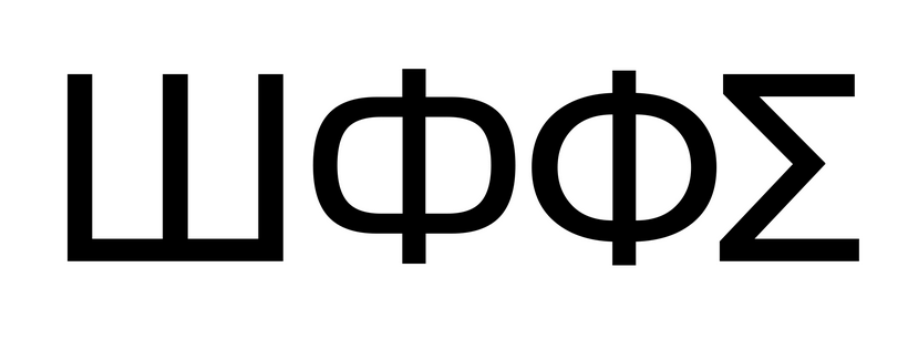
1. Cyrillic Ef is sometimes more square than Greek Phi:
Helvetica World Regular
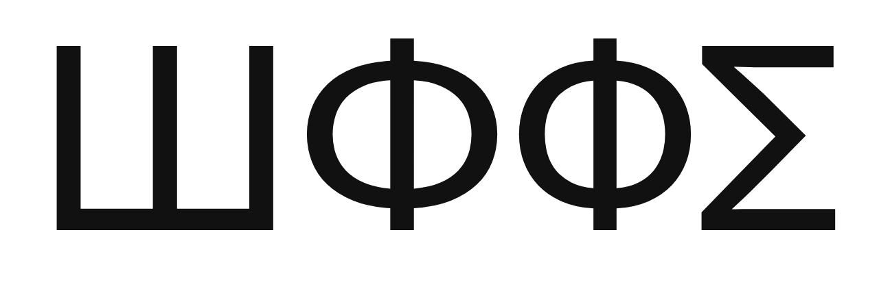
2. Size of the bowls are different:
Theinhardt Pan Regular, Cyrillic Ef’s bowls are wider
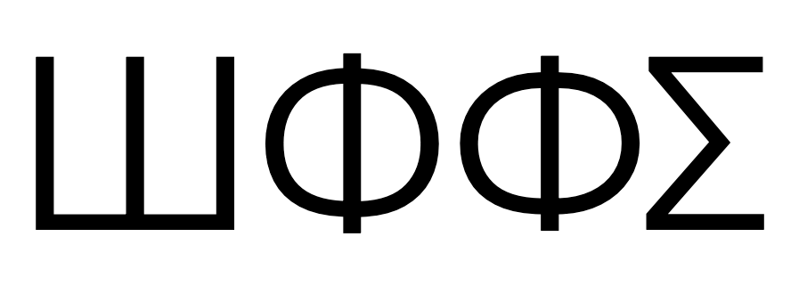
Sharp Earth, Cyrillic Ef's bowls are narrower but taller
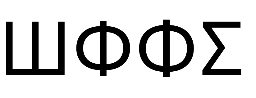
SF Pro Text, Greek Phi’s bowls are bigger
Graphik Regular, Greek Phi's bowls are bigger
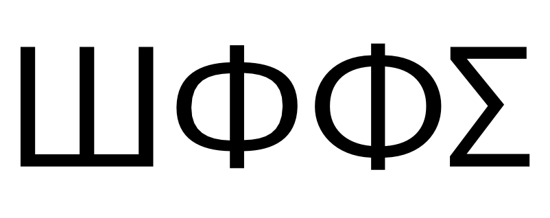
3. One may extend beyond the cap-height and baseline while the other does not:
Zed Display Regular, Cyrillic Ef’s bowls are larger and the stem extends beyond cap-height.
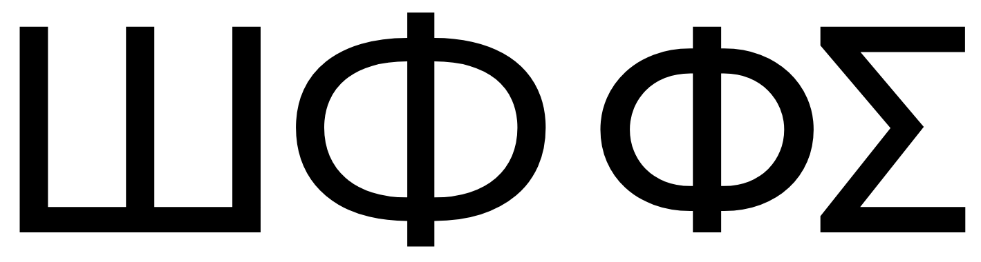
Neue Helvetica World Regular, Greek Phi’s bowls are larger and the stem extends beyond cap-height.
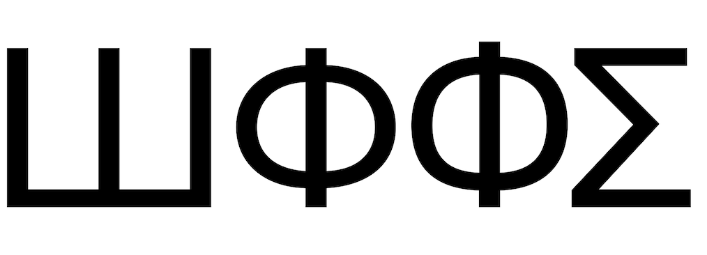
Also see SF Text Pro above, both extend beyond the cap heights but Phi is slightly taller but probably on account of the bigger bowls.
Would love some insight into these differences.
Tagged:
3
Comments
-
The Cyrillic Ф in Helvetica World is based on Russian sans types of the 1920s. The design of that Cyrillic set out to be idiomatically related to Helvetica, rather than simply being based on shapes derived from the Latin, so it references a Cyrillic sans serif tradition with its own features.
In general, the bowl of the Cyrillic letter is squatter and less round than the Greek, but note that there is a distinction in this respect in Bulgaria, where the bowl is very large and round. I would say that the example you show from Sharp Earth is very much in the Bulgarian tradition.4 -
The variety of relations in your examples indicates a probability that different people did different sets at different production stages, which led to inconsistencies.
I would be really surprised if curve tension is taken as a carrier of the localized form. In the Latin/Cyrillic/Greek corpus, that would be taking a type design trait to the orthographic level. That would be a poor practice IMO.
John is right, Bulgarians deliberately standardized their local forms in XX century, and their recommendation is here:
https://www.fontfabric.com/wp-content/uploads/2021/05/Capital-Letters-Comparison-2-1-1130x640.png
It's labeled as "rounded" compared to the "traditional," which is the rest of Cyrillic. You can find a whole article by the image URL.
That leaves us with the rest of the Cyrillic and Greek. While the Greek lowercase set is idiosyncratic, and thus lowercase /phi (φ) is obviously different than Cyrillic /ф, my opinion is that for uppercase /Ф Cyrillic = Greek. And the width and height of elements (bowls, stems) are type design preference, not alphabet norm, and should be consistent.
Moreover, although Bulgarian localized forms are generally well thought out, I think that here for /Ф, they have gone too far, making a type design trait an orthographic norm. It is true that this letter is problematic to harmonize with the rest, so it needs more width, and then consequently—more height. But even though 90% of typefaces would do that, it is a type design choice, sometimes on the level of optical correction.
Think of /J in Latin, sometimes on the baseline, sometimes descending. It is important for some display fonts not to have ascenders/descenders for caps, because of the intended typesetting.
4 -
...for uppercase /Ф Cyrillic = Greek. And the width and height of elements (bowls, stems) are type design preference, not alphabet norm, and should be consistent.I agree with much of what Igor wrote, but this statement implies that type design doesn’t have independent traditions and conventions that have evolved differently despite the related origins of scripts. A lot of my Cyrillic and Greek design work has been informed by iterative reviews by, respectively, Maxim Zhukov and Gerry Leonidas, and I always treated the scripts as independent and looked at idiomatic parallels — alongside Latin —, and in these regularly saw different proportions in related letters.
It is worth bearing in mind that coordinated multi-script typeface designs are a very recent phenomenon. Through most of history, Latin, Greek, and Cyrillic typefaces were independent things, mostly made by different people, and in that history they developed separately. Sometimes, this results in related letters gravitating to different proportions, ultimately reflecting their relationship to other shapes within each script, not across scripts.
4 -
I agree. I always try to establish a safe default first.
From there, one can pick one's own direction, proportional to the informed inspiration, so when it deflects from the default, that would be a choice, not wandering or copying others' mistakes.
Area beyond default is much more complicated than it might seem, given the interesting history of mutual relations between Greek, Latin, and Cyrillic. A lot of factors there that deserve a separate discussion or article, especially given the modern digital times, and here typographic opinions usually rest on wider cultural attitudes.1 -
Thanks for your replies, that's exactly what I was hoping to learn. @Igor Petrovic regarding your comment on lowercase /phi φ being different than Cyrillic /ef ф, what do you think about typefaces that use the same design?The article Igor mentions is A closer look at the Bulgarian stylistic variation of the Cyrillic script.
0 -
It is interesting that several sans-serif typefaces, as in the examples given above, gave different shapes to these Russian and Greek capital letters which are similar in general appearance. I am, however, very dubious about whether one can draw general conclusions in this area.An individual type designer might decide, for example, to derive the shapes of the Latin alphabet from Caslon, and then derive the shapes of the Greek majuscules from Bodoni because he felt it was more appropriate to Greek, but that would just be the subjectivity of one person, not a general property of the language communities involved.While a few typefaces have represented the Greek upsilon the same as the Latin letter Y, there is very good reason to reject this shape in the sense of making the other choice; one could study the look of Greek typography to try to get an idea about subtleties in the shapes of Greek letters, but it's not at all clear what is "right".The traditional majority view, or so it seems to me, has been in the past that when it comes to majuscules in Cyrillic and Greek as well as Latin, the prototype is the Trajan column - and so characters that have the same basic shape should be identical in printing. If Italians prefer Bodoni, Germans prefer Aldus, and Frenchmen prefer Garamond, this doesn't mean a French "P" looks different from an Italian "P", and so the same reason would be equally invalid for the Greek rho or the corresponding Cyrillic letter.Maybe studying Bulgarian typography could lead us to the conclusion that the traditional majority view is wrong -Of course, though, "wrong" is the wrong word. The traditional majority view has validity, but it's also limiting. Different communities, due to their different typographic histories, will see things in different ways. Letting letters vary in shape so as to reflect this... isn't wrong either. But I think it should be seen as a voluntary design choice, rather than a mandatory one, the way that proper handling of accent marks and so on in different languages is mandatory for correctness.(I think that perhaps I have worked my way to basically echoing the position taken by Igor Petrovic above.)0
-
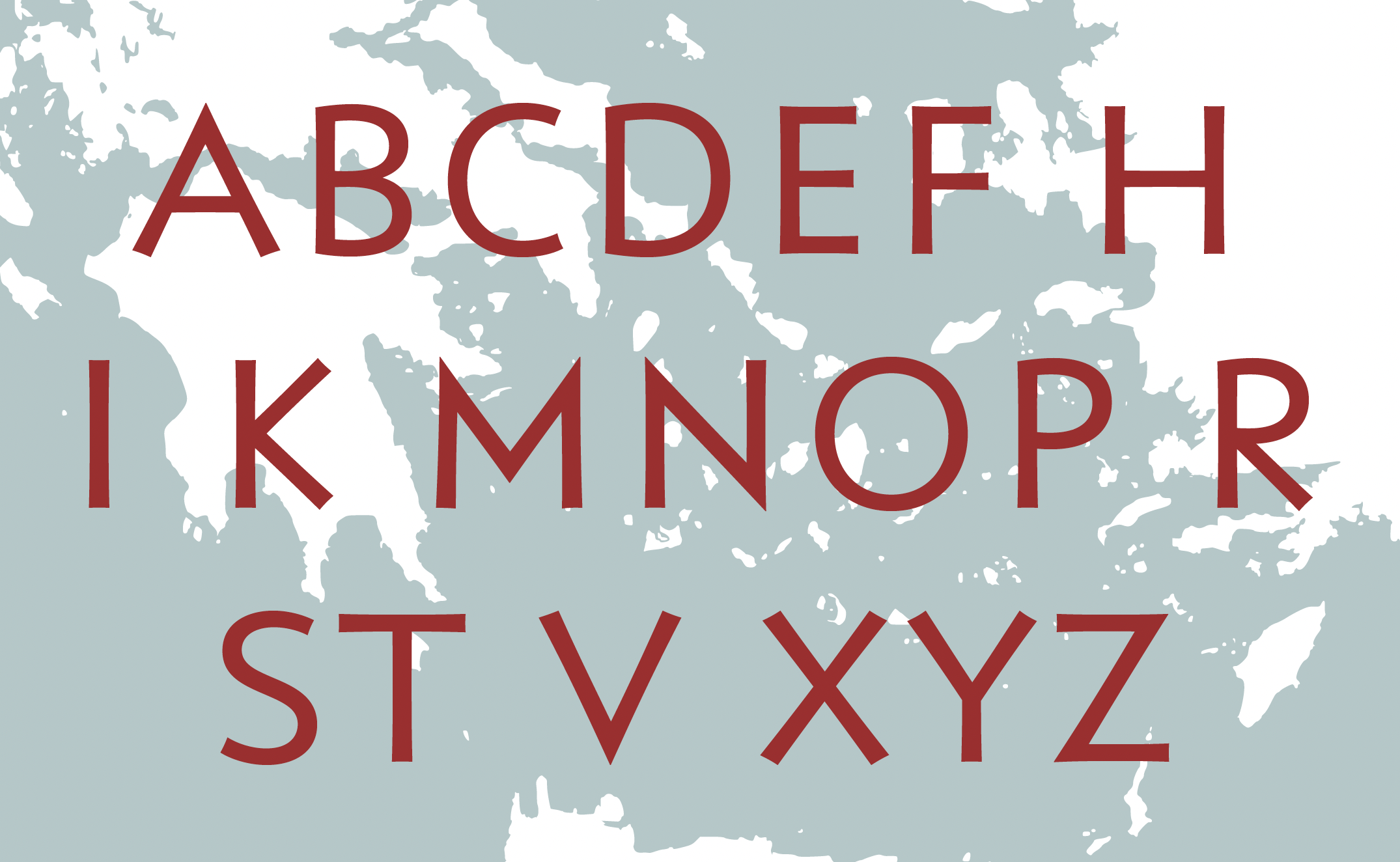
when it comes to majuscules in Cyrillic and Greek as well as Latin, the prototype is the Trajan columnBoth Greek and Cyrillic have independent manuscript histories that included development of majuscule letters, preceding by some centuries the reverse engineering of Latin typographic forms derived from Roman inscriptional letters. The underlying shapes of most majuscule Latin letters — as distinct from their particular serifed forms of the Roman period — are found in the earliest, archaic phase of Greek epigraphy, preceding the Trajan inscription by several hundred years. I would say these are the true prototypes of both Greek and Latin majuscules, and only indirectly and latterly of reformed Cyrillic majuscules.
2 -
I see you included the Latin "R"?0
-
At what point in type design do we just move on? Do we really need to cling to the originals still? I feel as though we have passed that point and our constraints only should be what reads to today's readers of any script. In other words, when a reader stops and thinks, "WTF?" should be the limitation for modern design. Of course, I am not talking about revivals or attempts to mimic classic forms. I am talking about new design.0
-
This is a very good point. Can one seriously maintain that Jenson found the "One True Way" to render the Latin alphabet legibly? Even simply clinging to the calligraphic tradition - making letters that seem to have been written with a pen nib - can't really be justified.Chris Lozos said:Do we really need to cling to the originals still?But Optima, for example - non-calligraphic, but strongly based on classic shapes and proportions - serves as an example that even the daring do not venture far.For display type, of course, there is plenty of choice. For text type, though, it seems that many accept the constraint - cling to the originals unless you think you can do better - and the originals are so good that they seem to have inspired despair. Because text type is so utilitarian, the field doesn't really invite experimentation.Given that kind of situation, typefaces such as Bodoni, Corona, and Clarendon constitute bold innovations, even if by a naive objective standard they're closely clustered around the originals.So I have no answer for you. We do not need to cling to the originals, but we will cling to the originals because there is no alternative tradition on which we can base anything genuinely different with a real hope of success. (Thus, even Times Roman was based on Plantin.) Someday, someone will come up with something truly original that is comparable to the existing tradition of type, which will then be widely imitated - but will it happen next year, or not for a thousand years? I can't say.0 -
I see you included the Latin "R"?In the archaic Greek context it is one of the variant forms of rho, found in some inscriptions on Melos and then at Athens and Corinth. The illustration is of shapes that found their way into the Latin alphabet, but not always with the same phonetic value as they had in Greek, and some of which disappeared from use in Greek.
2 -
Thanks, John.0
-
John, Do you have an image of the stone with that "R" form? I can't seem to find it and would love to see the cutting? I am sure my collection of images is woefully lacking.0
-
John Hudson said:I would say these are the true prototypes of both Greek and Latin majuscules, and only indirectly and latterly of reformed Cyrillic majuscules.Before Peter the Great changed the Russian alphabet, A looked like A, and so on and so forth. So the letter of the Greek alphabet were the prototypes of the original Cyrillic script - and you have me confused here.It certainly is true that the shapes of the letters of the Latin alphabet came directly from Greek - or from Greek through Etruscan. Of course, from there, it goes back to the Phoenicians, but the Greeks significantly modified the forms of the letters.But when I was talking about the Trajan column, I was talking about the precise typographical form of the capital letters, not their basic topological shapes. That, of course, went back to Greek at least with typefaces like Porson Greek, and, with Peter the Great, entered Cyrillic as well.If there are ancient Greek inscriptions with serifs on the letters, bring them on; that is what would prove me wrong.EDIT: Actually, some early Greek inscriptions do have serifs, but they're just small spikes on crudely drawn letters. There are later Greek inscriptions with carefully drawn letters, but those are without serifs. Until one gets to the inscription outside the Library of Celsus - but while that one was in Greek, it was commissioned by a Roman, from a time after Greece fell to the Roman Empire.0
-
John Hudson said:In general, the bowl of the Cyrillic letter is squatter and less round than the Greek, but note that there is a distinction in this respect in Bulgaria, where the bowl is very large and round. I would say that the example you show from Sharp Earth is very much in the Bulgarian tradition.@John Hudson If I understand you correctly squatter here means shorter and wider right? I was looking at your typefaces but what I'm seeing is the opposite (taller and narrower Cyrillic Ef), do I misunderstand, or is there something else going on with this style of typeface?
Brill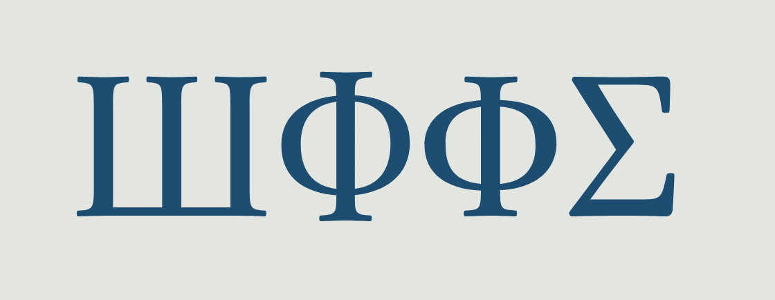 STIX Two
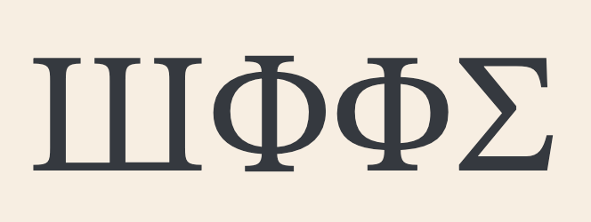 Cambria
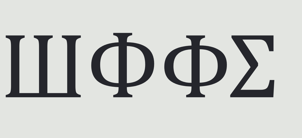 0
0 -
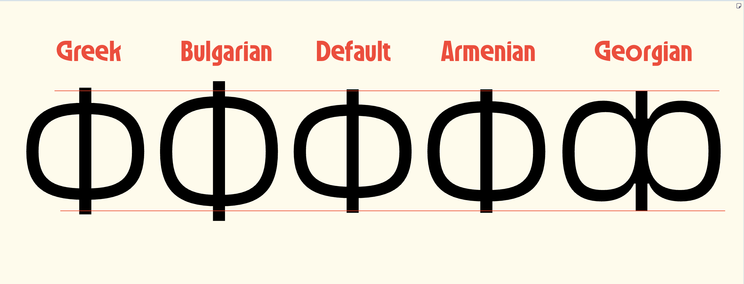 The examples you see in the screenshot are from a new typeface (Tatype Neue) I am working on. One of the most crucial technical and visual aspects of multi-script projects is ensuring that characters with similar anatomy do not look like mere copy-pastes of each other across different scripts.First, let's look at the directly related Greek and Cyrillic forms. The fundamental source is the Greek «Φ» (Phi). Visually, the default Cyrillic «Ф» differs very little from its Greek original. The reason for these minor differences (such as being more squarish or compact) is simply the visual habits of the people using the language and the optical logic applied by local designers to harmonize the symbol with other wide Cyrillic letters.However, the approach in Bulgarian Cyrillic is completely different. By applying lowercase handwriting (cursive) logic to upright fonts, Bulgarians have created a sort of Latin-Cyrillic hybrid. While I understand this as a historical attempt, from a designer's perspective, the fact that the central stem of the Bulgarian «Ф» extends so far beyond the baseline and cap height seems illogical to me. Especially in serif designs, this doesn't look good at all and disrupts the overall rhythm of the text.When it comes to the Armenian (Փ) and Georgian (Ჶ) letters, the issue moves to an entirely different level. Here, I want to draw attention specifically to the Georgian script. As we know, the Mtavruli forms, which represent capital letters, were added to the Georgian script much later. Since Mtavruli letters are designed strictly within the cap-height boundaries, the Georgian «Ჶ», with its central vertical stem and bowls, inevitably shares the same spatial structure as the Greek «Φ» and carries the risk of looking identical to it.For this exact reason, while working on the project, I paid special attention when designing the Armenian and especially the Georgian (Mtavruli) letters to ensure they are not mere copies of their Greek/Cyrillic sources. Even if they share a fundamental structure, each must retain its own local graphic character and dynamics.1
 -
Do you have an image of the stone with that "R" form?My reference when I was working on the Brill Epichoric typefaces were tables of forms in Kirchhoff’s Studien zur Geschichte des Griechischen Alphabets and in Jeffery’s The Local Scripts of Archaic Greece. Kirchhoff doesn’t include images or identify specific inscriptions. I have a copy of Jeffery, but don’t have time to browse through it at the moment,
There is a more recent book on The Early Greek Alphabet, edited by Robert Parker and Philippa Steele, that includes references to example inscriptions, some of them in Jeffery’s The Local Scripts of Archaic Greece or included in her large collection of field work descriptions and images. So it should be possible to track something down.
The form I showed from the Brill Epichoric font shows the typical representation in these books, which captures the essence of a rho with a round bowl and a diagonal leg. The size of the bowl and the length of the leg in inscriptions will vary.
Note, by the way, that ‘inscription’ doesn’t always imply letters cut in stone: some are painted inscriptions in pottery, or early coins.
1 -
@Wei Huang Sorry, I should have been clearer that I was talking about the proportions in the Cyrillic grotesks referenced in the design of Helvetica World.
The proportions of the Cyrillic Ф vary idiomatically, as do the proportions of the Greek letter, and sometimes these stylistic idioms diverge: the Cyrillic goes one way and the Greek goes the other way. There is plenty of latitude in the proportions across time and across styles, but when working within a particular style I am interested to determine the norm of that style for each script.0 -
Greek lowercase is somewhat a different paradigm, and I would be surprised to see Cyrillic lowercase /ф form used instead of /φ in a typical Greek font. Others may give more informed answers.Wei Huang said:@Igor Petrovic regarding your comment on lowercase /phi φ being different than Cyrillic /ef ф, what do you think about typefaces that use the same design?
I replied here on the Greek–Cyrillic capitals relation, because they share the same paradigm as Latin and Cyrillic (more or less closely depending on opinions). My opinion is based on the fact that all three scripts have H and O as the foundation of the typographic rhythm and proportions.
----
Regarding the general discussion, it reflects that beyond the default is a broad area. The task is to derive Platonian ideal letterforms (local or universal) from many particular examples, while understanding the context that led to those particular examples, which are not always typographically legit.
P.S.
My personal criterion is that if there are localized specifics that deflect from usual type design reasoning, then it should be stated, documented, and analyzied in a public article in order to properly enter the discourse.0 -
@John Hudson Thanks John! I will look at those sources.0
-
In addition to what I have already written, here is the example I noticed today. Greek lowercase /phi φ looks like the Cyrillic one, but without the top ascending stem. As per the context, it's from the popular album cover back in the 90s.Wei Huang said:regarding your comment on lowercase /phi φ being different than Cyrillic /ef ф, what do you think about typefaces that use the same design?
Although I would say this is not very common, it makes typographical sense. That is to distinguish it further from the lowercase /psi ψ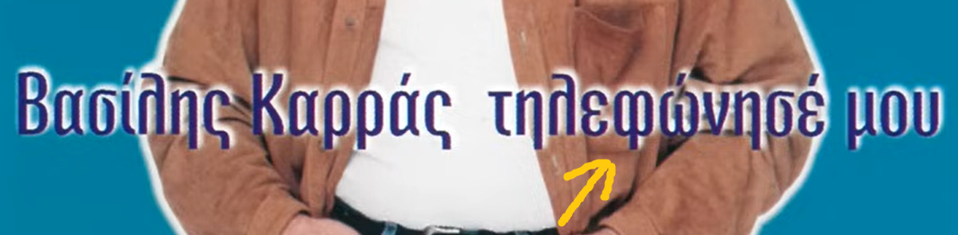
0 -
Sometimes the left side is open like the written with pen form.0
-
The Cyrillic Фф has changed greatly since its adoption from Greek, and these changes continue—even 100-150 years ago, the letter looked different. Today, the most important and least obvious point is that, as the great master Yuri Gordon said, "no one knows where the ascender of the Фф ends." That is, in professional fonts, it is never aligned with the other ascenders, but where it exactly is each individual designer's decision.1






Categories
- All Categories
- 47 Introductions
- 4K Typeface Design
- 496 Type Design Critiques
- 581 Type Design Software
- 1.1K Type Design Technique & Theory
- 672 Type Business
- 889 Font Technology
- 29 Punchcutting
- 540 Typography
- 125 Type Education
- 333 Type History
- 82 Type Resources
- 113 Lettering and Calligraphy
- 33 Lettering Critiques
- 80 Lettering Technique & Theory
- 570 Announcements
- 100 Events
- 116 Job Postings
- 170 Type Releases
- 183 Miscellaneous News
- 270 About TypeDrawers
- 54 TypeDrawers Announcements
- 114 Suggestions and Bug Reports