Textura Eszett

Nick Shinn
Posts: 2,407
My latest project, Puffery, updates the “Olde English” style of blackletter with Roman-based capitals—providing better legibility for those unfamiliar with the classic Fraktur capitals, and also to enable a neat all-caps setting. So I had to include a suitable capital Eszett, giving it some commonality with the lower case ß.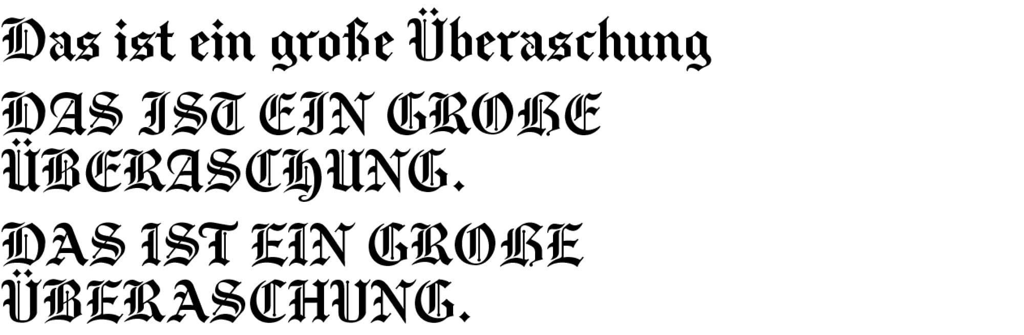
There are two variants of the typeface—Vintage Capitals (above) and Regular (below).
Tagged:
8
Comments
-
*eine 🧐Nice cap eszett! The Regular /U doesn't quite work though, IMHO. The Vintage one seems legible enough to use in Regular, in any case.0
-
Thanks! No doubt, but I wanted to make the two sets of capitals different, within reason.
I’ve done the alternates as separate fonts, rather than Stylistic Alternates, for ease of accessibility, so it’s quite easy to mix them.0 -
Also *Überraschung

I'm a big fan of the capital ẞ. Great work.1 -
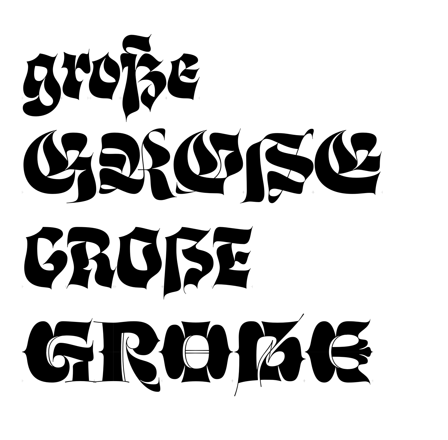
Drawn a few recently, for a somewhat psychedelic blackletter that I'm close to finishing. From top to bottom: lowercase, default Fraktur caps, simplified caps, Lombardic caps.
 6
6 -
Wow! Psychedelic indeed! 🤩1
-
@Nick Shinn
Nice work, but I think the cap eszett is too similar to the cap B. I would either make it more different, e.g. with a serious horn in the top right corner, and/or stick to two letters S creatively intertwined as a monogram, and leave the other version as an Opentype alt.
1 -
Nah, they’re all quite unambiguous to me. The implied descender helps.Two /S stuck together is a no-go.Some of those caps in the bottom line look like they should be aces in some obscure deck of playing cards!3




Categories
- All Categories
- 47 Introductions
- 4K Typeface Design
- 497 Type Design Critiques
- 591 Type Design Software
- 1.1K Type Design Technique & Theory
- 674 Type Business
- 907 Font Technology
- 29 Punchcutting
- 544 Typography
- 129 Type Education
- 333 Type History
- 82 Type Resources
- 114 Lettering and Calligraphy
- 33 Lettering Critiques
- 81 Lettering Technique & Theory
- 580 Announcements
- 101 Events
- 116 Job Postings
- 176 Type Releases
- 186 Miscellaneous News
- 270 About TypeDrawers
- 54 TypeDrawers Announcements
- 114 Suggestions and Bug Reports