Historical examples of serpentine-shaped /one

Craig Eliason
Posts: 1,510
in Type History
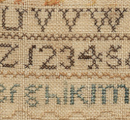
In embroidered samplers I've been studying, it was very common to make the figure /one with a "stroke" that curves a bit to the left at the bottom and to the right at the top (like a very compressed /S or an upright /integral).
In manuscripts and inscriptions I think I've seen /ones that look like /Js (that is, with a curve at the bottom), but I can't recall if I've seen this serpentine /one elsewhere.
Anyone know of examples ∫ -like /ones in lettering or type?
0
Comments
-
That sounds very unusual. I don’t think I’ve ever encountered such a form, anywhere. Do you have any examples you can share? Now I’m really curious.0
-

1 -
 I experimented with some of my typefaces, in InDesign, finagling the integral symbol.
These were the most successful.
From top to bottom: Beaufort, Brown, Sense.
Despite being able to achieve even colour, the disparity in style is too great, the s-shaped “one” doesn’t look like a one.
I did try my more unorthodox designs, such as Fontesque, on the principle that their general weirdness would make the odd “one” more at home, but in those I had either omitted the integral or designed it to be quite conventional, with tiny ball terminals, so that didn’t work.
0 -
Thanks, Craig. Those are very unorthodox-looking, to say the least. I’m not sure how well they’d read outside of a sampler context. Although, I suppose in the context of a date, it would certainly be assumable. But still weird. :-∫0
-
I'm tempted to see it as a kind of disambiguation strategy (as sampler lowercase /l's were often sans serif and capital /I's had bilateral serifs). But in the content of samplers and other likely cross-stitch products, there was probably zero danger of mistaking figures for letters.0
-
1
-
Thanks Florian. That's in the neighborhood of the J-like figures on this Venetian clock, pictured at the Wikipedia page for "1".
 3
3 -
I can’t NOT read that as a J.
It’s J2-o’clock!3 -
“When does Good Times come on?” “JJ oʼclock.” “DYN‐Oʼ‐(clock)‐MITE!!”Thomas Phinney said:I can’t NOT read that as a J.
It’s J2-o’clock!0 -
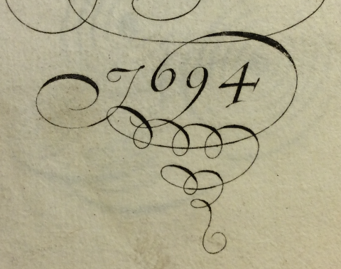
The J-like 1 is very common in the 17th and 18th Centuries in the Netherlands and England, especially in the more upright styles. It is a frequent form in the copybooks of English writing masters, as well as occurring in memorial inscriptions.
Some flourished examples by John Seddon: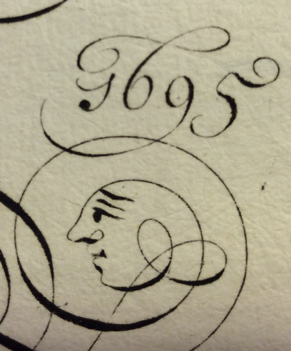
George Shelley c.1710: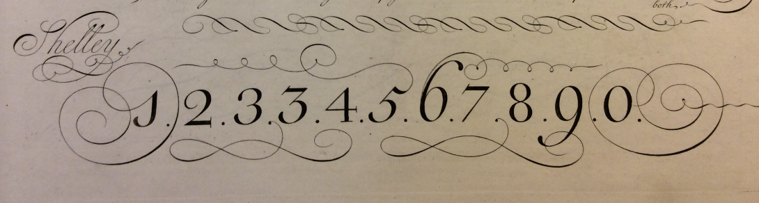
And illustrating two common forms of the period: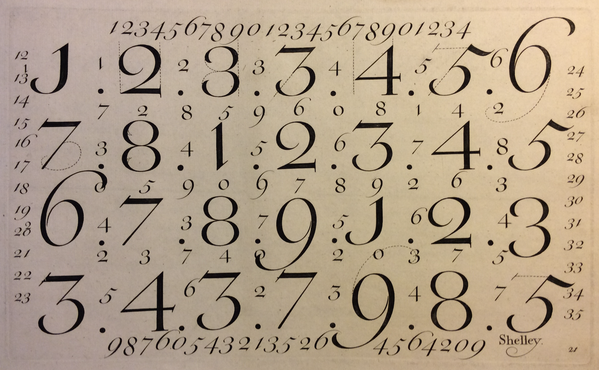
And a couple of contemporary inscriptions (note the hooked 4, which is also fairly common at this time):

9 -
Two from the church I'm in this evening - one more like John's J-shape, and one that I feel is a bit more like an inversed version of the "integral 1":
2 -
Oddly, tonight I was in a history lecture and when she saw what I was taking pictures of, the lecturer told me that J-shaped ones were also often used in financial records because they were more difficult to fiddle by altering them into other numerals.2
-
Funny then that so many of the ones and sevens above are so similar!0
-
Perhaps the stonecarvers are less worried about post-facto gravestone modification?0
-
...the lecturer told me that J-shaped ones were also often used in financial records because they were more difficult to fiddle by altering them into other numerals.It’s a nice idea, but in my review of the accountancy pages of writing masters’ exemplars I have observed the opposite: the J-like 1 is not used in this context (at least, not in the 18th Century and later; I’ve not seen enough 17th Century examples of confirm). The numerals used in financial documents tend to be the closest to the modern standard, which is not surprising because it is largely from that context that they made their way onto typewriters and hence computers.
This is a typical exemplar bill of sale, written by Nathaniel Dove and engraved by Bickham for The Universal Penman (so probably from the 1740s):
2 -
And here, just because it is so glorious, is an invoice written by Joseph Champion, also from The Universal Penman. If we ever do get to the stage where text is being reliably and cleanly composed on-the-fly by AI instead of typeset by fonts, all my invoices for the fonts licenses that no one buys will look like this.

3 -
Oh, and here is a lovely example of cursively connected numerals, from Geroge Snell’s The Art of Writing (1712).
 2
2 -
I love how the tittles get their own flourishes!3
-
I'll license your fonts just to get an invoice like that.0


Categories
- All Categories
- 47 Introductions
- 4K Typeface Design
- 495 Type Design Critiques
- 577 Type Design Software
- 1.1K Type Design Technique & Theory
- 671 Type Business
- 885 Font Technology
- 29 Punchcutting
- 539 Typography
- 125 Type Education
- 333 Type History
- 81 Type Resources
- 113 Lettering and Calligraphy
- 33 Lettering Critiques
- 80 Lettering Technique & Theory
- 569 Announcements
- 100 Events
- 116 Job Postings
- 170 Type Releases
- 182 Miscellaneous News
- 270 About TypeDrawers
- 54 TypeDrawers Announcements
- 114 Suggestions and Bug Reports